Welcome to our Dash Club Dispatch #7. Dash Club brings essays and updates about Plotly and Dash every 8 weeks. To have these directly delivered to your inbox, sign up. (In this edition, we’ve prepared a special set of cheat sheets!)
In Dispatch #7
- Version Check
- An Essay from Chris: Measure Twice, Cut Once
- App of the Month
- Component of the Month
- Summer Community App Challenge Winners
- Fall Community App Challenge
- Survey Results
- Things Happen
Version Check
- Dash Enterprise Platform 4.3 (announcement, request a demo)
- Dash Open Source Framework 2.6.1 (announcement)
- Dash Open Source Framework 2.5 (announcement)
- Plotly.py 5.10
- Plotly.js 2.14.0 (See the changelog)
An Essay from Chris
Measure Twice, Cut Once
Over the years, we’ll pick up hundreds of little tricks to speed up a codebase. List comprehensions, caches, yields, numpy arrays, lazy loads, materialized views…
The most important trick of them all is sometimes the easiest to neglect: Profiling.
Profiling reveals how long each part of your code takes to run. There are good tools available to do this in Dash:
- The Dash Dev Tools UI tells you how long each callback takes to run and breaks things down by compute time vs network transfer time. You can also record your own custom timing events.
- The ProfilerMiddleware breaks down the performance of your code line by line. It’ll also cumulate times for functions that are called multiple times giving you an easy place to focus your optimization efforts.
3. Your browser’s Network Tools can give you a high level understanding of network delays overall website loading and even allow you to throttle your network to 3, 4, or 5G. Dash’s custom timing events can appear here, too.
- To simulate load for smaller apps, I will often just open up several browser windows. A more robust solution is JUnit. Our customer success team published this guide.
Without a good profile, we miss the forest for the trees. It limits us in two ways:
- Premature optimization: I’ve spent countless hours making a function 100x faster only to discover days later that it’s only responsible for 0.5% of the total runtime.
- Thinking it will never work. I’ve spent equal time not building a feature because I think the architecture will be too slow, only to measure it later and find that it would’ve been fast enough for that particular use case.
A mentor of mine makes a point to never discuss a performance improvement until they’ve measured the whole program in a real production environment.
Time shifts in production. The network comes into play. Different operating systems, processors, and even Python versions. There’s middleware abound.
On Dash Enterprise, we built out an onboard IDE that runs on the platform. Same operating system, image, network, processors, memory, cache, filesystem, python version as the deployed app. dev=prod. Less surprises on the perilous road to production.
In production, network delays will eclipse compute times. Concurrent users will compete for resources. The server’s clock speed will be an order of magnitude faster than your laptop.
Or maybe it won’t be. After all, you won’t know until you measure it ![]()
Interested in learning more? Join me in a technical seminar on performance on August 23.
App of the Month
The Airport Explorer app, created by Yanboe for their Master’s Thesis at the Swiss University of Applied Sciences, allows users to compare airports and routes. Read more from the original post.
Everything about this app is exquisite: the beautiful design, the usage of Dash Pages, and the informative flight explorer!
The Flight Explorer displays the 10 shortest routes from one airport to the next. Here’s SFO (San Francisco) to GOA (Genoa, Italy).
Flying to Rome? The Airport-Indicator Matrix shows the top airports for that trip in the USA.
See more Dash apps or share your own in the Community Forum’s Show and Tell tag. If you would like your app to be considered for the next edition of the Dash Club newsletter, please message Adam.
Component of the Month
The Dash Mantine Components package has come a long way since it was first introduced to the community. With more than 70 components from Mantine React Library, a growing community, great docs, and well-maintained GitHub repo, Dash Mantine is now a leading UI library in the world of Dash apps.
Thank you, Snehil, for bringing Mantine to our Dash community. See Docs, PyPi, Github.
Visit our community components index to see more components! And join our component-builder community by creating and sharing your own community components.
Summer Community App Challenge Winners
Thank you for helping our animals by submitting your apps to the Plotly Summer App-Building Challenge. Not only are your apps beautiful, they also allow animal shelters to better understand the shelter activity and likelihood of animal adoption. This could affect the way shelters operate: the hiring of staff, the launch of adoption campaigns, shelter staffing hours, and much more. We’ve shared your apps with the Austin Animal Shelter, and we’re excited to hear their feedback.
A large team of Plotly staff came together, studied each app, and voted for the top three app winners.
Michael’s app took first place for going above and beyond with the Lost and Found page, very nice user interface and presentation, and an impressive predictor tool to estimate the length of care an incoming animal is likely to need. Also, the details in the About page show how thoughtful Michael was in giving context to potential users of the app.
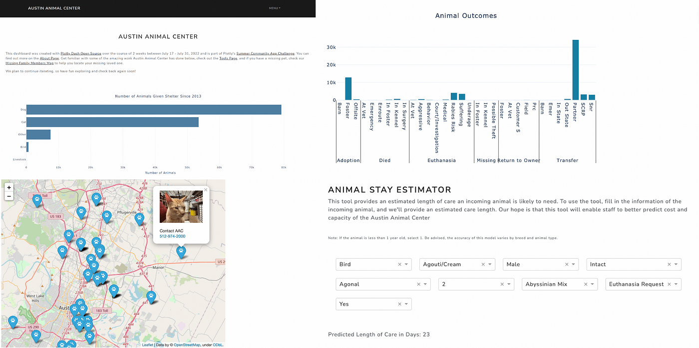
Animal Shelter Dash App, created by Michael M., with the following code.
Deepa’s app was the runner app because the cat-box-surprise lottie won our hearts. Joking aside, the app’s well organized sidebar makes it easy to navigate through the app pages; a comprehensive usage of graphs make for a thorough data exploration experience, with an original use of the scatter plot and a nice use of the sunburst to drill down into the data. In addition, we loved the persistent selection of component values from start to finish across the categories and pages.
Animal Shelter Dash App, created by Deepa S., with the following code.
Tied for third place, Matan’s app is a one-page page, yet it has a thoughtful layout and style, and it is intuitive. It is obvious that Matan took the time to customize every design feature of the app.
Animal Shelter Dash App, created by Matan M., with this code.
Julie and Joanna’s app is no less impressive, with an informative documentation page, a good use of the scatter mapbox for lost animals, a straightforward landing page that puts the end user experience at the forefront, and a useful prediction tool that uses the Gradient Boosting Classifier.
Animal Shelter Dash App, created by Joanna & Julie, with this code.
We would like to reiterate our appreciation for the apps submitted by the other community members: app by Sachin, app by Bilal, and app by Lyndon.
Over the next couple of days, a Plotly staff member will reach out to the winning community members to share a package of this season’s Plotly swag, which includes our new perceptually uniform socks! Match your apps to your socks, or your socks to your apps, with px.scatter(continuous_color_scale="Viridis".
Fall Community App Challenge
We challenge the community to build the most dazzling multi-page app with the new Dash Pages feature. The data is a list of sales belonging to a supermarket company. It was uploaded to Kaggle by Aung Pyae.
To enter the Community Challenge, please download the dataset, create an app, and share it by replying to this Forum topic by midnight Sunday, October 2. Please share the code used. Also, please share a link to the deployed app, if possible.
The winning apps will be judged according to the following categories:
- Creativity
- Design
- Data Exploration
- Data Science or Data Analysis Routines (e.g. numerical methods, machine learning, prediction, classification, optimization)
First place prize: $125 US dollars
Second place prize: $75 US dollars
Third place prize: $50 US dollars
The winners will be announced in the next Dash Club Dispatch (October). For any questions, feel free to reply to the Forum topic or email Adam at adam@plot.ly.
Survey Results
Thank you to all the community members who gave us feedback about Dash by filling out the UserEvidence survey sent out in the last Dash Club newsletter.
We learned a lot about the way you use Dash and for what purpose. Here are a few highlights from your responses:
We’re always interested in more feedback around Dash. Please write to Adam at adam@plot.ly if you would like to share your thoughts with us.
Things Happen
-
 Plotly is hiring two positions in the product development team: Technical Product Manager and UI/UX Designer. Help design the next Dash features!
 -
 Community member Silvio creates YouTube videos on stock analysis in Python. Here’s his latest Dash App, FoxyFi.
 -

 Community member Øystein built a Multi-page App (in Norwegian) for investment rental cases, using Dash Pages.
 -
 Dash enthusiast, Rui M., created a Dash app to support civil engineering curriculum at the Swiss Federal Institute of Technology in Zürich.
 -
 Community member, Ann, used Emil’s BeforeAfter image component to make a Dash app that highlights the first James Webb Telescope images.
 -
More Dash job postings
-
 Plotly staff members connect with the community in person at Databricks Data & AI Summit.
 -
 Community member, Brad, has written a detailed and very helpful Forum post explaining how to add a blog to your Dash App.
 -
 Robert’s Pencil App is definitely an app you don’t see every day.
 -
 4 new Community Badges were introduced to the Plotly Forum: Component Builder, Component Master, Community Inspirer, and Community Honoree.
 -
 Community member, John K., wrote a Medium article on Capacity Modeling using Dash.
 -
 Andrew created the Dash tools package that makes deploying dash projects to Heroku intuitive and easy.
 -
 Community member, Emil, came out with OperatorTransform, which makes it possible to perform partial component property updates.
 -
 Our very own Mike Razo facilitated a webinar on Real-Time Operational Analytics with Dash on July 27. Watch the video!
-
 Community member, Brad, completed his awesome Pokémon app with Dash Pages.
 -
 Our amazing Celia built an app to explain annotations & legend positioning.
 -
 Our very own Dave is building a web app with a list of awesome community apps. To submit your app to Dave, please reply to this Forum thread.
All the best,
Chris (@chriddyp) & Adam (@adamschroeder)