Plotly IBCS Chart Challenge

Hi Plotly community,

We’d like to kick off 2026 with a new exciting challenge: create templates for IBCS chart types.

International Business Communication Standards (IBCS) aims to establish a universal framework of rules and best practices for creating clear, consistent, and easily understandable business charts and reports.

We’d like to use the power of Plotly Studio to create prompts that serve as reusable templates for IBCS-style charts. A successful prompt will be one that anyone in the community can insert into Plotly Studio to create a similar IBCS chart with a similar dataset.

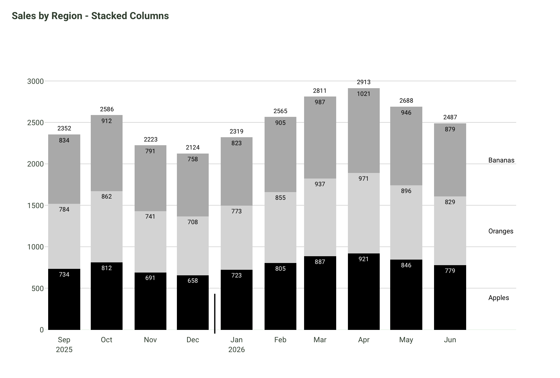
Let’s see an example of how I developed a prompt that reproduces one of the Stacked Column charts in Plotly Studio, using a similar dataset. This was the process:

  1. I uploaded a dataset to Plotly Studio. Then, I clicked Continue, and on the next screen I clicked the +Add button to create a new chart.

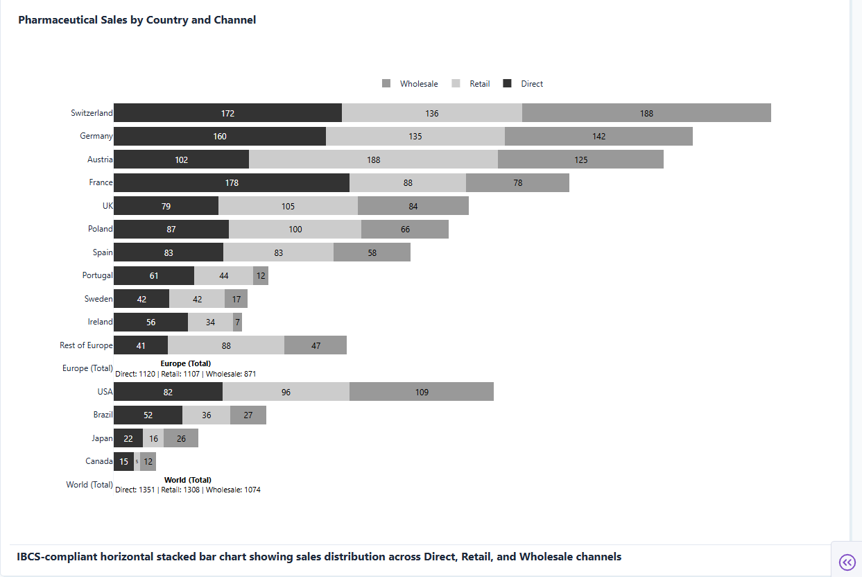
  2. Then, I created the following prompt in an attempt to generate a similar chart to the IBCS Stacked Column chart, found on their website.

Follow the IBCS stacked graphing guidelines below when building the stacked columns graph that shows a timeline of sales by region. 

The x-axis, starting on zero, should only mention the months in short 3-letter words. Add a short ticker line (15% of the length of the graph, with 10% of the line continuing below the x-axis) that makes the transition from present time (2025) to future time (2026). To the right of this ticker line, continue writing the months on the x-axis but add the year label only under the first month (January).

Don’t add a legend. Simply add an annotation of the region pertaining to each group at the far right of the graph. The annotation should be aligned to the midway point of each stacked bar chart that it pertains to.

No need for the x-axis title or the y-axis title.
No need for the description at the bottom of the card. Remove it.

Given every stacked bar that representes each month a different color shade, from black to medium light gray. For example, if there are 3 stacked bars, use 3 different colors.

Add text inside each stacked bar. 

Add the sum of each bar as text on top of each bar.
  1. This is the chart Plotly Studio created from the prompt. Pretty good, right?!

  2. This prompt is good, but it could be made even better by incorporating the IBCS practical guidelines. See the section below on the Tip for Enhanced Prompt Development.

The Challenge:

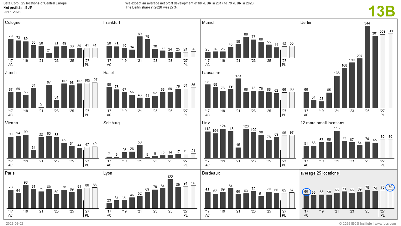
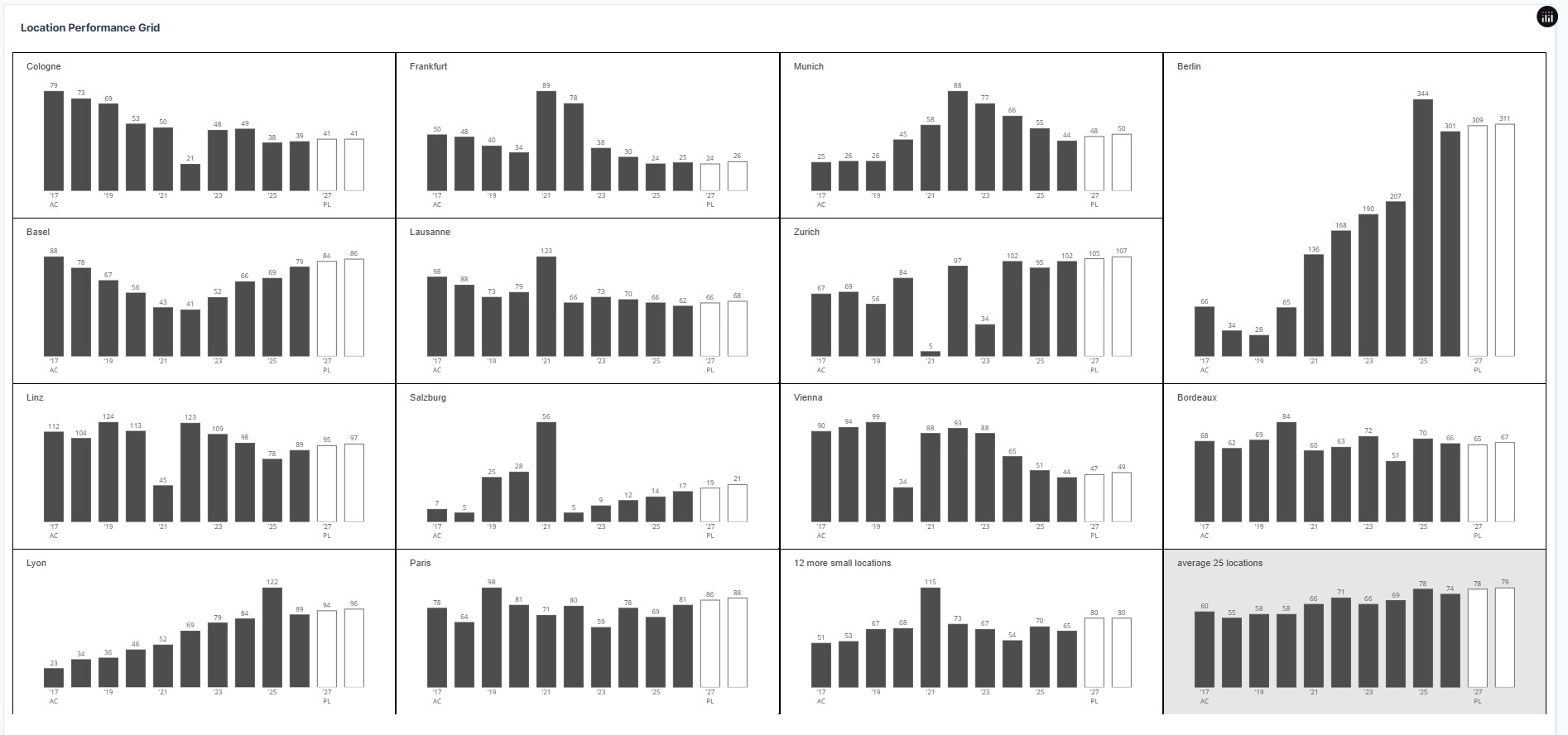
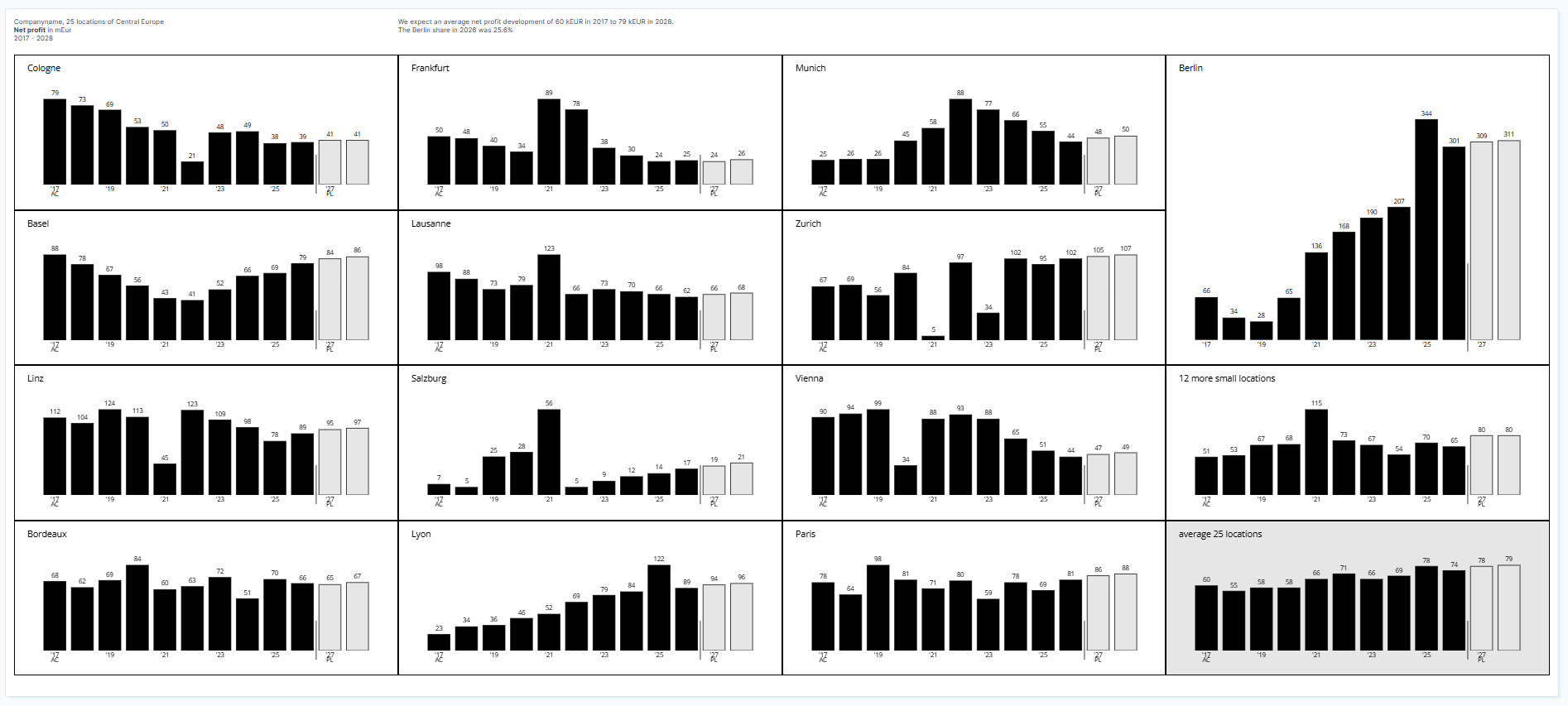
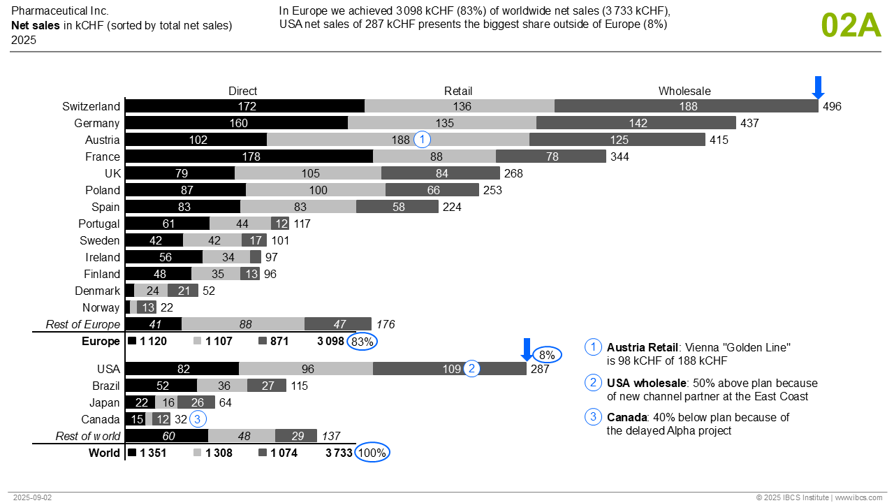
We challenge the community to build prompt templates for one of these IBCS charts, using the respective datasets.

The winning prompt templates will be the ones that reproduce the most similar IBCS charts inside Plotly Studio with similar datasets (that Plotly will create to judge submissions).

The winners will be announced at the end of February (one prize per participant):

:1st_place_medal: $250 USD

:2nd_place_medal: $150 USD

:3rd_place_medal: $50 USD

You’re submission must include the following by end of day, February 15:

  1. the IBCS chart you chose to replicate for this challenge
  2. an image of the final IBCS chart that you built within Plotly Studio
  3. the complete template prompt you wrote to create the chart

Tip for Enhanced Prompt Development:

To build a comprehensive, universal prompt for a particular IBCS chart type, we recommend you incorporate into Plotly Studio some of the IBCS practical guidelines PDF version 1.2. To download for free, simply register to IBCS and use the emailed coupon code to purchase the PDF. Participants can focus on the UNIFY, EXPRESS, and CHECK chapters.

For any questions, feel free to reply to the Forum topic or message me (Adam) directly.

Good luck :four_leaf_clover:

5 Likes

I gave this challenge a try, but with a few restrictions: there was something like 50% or less left of my free tier, that’s what I gave myself.

The image I tried to recreate:

The result at the end of the free tier:

The prompt

Data

Order locations by country.
If you can not identify a country, move the row to the end of the table.
If the location name has something like [mean, average, sum] in the name put it at the end of the datatable.
Each location has values for scenario AC (Actual data) and scenario PL(Planned), these data together will be used for the barchart per location.

Layout

Use a 4 column grid layout and a number of rows as needed, set rowheight 250px
Fill the layout from left to right with the histograms per location.
Use the following order to fill the grid: locations in Germany, in Switzerland, in Austria, in France, the rest.
For Germany display Berlin as the last location. Berlin is also the main location.
Use 1 column and two rows to display the main location.
Display the grid as a table with 1 pixel wide black lines to separate the cells

Do not add any dropdowns or other filters.
No need for the description at the bottom of the card. Remove it.

Colours

Black: #000000 (Used for actual data)
Medium Gray: A common choice is #808080 (Used for previous year data)
White/Outline: #FFFFFF (Used for plan and budget data, often as an outline on a contrasting background)
Red: #FF0000 (Used for negative variances and highlights)
Green: #00FF00 or a similar bright green (Used for positive variances and highlights)
Blue: #0000FF or #0041AA (Used for highlighting actual data)

Barchart

A barchart shows years on the x-axis and values on the y-axis per location
The starting value for x is the minimal year-1, the end value for x+1 is the maximum year.

Follow IBCS standards and guidelines to create the barcharts

  • all text is IBCS dark grey
  • set font-size 10px, also for the ticks
  • margin top = 50, margin-bottom=40, margin left = 20, margin-right=20
  • Set y-axis range with autorange allowing 15% padding above the maximum value to ensure bar values are visible
  • abbreviate year ticks to ’ + the last two numbers
  • remove y-axis ticks
  • use line + fill colour IBCS dark grey for the AC bars
  • use line colour IBCS dark grey + fill colour white for the PL bars
  • remove gridlines
  • the title = " "+location, insert the title, font weight normal, font size 14px.
    align the title left, make sure there is 20px padding left.
  • add a year tick every two years, starting with the first year which has an AC value, ending in the year with the last PL value.
  • add an “AC” label under the first year used in the chart.
  • add a “PL” label under the first year with a bar reflecting a PL value
  • add value at the end and outside of each bar. Ensure these text annotations have sufficient space by setting clip: false or ensuring they’re within the expanded y-axis range.
  • hide legend.
  • If the location name contains “average” set plot background IBCS light grey and overall background color to light grey, otherwise make it white.

It’s not complete, it was fun, some things made me think, some things made me angry

What made me angry, if you compare the data with the ordering in the chart, it’s clear that the chart is ordered by country, maybe the last column filled separately or in a flow. So I asked in the data tab to add Country. But somehow some locations weren’t recognized, I had to tell PS which location was which country. That went fine, but was not used in the charts. In the end I added countries to the .csv and started a new project.

Why is Berlin larger than the rest, because it’s important, see original image text above/middle, or to fill up space?

What also kept me busy, the vertical line between AC/PL not moving all the ticks down. That’s when there was less than 25% free tier left. Didn’t manage to fix that.

With less than 10% I changed the Card title into what is in the original image in the upper left corner. That worked more or less, the correct text was in the upper right and all charts where reversed, Berlin being on the left of all the subplots. While trying to discover what went wrong my free tier was done. Luckily I published a few times intermediate results.

Try it yourself, it’s fun!

5 Likes

Thank you for sharing the prompting development process with us, @marieanne
Your chart looks very similar to the IBCS template chart :fire:
I remember when I worked with the vertical line that crosses the x axis, it took me some time to get.

I think it’s a great idea that you added some of the IBCS bar chart standards and guidelines in to the prompt.

1 Like

I tried your vertical line approach but “it“ kept pushing the ticks below the line, gave up :grinning_face:

1 Like

Hi Marianne, I’m not sure if it’s a good idea, but maybe you could first recreate the chart by writing the code (with the help of AI) and see what result you get. I don’t know, personally, I would do it that way to get a better understanding of IBCS Charts. Good luck with the challenge!

2 Likes

Actually I had that idea at first, more to check the results (the numbers), until I saw the prepared data for this challenge. And I’ve already spent a lot of time to recreate ibcs charts, sorry spam in plotly dash, see You searched for ibcs | EMMA-design , and recreated one of them a half year ago in Plotly Studio.

But in general, it’s good to have a look IBCS charts, what it is and guidelines before you start creating a prompt or create it in dash/plotly, completely agree with that @Avacsiglo21 There is a reason you can get IBCS-certified :grinning_face:

And there’s an end to free-tier.

2 Likes

Very nice chart @adamschroeder. I don’t know if IBCS allows, but I would have made the segments for bananas, oranges, and apples of similar color to the real fruit. Also, would get rid of the y-axis tick labels. Are there any documented rules for ICBS, of what to include or not include? I will give this a try.

1 Like

Got a bit sponsored for this one, which resembles the original more. Where have the AC & PL label for Berlin gone? I have no idea. Either invisible or not drawn, I have spent an hour to get them back, no success. This whole exercise makes me think a lot about configuration, comments in prompts which must be neglected or uncommented and used for configuration and templating:

Giving this a try is at least very educational.

This challenge is a great way to get familiar with IBCS charts and how Plotly Studio works.
I chose at first the Chart 07 and I probably solved it similarly, adding a few missing sentences several times.

  1. Original Chart

  2. My Chart

    My prompts:
    “Create an IBCS-style multi-line stock chart: Gamma-magenta, Beta-black, Alpha-lightblue.

    I want to see the daily data on x axis.

    Filters: Date and company filters

    Show horizontal gridline only at index 100 and all monthly vertical gridlines.

    Show the company name (Alpha, Beta, Gamma) as the legend on the end of each lines.

    I dont need x and y axis title and show only the sorted month names wit the first three letters.

    I dont need on y axis the labels.

    Show the numbers with bold font at the months on the chart.

    Color the the last vertical gridline from Beta endpoint 100 to Gamma endpoint 7 for red 2px line, and beside this show the difference in percentage. /93%/

    Enable plotly drawing tools. “

3 Likes

Good question @Mike_Purtell . No in this case, having similar colors to the fruit would not be the recommended way with IBCS. The documented guidelines can be found under the section I wrote on: Tip for Enhanced Prompt Development, located at the bottom of the first post I wrote.

Nice work, @marieanne .
Sometimes when I can’t get exactly what I want in a particular Plotly Studio card despite multiple prompt edits, I’ll restart with a new card and slightly redo my prompts. That usually works for me.

wow @Ester great job. That’s an incredibly similar chart with a shorter-than-expected prompt.
So cool!

1 Like

This project aims to use prompts to reproduce the international business communication standard charts 04A using the given dataset.

Comparing actual (AC) vs. planned (PL) values by business sessions.

Promptn :

Create an IBCS-compliant variance analysis chart comparing Actual (AC) vs Plan (PL) values by business area, including absolute and percentage variance, sorted by variance.

Layout

  • Use a 3-column grid layout with 2 rows
  • Row 1 (≈85%): Main categories
  • Row 2 (≈15%): Total summary row

Columns:

  • AC vs PL comparison
  • Absolute variance (ΔPL)
  • Percentage variance (ΔPL%)
  • All charts must share the same category axis
  • Categories must be sorted in descending order by ΔPL
  • Use a horizontal orientation for all bars and lollipops
  • Remove legends (labels are embedded in the chart)
  • Use a white background with 4 horizontal gridlines
  • Add a thick horizontal separator line above the total row charts, drawn end to end
  • Reverse the category axis so the largest variance appears at the top

Color :

  • Use a strict IBCS color system
  • Actual (AC): solid dark gray
  • Plan (PL): hollow bar with dark gray outline
  • Positive variance: green
  • Negative variance: red
  • Do not use gradients or transparency (except for hollow PL bars)
  • Use black for axes and separators
  • Keep colors consistent across all columns

Charts
Column 1 — AC vs PL|

  • Overlay two horizontal bars per category: must be in line with the International business communication standard c
  • Standard Bars (Plan/Budget): Should occupy 2/3 of the category width
  • Apply the overlapping technique by placing one object over another to create an illusion of depth. bars are same-sized but PL is offset to show only a small edge
  • Each bar should be half the width of a standard single bar
  • Plan (PL): hollow bar, same size
  • Actual (AC): solid bar, same size and thinner, overlaid on PL
  • Show numeric labels for both PC and AC values, positioned outside the bar
  • Place “PL” and “AC” labels above the column, not in a legend
  • The Placement of the PL and AC labels above the column should sit on the bar

Column 2 — Absolute Variance (ΔPL)

  • Horizontal bar chart centered on zero
  • Bars extending right represent positive variance
  • Bars extending left represent negative variance
  • Color bars green for positive and red for negative
  • Display signed values (e.g., +3, −5) outside each bar
  • Include a thin zero baseline

Column 3 — Percentage Variance (ΔPL%)

  • Use a lollipop chart
  • Line from zero to the percentage value
  • Square marker at the end of the line
  • Color green for positive and red for negative
  • Display signed percentage values next to the marker
  • No axis tick labels; rely on text labels only

total Row (Footer)
Repeat the same structure as above for the total
Display total AC, PL, and ΔPL values clearly
Typography & Labels
Use bold text for headers and column labels
Use consistent numeric formatting (no decimals unless necessary)
Avoid clutter: no legends, no axis tick labels

  • Add a thin horizontal line separating the topic and the chart
  • The thin horizontal line should be above the charts
  • Metric description at the right top end
  • Year and scenario comparison

Sorting & Logic
Calculate:
ΔPL = AC − PL
ΔPL% = (AC − PL) / PL × 100
Sort all categories by ΔPL descending
Ensure all columns reflect the same sorted order
Style Rules
Follow IBCS standards:
Plan = hollow
Actual = solid
Variance = color-coded
Prioritize clarity over decoration

2 Likes

I chose another interesting chart; I was curious how it could be made with just prompts.
(I added checkboxes to control interactivity.)

Name on the IBCS website: C09: Scattergrams – This template arranges data points for “Net sales” and “Margin” in a chart with two value axes.

  • Scatter plot: Y-axis = Net Sales (mUSD), X-axis = Margin (%)
  • Gross profit iso-lines (hyperbolas) at 1, 2, and 3 mUSD levels (formula: NetSales = GrossProfit * 100 / Margin)
  • Gray shaded area above the 3 mUSD gross profit line (highlighted zone)
  • Three product lines scatter a little bigger with distinct colors: RX (black #333333), X2 (yellow #f0c040), VA (orange #e86000)
  • Label key products directly on chart (RX-2000, X2-200, VA-19, X2-201, X2-122, RX-4, RX-6, VA-D2, RX-180, VA-3PO) without arrow
  • Product line filter with checkboxes to show/hide categories
  • Filter table by product line (color) using dropdown

My chart:

Original Chart:

3 Likes

That’s a long and detailed prompt, thank you, @Moritus .
Can you please share the two required images for submission?

  1. the IBCS chart you chose to replicate for this challenge
  2. an image of the final IBCS chart that you built within Plotly Studio

@Ester it’s incredible how similar these two scatter graphs are. And the whole prompt was only these 7 bullet points?

@adamschroeder Yes, that was all the prompts.
The majority of it is orange because it covers the yellow dot in the back in many places, because the values ​​are the same, but I can take a picture of that too.

1 Like

I made another IBCS chart out of curiosity, C02: Stacked bar chart: Stacked bar charts are being used for displaying the structure of data in a given time period or at a given point of time.

My prompts:

”Create 2 IBCS-compliant interactive horizontal stacked bar chart (type 02A) using Dash and Plotly.

1. Chart: Europe countries (sorted by total sales) → Europe (Total) , below this:

2. Chart: USA, Brazil, Japan, Canada → World (Total). Sum rows display text values only without bars.

Legend on the top of the chart

Horizontal stacked bar chart: pharmaceutical sales by country with three channels (Direct, Retail, Wholesale)

IBCS grayscale colors: Direct (black #333333), Retail (light gray #CCCCCC), Wholesale (medium gray #999999)

Display labels inside center each bar segment with appropriate text colors for readability

Sort each chart by total sales descending; special handling for sum rows (Europe Total, World Total) - text only, no bars beside this percent number

Last row is world total”

My Chart:

Original Chart:

1 Like

Well done @Ester
The graphs are almost identical.
I’m not sure it’s possible to have a blue circle around the x-axis number, but perhaps it’s possible to get the blue facing-down arrow as an annotation.

Thank you for submitting this :folded_hands:

1 Like