Hey everybody! I wanted to share my recommended workflow for working on charts in Plotly Studio by showing how a chart might evolve from something simple like this:

To something sophisticated like this:

This chart was made within Plotly Studio by iterating on a single chart within the Chart Outline editor. Here’s what the final result looks like in the product:

This was created entirely with natural language: 11 lines of english! All in all, Plotly Studio generated 600 lines of code to create the final chart.
I have three main tips:
- Start with a simple chart that works
- Make changes 1 at a time
- Add each new change on a new line within your Plotly Studio prompt (to keep things organized as the prompt gets longer).
In this example, here are the series of prompts that I used to evolve the chart above from A to B.
Open stock price of Barclays:

Open stock price with ticker dropdown

Stock price with ticker dropdown.
Dropdown to chose open, close, high, low.

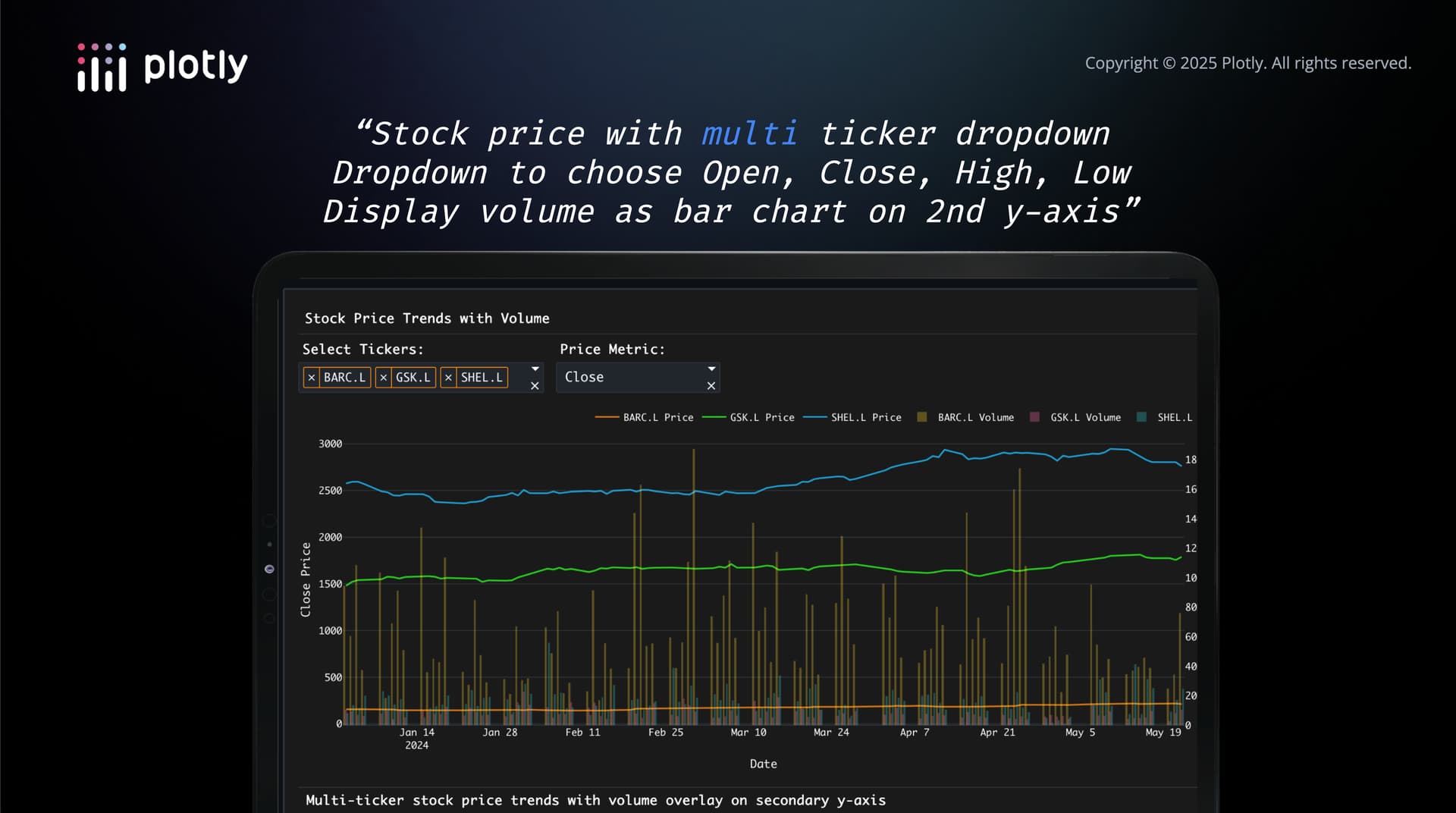
“Stock price with multi ticker dropdown
Dropdown to choose Open, Close, High, Low
Display volume as bar chart on 2nd y-axis”

“Stock price with multi ticker dropdown
Dropdown to choose Open, Close, High, Low
Display volume as bar chart on 2nd y-axis.
“Stock price with multi ticker dropdown
Dropdown to choose Open, Close, High, Low
Display volume as bar chart on 2nd y-axis.
Display separate, stacked charts for each ticker (150px tall)”

“Stock price with multi ticker dropdown
Dropdown to choose Open, Close, High, Low
Display volume as bar chart on 2nd y-axis.
Display separate, stacked charts for each ticker (150px tall).
Hide the gridlines and axis labels.

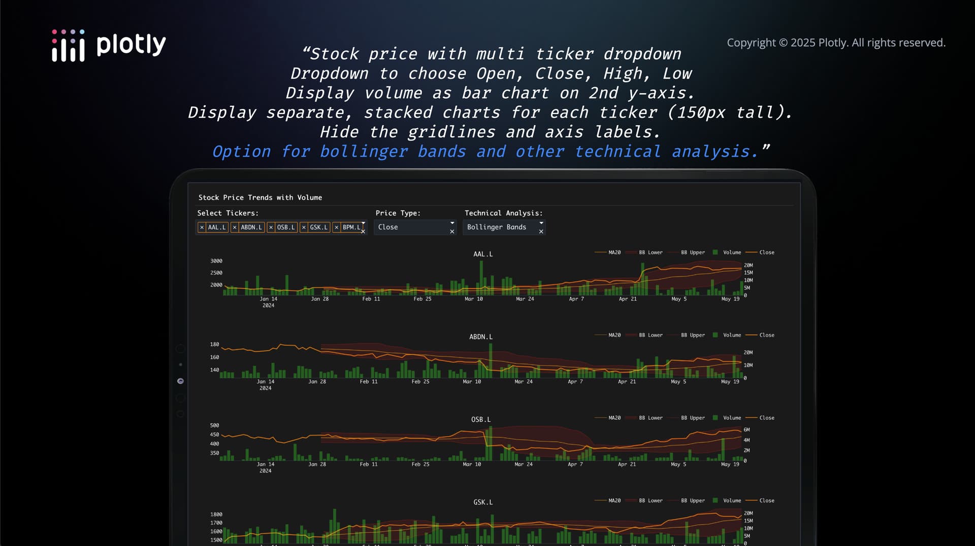
“Stock price with multi ticker dropdown
Dropdown to choose Open, Close, High, Low
Display volume as bar chart on 2nd y-axis.
Display separate, stacked charts for each ticker (150px tall).
Hide the gridlines and axis labels.
Option for bollinger bands and other technical analysis.”
“Stock price with multi ticker dropdown
Dropdown to choose Open, Close, High, Low
Display volume as bar chart on 2nd y-axis.
Display separate, stacked charts for each ticker (150px tall).
Hide the gridlines and axis labels.
Option for bollinger bands and other technical analysis.
Time range dropdown for Last day, 7 days, 14 days, month, quarter, all.
Include 10 different sample portfolios (e.g. tech stocks, bank stocks).
Highlight 5% jumps with vertical line (solid red for neg, dashed magenta for positive). Choose 5% threshold in dropdown (2%, 5%, 10%, 20%, …)”

Hope
