Plotly Studio generates a complete, publishable data app in 2 minutes from your data.

But generating a full app isn’t the only use case for Studio. I use Studio to do data analytics and answer questions one-by-one by working on the individual chart level.
Here’s an example. The data app that was generated above contains some supply chain and manufacturing data. You can download this data here: 10k.csv · GitHub (right click on “Raw” and click “Download Save As”)
6 charts and filters were automatically generated by default.
I’ll usually look at those 6 charts for inspiration and to get oriented with the data.
Here’s an example of iterating on a series of questions for this dataset:
Show which locations have the most number of defects:

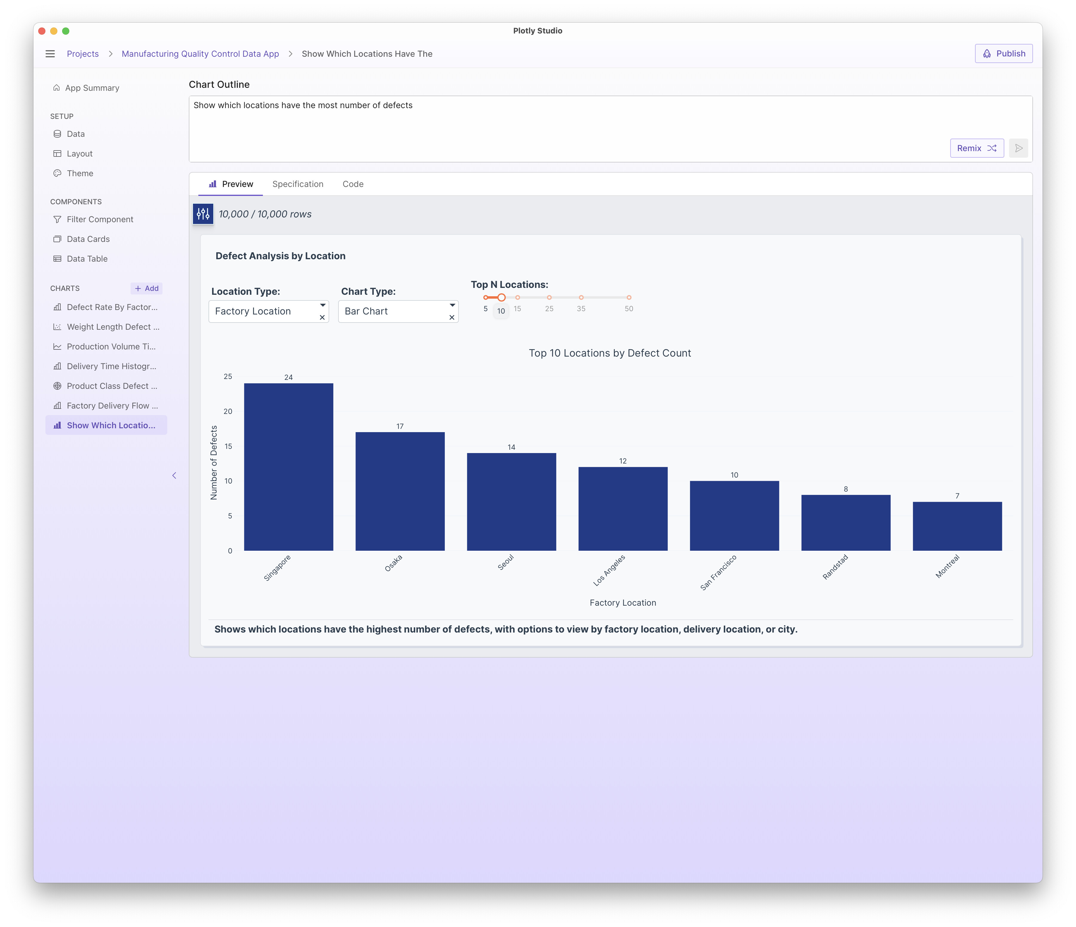
Show which locations have the most number of defects:
Display the data as a pivot table rendered as an HTML table - So for each city, show the individual parts that have defects
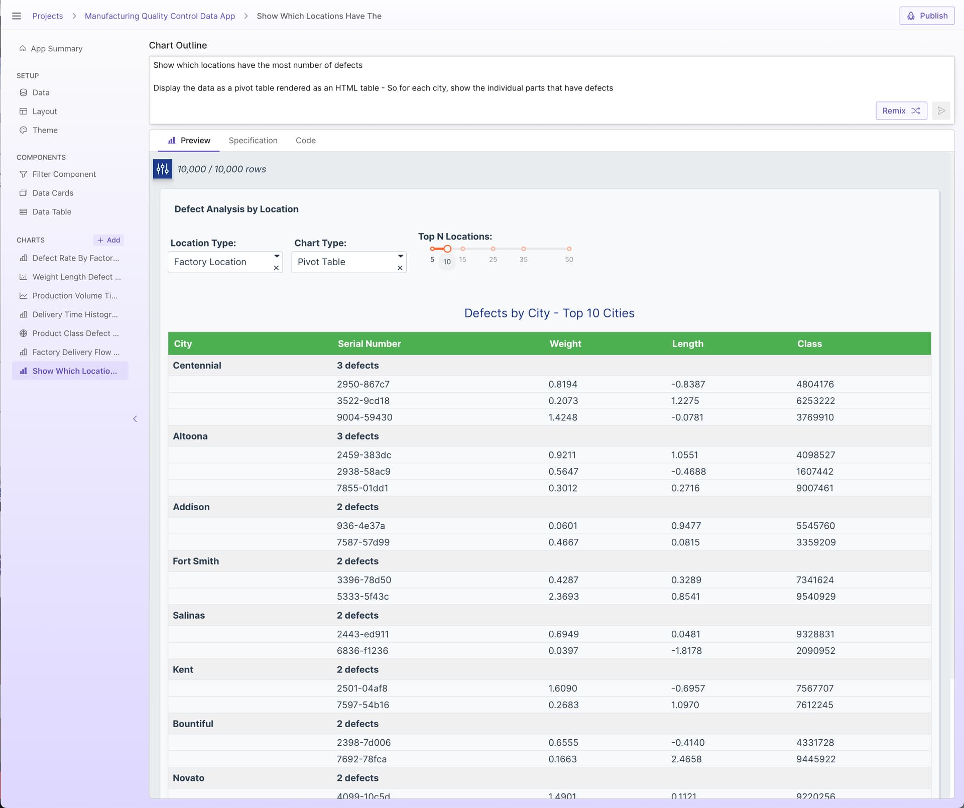
As a side note, Plotly Studio does an exceptional job with tables! There’s a few different table technologies that are all great. My favorite lately is using the HTML table technologies. See more examples here: Tables in Plotly Studio - Conditional Formatting, Pivot Tables, Ag Grid vs HTML, Cross-filtering, Freezing Columns, and more
Another side note - Plotly Studio won’t “tell you the answer”. Our approach with AI is that Plotly Studio will generate analytics code that will crunch numbers and display the results as tables and charts that can be interpreted itself. Data is complex and it’s easy to come to the wrong conclusion when you see a simple answer - viewing the results as a table or a chart will tell a much better story and allow you to spot check the results.
So at this point, I’ve got my answer - I can see the top defects by city and I can also drill in to the exact defects.
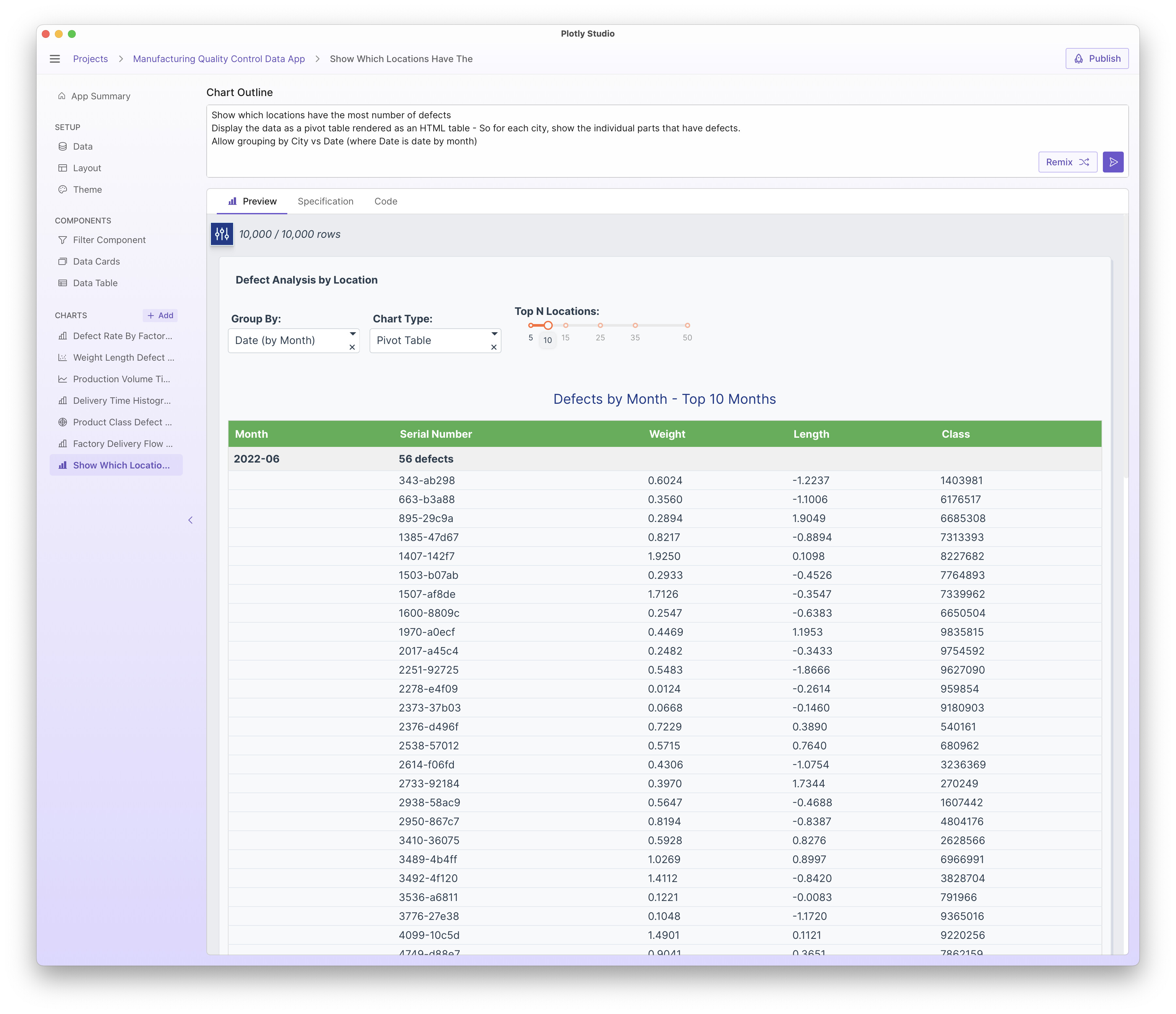
I might be interested in slicing it in different ways. I usually do this by adding additional options or dropdowns to the analsyis so I can rapidly switch between different views. Here’s grouping by month now:
Show which locations have the most number of defects
Display the data as a pivot table rendered as an HTML table - So for each city, show the individual parts that have defects.
Allow grouping by City vs Date (where Date is date by month)
I’ll usually create a series of charts as part of this exploration. So at this point I’ve got a good idea of which cities had the most defects, but now I’m interested if there is any correlation between weight & length and defects. So I’ll create a new chart for that:
As an aside - If you are creating a totally new analysis, I recommend creating a new chart rather than clearing the prompt and rewriting it OR clicking on the “Remix” button. Otherwise, Plotly Studio will use the existing code as a “baseline” when updating your chart and will attempt to make as little code changes as possible to make that change. This works well for additions or simple changes to your existing prompt because it should change as little code as possible (without introducing any new features). But that means that there can be some “history” when edits are made.
Anyway, here is a new chart showing defects vs length/width:

Click on the legend to hide the “No defect” trace:

Looks pretty evenly distributed!
This is just a glimpse in how I use Studio to answer certain analytic questions and inquiries. See Example and pro tip: Create charts one sentence at a time with Plotly Studio - #5 by chriddyp for another example of building out a particular view sentence by sentence.
Hope this was helpful!