Hey everyone! Kicking off this thread for folks to show and tell some of their favorite charts that you’ve created with Plotly Studio ![]()
One of my favorite charts I’ve been creating lately are “comparison views”. I specify two charts (within the same card) and a dropdown to update each chart individually. I’ve also been playing around with including table views within the card as well and asking for “compact” styles.
Trading volume and open and close price. Show open and close as the right axes and volume as the left axis.
Two plots side by side so that I can compare two stocks next to each other. Don’t display any title besides the stock.
Include 2 dropdown to select each stock ticker (show ticker and company name) - Select the top 2 tickeres by trading volume.
Include an ag grid table below the chart showing all of the data. No title. Compact style. Conditional formatting.
Use the same chart styles and colors for each plot.

In the spirit of “comparison views”, this is another one of my favorite examples from this week. I’ve been looking in to SF Open Data for 311 calls (these are city services calls, like complaints about parking or trash pickups).
I’m particularly interested in neighborhood-by-neighborhood comparison charts.
As I made this chart, I noticed that some neighbhorhoods are much larger than otheres so it wasn’t a fair comparison. Adding a “Normalize” option helped here.
I also added an option to sort by different neighbhorhoods, too:
Service request categories by frequency as a horizontal bar chart with multi-select dropdown for neighborhoods and range slider for date filtering. When selecting multiple values from the dropdown, show the results in different colors on the bar chart.
Group the bar chart.
Add an option to normalize the data by the number of total service requests in the neighborhood.
Add a neighorhood sort option - so I can sort the results by the most common service requests of a certain neighborhood (whether or not it is displayed). Include all neighorhoods in this dropdown.

5 ways to time series!
We usually visualize time series data the same way - a line chart showing the data over time. But there are many ways to view the time series data in different ways. Here are a few of my favorites.
This data is hourly energy consumption from an electrical grid: Hourly Energy Consumption | Kaggle
- Line Chart over Time
Rather than just showing the raw data, I like to sometimes show moving averages, min/max bands, and other options on top of the raw line data:
Energy demand over time as a line chart with toggles to show daily min/max bands, daily moving average overlay, and option to hide main series. Set uirevision so that I can change the options in the dropdown and the graph’s zoom levels don’t change.

- Heatmap
Energy demand patterns as a heatmap with dropdown to select time grouping (Day of Week (Mon-Sun) on xaxis vs hour of day (on yaxis) OR week of year (1-52) (on xaxis) vs day of week (Mon-Sun) (on y-axis) and aggregation method (average, max, min).
This is one of my new favorites. You can view the data by day of week vs hour of day:

Or week of year vs day of wek:

- Start of Time Period Line Charts
Another new fav - These line charts allow you to compare one time period to the next. Helpful for month over month comparisons or hour over hour comparisons when there is a strong cyclical pattern in the data.
Seasonal demand comparison as multiple line charts with dropdown to select grouping (day of month by month, hour of day by selected days) and aggregation method (average, max, min) with background average reference line
So for this energy data, there isn’t really anything you can see looking day over day (“Day 5” of the month doesn’t really mean anything for energy data but if you are tracking something like month-over-month revenue then this would be a good view to look at)

BUT energy data has a strong patterns hour over hour:

The great thing about Plotly Studio is that you can easily add these dropdowns to easily compare these different views.

- Table View
Sometimes you just can’t beat a table! I’ve been specifying compact tables with conditional formatting and additional, optional derived computational columns.
The tables can show the raw data or aggregated data.
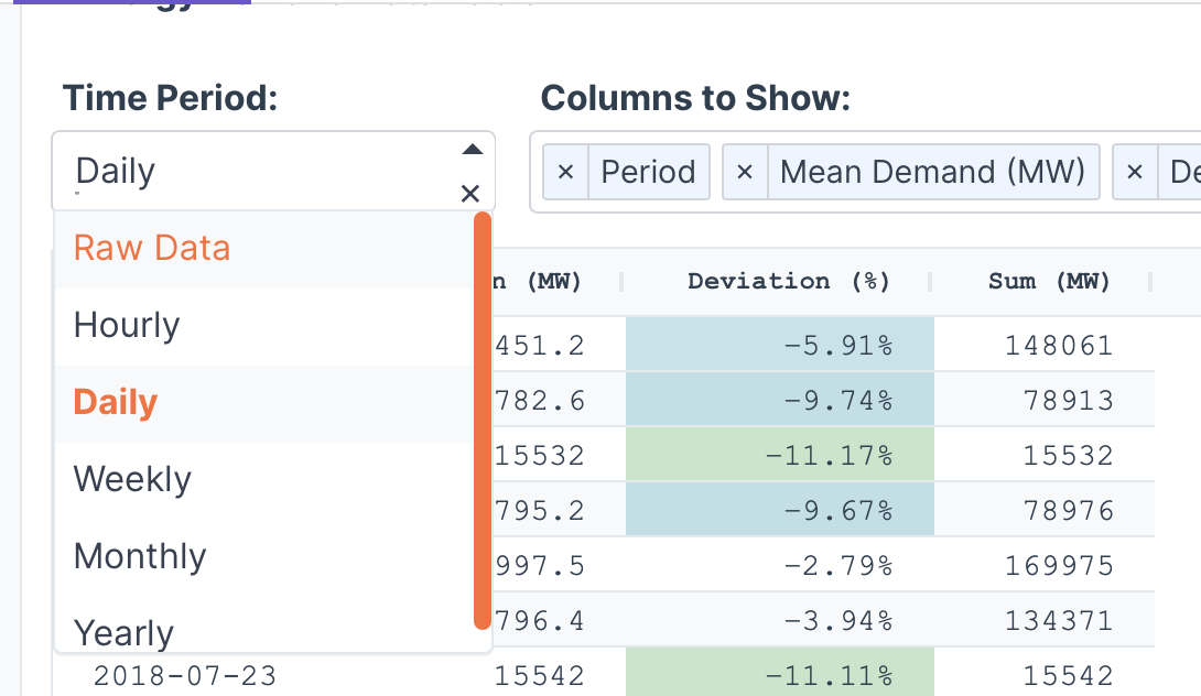
Energy demand data table with conditional formatting and compact display including deviation from average column with color-coded background highlighting. use ag grid in a compact layout with monospace fonts. Add option to hide/show columns for various aggregation types (min, max, mean, and some others. Show an option to show all of the raw data vs aggregated by hour, day, week, month, year.

- Subplots / Small Multiples
These can be a little finicky to get right but are also a nice way to do time period comparisons.
The prompt is fairly detailed to get the chart to render just right with strong data-to-ink ratio (h/t Tufte):
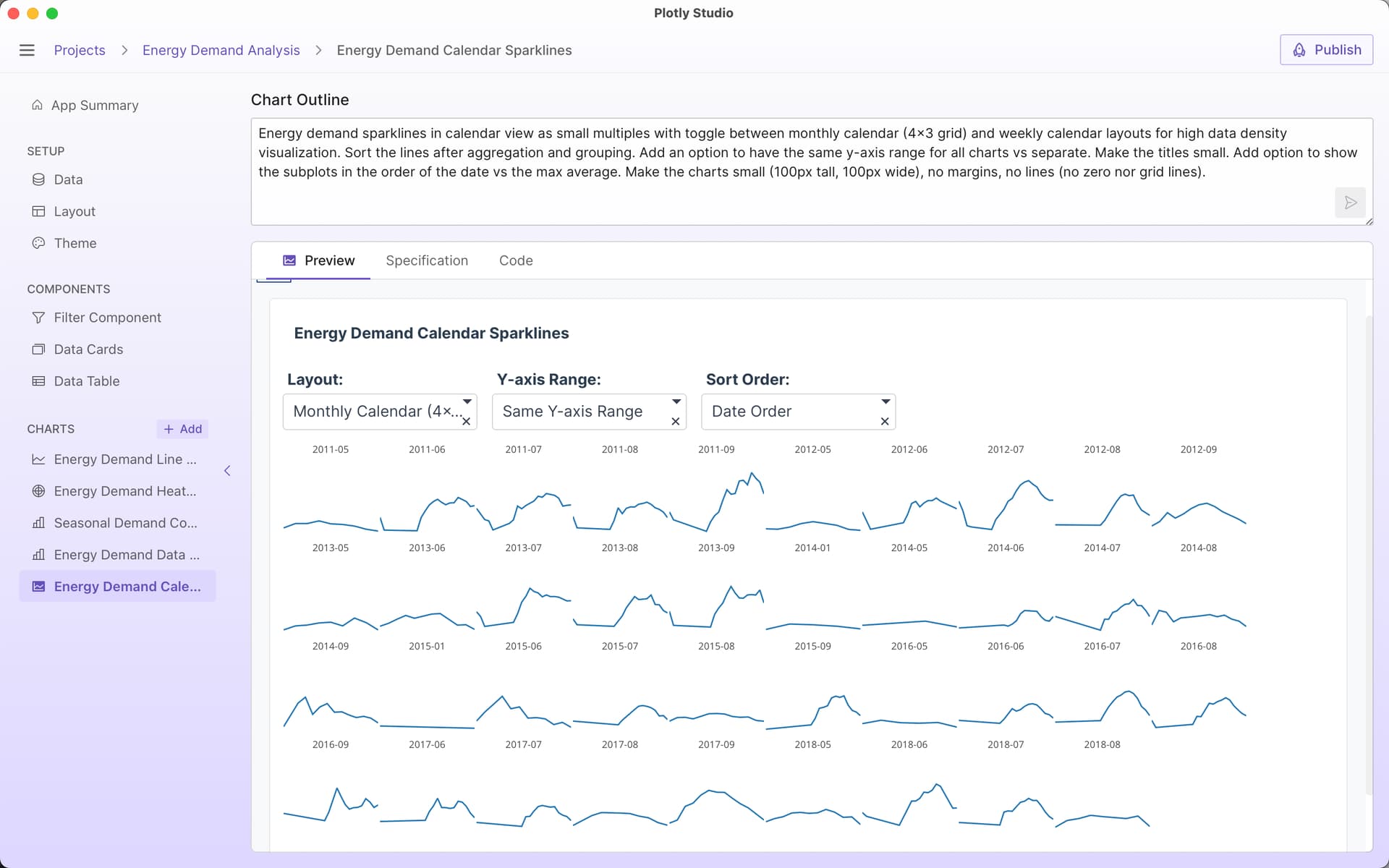
Energy demand sparklines in calendar view as small multiples with toggle between monthly calendar (4x3 grid) and weekly calendar layouts for high data density visualization. Sort the lines after aggregation and grouping. Add an option to have the same y-axis range for all charts vs separate. Make the titles small. Add option to show the subplots in the order of the date vs the max average. Make the charts small (100px tall, 100px wide), no margins, no lines (no zero nor grid lines).
I like to include options to switch between unified y-axis ranges vs independent y-axis ranges. There’s no right option here - it depends on what you are interested in looking at.
It’s amazing to be able to specify these different visualization options within the card itself. Here are a few different views.


What an informative post. Thank for sharing, @chriddyp .
I gotta use those subplots more often. Thanks for sharing the prompt to make them.
For those interested in creating similar graphs to what Chris showed, as a reminder you will need access to Plotly Cloud and Studio. Simply go to the Plotly Studio webpage and click the Apply For Early Access button to get started.
Simulations and Scenarios - Stock Buy/Sell Example App
Another area I’ve been using Plotly Studio for lately is creating computational calculators, simulators, and scenario apps.
So rather than just looking at historical data, Plotly Studio will generate code that will run computations and scenarios and visualize the results in graphs, tables, or text.
The scenarios can have their own controls and I’ve enjoyed specifying “prebuilt” scenarios that are selectable from a dropdown, too.
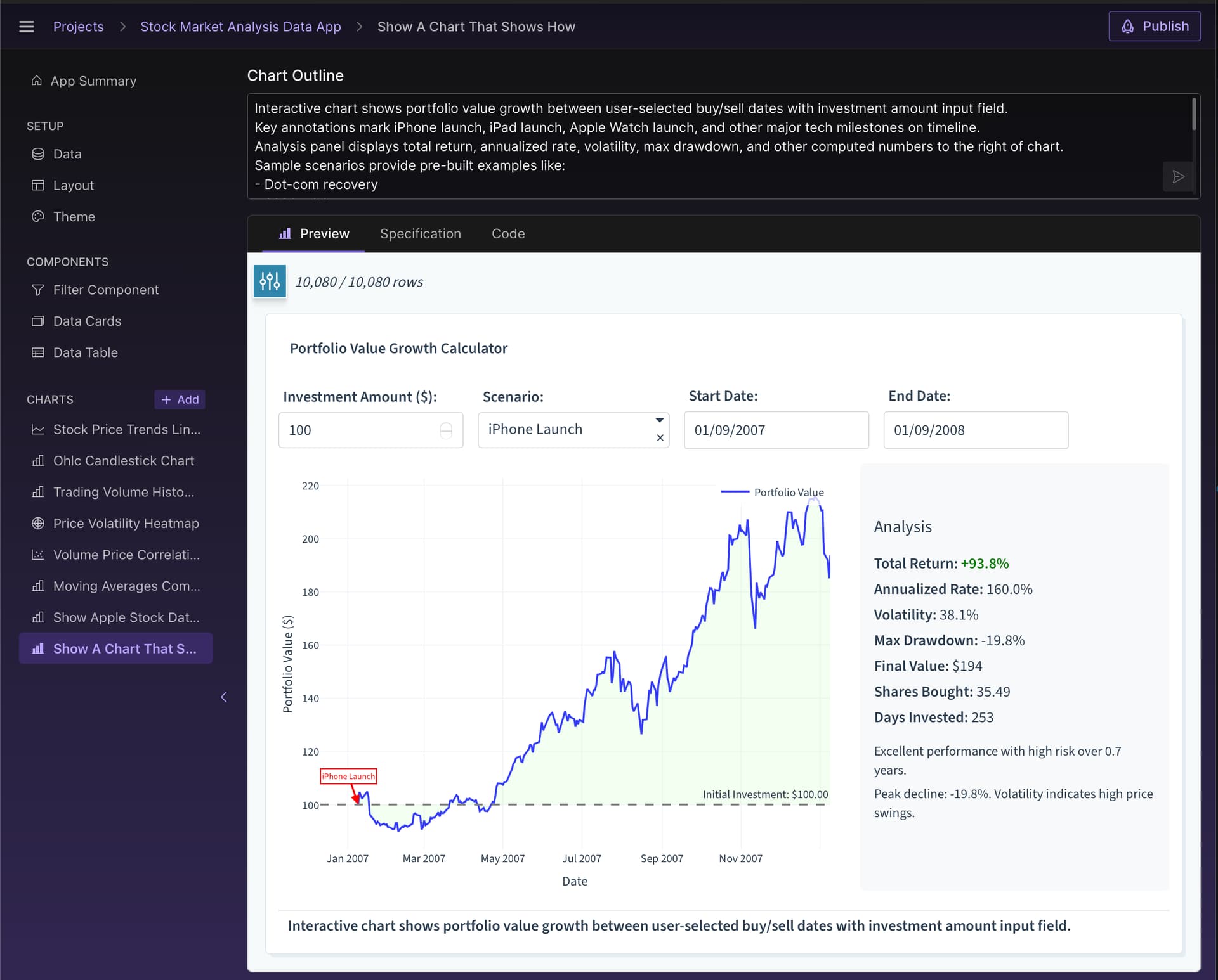
Simple example, “how much money would you make if you invested $100 in Apple when they launched the iPhone”"?
As I build out scenarios, I find myself writing more and more sophisticated ones. For this finance example, the scenarios ended up including a lot of quantitive examples too. Here is the full prompt:
Interactive chart to show portfolio value growth between buy/sell dates and investment amount input field.
Annotate key events like iPhone launch, iPad launch, Apple Watch launch, and other major tech milestones
Display analysis panel with total return, annualized rate, volatility, max drawdown, and other computed numbers to the right of chart.
Sample scenarios provide pre-built examples like:
- Dot-com recovery
- 2008 crisis
- iPhone launch (and all product launches, including v1 to v2 of products). Also:
- Product Launch Hype - Buy 3 months before iPhone/iPad announcement, sell on launch day peak
- Holiday Season Run - Buy in October, sell in January after holiday earnings boost
- 52-Week Low Recovery - Buy when stock hits new 52-week low, sell when it recovers to 20th percentile of yearly range
- Moving Average Bounce - Buy when price drops 15% below 200-day moving average, sell when it crosses back above
- Fibonacci Retracement - Buy at 61.8% retracement from recent high, sell when price recovers to 23.6% level

Then, instead of just looking at the scenarios one at a time, you can have the code run all of the scenarios at once and display the results!
In table below, run all of the scenarios and show a summary of the results:


One thing that’s amazing about this example is that all of the events are pulled out from the AI’s “world knowledge”. I didn’t need to specify or look up any of the actual launch dates of the products myself.
Dataset from Kaggle if you want to create it yourself: Apple (AAPL) Stock Dataset 1980-2025 | Kaggle
It’s amazing how much Plotly Studio can do with a good prompt. The level of sophistication of the apps is something that would have taken me days to build.
Chart Editor in Plotly Studio
Another really simple and powerful tool is to build a custom chart editor with the dimensions that you care about.
The prompt is really simple:
Make a chart editor where i can chose chart type, x, y, z, color by, size by, facet rows, facet columns, height.
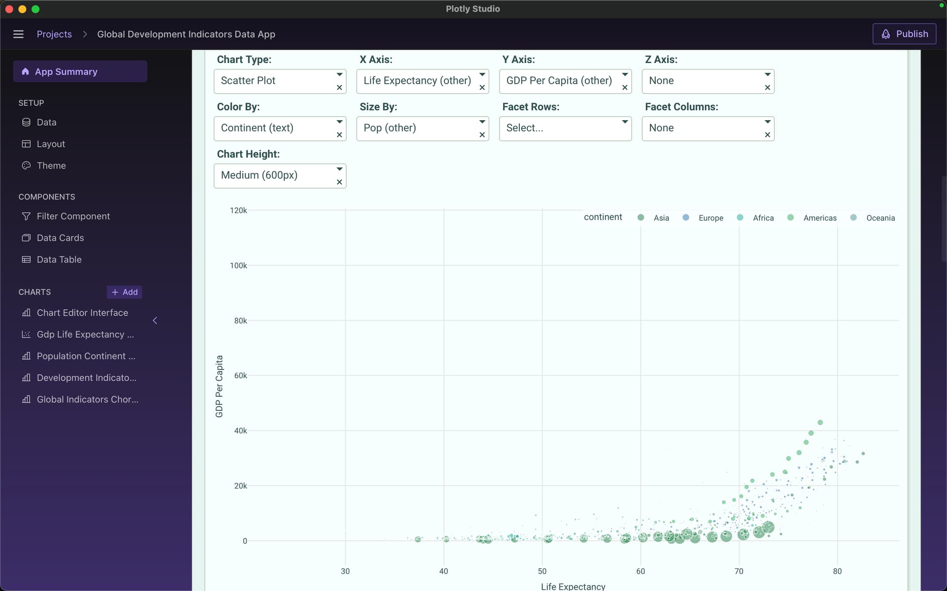
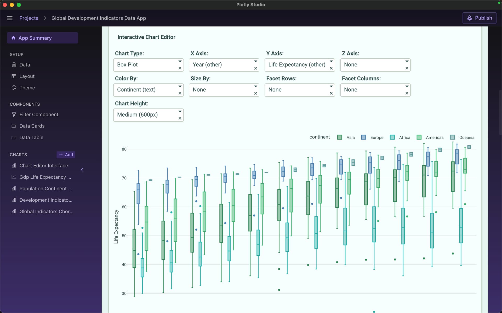
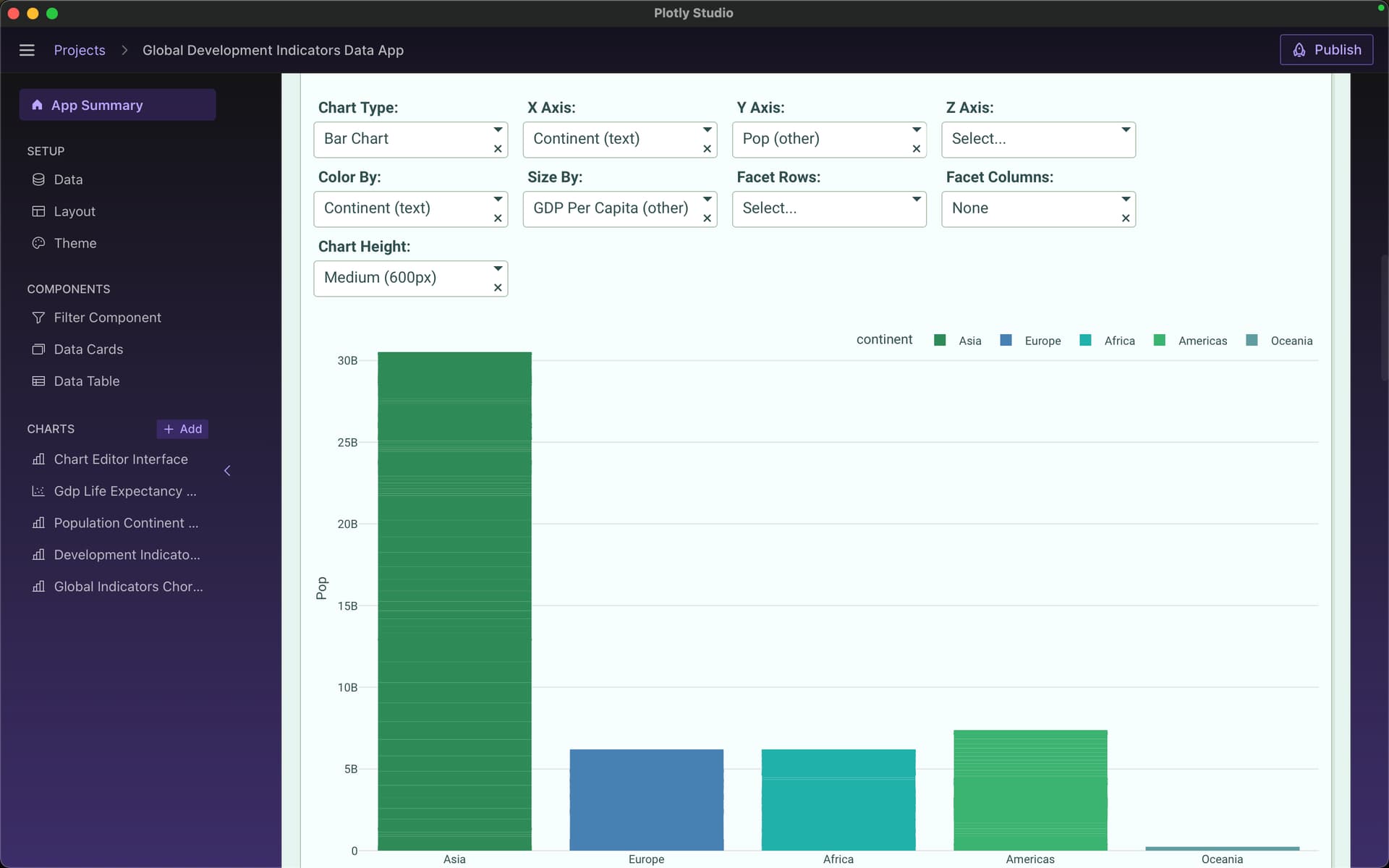
It’s great because you can easily add and remove certain controls that you or your users care about, like color scales or log axes or certain aggregations. Totally custom!
Sankey Flow Diagrams in Plotly Studio
Beautiful sankey diagram made with Plotly Studio:
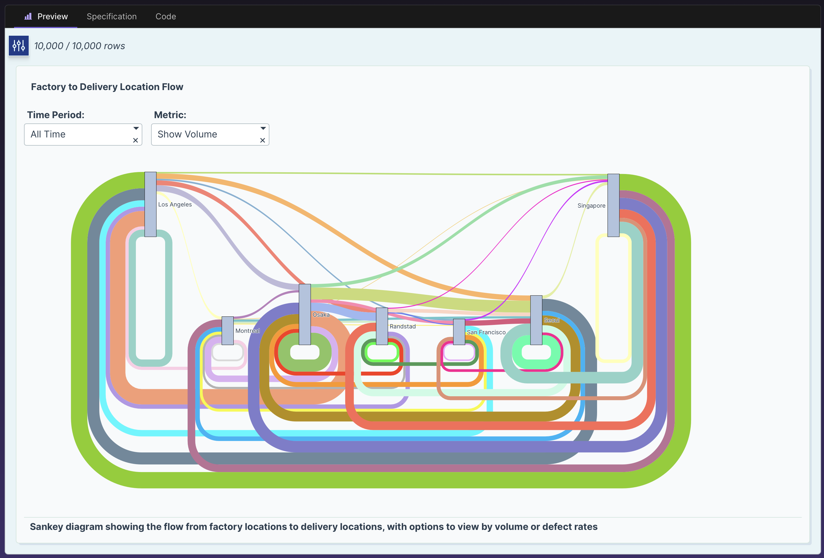
The colors represent the unique source+destination pairs which realllyyy helps distinguish the different routes throughout the diagram.
Without colors, it’s much harder to distinguish:

You can make it yourself and with this dataset: synthetic shipping data - 10k rows.csv · GitHub
(download the dataset by right clicking on “raw” and clicking “download linked file as”)

and this chart outline:
Factory to delivery location flow as a sankey diagram with dropdown to filter by time period and toggle to show volume vs defect rates, use different colors for different relationships.
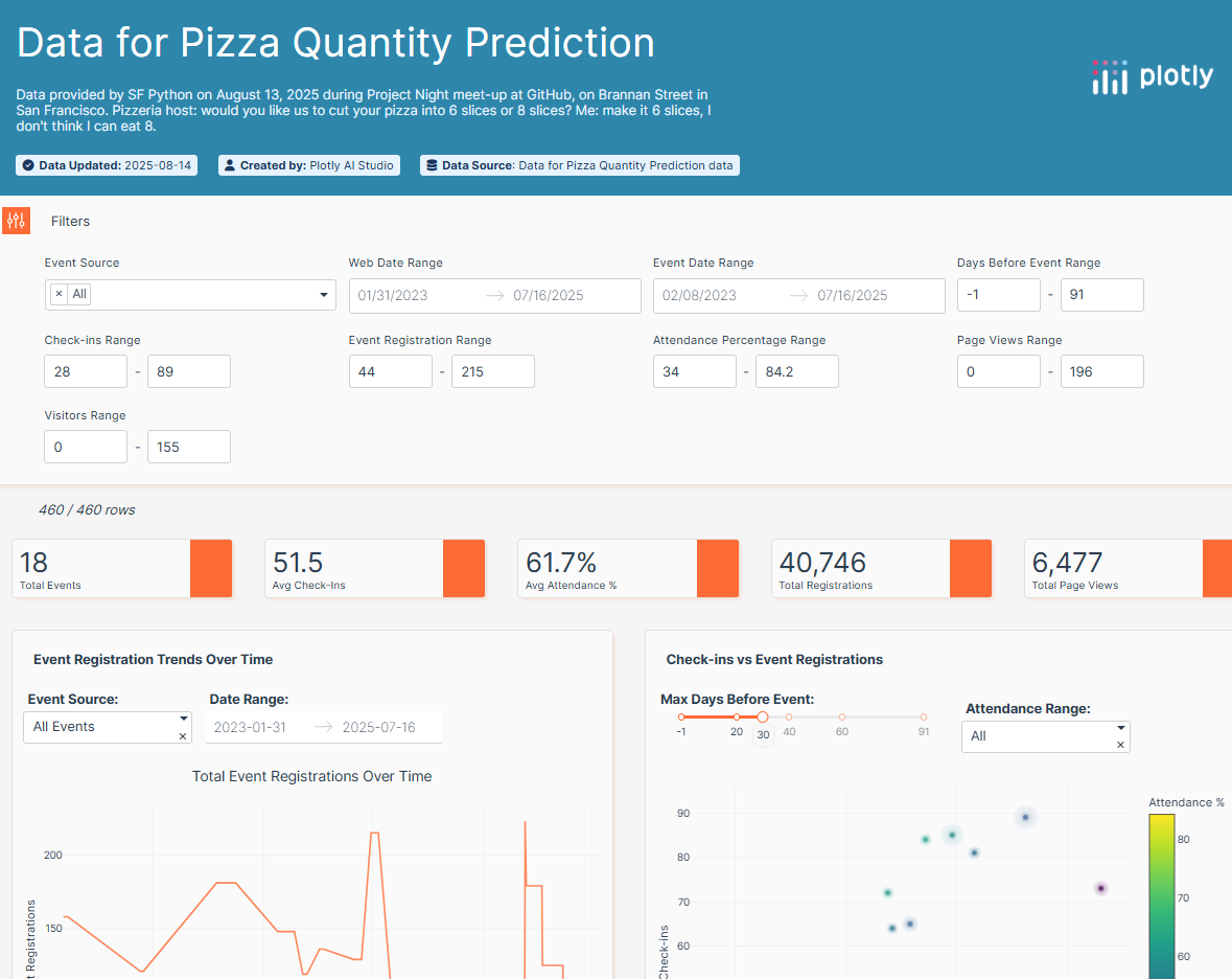
Last night I went to an SF Python Meetup at GitHub, near the San Francisco Giants Baseball Stadium. It was a lousy day for the Giants, but I had a great time just 2 blocks away at GitHub, where 40 or so attendees of Project Night split into groups and worked on fun projects. I cleaned 3 years of registration and attendance data, to help organizers predict future attendance, and help figure out how many pizzas to order. Here is a link and a screen shot
Cool app, @Mike_Purtell .
Did you clean the data before using Plotly Studio with Polars or did you let Plotly Studio deal with it?
Do you mind sharing a little more about Project Night? I think the Plotly IRL meetup in different cities in Europe and North America are similar, so I’m wondering if there is something you like in that meetup that we can learn from.
Hi @adamschroeder, I just did typical data cleaning tasks – vertical concatenation of 18 csv files, a join to a global table with data on how many people showed up at each event. I was impressed by the organization, where 3 project ideas were offered. Attendees grouped together based on selected project. I was not the only one using plotly; I saw others using plotly express. GitHub had a cool video board in the lobby showing real time git activity & pull requests from around the world. A similar idea for plotly would be to provide 3 fun data sets, and split people into groups to work on them. Ideas with local themes like NYC Taxis, Raleigh public works project, sports popular music or movies are all good. One thing about the SF event was we had to be out of the building by 8:30PM so there wasn’t any time left over for teams to share the results. Consequently, the socializing continued on the sidewalk in front of GitHub for at least 20 minutes, sign of a great social event.
@Mike_Purtell How many pizzas?
Plotly Studio makes great visualizations, but sometimes plotly open-source solutions saved as html files may be more convenient. So I re-created the beautiful Plotly Studio dashboard that @chriddyp submitted to this Show&Tell Thread with the Sankey diagram, extracted the python code and shaped it into a nice open-source solution I can share with anyone as an html file. Only other time that I made a Sankey diagram it took me 4 hours (Sankey is more complex than most other visualization types). This time it took me about 15 minutes to get it working and a few more minutes to customize. I changed to larger fonts for the city names and added a plot title. So open-source users can benefit by using Plotly Studio first and customizing the code it provides.
Here is a screen shot of my open-source Sankey, followed by 60 lines of source code, mostly written by Plotly Studio.
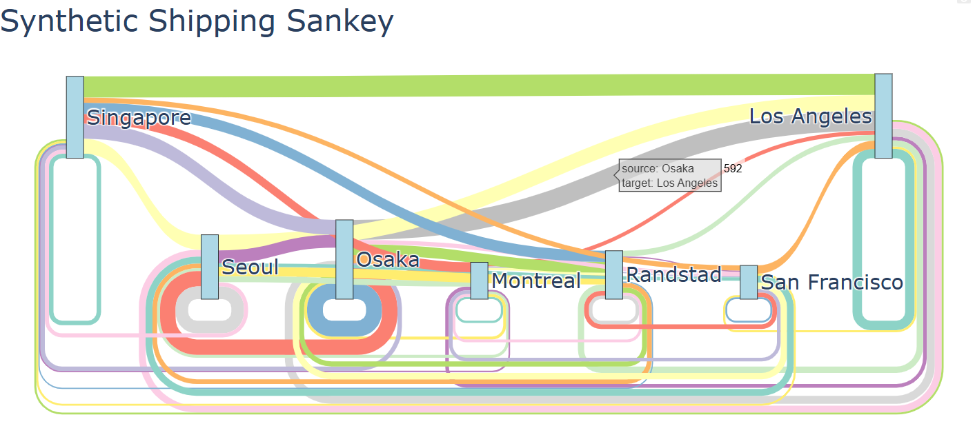
import plotly.graph_objects as go
import polars as pl
import plotly.colors as pc

df = pl.read_csv('synthetic shipping data - 10k rows.csv').to_pandas()

flow_data = df.groupby(
    ['factory_location', 'delivery_location']).size().reset_index(name='count')

# Get unique locations for nodes
all_locations = list(set(flow_data['factory_location'].unique().tolist() +
                            flow_data['delivery_location'].unique().tolist()))

# Create node indices
node_dict = {location: i for i, location in enumerate(all_locations)}

# Create source and target indices for the flows
source_indices = [node_dict[factory]
                    for factory in flow_data['factory_location']]
target_indices = [node_dict[delivery]
                    for delivery in flow_data['delivery_location']]
values = flow_data['count'].tolist()

# Create different colors for different relationships
# Generate colors based on source-target pairs

color_palette = pc.qualitative.Set3
link_colors = []

for i, (source, target) in enumerate(zip(source_indices, target_indices)):
    # Create a unique color for each source-target relationship
    color_index = (source * len(all_locations) +
                    target) % len(color_palette)
    link_colors.append(color_palette[color_index])

# Create the sankey diagram
fig = go.Figure(data=[go.Sankey(
    node=dict(
        pad=15,
        thickness=20,
        line=dict(color="black", width=0.5),
        label=all_locations,
        color="lightblue"
    ),
    link=dict(
        source=source_indices,
        target=target_indices,
        value=values,
        color=link_colors
    )
)])

fig.update_layout(
    title='Synthetic Shipping Sankey',
    font_size=24,
    height=600
)
fig.write_html('synthetic_shipping_sankey.html')
print('done')
Good question @DaveG. I think I answered every question except that one and I still don’t have an answer for it. Creating this dashboard was a case of the journey being more fun than the destination. ![]()
Visualizing Electric Grid Data
Was exploring some electric grid data this morning from https://www.eia.gov/electricity/gridmonitor/dashboard/electric_overview/balancing_authority/PACE
This is a pretty hefty 100MB dataset.
Some pretty cool charts:
Interchange data by week - so showing how the energy flows between two interconnects on the grid over time.


Sankey diagram showing flows between interconnects:
Sankey diagram of energy flow between interconnects.
Color bands and nodes.
Option to sort nodes energy flow amount.
Multi-select option to show just certain interconnects or ALL
Option to show all flows vs low flows vs medium flows vs large flows
Option to color by node or color by amount of flow (blue for positive, red for negative)

Drag and Drop is a Drag: A bit off topic but want report that when I got home after a busy Monday and started poking around on YouTube, I stumbled across a really great Plotly Studio promo that already had 40K views in 40 minutes. It was so well done that I didn’t even realize it was an ad. Congrats on what feels like a first (at least to me), and really nicely done. Hope this keeps everyone at Plotly very busy in all of the best ways to be busy. I look forward to seeing many of you in San Francisco in the coming weeks.
Thank you, Mike. We’re looking forward to seeing you in San Francisco.