This is one of my favorite tricks in Plotly Studio when analyzing time series data to understand how world events and important dates correlate with your business data. The old way of doing this would require you to look up all of the relevant event dates, create a list manually in your code, and then draw ticks and labels for each event. But LLMs know these dates innately, so you can just ask for them to be overlaid on any time series chart.
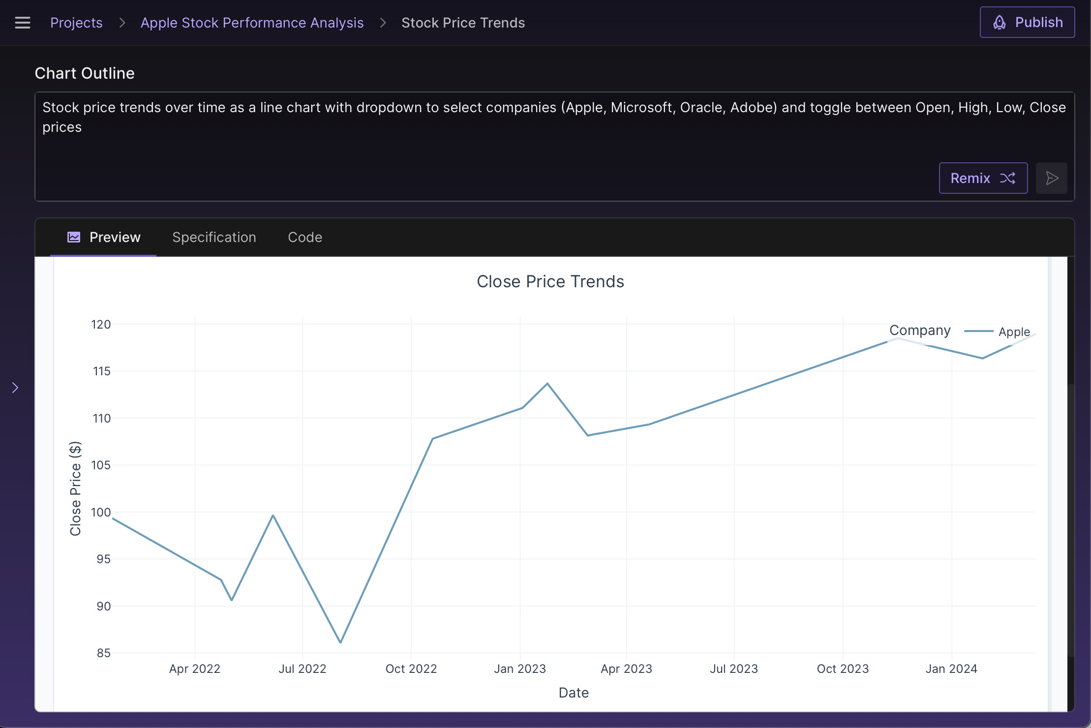
Say you were looking at stock data and trying to understand the impact of product releases on Apple’s stock performance over time. You might have a simple line chart like this:
Now all you have to ask for vertical rules to be overlaid on this chart to signify important product releases. The LLM behind the scenes knows these dates and easily adds the marks and labels.
Stock price trends over time as a line chart with dropdown to select companies (Apple, Microsoft, Oracle, Adobe) and toggle between Open, High, Low, Close prices. Overlay vertical rules for all major product release dates for Apple for comparison, use a numeric timestamp format for the dates, not date strings. The labels should be horizontal and staggered vertically so they don't overlap.
Now you’ll get a chart that looks like this:
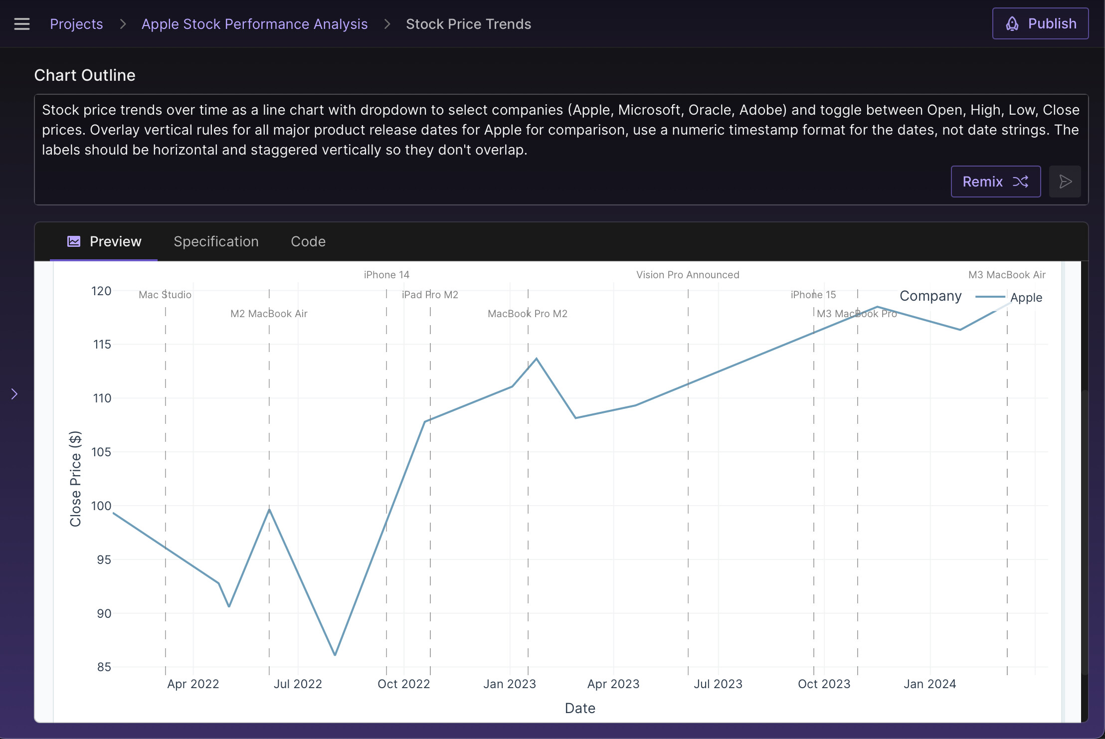
Of course, this doesn’t tell the whole story, but it’s very useful to see business milestones as context for the time series. The best part is that you didn’t have to spend any extra time looking these up for yourself!