Hi everyone! Curious to hear what types of prompts folks are using to style their tables.
Here are a few tips I have so far:
Table Technologies - Ag Grid vs HTML
Specify the table technology: There are 4 different table technologies: Ag Grid, HTML, Plotly Tables, and Dash Table. Requesting Ag Grid is a safe bet for interactivity (sorting, filtering) but HTML might get you further for things like conditional formatting.
Table Styles
Specify “Compact - Very short rows”. I use this spec every time I create a table now as I like more compact tables in general. For example:
-
Conditional formatting requests with Ag Grid don’t always reliably work right now! For example, above I wrote “no striped rows” and it still made the striped rows
-
“No title” - Whenever I display a table below a chart (which I do fairly often now and combine with cross filtering: ✨ Cross-filtering in Plotly Studio - #2 by chriddyp ), Plotly Studio will often display a title above the chart. So most of my specs will explicitly say “No title for the table."
Richly formatted HTML tables
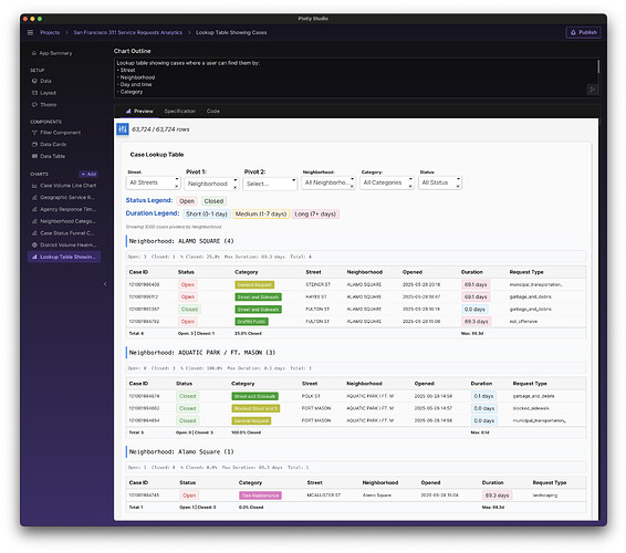
Beautiful, richly formatted tables can be made by specifying “HTML table”. For example, look at this beauty! The spec I used was:
Table style: render as a compact HTML table with conditional formatting for open/closed (soft green/red), total case time open (a color bar with an html legend), and different colors for categories (also an HTML legend)
“Table Legends” - Tables themselves don’t have native legends like Plotly charts do. So whenever I display a table, I explicitly ask for an “HTML Legend” that gets implemented as HTML (see above).
Pivot Tables
Pivot tables can be created by simply asking for things like “sub tables” that appear when you select a particular dropdown:
Include an option to pivot the table by a particular dropdown and display sub tables when you do that.
You can also pivot on multiple dimensions:
Allow for pivoting on multiple dimensions
Pivot Table Summary Stats
I also like to include summary statistics in the bottom of each row by specifying e.g.:
Show the summary stats in a nice footer row of the table for each column showing e.g. number open/closed cases, max duration, percent closed, and total cases.
It is SO NICE to be able to control exactly what summary stats and aggregations I want to see.


