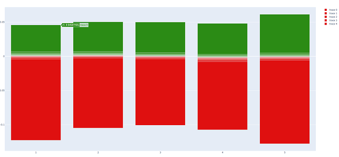
Cannnot create desired bar chart?

Hello Dashers, I need to make a bar graph as described below and can’t find a way to do this based on the options shown on Bar charts in Python

What I need would appear most like the Relative Barmode example with my bars beginning below zero to a point above zero.

However the manner of the first bar defined getting placed from zero to that point and additional bars stacked on top of that is kind of funky.

What I need is a bar of ten colored segments as could be defined by an eleven value list. The first color 0 to 1, second 1 to 2 and so on to 11. At one point, one value will move through zero and none of this should have any relation to zero as most of the Bar charts do.

My numbers are percentages, so the perfect example of three bars I would need to graph besides each other are:

[i/1000 for i in range(-10,11,2)] 
[i/1000+0.003 for i in range(-10,11,2)]  
[i/1000-0.003 for i in range(-10,11,2)]
or 
[-0.01, -0.008, -0.006, -0.004, -0.002, 0.0, 0.002, 0.004, 0.006, 0.008, 0.01]
[-0.007, -0.005, -0.003, -0.001, 0.001, 0.003, 0.005, 0.007, 0.009, 0.011, 0.013]
[-0.013, -0.011, -0.009, -0.007, -0.005, -0.003, -0.001, 0.001, 0.003, 0.005, 0.007]

If there were any other way to define the data, that would be fine. I am really hoping there is a way Dash can make this type of graph.

Hello @marketemp,

To get a bar chart that is side by side with the groups, you need to pass barmode='group' in the figure.

1 Like

I don’t want grouped. I want stacked. But I want ten levels stacked from -# through 0 to #. All the stack options on the demo page start the stacked bars from zero besides barmode='relative' which doesn’t compute in the manner I desire. All of my rows will look like a floating spectrum with 10 consistently colored sections.

1 Like

Here is a funky way:

It takes some configuring, assuming you are trying to capture the move to the next stage with your range motion:

import pandas as pd
import plotly.graph_objs as go
import plotly.express as px

df = pd.DataFrame({'x':[i for i in range(11)],
    'a': [-0.01, -0.008, -0.006, -0.004, -0.002, 0.0, 0.002, 0.004, 0.006, 0.008, 0.01],
    'b': [-0.007, -0.005, -0.003, -0.001, 0.001, 0.003, 0.005, 0.007, 0.009, 0.011, 0.013],
    'c': [-0.013, -0.011, -0.009, -0.007, -0.005, -0.003, -0.001, 0.001, 0.003, 0.005, 0.007]})

df2 = df.copy()

df2 = df2.set_index('x').shift(periods=-1).reset_index()[0:-1]

df = pd.concat([df2, df])

df_mod = df.groupby(['x']).diff().dropna()

df_mod['a_low'] = df.groupby(['x']).min()['a']
df_mod['b_low'] = df.groupby(['x']).min()['b']
df_mod['c_low'] = df.groupby(['x']).min()['c']

df_mod['x'] = df_mod.index


fig = go.Figure()
fig.add_trace(go.Bar(x=df['x'], y=df['a'], base=df_mod['a_low']))
fig.add_trace(go.Bar(x=df['x'], y=df['b'], base=df_mod['b_low']))
fig.add_trace(go.Bar(x=df['x'], y=df['c'], base=df_mod['c_low']))

fig.update_layout(barmode='overlay')

fig.show()

Here is another way:


df = pd.DataFrame({'x':[i for i in range(11)],
    'a': [-0.01, -0.008, -0.006, -0.004, -0.002, 0.0, 0.002, 0.004, 0.006, 0.008, 0.01],
    'b': [-0.007, -0.005, -0.003, -0.001, 0.001, 0.003, 0.005, 0.007, 0.009, 0.011, 0.013],
    'c': [-0.013, -0.011, -0.009, -0.007, -0.005, -0.003, -0.001, 0.001, 0.003, 0.005, 0.007]})


fig = go.Figure()

## greater
fig.add_trace(go.Bar(x=df[df['b'] > 0]['x'], y=df[df['b'] > 0]['b']))
fig.add_trace(go.Bar(x=df[df['a'] > 0]['x'], y=df[df['a'] > 0]['a']))
fig.add_trace(go.Bar(x=df[df['c'] > 0]['x'], y=df[df['c'] > 0]['c']))

## lesser
fig.add_trace(go.Bar(x=df[df['c'] <= 0]['x'], y=df[df['c'] <= 0]['c']))
fig.add_trace(go.Bar(x=df[df['a'] <= 0]['x'], y=df[df['a'] <= 0]['a']))
fig.add_trace(go.Bar(x=df[df['b'] <= 0]['x'], y=df[df['b'] <= 0]['b']))


fig.update_layout(barmode='overlay')

fig.show()

I feel stupid :rofl: I still can’t figure out, what you’re trying to achieve @marketemp. Once more it is confirmed, that I am a visual learner.

What I am looking for is most like the first red-blue-green example. A number of floating bars which could be entirely above 0, entirely below 0, but most of the time from negative into positive. All being above or below zero seems to be the drawback of solution #2. Each bar will have 10 colored sections with no gap, hence the ability to define it with a list of eleven floats.

@jinnyzor can you update the upper block with the code that made the upper image? When I run that upper block, I get something different and uglier.

I will get my real data, explore with these, and let you know what I find. I think using a number of figures will be a speed impediment because this graph could have between 13 and 130 columns, and possibly more.

If it weren’t for the all above or below zero case, manipulating the data to actually work with the Relative Barmode graph. I also think the getting the coloring of whatever section goes through zero might be hard

@marketemp,

I had to add dup the data and then shift it, because I was thinking that you wanted to represent the range of movement, not just the point. Is that correct?

here’s a step in the right direction doing ten go.Bar calls which isn’t too time consuming:

data = [[-0.12258064516129029,
         -0.004118444374934793,
         -0.0019027849852966516,
         -0.0005512679162073629,
         0.0,
         0.000688705234159765,
         0.0015693659761456594,
         0.002682763246143497,
         0.004020677771395803,
         0.006778868630201008,
         0.04581165187225787],
        [-0.10469770381293453,
         -0.0025438596491228617,
         -0.0006713662302786027,
         -2.3809523808886775e-06,
         0.0006414368184733667,
         0.0013561829614104233,
         0.002134646962233211,
         0.003375843960990242,
         0.0048455481526346635,
         0.007221182134260391,
         0.0503304524656837],
        [-0.10066399574146195,
         -0.0038356842365749578,
         -0.0020833333333334122,
         -0.000994530084535036,
         -0.00010378288620211837,
         0.0001390240511608355,
         0.00099814629972918,
         0.0018181818181817794,
         0.0029944838455476957,
         0.0054733118873015844,
         0.049994048327580094],
        [-0.1072961373390558,
         -0.007906041495293017,
         -0.005279164514833396,
         -0.003605459696111269,
         -0.0024149034038638347,
         -0.001434720229555291,
         -0.0004974762182100464,
         0.00018744142455478932,
         0.0014705882352940864,
         0.0031733543141882494,
         0.0480364656381487],
        [-0.12765957446808504,
         -0.005706521739130266,
         -0.0035444234404536524,
         -0.002334630350194503,
         -0.0013410818059902162,
         -0.0004737091425863577,
         4.282105082848753e-05,
         0.0012012012012013891,
         0.002486572508454346,
         0.004981320049813272,
         0.06135190298955461]]

level = []
for n in range(len(data[0])):
    level.append([max(min(data[i][n], 0.02), -0.02) for i in range(len(data))])
x = list(range(1, len(data)+1))

fig = go.Figure()

for i in range(len(level)-1):
    fig.add_trace(go.Bar(x=x, y=level[i], base=level[i+1]))
    # fig.add_trace(go.Bar(x=x, y=level[i+1], base=level[i]))

fig.update_layout(barmode='overlay', yaxis={'tickformat': '.1%'})
fig.show()

So this graph works below zero but above zero is off and if you comment the upper go.Bar call and uncomment the lower one, it reverses that the top half looks right and the bottom has gaps. The question is how do you get the bar correctly drawn between any two points without relation to zero?

Nothing at plotly.graph_objects.Bar — 5.11.0 documentation jumps out at me although it is a challenging read.

Change it to this:

for i in range(len(level)-1):
    if level[i] < level[i-1]:
        fig.add_trace(go.Bar(x=x, y=level[i], base=level[i-1]))
    else:
        fig.add_trace(go.Bar(x=x, y=level[i], base=level[i+1]))

This is what I end up with:

But… I dont think that is right…

Can you explain the relationship between the points? Why is it a series of lists instead of columns? Is the next point supposed to go up, or is it just random?

No, you can’t conditionalize it because the above zero and below zero points are going to be different for each column. They fluctuate randomly.

This is a picture of stock market returns. The S&P 500 goes up and down every minute and is one point. These are ten measurements of gains for ten percent of the market (0-10, 10-20…90-100). The midpoint between bar 5 and bar 6 would be a middle of the market indicator similar to a market index. I can draw this easily using nine lines (ignores top and bottom which we also have to cap in this display), but want to do something more advanced showing the bars.

I was thinking creating two arrays, plevel (postive) with negatives = None and nlevel (negative) with positives = None. That would make 20 bars but we can hard set the colors using marker.color.

Ok, that makes a lot more sense.

Is level 0 always going to be smaller than level 1?

1 Like

yes, all levels are always in ascending order. That’s why we can define ten ranges with eleven values. The ten bars are value [0-1, 1-2, 2-3, 3-4, 4-5, 5-6, 6-7, 7-8, 8-9, 9-10].

import pandas as pd
import plotly.graph_objs as go
import plotly.express as px

data = [[-0.12258064516129029,
         -0.004118444374934793,
         -0.0019027849852966516,
         -0.0005512679162073629,
         0.0,
         0.000688705234159765,
         0.0015693659761456594,
         0.002682763246143497,
         0.004020677771395803,
         0.006778868630201008,
         0.04581165187225787],
        [-0.10469770381293453,
         -0.0025438596491228617,
         -0.0006713662302786027,
         -2.3809523808886775e-06,
         0.0006414368184733667,
         0.0013561829614104233,
         0.002134646962233211,
         0.003375843960990242,
         0.0048455481526346635,
         0.007221182134260391,
         0.0503304524656837],
        [-0.10066399574146195,
         -0.0038356842365749578,
         -0.0020833333333334122,
         -0.000994530084535036,
         -0.00010378288620211837,
         0.0001390240511608355,
         0.00099814629972918,
         0.0018181818181817794,
         0.0029944838455476957,
         0.0054733118873015844,
         0.049994048327580094],
        [-0.1072961373390558,
         -0.007906041495293017,
         -0.005279164514833396,
         -0.003605459696111269,
         -0.0024149034038638347,
         -0.001434720229555291,
         -0.0004974762182100464,
         0.00018744142455478932,
         0.0014705882352940864,
         0.0031733543141882494,
         0.0480364656381487],
        [-0.12765957446808504,
         -0.005706521739130266,
         -0.0035444234404536524,
         -0.002334630350194503,
         -0.0013410818059902162,
         -0.0004737091425863577,
         4.282105082848753e-05,
         0.0012012012012013891,
         0.002486572508454346,
         0.004981320049813272,
         0.06135190298955461]]

colors = ['#df1010', '#e43232', '#e85454', '#ed7777', '#f29898',
          '#afd6a7', '#8fc383', '#6db05e', '#4d9e3a', '#2b8b15']

# create data for positive and negative level bers
plevel, nlevel, limit = [], [], 0.02
for d in range(len(data[0])):
    plevel.append([max(min(data[i][d], limit), 0.0) for i in range(len(data))])
    nlevel.append([min(max(data[i][d], -limit), 0.0) for i in range(len(data))])

x = list(range(1, len(data)+1))

print(plevel)
print(nlevel)

fig = go.Figure()

# plot the positive and negative bars with correct y and base settings
for i in range(len(plevel)-1):
    fig.add_trace(go.Bar(x=x, y=nlevel[i], base=nlevel[i+1]))
    fig.add_trace(go.Bar(x=x, y=plevel[i+1], base=plevel[i]))

# hard-set the coloring for all 20 bars to 0-9,0-9
for c in range(len(colors)):
    fig.data[c].marker.color = [colors[c] for _ in range(len(nlevel))]
    fig.data[c+len(colors)].marker.color = [colors[c] for _ in range(len(nlevel))]

fig.update_layout(barmode='overlay', yaxis={'tickformat': '.1%'})
fig.show()

here is how it looks. The gaps are gone but there’s still some funky play in the middle that probably has to do with the middle transition. All ten bars should be colored from the deepest red at the bottom to the deepest green at the top.

I am wondering why the upper and lower limits of each bar are not hard set to 0.02 and -0.02 as the data is clearly set to, and the output of those prints is:

[[0.0, 0.0, 0.0, 0.0, 0.0], ..., [0.02, 0.02, 0.02, 0.02, 0.02]]
[[-0.02, -0.02, -0.02, -0.02, -0.02], ..., [0.0, 0.0, 0.0, 0.0, 0.0]]

Is these values are fluctuating, how do I know if any others are correct and suspect they also might not be? Tinker with that limit var setting and please explain why the limits are always random floats close to but not equal to that value? Mysterious…

I think we are hacking out a crazy way to make this work under the circumstances, but you now can clearly see the requirement of:

There must be a way to consistently graph a bar from level X to level Y whether both values are below zero, both values are above zero, or one value is above zero and the other value is below zero.

What is also trippy is if you comment out one or the other fig.add_trace(go.Bar call and the second color definition line, it seems to draw the top or bottom half of the chart perfectly. But when you put the two together, you get that funky play in the middle?

import plotly.graph_objs as go
import plotly.express as px
import math

data = [[-0.12258064516129029,
         -0.004118444374934793,
         -0.0019027849852966516,
         -0.0005512679162073629,
         0.0,
         0.000688705234159765,
         0.0015693659761456594,
         0.002682763246143497,
         0.004020677771395803,
         0.006778868630201008,
         0.04581165187225787],
        [-0.10469770381293453,
         -0.0025438596491228617,
         -0.0006713662302786027,
         -2.3809523808886775e-06,
         0.0006414368184733667,
         0.0013561829614104233,
         0.002134646962233211,
         0.003375843960990242,
         0.0048455481526346635,
         0.007221182134260391,
         0.0503304524656837],
        [-0.10066399574146195,
         -0.0038356842365749578,
         -0.0020833333333334122,
         -0.000994530084535036,
         -0.00010378288620211837,
         0.0001390240511608355,
         0.00099814629972918,
         0.0018181818181817794,
         0.0029944838455476957,
         0.0054733118873015844,
         0.049994048327580094],
        [-0.1072961373390558,
         -0.007906041495293017,
         -0.005279164514833396,
         -0.003605459696111269,
         -0.0024149034038638347,
         -0.001434720229555291,
         -0.0004974762182100464,
         0.00018744142455478932,
         0.0014705882352940864,
         0.0031733543141882494,
         0.0480364656381487],
        [-0.12765957446808504,
         -0.005706521739130266,
         -0.0035444234404536524,
         -0.002334630350194503,
         -0.0013410818059902162,
         -0.0004737091425863577,
         4.282105082848753e-05,
         0.0012012012012013891,
         0.002486572508454346,
         0.004981320049813272,
         0.06135190298955461]]

x = list(range(1, len(data)+1))

fig = go.Figure()

newData = []

for i in range(len(data)):
    newData.append([max(data[i][y+1],-0.02)-min(data[i][y],0.02) for y in range(len(data[i])-1)])

colors = ['#df1010', '#e43232', '#e85454', '#ed7777', '#f29898',
          '#afd6a7', '#8fc383', '#6db05e', '#4d9e3a', '#2b8b15']


fig = go.Figure()

for i in range(len(data)):
    fig.add_trace(go.Bar(x=[x[i]]*len(newData[0]), y=newData[i], base=data[i][:-1],
                         marker_color=colors))

fig.update_layout(barmode='overlay')
fig.show()

I’d recommend applying the restrictions to the base data.

@marketemp, here is the updated version that takes in account your restrictions to 2%:

import plotly.graph_objs as go

data = [[-0.12258064516129029,
         -0.004118444374934793,
         -0.0019027849852966516,
         -0.0005512679162073629,
         0.0,
         0.000688705234159765,
         0.0015693659761456594,
         0.002682763246143497,
         0.004020677771395803,
         0.006778868630201008,
         0.04581165187225787],
        [-0.10469770381293453,
         -0.0025438596491228617,
         -0.0006713662302786027,
         -2.3809523808886775e-06,
         0.0006414368184733667,
         0.0013561829614104233,
         0.002134646962233211,
         0.003375843960990242,
         0.0048455481526346635,
         0.007221182134260391,
         0.0503304524656837],
        [-0.10066399574146195,
         -0.0038356842365749578,
         -0.0020833333333334122,
         -0.000994530084535036,
         -0.00010378288620211837,
         0.0001390240511608355,
         0.00099814629972918,
         0.0018181818181817794,
         0.0029944838455476957,
         0.0054733118873015844,
         0.049994048327580094],
        [-0.1072961373390558,
         -0.007906041495293017,
         -0.005279164514833396,
         -0.003605459696111269,
         -0.0024149034038638347,
         -0.001434720229555291,
         -0.0004974762182100464,
         0.00018744142455478932,
         0.0014705882352940864,
         0.0031733543141882494,
         0.0480364656381487],
        [-0.12765957446808504,
         -0.005706521739130266,
         -0.0035444234404536524,
         -0.002334630350194503,
         -0.0013410818059902162,
         -0.0004737091425863577,
         4.282105082848753e-05,
         0.0012012012012013891,
         0.002486572508454346,
         0.004981320049813272,
         0.06135190298955461]]

adjData = []
for n in range(len(data)):
    adjData.append([max(min(data[n][i], 0.02), -0.02) for i in range(len(data[0]))])

x = list(range(1, len(adjData)+1))

fig = go.Figure()

newData = []

for i in range(len(adjData)):
    newData.append([adjData[i][y+1]-adjData[i][y] for y in range(len(adjData[i])-1)])

colors = ['#df1010', '#e43232', '#e85454', '#ed7777', '#f29898',
          '#afd6a7', '#8fc383', '#6db05e', '#4d9e3a', '#2b8b15']


fig = go.Figure()

for i in range(len(data)):
    fig.add_trace(go.Bar(x=[x[i]]*len(newData[0]), y=newData[i], base=adjData[i][:-1],
                         marker_color=colors))

fig.update_layout(barmode='overlay', yaxis={'tickformat': '.1%'})
fig.show()
2 Likes

Nailed it again, thanks!!!

I simply capped the limits on data using

limit = 0.02
for d in range(len(data)):
    data[d][0], data[d][-1] = -limit, limit

substituted the 0.02 values below for limit, -limit and renamed newData to diff which is what it seems to be. I’ll show you how this really is supposed to look when it’s plugged in soon!

2 Likes

@jinnyzor @AIMPED Alright here is the final product. Let’s start with the line graph, this tells us how the market is doing for all the stocks at not only a midpoint, but at percentile rankings of 10 to 90:

Each point on this line is calculated from the prior closing price to the time indicated on the X-axis. So here is how we use the bar chart do display how each 10 percent of the market has moved over 15 minute increments. In this one, we show 20 bars, 9:30-9:45, 9:45-10:00 and so on:

And here is a fancier one showing them minute by minute 9:30-9:45, 9:31-9:46, 9:32-9:47 and so on:

I can create these graphs for 1, 2, 3, 5, 10, 15, 30, and 60 minute periods and are the starting point to put a lot on top of that. The bar data is calculated using about 8000 common stocks, but can also be modified for stocks within a certain segment such as Market Cap level and GICS Market Sector. And my “cap” is the top and bottom bars are 5-10% and 90-95% otherwise those bars would stretch too far.

Thanks for your help. I thought this would be easier to knock out on my own and I hope you can now see the purpose and value.

2 Likes

I like number 3. It does look really nice.

Have you messed around with any of the plotly templates for the background and style?

1 Like

no, please point me to what you’re referencing I assume as far as charting goes. I do set the coloring to match the theme and you know how much time I’ve spent (or you’ve spent :face_with_diagonal_mouth:) on getting things right via bootstrap themes and ThemeSwitchAIO.

Sure, here you go:

These are specific to the charts.