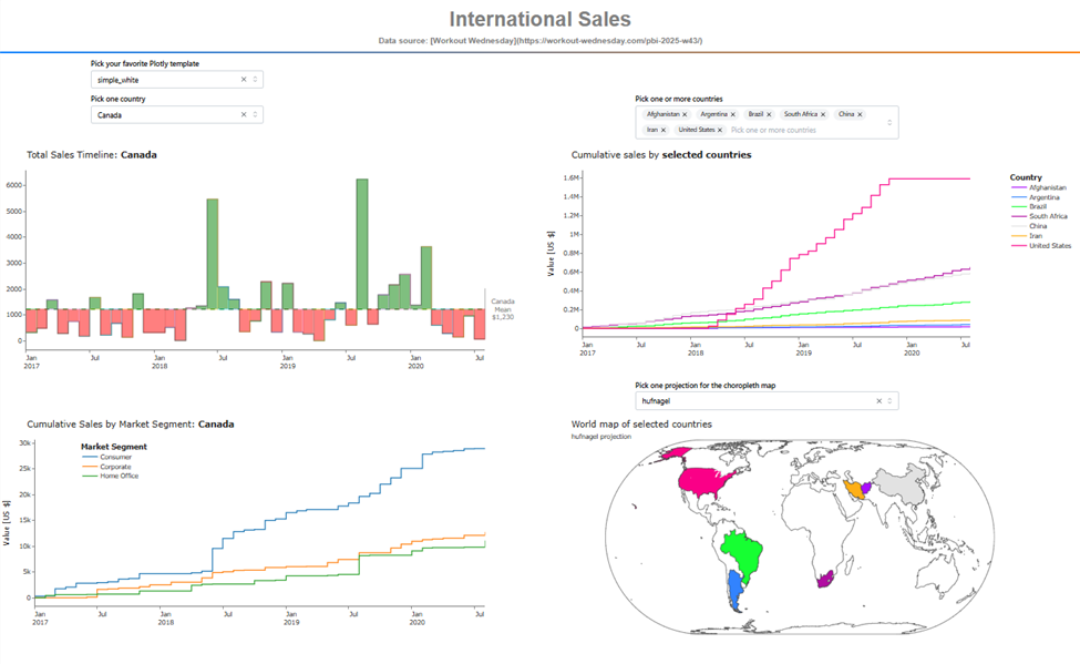
This dashboard provides three timeline plots for exploring monthly aggregated sales by country, using a Polars dynamic_group_by operation.
On the left, the visualizations focus on a single country, selected via the dmc.Select tool.
- The top-left plot shows total monthly sales for the chosen country. It includes a neat visual effect: green shading for values above the mean and red shading for values below it.
- The bottom-left plot displays cumulative sales for that country, broken out by the three market segments in the dataset.
On the right, the visualizations support multiple countries, selected with the dmc.MultiSelect tool.
- The top-right plot shows cumulative sales for each selected country.
- The bottom-right visualization is a choropleth map highlighting their locations.
You can change the map projection using the dropdown above the map—there are more than 80 projection styles available in the Plotly library.
Have fun exploring!
Here is the link to the app on Plotly Cloud:
Here is the code:
import pycountry  # to get ISO-3 codes for each country in the dataset
import polars as pl
import plotly.express as px
import plotly.graph_objects as go
import dash
from dash import Dash, dcc, html, Input, Output
import dash_mantine_components as dmc
dash._dash_renderer._set_react_version('18.2.0')

'''
Top-left (TL): pick one country, timeline showing total sales of selected country
          include horizontal bar to show mean values
          color green above mean, red below mean
Top-right(TR): pick on or more countries, cumulative sales on timeline
Bottom-left(BL): show total sales of country in Top-left, with group by market segment
Bottom-right(BR): choropleth to sales by country
 one segment, timeline showing total sales of selected s
'''

#----- GLOBALS -----------------------------------------------------------------
style_horizontal_thick_line = {'border': 'none', 'height': '4px',
    'background': 'linear-gradient(to right, #007bff, #ff7b00)',
    'margin': '10px,', 'fontsize': 32}

style_h2 = {'text-align': 'center', 'font-size': '40px',
            'fontFamily': 'Arial','font-weight': 'bold', 'color': 'gray'}
style_h3 = {'text-align': 'center', 'font-size': '16px',
            'fontFamily': 'Arial','font-weight': 'bold', 'color': 'gray'}

template_list = ['ggplot2', 'seaborn', 'simple_white', 'plotly','plotly_white',
    'plotly_dark', 'presentation', 'xgridoff', 'ygridoff', 'gridon', 'none']

choro_projections = sorted(['airy', 'aitoff', 'albers', 'august',
    'azimuthal equal area', 'azimuthal equidistant', 'baker',
    'bertin1953', 'boggs', 'bonne', 'bottomley', 'bromley',
    'collignon', 'conic conformal', 'conic equal area', 'conicequidistant',
    'craig', 'craster', 'cylindrical equal area', 'cylindrical stereographic',
    'eckert1', 'eckert2', 'eckert3', 'eckert4', 'eckert5', 'eckert6', 'eisenlohr',
    'equal earth', 'equirectangular', 'fahey', 'foucaut', 'foucaut sinusoidal',
    'ginzburg4', 'ginzburg5', 'ginzburg6', 'ginzburg8', 'ginzburg9', 'gnomonic',
    'gringorten', 'gringorten quincuncial', 'guyou', 'hammer', 'hill',
    'homolosine', 'hufnagel', 'hyperelliptical', 'kavrayskiy7', 'lagrange',
    'larrivee', 'laskowski', 'loximuthal', 'mercator', 'miller', 'mollweide',
    'mt flatpolar parabolic', 'mt flat polar quartic', 'mt flat polar sinusoidal',
    'natural earth', 'natural earth1', 'naturalearth2', 'nell hammer',
    'nicolosi', 'orthographic','patterson', 'peirce quincuncial', 'polyconic',
    'rectangular polyconic', 'robinson', 'satellite', 'sinumollweide',
    'sinusoidal', 'stereographic', 'times', 'transverse mercator',
    'van der grinten', 'van dergrinten2', 'van der grinten3', 'van der grinten4',
    'wagner4', 'wagner6', 'wiechel', 'winkel tripel','winkel3'
])

attribution = (
    'Data source: ' +
    '[Workout Wednesday](https://workout-wednesday.com/pbi-2025-w43/)'
)
#----- LOAD AND CLEAN THE DATASET ----------------------------------------------
df = (
    pl.read_csv('Sales.csv')
    .select(
        DATE = pl.col('Order Date')
            .str.split(' ')
            .list.first()
            .str.to_date(format='%m/%d/%Y'),
        SALES = pl.col('Sales').cast(pl.Float32),
        COUNTRY = pl.col('Country'),
        SEGMENT = pl.col('Segment'),
    )
    .with_columns(
        COUNTRY = pl.col('COUNTRY')
                    .str.replace('Russia', 'Russian Federation')
    )
    .filter(pl.col('COUNTRY') != 'Bahrain') # Not enough data to include Bahrain
)

#----- CREATE GLOBAL LISTS -----------------------------------------------------
countries = (sorted(df.unique('COUNTRY').get_column('COUNTRY').to_list()))
iso_codes = [pycountry.countries.lookup(c).alpha_3 for c in countries]
segments = (sorted(df.unique('SEGMENT').get_column('SEGMENT').to_list()))

dict_country_color = dict(
    zip(
        countries, [px.colors.qualitative.Alphabet[i] for i in range(len(countries)) ]
    )
)
#----- Make Dataframe of ISO-3 CODES by country, then join with df -------------
df_iso = (   # join this with main df to get ISO-3 codes for each country
    pl.DataFrame({
        'COUNTRY': countries,
        'ISO-3': iso_codes
    })
)
df = (
    df
    .join(df_iso, on='COUNTRY', how='left')
)

#----- FUNCTIONS ---------------------------------------------------------------
def set_timeline_axis(fig):
    fig.update_xaxes(
        dtick='M6',
        tickformat='%b\n%Y',
        ticklabelmode="period",
        minor=dict(
            ticks="outside",
            tickwidth=2,
            ticklen=30,
            dtick="M12",
        ),
    )
    return fig

def get_tl_country(country, template):
    df_country_timeline = ( # group by dynamic to bin by month
        df
        .filter(pl.col('COUNTRY') == country)
        .group_by_dynamic('DATE', every='1mo').agg(pl.col('SALES').sum())
    )
    mean_sales = df_country_timeline['SALES'].mean()
    df_country_timeline = (
        df_country_timeline
        .with_columns(MEAN_SALES = pl.lit(mean_sales))
        .with_columns(
            FILL_COLOR = pl.when(pl.col('SALES')>pl.col('MEAN_SALES'))
            .then(pl.lit('green'))
            .otherwise(pl.lit('red'))
        )
    )
    x = df_country_timeline['DATE'].to_numpy()
    y1 = df_country_timeline['SALES'].to_numpy()
    y2 = df_country_timeline['MEAN_SALES'].to_numpy()

    fig = go.Figure()

    fig.add_trace(go.Scatter(
        x=x, y=y1,
        mode='lines',
        line=dict(color='gray', width=1, shape='hv'),
        name='MONTHLY_SALES_TOT',
    ))

    fig.add_trace(go.Scatter(
        x=x, y=y2,
        mode='lines',
        line=dict(color='green', width=1, dash='dash'),
        name='MONTHLY_SALES_MEAN',
    ))

    fig.update_layout(
        template=template,
        hovermode='x unified',
        showlegend=False,
        title_text = f'Total Sales Timeline: <b>{country}</b>',
        margin=dict(l=50, r=100, t=50, b=20),
    )

    fill_color = df_country_timeline['FILL_COLOR'].to_list()
    for i in range(len(x) - 1):
        fig.add_trace(go.Scatter(  # define fill area using 4 defined points
            x=[x[i], x[i+1], x[i+1], x[i]],
            y=[y1[i], y1[i], y2[i+1], y2[i+1]],
            fill='toself',
            fillcolor=fill_color[i],
            line=dict(width=0),
            mode='lines',
            hoverinfo='skip',
            showlegend=False,
            opacity=0.5
        ))
    fig.add_annotation(
        x=1, xref='paper',
        y = mean_sales, yref='y',
        text = f'{country}<br>Mean<br>${mean_sales:,.0f}',
        xanchor='left', xshift=10, showarrow=False,
        font=dict(color='gray', size=12)
    )
    fig = set_scatter_traces(fig)  # takes care of hover, line size, line shape
    fig = set_timeline_axis(fig)  # set x-axis timeline 6-month tick spacing
    return fig

def get_cum_tl_countries(countries, template):
    df_countries = ( # group by dynamic to bin by month
        df
        .filter(pl.col('COUNTRY').is_in(countries))
        .pivot(
            on='COUNTRY',
            index='DATE',
            values='SALES',
            aggregate_function='sum',
        )
        .group_by_dynamic('DATE', every='1mo').agg(pl.col(countries).sum())
        .with_columns([   # replace raw data with cumulative sums
            pl.col(c).cum_sum().alias(c) for c in countries
        ])
    )

    fig = go.Figure()
    for country in countries:
        fig.add_trace(go.Scatter(
            name=country,
            x=df_countries['DATE'],
            y=df_countries[country],
            line=dict(color=dict_country_color[country]),
            )
        )

    fig.update_layout(
        template=template,
        title_text = 'Cumulative sales by <b>selected countries</b>',
        hovermode='x unified',
        showlegend=True,
        margin=dict(l=50, r=100, t=50, b=20),
        xaxis = dict(title=''),
        yaxis = dict(title='Value [US $]'),
        legend=dict(
            title='<b>Country</b>',
            yanchor='top', y=1, xanchor='left', x=1.1
            ),
    )
    fig = set_scatter_traces(fig)  # takes care of hover, line size, line shape
    fig = set_timeline_axis(fig)  # set x-axis timeline 6-month tick spacing
    return fig

def get_tl_country_breakdown(country, template):
    df_country_groupby = ( # group by dynamic to bin by month
        df
        .filter(pl.col('COUNTRY') == country)
        .pivot(
            on='SEGMENT',
            index='DATE',
            values='SALES',
            aggregate_function='sum',
        )
        .sort('DATE')
        .group_by_dynamic('DATE', every='1mo').agg(pl.col(segments).sum())
         .with_columns([   # replace raw data with cumulative sums
            pl.col(c).cum_sum().alias(c) for c in segments
        ])
    )

    fig = px.scatter(
        df_country_groupby,
        x='DATE',
        y=segments,
        title=f'Cumulative Sales by Market Segment: <b>{country}</b>',
        opacity=1.0,
        template=template,
    )

    fig.update_layout(
        template=template,
        hovermode='x unified',
        showlegend=True,
        margin=dict(l=50, r=100, t=50, b=20),
        xaxis = dict(title=''),
        yaxis = dict(title='Value [US $]'),
        legend=dict(
            title='<b>Market Segment</b>',
            yanchor='top', y=1, xanchor='left', x=0.1
        )
    )
    fig = set_scatter_traces(fig)  # takes care of hover, line size, line shape
    fig = set_timeline_axis(fig)  # set x-axis timeline 6-month tick spacing
    return fig

def get_choropleth(countries, template, projection):
    df_choro = (
        df
        .filter(pl.col('COUNTRY').is_in(countries))
        .with_columns(
            SALES = pl.col('SALES').sum().over('COUNTRY')
        )
        .unique(['SALES', 'COUNTRY'])
        .sort(['COUNTRY'])
    )

    fig = px.choropleth(
        df_choro,
        locations='ISO-3',
        locationmode='ISO-3',
        hover_name='SALES', # column to add to hover information
        template=template,
        title='World map of selected countries',
        subtitle = f'{projection} projection',
        projection=projection,
        custom_data=['COUNTRY', 'SALES'],
        color='COUNTRY',
        color_discrete_map=dict_country_color
    )
    fig.update_layout(
        showlegend=False,
        margin=dict(l=50, r=100, t=50, b=20),
    )
    fig.update_traces(  # for choropleth, setup hover to only show country
        hovertemplate=(
                "%{customdata[0]}<br>"
                "SALES: US$ %{customdata[1]:,.0f}<br>"
                "<extra></extra>"
            )
        )
    return fig

def set_scatter_traces(fig):
    fig.update_traces(mode='lines')
    for trace in fig.data:
        trace.line.width = 2      # adjust line thickness
        trace.line.shape = 'hv'    # 'hv' for step-like appearance
        fig.for_each_trace(
        lambda t: t.update(
            hovertemplate=(
                f"<b>{t.name}</b><br>"
                'US$ %{y:,.0f}'
                "<extra></extra>"      # removes the trace name footer
            )
        )
    )
    return fig

#----- DASH COMPONENTS------ ---------------------------------------------------
dmc_select_country = (
    dmc.Select(
        label='Pick one country',
        id='pick-country',
        data= countries,
        value='Canada',     # default is arbitrary
        searchable=False,   # Enables search functionality
        clearable=True,     # Allows clearing the selection
        size='sm',
    ),
)

dmc_select_countries = (
    dmc.MultiSelect(
        label='Pick one or more countries',
        placeholder='Pick one or more countries',
        id='pick-countries',
        data= countries,
        value=[countries[0], countries[1]], # default countries arbitrary
        clearable=False,    # Allows clearing the selection
        size='sm',
        hidePickedOptions=True
    ),
)

dmc_select_template = (
    dmc.Select(
        label='Pick your favorite Plotly template',
        id='template',
        data= template_list,
        value=template_list[2],
        searchable=False,  # Enables search functionality
        clearable=True,    # Allows clearing the selection
        size='sm',
    ),
)
dmc_select_projection = (
    dmc.Select(
        label='Pick one projection for the choropleth map',
        id='choro_projection',
        data= choro_projections,
        value='hufnagel',               # arbitrary choice
        searchable=False,               # Enables search functionality
        clearable=True,                 # Allows clearing the selection
        size='sm',
    ),
)
#----- DASH APPLICATION --------------------------------------------------------
app = Dash()
server = app.server
app.layout =  dmc.MantineProvider([
    html.Hr(style=style_horizontal_thick_line),
    dmc.Text('International Sales', ta='center', style=style_h2),
    dmc.Text(attribution, ta='center', style=style_h3),
    html.Hr(style=style_horizontal_thick_line),
        dmc.Grid(children = [
        dmc.GridCol(dmc_select_template, span=2, offset = 1),
    ]),
    dmc.Grid(children = [
        dmc.GridCol(dmc_select_country, span=2, offset = 1),
        dmc.GridCol(dmc_select_countries, span=3, offset = 4),
    ]),
    dmc.Space(h=10),
    dmc.Grid(children = [
        dmc.GridCol(dcc.Graph(id='tl_country'), span=6, offset=0),
        dmc.GridCol(dcc.Graph(id='tl_cum_countries'), span=6, offset=0),
    ]),
    dmc.Grid(children = [
        dmc.GridCol(dmc_select_projection, span=3, offset = 7),
    ]),
    dmc.Grid(children = [
        dmc.GridCol(dcc.Graph(id='tl_groupby'), span=6, offset=0),
        dmc.GridCol(dcc.Graph(id='choropleth'), span=6, offset=0),
    ]),
])
@app.callback(
    Output('tl_country', 'figure'),
    Output('tl_cum_countries', 'figure'),
    Output('tl_groupby', 'figure'),
    Output('choropleth', 'figure'),
    Input('pick-country', 'value'),
    Input('pick-countries', 'value'),
    Input('template', 'value'),
    Input('choro_projection', 'value')
)
def callback(country, countries, template, choro_projection):
    if not isinstance(countries, list):  # if value is not a list, make it one
        countries = [countries]
    tl_country  = get_tl_country(country, template)
    cum_tl_countries = get_cum_tl_countries(countries, template)
    tl_country_breakdown = get_tl_country_breakdown(country, template)
    choropleth = get_choropleth(countries, template, choro_projection)

    return tl_country, cum_tl_countries,tl_country_breakdown, choropleth
if __name__ == '__main__':
    app.run(debug=True)
Here is a screenshot: