The Code
import pandas as pd
import plotly.graph_objects as go
from dash import Dash, html, dcc, callback, Output, Input
import dash_bootstrap_components as dbc
from datetime import datetime
“”"
Customer Journey Analyzer Dashboard
This dashboard provides a multi-faceted view of customer behavior,
including a comparison to global metrics, a detailed order funnel,
and a temporal analysis of their purchasing evolution.
“”"
1. Calculation and Analysis Functions
def calculate_global_metrics(df):
“”"
Calculates average metrics for all customers based ONLY on completed orders.
This provides a market benchmark for comparison.
“”"
completed_df = df[df[‘Status’] == ‘Completed’]
total_customers = df['Customer Name'].nunique()
completed_customers = completed_df['Customer Name'].nunique()
customer_order_counts = df.groupby('Customer Name').size()
repeat_customers = (customer_order_counts > 1).sum()

pending_customers = df[df['Status'] == 'Pending']['Customer Name'].nunique()
cancelled_customers = df[df['Status'] == 'Cancelled']['Customer Name'].nunique()

global_completion_rate = (completed_customers / total_customers) * 100 if total_customers > 0 else 0

total_revenue = completed_df['Total Sales'].sum()
avg_order_value = completed_df['Total Sales'].mean() if len(completed_df) > 0 else 0

customer_stats = completed_df.groupby('Customer Name').agg(
    total_spent=('Total Sales', 'sum'),
    avg_order_value=('Total Sales', 'mean'),
    order_count=('Customer Name', 'count'),
    categories_bought=('Category', 'nunique'),
    products_bought=('Product', 'nunique')
).fillna(0)

return {
    'total_customers_global': total_customers,
    'completed_customers_global': completed_customers,
    'repeat_customers_global': repeat_customers,
    'pending_customers_global': pending_customers,
    'cancelled_customers_global': cancelled_customers,
    'total_revenue_global': total_revenue,
    'avg_order_value_global': avg_order_value,
    'avg_total_spent': customer_stats['total_spent'].mean() if not customer_stats.empty else 0,
    'avg_order_count': customer_stats['order_count'].mean() if not customer_stats.empty else 0,
    'avg_categories': customer_stats['categories_bought'].mean() if not customer_stats.empty else 0,
    'global_completion_rate': global_completion_rate
}
def analyze_customer(df, customer_name):
“”"
Analyzes a specific customer’s journey, providing metrics for a funnel-focused view.
“”"
customer_data = df[df[‘Customer Name’] == customer_name].copy()
customer_data = customer_data.sort_values(‘Date’)
if customer_data.empty:
    return None

total_orders = len(customer_data)
completed = len(customer_data[customer_data['Status'] == 'Completed'])
pending = len(customer_data[customer_data['Status'] == 'Pending'])
cancelled = len(customer_data[customer_data['Status'] == 'Cancelled'])

completion_rate = (completed / total_orders) * 100 if total_orders > 0 else 0
pending_rate = (pending / total_orders) * 100 if total_orders > 0 else 0
cancel_rate = (cancelled / total_orders) * 100 if total_orders > 0 else 0

completed_data = customer_data[customer_data['Status'] == 'Completed']
total_spent = completed_data['Total Sales'].sum()
avg_order_value = completed_data['Total Sales'].mean() if not completed_data.empty else 0

cancelled_data = customer_data[customer_data['Status'] == 'Cancelled']
pending_data = customer_data[customer_data['Status'] == 'Pending']
lost_revenue = cancelled_data['Total Sales'].sum()
potential_revenue = pending_data['Total Sales'].sum()

categories_bought = completed_data['Category'].nunique() if not completed_data.empty else 0
products_bought = completed_data['Product'].nunique() if not completed_data.empty else 0

if not completed_data.empty:
    fav_category = completed_data.groupby('Category')['Total Sales'].sum().idxmax()
    fav_category_spent = completed_data.groupby('Category')['Total Sales'].sum().max()
    fav_category_pct = (fav_category_spent / total_spent) * 100 if total_spent > 0 else 0
else:
    fav_category = "N/A"
    fav_category_pct = 0

customer_data['Order_Number'] = range(1, len(customer_data) + 1)

return {
    'data': customer_data,
    'metrics': {
        'total_orders': total_orders,
        'completed': completed,
        'pending': pending,
        'cancelled': cancelled,
        'completion_rate': completion_rate,
        'pending_rate': pending_rate,
        'cancel_rate': cancel_rate,
        'total_spent': total_spent,
        'avg_order_value': avg_order_value,
        'lost_revenue': lost_revenue,
        'potential_revenue': potential_revenue,
        'categories_bought': categories_bought,
        'products_bought': products_bought,
        'fav_category': fav_category,
        'fav_category_pct': fav_category_pct
    }
}
2. Functions to create UI components
def create_kpi_card(title, value, format_type=‘number’, icon=‘ ’):
’):
“”“Creates a KPI card with a title, value, and icon.”“”
if format_type == ‘currency’:
value_str = f"${value:,.0f}"
elif format_type == ‘percentage’:
value_str = f"{value:.1f}%"
else:
value_str = f"{value:.0f}"
return dbc.Col(dbc.Card([
    dbc.CardBody([
        html.H6(f"{icon} {title}", className="card-subtitle mb-2 text-center text-muted"),
        html.H4(value_str, className=f"text-center mb-0 text-dark")
    ])
], className="shadow-sm border-0 h-100 bg-white"), width=12, md=3)
def create_comparison_card(title, customer_value, market_value, format_type=‘number’, icon=‘’):
“”"
Creates a comparison card showing a customer’s metric vs. the market average.
Includes a status indicator based on the difference.
“”"
if format_type == ‘currency’:
customer_str = f"{customer_value:,.0f}"
market_str = f"{market_value:,.0f}"
elif format_type == ‘percentage’:
customer_str = f"{customer_value:.1f}%"
market_str = f"{market_value:.1f}%"
else:
customer_str = f"{customer_value:.1f}"
market_str = f"{market_value:.1f}"
if market_value > 0:
    diff_pct = ((customer_value - market_value) / market_value) * 100
    if diff_pct > 10:
        status_color = "success"
        status_icon = "📈"
        status_text = f"+{diff_pct:.0f}%"
    elif diff_pct < -10:
        status_color = "danger"
        status_icon = "📉"
        status_text = f"{diff_pct:.0f}%"
    else:
        status_color = "secondary"
        status_icon = "➡️"
        status_text = f"{diff_pct:+.0f}%"
else:
    status_color = "info"
    status_icon = "ℹ️"
    status_text = "N/A"

return dbc.Col([
    dbc.Card([
        dbc.CardBody([
            html.H6(f"{icon} {title}", className="card-subtitle mb-2 text-muted"),
            html.H4(customer_str, className=f"text-{status_color} mb-1"),
            html.P(f"Market: {market_str}", className="text-muted mb-1", style={'fontSize': '0.9em'}),
            html.Span([
                status_icon, f" {status_text}"
            ], className=f"badge bg-{status_color}")
        ])
    ], className="shadow-sm border-0 h-100 bg-white")
], width=12, lg=3)
— Functions to render the content of each tab —
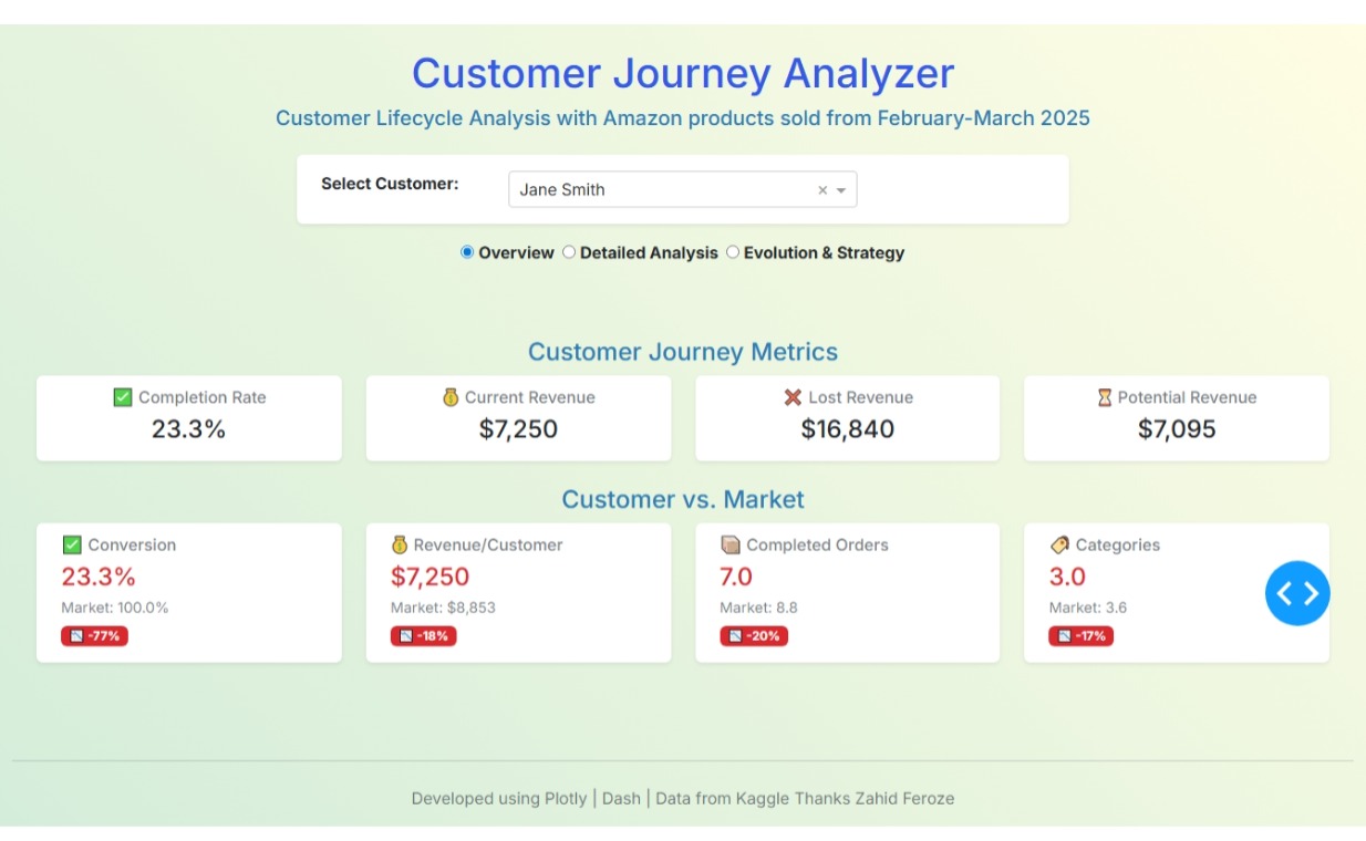
def _render_tab_1(metrics, global_metrics):
“”“Renders the content of the ‘Overview’ tab.”“”
# Section 1: Customer KPI Cards
kpi_cards = [
create_kpi_card(“Completion Rate”, metrics[‘completion_rate’], ‘percentage’, ‘ ’),
’),
create_kpi_card(“Current Revenue”, metrics[‘total_spent’], ‘currency’, ‘ ’),
’),
create_kpi_card(“Lost Revenue”, metrics[‘lost_revenue’], ‘currency’, ‘ ’),
’),
create_kpi_card(“Potential Revenue”, metrics[‘potential_revenue’], ‘currency’, ‘ ’)
’)
]
# Section 2: Market Comparison Cards
comparison_cards = [
    create_comparison_card("Conversion", metrics['completion_rate'], global_metrics['global_completion_rate'], 'percentage', '✅'),
    create_comparison_card("Revenue/Customer", metrics['total_spent'], global_metrics['avg_total_spent'], 'currency', '💰'),
    create_comparison_card("Completed Orders", metrics['completed'], global_metrics['avg_order_count'], 'number', '📦'),
    create_comparison_card("Categories", metrics['categories_bought'], global_metrics['avg_categories'], 'number', '🏷️')
]

return html.Div([
    dbc.Row(dbc.Col(html.H4("Customer Journey Metrics", className="card-title text-center mb-2 text-info"))),
    dbc.Row(kpi_cards, className="g-4 mb-4"),
    dbc.Row(dbc.Col(html.H4("Customer vs. Market", className="card-title text-center mb-2 text-info"))),
    dbc.Row(comparison_cards, className="g-4")
])
def _render_tab_2(customer_data, metrics, selected_customer):
“”“Renders the content of the ‘Detailed Analysis’ tab.”“”
customer_counts = customer_data[‘Status’].value_counts().reset_index()
customer_counts.columns = [‘Status’, ‘count’]
status_order = [‘Completed’, ‘Pending’, ‘Cancelled’]
customer_counts[‘Status’] = pd.Categorical(customer_counts[‘Status’], categories=status_order, ordered=True)
customer_counts = customer_counts.sort_values(‘Status’)
fig_donut_chart = go.Figure(go.Pie(
    labels=customer_counts['Status'],
    values=customer_counts['count'],
    hole=.65,
    marker_colors=['#27ae60', '#f39c12', '#e74c3c'],
    textinfo='label+percent',
    insidetextorientation='radial',
    hoverinfo='label+value'
))
fig_donut_chart.update_layout(
    title_text=f"Order Distribution: {selected_customer}",
    legend=dict(
        orientation="h",
        yanchor="top",
        y=1.02,
        xanchor="center",
        x=0.5
    ),
    plot_bgcolor='rgba(0,0,0,0)',
    paper_bgcolor='rgba(0,0,0,0)',
    showlegend=False
)


total_potential = metrics['total_spent'] + metrics['lost_revenue'] + metrics['potential_revenue']
realized_pct = (metrics['total_spent'] / total_potential * 100) if total_potential > 0 else 0
lost_pct = (metrics['lost_revenue'] / total_potential * 100) if total_potential > 0 else 0
potential_pct = (metrics['potential_revenue'] / total_potential * 100) if total_potential > 0 else 0

revenue_analysis_content = [
    html.Div([html.H6("Current Revenue", className="mb-2 text-muted"), html.H5(f"${metrics['total_spent']:,.0f}", className="text-success"), html.Small(f"{realized_pct:.1f}% of potential", className="text-muted")], className="mb-3"),
    html.Div([html.H6("Lost Revenue", className="mb-2 text-muted"), html.H5(f"${metrics['lost_revenue']:,.0f}", className="text-danger"), html.Small(f"{lost_pct:.1f}% of potential", className="text-muted")], className="mb-3"),
    html.Div([html.H6("Potential Revenue", className="mb-2 text-muted"), html.H5(f"${metrics['potential_revenue']:,.0f}", className="text-warning"), html.Small(f"{potential_pct:.1f}% of potential", className="text-muted")], className="mb-3"),
    html.Hr(),
    html.Div([html.H6("Total Revenue Potential", className="mb-2 text-muted"), html.H4(f"${total_potential:,.0f}", className="text-primary")])
]

return dbc.Row([
    dbc.Col([
        html.H4("Order Evolution", className="card-title text-center mb-3 text-info"),
        dcc.Graph(figure=fig_donut_chart, style={'height': '500px'})
    ], width=12, lg=9),
    dbc.Col([
        html.H4("Revenue Analysis", className="card-title text-center mb-3 text-info"),
        dbc.Card(dbc.CardBody(revenue_analysis_content), className="shadow-sm border-0 h-100 bg-white")
    ], width=12, lg=3)
], className="g-4")
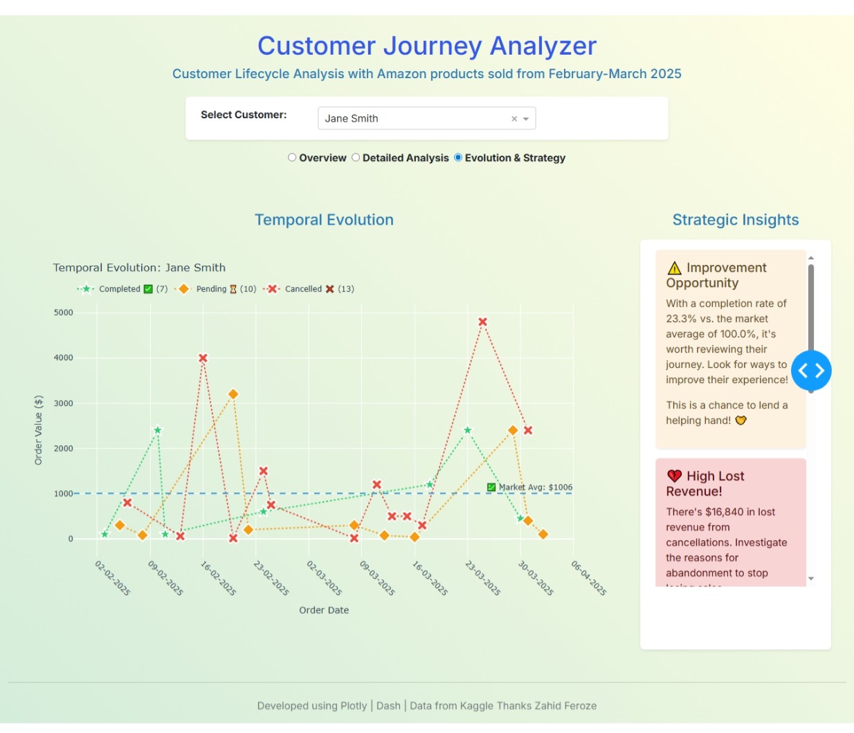
def _render_tab_3(customer_data, metrics, global_metrics, selected_customer):
“”“Renders the content of the ‘Evolution and Strategy’ tab.”“”
fig_timeline = go.Figure()
status_config = {
‘Completed’: {‘color’: ‘#2ecc71’, ‘symbol’: ‘star’, ‘name’: ‘Completed ’},
‘Pending’: {‘color’: ‘#f39c12’, ‘symbol’: ‘diamond’, ‘name’: ‘Pending ’},
‘Cancelled’: {‘color’: ‘#e74c3c’, ‘symbol’: ‘x’, ‘name’: ‘Cancelled ’}
}
for status in customer_data[‘Status’].unique():
status_data = customer_data[customer_data[‘Status’] == status].sort_values(‘Date’)
config = status_config.get(status, {‘color’: ‘#95a5a6’, ‘symbol’: ‘circle’, ‘name’: status})
fig_timeline.add_trace(go.Scatter(
x=status_data[‘Date’], y=status_data[‘Total Sales’], mode=‘markers+lines’, name=f"{config[‘name’]} ({len(status_data)})“,
marker=dict(size=15, color=config[‘color’], symbol=config[‘symbol’], line=dict(width=2, color=‘white’)),
line=dict(color=config[‘color’], width=2, dash=‘dot’),
hovertemplate=”%{text}
Date: %{x|%d-%m-%Y}
Value: %{y:,.0f}<br>Status: " + status + "<extra></extra>",
text=[f"{row['Product']}" for _, row in status_data.iterrows()]
))
avg_order_value = global_metrics['avg_order_value_global']
if avg_order_value > 0:
fig_timeline.add_hline(y=avg_order_value, line_dash="dash", line_color="#3498db", annotation_text=f"💹 Market Avg: {avg_order_value:.0f}“, annotation_position=“top right”)
fig_timeline.update_layout(
title=f"Temporal Evolution: {selected_customer}”, xaxis_title=“Order Date”, yaxis_title=“Order Value ($)”,
hovermode=‘closest’, plot_bgcolor=‘rgba(0,0,0,0)’, paper_bgcolor=‘rgba(0,0,0,0)’,
font=dict(color=‘#2c3e50’),
xaxis=dict(tickformat=‘%d-%m-%Y’, tickangle=45, showgrid=True),
yaxis=dict(showgrid=True),
legend=dict(orientation=“h”, yanchor=“bottom”, y=1.02, xanchor=“left”, x=0)
)
insights = []
if metrics['completion_rate'] > global_metrics['global_completion_rate'] * 1.2:
    insights.append(dbc.Alert([html.H5("✅ Excellent Conversion!", className="alert-heading"), html.P(f"Their completion rate of {metrics['completion_rate']:.1f}% is significantly higher than the market average of {global_metrics['global_completion_rate']:.1f}%. This customer is highly reliable and valuable to your business.")], color="success", className="shadow-sm border-0"))
elif metrics['completion_rate'] < global_metrics['global_completion_rate'] * 0.7:
    insights.append(dbc.Alert([html.H5("⚠️ Improvement Opportunity", className="alert-heading"), html.P(f"With a completion rate of {metrics['completion_rate']:.1f}% vs. the market average of {global_metrics['global_completion_rate']:.1f}%, it's worth reviewing their journey. Look for ways to improve their experience!"), html.P("This is a chance to lend a helping hand! 🤝")], color="warning", className="shadow-sm border-0"))
if metrics['lost_revenue'] > metrics['total_spent'] * 0.3:
    insights.append(dbc.Alert([html.H5("💔 High Lost Revenue!", className="alert-heading"), html.P(f"There's ${metrics['lost_revenue']:,.0f} in lost revenue from cancellations. Investigate the reasons for abandonment to stop losing sales."), html.P("What went wrong here? 🤔")], color="danger", className="shadow-sm border-0"))
if metrics['potential_revenue'] > metrics['total_spent'] * 0.2:
    insights.append(dbc.Alert([html.H5("🚀 High Pending Potential!", className="alert-heading"), html.P(f"There's a massive ${metrics['potential_revenue']:,.0f} in pending orders. A great opportunity for follow-up and reminders to close those sales!"), html.P("The gold is within reach! ✨")], color="info", className="shadow-sm border-0"))
if metrics['fav_category_pct'] > 60:
    insights.append(dbc.Alert([html.H5(f"🎯 The {metrics['fav_category']} Specialist!", className="alert-heading"), html.P(f"{metrics['fav_category_pct']:.1f}% of their purchases are in {metrics['fav_category']}. This makes them an ideal candidate for targeted upselling."), html.P("Keep giving them what they love! 😉")], color="primary", className="shadow-sm border-0"))

return dbc.Row([
    dbc.Col([
        html.H4("Temporal Evolution", className="card-title text-center mb-3 text-info"),
        dcc.Graph(figure=fig_timeline, style={'height': '600px'})
    ], width=12, lg=9),
    dbc.Col([
        html.H4("Strategic Insights", className="card-title text-center mb-3 text-info"),
        dbc.Card(
            dbc.CardBody(
                html.Div(insights, style={'height': '530px', 'overflowY': 'scroll'})
            ), className="shadow-sm border-0 h-100 bg-white"
        )
    ], width=12, lg=3)
], className="g-4")
3. Data and global metrics
This line assumes you have a CSV file named “amazon_sales_data.csv”
df = pd.read_csv(“amazon_sales_data.csv”)
df[‘Date’] = pd.to_datetime(df[‘Date’], format=‘%d-%m-%y’, errors=‘coerce’)
df = df.sort_values([‘Customer Name’, ‘Date’])
global_metrics = calculate_global_metrics(df)
4. Initialize Dash App with a modern theme
app = Dash(name, external_stylesheets=[dbc.themes.ZEPHYR])
app.title = ‘Customer Journey Analyzer’
5. Layout structure
app.layout = dbc.Container([
# Titles
dbc.Row([
dbc.Col([
html.H1(“Customer Journey Analyzer”, className=“text-center mt-4 mb-2 text-primary”),
html.H5(“Customer Lifecycle Analysis with Amazon products sold from January-Mid April 2025”, className=“text-center mb-4 text-info”),
])
]),
# Customer dropdown
dbc.Row(dbc.Col(
    dbc.Card(dbc.CardBody(
        dbc.Row([
            dbc.Col(html.Label("Select Customer:", className="form-label fw-bold mb-2 text-dark"), width=3),
            dbc.Col(dcc.Dropdown(
                id='customer-dropdown',
                options=[{'label': str(customer), 'value': str(customer)}
                         for customer in sorted(df['Customer Name'].unique())],
                value=str(df['Customer Name'].iloc[0]),
                className="mb-0 bg-white text-dark"
            ), width=6)
        ])
    ), className="shadow-sm border-0 bg-white"), width=7, className="mx-auto mb-2"),
),

# Radio Items for tabs
dbc.Row(dbc.Col(
    dcc.RadioItems(
        id='radio-items',
        options=[
            {'label': html.Span('Overview', className="fw-bold fs-6"), 'value': 'tab-1'},
            {'label': html.Span('Detailed Analysis', className="fw-bold fs-6"), 'value': 'tab-2'},
            {'label': html.Span('Evolution & Strategy', className="fw-bold fs-6"), 'value': 'tab-3'}
        ],
        value='tab-1',
        className="d-flex justify-content-center flex-wrap gap-2 text-dark",
        inputClassName="me-1"
    ), className="mt-2 mb-5 text-center")
),

# Dynamic content container with loading feedback
dbc.Row([
    dbc.Col(
        dcc.Loading(
            id="loading-spinner",
            type="default",
            children=[html.Div(id="content-container", className="p-4")]
        )
    )
]),

# Footer
dbc.Row([
    dbc.Col([
        html.Hr(className="my-4"),
        html.P("Developed using Plotly | Dash | Data from Kaggle Thanks Zahid Feroze", className="text-center text-muted")
    ])
], className="mt-5 mb-3")
], fluid=True, style={‘background’: ‘linear-gradient(45deg, #d4edda 0%, #fffde4 100%)’}, className=“mt-4”)
6. Callbacks
@callback(
Output(“content-container”, “children”),
Input(“radio-items”, “value”),
Input(‘customer-dropdown’, ‘value’)
)
def render_content(selected_option, selected_customer):
customer_analysis = analyze_customer(df, selected_customer)
if not customer_analysis:
return html.Div(“No data available for this customer.”, className=“text-center text-muted”)
customer_data = customer_analysis['data']
metrics = customer_analysis['metrics']

if selected_option == "tab-1":
    return _render_tab_1(metrics, global_metrics)

elif selected_option == "tab-2":
    return _render_tab_2(customer_data, metrics, selected_customer)

elif selected_option == "tab-3":
    return _render_tab_3(customer_data, metrics, global_metrics, selected_customer)

return html.Div("Please select one of the tabs to view the content.", className="text-center text-muted")
server = app.server