The code
import dash
from dash import dcc, html, Input, Output
import dash_bootstrap_components as dbc
import plotly.graph_objects as go
import pandas as pd
import numpy as np
============================================
GLOBAL CONSTANTS AND METADATA (English UI Text)
============================================
MOMENTUM_MIN = -1.5
MOMENTUM_MAX = 2.5
SHARPNESS_MAX = 1.2
SLOPE_MAX = 0.5
RADAR_CATEGORIES = [‘Momentum’, ‘Sharpness’, ‘Resilience’, ‘Consistency’, ‘Trend’, ‘Concentration’]
Narrative descriptions for the Radar Tooltip
RADAR_DESCRIPTIONS = {
‘Momentum’: “The night’s pace. Indicates if the flow of candy ended stronger than it began (Was there a Grand Finale?).”,
‘Sharpness’: “The Peak Roar. Measures how explosive the night’s peak moment was compared to the lull.”,
‘Resilience’: “Night’s Resilience. Ability to sustain activity within the 6:00pm to 8:15pm window (Warning: does not measure the full night).”,
‘Consistency’: ‘The Clockwork. Predictability of the flow. A high value means activity was steady, with no unexpected scares.’,
‘Trend’: ‘The Night’s Trend. Measures the general slope of the flow: did the night feel consistently ascending or descending?’,
‘Concentration’: ‘The Hour Bond. How clustered the activity is. Low dispersion = activity concentrated in a few key hours.’
}
Sidebar style
SIDEBAR_STYLE = {
“width”: “400px”,
“padding”: “2rem 1rem”,
“background”: “linear-gradient(180deg, #1a1a2e 0%, #16213e 100%)”,
“borderRight”: “3px solid #ff6b35”,
“height”: “100vh”,
“overflow”: “hidden”,
}
Main content style
CONTENT_STYLE = {
“padding”: “1.5rem”,
“background”: “#0f0f1e”,
“minHeight”: “100vh”,
“flexGrow”: 1,
“overflowY”: “auto”
}
DAY_MAPPING = {
‘Monday’: ‘Monday  ’, ‘Tuesday’: ‘Tuesday
  ’, ‘Wednesday’: ‘Wednesday
  ’,
’,
‘Thursday’: ‘Thursday  ’, ‘Friday’: ‘Friday
  ’, ‘Saturday’: ‘Saturday
  ’,
’,
‘Sunday’: ‘Sunday  ’
’
}
PATTERN_COLORS = {
“ Rocket”: ‘#ff6b35’,
“ Spike”: ‘#00d9ff’,
“ Volatile”: ‘#ff00ff’,
“ Retreat”: ‘#808080’
}
Base Layout definition for plots
BASE_LAYOUT_CONFIG = {
‘paper_bgcolor’: ‘#16213e’,
‘plot_bgcolor’: ‘#16213e’,
‘font’: {‘color’: ‘#adb5bd’, ‘size’: 12},
‘showlegend’: True,
‘legend’: {
‘orientation’: “h”,
‘yanchor’: “top”,
‘y’: -0.2,
‘xanchor’: “center”,
‘x’: 0.5,
‘font’: {‘size’: 13}
}
}
============================================
AUXILIARY ANALYSIS FUNCTIONS
============================================
def safe_float(val, default=0.0):
“”“Converts to a float and ensures finiteness, otherwise returns the default.”“”
if isinstance(val, (np.ndarray, pd.Series, list)) and len(val) > 0:
val = val[0]
try:
f_val = float(val)
return f_val if np.isfinite(f_val) else default
except (TypeError, ValueError):
return default
def calculate_features(counts, year_data):
“”“Calculates the 6 key pattern metrics and normalizes them.”“”
counts_sum = counts.sum()
counts_mean = counts.mean()
peak_value = counts.max()
if len(counts) < 2 or counts_sum == 0 or counts_mean == 0 or peak_value == 0:
return None
# 1. MOMENTUM SCORE
early_avg = counts[:2].mean() if len(counts) >= 2 else 0
late_avg = counts[-2:].mean() if len(counts) >= 2 else 0
momentum = (late_avg - early_avg) / early_avg if early_avg > 0 else 0
momentum_scaled = (momentum - MOMENTUM_MIN) / (MOMENTUM_MAX - MOMENTUM_MIN)
momentum_normalized = np.clip(momentum_scaled, 0, 1)
# 2. PEAK SHARPNESS
sharpness = (peak_value - counts_mean) / counts_mean
sharpness_normalized = np.clip(sharpness / SHARPNESS_MAX, 0, 1)
# 3. RESILIENCE
final_count = counts[-1]
resilience_normalized = np.clip(final_count / peak_value, 0, 1)
# 4. CONSISTENCY
pct_changes = np.diff(counts) / counts[:-1]
pct_changes = pct_changes[~np.isinf(pct_changes) & ~np.isnan(pct_changes) & (counts[:-1] != 0)]
volatility = np.std(pct_changes) if len(pct_changes) > 0 else 0
consistency = 1 / (1 + volatility * 2)
# 5. TREND (SLOPE) - PURE NUMPY IMPLEMENTATION
x_indices = np.arange(len(counts))
if np.std(counts) == 0:
slope = 0.0
else:
# Calculate slope (m) using Cov(x,y) / Var(x)
slope, intercept = np.polyfit(x_indices, counts, 1)
trend_normalized = np.clip(abs(slope) / SLOPE_MAX, 0, 1)
# 6. CONCENTRATION
cv = np.std(counts) / counts_mean
concentration = 1 / (1 + cv)
features = {
'Year': year_data['Year'].iloc[0],
'Day_of_Week': year_data['Day of Week'].iloc[0],
'Total_Count': counts_sum,
'Peak_Time': year_data.loc[year_data['Count'].idxmax(), 'Time'],
'Momentum': safe_float(momentum_normalized),
'Sharpness': safe_float(sharpness_normalized),
'Resilience': safe_float(resilience_normalized),
'Consistency': safe_float(consistency),
'Trend': safe_float(trend_normalized),
'Slope': safe_float(slope),
'Concentration': safe_float(concentration),
'Counts': counts
}
# Pattern Classification (Uses the new Trend/Slope value)
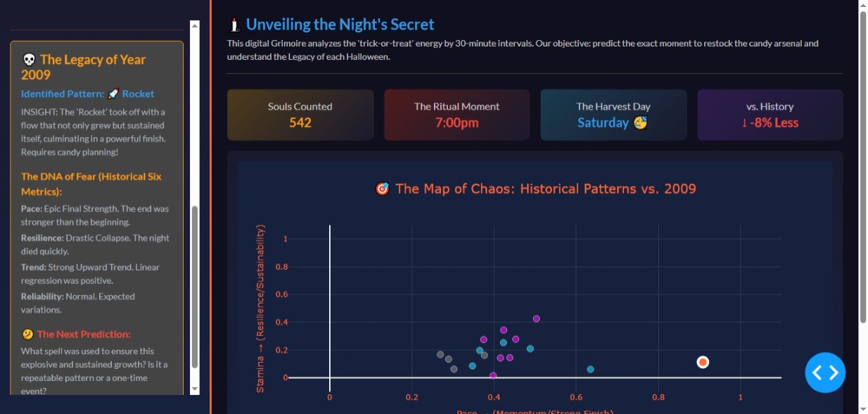
if features['Slope'] > 0.1 and features['Momentum'] > 0.7:
pattern = "🚀 Rocket"
elif features['Slope'] < -0.1:
pattern = "😴 Retreat"
elif features['Sharpness'] > 0.6 and features['Resilience'] < 0.3:
pattern = "⚡ Spike"
else:
pattern = "🎢 Volatile"
features['Pattern'] = pattern
return features
def create_info_card(title, id_name, text_class, gradient_style):
“”“Generates a reusable information card component (English titles).”“”
narrative_titles = {
‘total-count’: ‘Souls Counted’,
‘peak-time’: ‘The Ritual Moment’,
‘day-of-week’: ‘The Harvest Day’,
‘vs-avg’: ‘vs. History’,
}
width_col = 3 if id_name not in [‘vs-avg’] else 3
return dbc.Col([
dbc.Card([
dbc.CardBody([
html.Div([
html.H6(narrative_titles.get(id_name, title), className=“text-muted mb-1”),
html.H5(id=id_name, className=f"{text_class} fw-bold mb-0")
], className=“text-center”)
])
], style={‘background’: gradient_style, ‘borderRadius’: ‘0.5rem’})
], width={‘size’: width_col, ‘md’: width_col, ‘sm’: 6})
def generate_narrative(data):
“”“Generates the narrative interpretation (English).”“”
pattern = data[‘Pattern’]
# 1. Pattern Summary (MAIN INSIGHT)
if pattern == "🚀 Rocket":
    desc = "INSIGHT: The 'Rocket' took off with a flow that not only grew but sustained itself, culminating in a powerful finish. Requires candy planning!"
elif pattern == "⚡ Spike":
    desc = "INSIGHT: The 'Spike' was a seismic event: a moment of brutal intensity that faded quickly. Calm arrived dramatically early."
elif pattern == "😴 Retreat":
    desc = "INSIGHT: 'Retreat'. The night had a general downward trend. The peak occurred very early, and activity decreased until the end."
else: # Volatile
    desc = "INSIGHT: 'Volatile' like a bubbling potion. The night was full of false peaks and unexpected drops. Impossible to predict!"

# 2. Key interpreted features
momentum_text = "Epic Final Strength. The end was stronger than the beginning." if data['Momentum'] > 0.6 else "Steady Pace. Similar start and end." if data['Momentum'] > 0.4 else "Slow Start. Took effort to get going."
resilience_text = "Mythical Resilience (up to 8:15pm). Final activity was almost equal to the peak." if data['Resilience'] > 0.7 else "Decent Resilience. Halved, but sustained." if data['Resilience'] > 0.4 else "Drastic Collapse. The night died quickly."
consistency_text = "Predictable. Stable flow without surprises." if data['Consistency'] > 0.7 else "Normal. Expected variations." if data['Consistency'] < 0.5 else "Chaotic. Totally unpredictable."
trend_text = "Strong Upward Trend. Linear regression was positive." if data['Slope'] > 0.1 else "Strong Downward Trend. Linear regression was negative." if data['Slope'] < -0.1 else "Flat Trend. The flow remained relatively level."

# 3. Open Question (Planning Narrative)
if pattern == "⚡ Spike":
    q = "Was there an event or weather that caused the terror not to last (low Resilience)? Next time, when should we close the doors?"
elif pattern == "💪 Endurance":
    q = "What factors (day of the week, weather) made the flow so constant and how can we replicate that marathon activity?"
elif pattern == "🚀 Rocket":
    q = "What spell was used to ensure this explosive and sustained growth? Is it a repeatable pattern or a one-time event?"
elif pattern == "😴 Retreat":
    q = "The trend is downwards. How can we delay the peak and use early advertising to increase arrival momentum?"
else:
    q = "How can we minimize volatility and find the 'sweet spot' for restocking?"

narrative_elements = [
    html.H5(f"💀 The Legacy of Year {int(data['Year'])}", className="mb-2 fw-bold text-warning"),
    html.H6(f"Identified Pattern: {pattern}", className="mb-2 fw-bold text-info"),
    html.P(desc, className="small text-light mb-3"),
    html.Div("The DNA of Fear (Historical Six Metrics):", className="fw-bold text-warning mb-1"),
    html.P([html.B("Pace: "), momentum_text], className="mb-1 small text-light"),
    html.P([html.B("Resilience: "), resilience_text], className="mb-1 small text-light"),
    html.P([html.B("Trend: "), trend_text], className="mb-1 small text-light"),
    html.P([html.B("Reliability: "), consistency_text], className="mb-1 small text-light"),
    html.Div("🤔 The Next Prediction:", className="fw-bold text-danger mt-3 mb-1"),
    html.P(q, className="small text-light")
]
return dbc.Alert(narrative_elements, color="secondary", className="border border-warning")
============================================
LOAD AND PREPARE DATA
============================================
try:
# Ensure ‘HalloweenTableau2024.csv’ is available in the environment
halloween_data = pd.read_csv(‘HalloweenTableau2024.csv’)
# Preprocessing
halloween_data['Date'] = pd.to_datetime(halloween_data['Date'], format='%m/%d/%y')
halloween_data['Year'] = halloween_data['Date'].dt.year
halloween_data = halloween_data.sort_values(['Date', 'Time']).reset_index(drop=True)

# Feature Engineering
year_features = []
for year in halloween_data['Year'].unique():
    year_data = halloween_data[halloween_data['Year'] == year].sort_values('Time')
    features = calculate_features(year_data['Count'].values, year_data)
    if features:
        year_features.append(features)

features_df = pd.DataFrame(year_features)

# Calculate historical averages and percentiles for the new IQR band feature
counts_list = [pd.Series(f['Counts']) for f in year_features]
aligned_counts = pd.concat(counts_list, axis=1).fillna(0) if counts_list else pd.DataFrame()

avg_counts = aligned_counts.mean(axis=1).values
# Calculate 25th and 75th percentiles for IQR band
q25_counts = aligned_counts.quantile(0.25, axis=1).values
q75_counts = aligned_counts.quantile(0.75, axis=1).values
except Exception as e:
# Print error in English for debugging
print(f"FATAL ERROR: Could not load ‘HalloweenTableau2024.csv’. Details: {e}")
features_df = pd.DataFrame()
avg_counts =
q25_counts =
q75_counts =
============================================
DASHBOARD LAYOUT
============================================
app = dash.Dash(name, external_stylesheets=[dbc.themes.DARKLY])
app.title = “ Halloween Energy Dashboard”
Definition of information cards (English Titles)
card_definitions = [
(“Total Attendance”, ‘total-count’, “text-warning”, ‘linear-gradient(135deg, #4e3a1b 0%, #1a1a2e 100%)’),
(“Peak Time”, ‘peak-time’, “text-danger”, ‘linear-gradient(135deg, #4e1b1b 0%, #1a1a2e 100%)’),
(“Day of Week”, ‘day-of-week’, “text-info”, ‘linear-gradient(135deg, #1b3a4e 0%, #1a1a2e 100%)’),
(“vs History”, ‘vs-avg’, “text-light”, ‘linear-gradient(135deg, #2d1b4e 0%, #1a1a2e 100%)’),
]
app.layout = html.Div(style={‘display’: ‘flex’, ‘height’: ‘100vh’, ‘width’: ‘100vw’, ‘overflow’: ‘hidden’}, children=[
# SIDEBAR
html.Div([
    html.Div([
        html.Div("🎃", style={'fontSize': '4rem', 'textAlign': 'center'}),
        html.H2("The Candy Oracle", className="text-warning text-center mb-1",
               style={'fontWeight': 'bold'}),
        html.P("Mystical Energy Pattern Analysis", className="text-muted text-center mb-4"),

        html.Hr(style={'borderColor': '#ff6b35', 'opacity': '0.3'}),

        # Selectors
        *[html.Div([
            html.Label(label, className="text-warning mb-2 fw-bold"),
            dcc.Dropdown(
                id=id_val,
                options=[{'label': opt_label, 'value': opt_value}
                         for opt_label, opt_value in options] if not features_df.empty else [],
                value=default_value,
                clearable=False,
                style={'marginBottom': '1.5rem', 'color': '#0f0f1e'}
            )
        ]) for label, id_val, options, default_value in [
            ("📅 The Ritual Year", 'year-selector',
             [(f'{int(year)}', int(year)) for year in features_df['Year'].sort_values()],
             int(features_df['Year'].max()) if not features_df.empty else None),
            ("⚖️ The Magic Contrast", 'compare-year',
             [('The Historical Average', 'avg')] + [(f'{int(year)}', int(year))
                                                for year in features_df['Year'].sort_values()],
             'avg')
        ]],

        html.Hr(style={'borderColor': '#ff6b35', 'opacity': '0.3'}),

        # Radio Items (English View Selector)
        html.Label("🔮 Which Form of Fear Will You See?", className="text-warning mb-2 fw-bold"),
        dbc.RadioItems(
            id='view-selector',
            options=[
                {'label': '🧬 DNA Profile (Metrics)', 'value': 'radar'},
                {'label': '📈 The Timeline (Hourly Flow)', 'value': 'timeline'},
                {'label': '🎯 Chaos Map (Momentum vs. Resilience)', 'value': 'scatter'}, # NEW VIEW
            ],
            value='radar',
            className="text-light",
            labelStyle={'marginBottom': '0.8rem'}
        ),

        html.Hr(style={'borderColor': '#ff6b35', 'opacity': '0.3'}),

        html.Div(id='year-info', className="mt-3")

    ], style={'maxHeight': '100%', 'overflowY': 'auto', 'paddingRight': '10px'})

], style=SIDEBAR_STYLE),

# MAIN CONTENT
html.Div([
    html.Div([
        html.H4("🕯️ Unveiling the Night's Secret", className="text-info fw-bold mb-1"),
        html.P("This digital Grimoire analyzes the 'trick-or-treat' energy by 30-minute intervals. Our objective: predict the exact moment to restock the candy arsenal and understand the Legacy of each Halloween.",
               className="text-muted small mb-4 border-bottom border-secondary pb-3")
        , # Cards generated programmatically
        dbc.Row([create_info_card(*card) for card in card_definitions], className="mb-3 g-3"),

        # Main Graph
        dbc.Row([
            dbc.Col([
                dbc.Card([
                    dbc.CardBody([
                        dbc.Spinner(
                            dcc.Graph(id='main-graph', style={'height': '70vh'}),
                            color="warning"
                        )
                    ])
                ], style={'background': 'linear-gradient(180deg, #1a1a2e 0%, #16213e 100%)', 'borderRadius': '0.5rem'})
            ], width=12)
        ])

    ], className="flex-grow-1"),

    # FOOTER
    html.Footer([
        html.P([
            "Dashboard powered by the ",
            html.Span("Mystery of Plotly | Dash", className="text-warning fw-bold"),
            " | by Avacsiglo21 | Data courtesy of ",
            html.A("Data Plus Science", href="https://www.dataplusscience.com/", target="_blank", className="text-info fw-bold"),
            "."
        ], className="text-center text-muted small mb-0")
    ], style={
        'padding': '1rem 0',
        'borderTop': '1px solid #2d3b55',
        'marginTop': '1rem',
        'flexShrink': 0
    })

], style=CONTENT_STYLE)
])
============================================
CALLBACK (CENTRAL PLOTTING LOGIC)
============================================
@app.callback(
[Output(‘main-graph’, ‘figure’),
Output(‘total-count’, ‘children’),
Output(‘peak-time’, ‘children’),
Output(‘day-of-week’, ‘children’),
Output(‘vs-avg’, ‘children’),
Output(‘year-info’, ‘children’)],
[Input(‘year-selector’, ‘value’),
Input(‘compare-year’, ‘value’),
Input(‘view-selector’, ‘value’)]
)
def update_dashboard(selected_year, compare_year, view):
if features_df.empty or selected_year is None:
return go.Figure(), “N/A”, “N/A”, “N/A”, “N/A”, dbc.Alert(
“ERROR: The Data Grimoire could not be loaded. Check for the presence and validity of ‘HalloweenTableau2024.csv’.”,
color=“danger”)
year_data = features_df[features_df['Year'] == selected_year].iloc[0]

# --- Shared Metadata Calculation ---
avg_total = features_df['Total_Count'].mean()
diff_pct = ((year_data['Total_Count'] - avg_total) / avg_total) * 100

if diff_pct > 0:
    vs_avg_text, vs_avg_color = f"↑ +{diff_pct:.0f}% Better", "success"
elif diff_pct < 0:
    vs_avg_text, vs_avg_color = f"↓ {diff_pct:.0f}% Less", "danger"
else:
    vs_avg_text, vs_avg_color = "— Equal", "info"

year_info = generate_narrative(year_data)
display_day = DAY_MAPPING.get(year_data['Day_of_Week'], year_data['Day_of_Week'])

fig = go.Figure()
layout = BASE_LAYOUT_CONFIG.copy()

# --- GRAPH GENERATION ---

if view == 'radar':
    # Generate hovertext that includes the category description (English).
    hover_descriptions = [RADAR_DESCRIPTIONS[cat] for cat in RADAR_CATEGORIES]

    # Radar Trace (Selected Year)
    values = [float(year_data[cat]) for cat in ['Momentum', 'Sharpness', 'Resilience', 'Consistency', 'Trend', 'Concentration']]

    fig.add_trace(go.Scatterpolar(
        r=values,
        theta=RADAR_CATEGORIES,
        fill='toself',
        name=f'{selected_year} (Pattern: {year_data["Pattern"]})',
        line=dict(color='#ff6b35', width=3),
        fillcolor='rgba(255, 107, 53, 0.4)',

        # ADVANCED TOOLTIP IMPLEMENTATION:
        customdata=np.array([hover_descriptions, values]).T,
        hovertemplate=(
            "<b>Metric:</b> %{theta}<br>"
            "<b>Value (%{selected_year}):</b> %{r:.2f}<br>"
            "---<br>"
            "<b>Definition:</b> %{customdata[0]}"
            "<extra></extra>"
        )
    ))

    # Comparison Logic
    comp_name_label = ""
    if compare_year == 'avg':
        comp_r = [float(features_df[cat].mean()) for cat in ['Momentum', 'Sharpness', 'Resilience', 'Consistency', 'Trend', 'Concentration']]
        comp_name, comp_line = 'The Grand Historical Average', dict(color='#00d9ff', width=2, dash='dash')
        comp_name_label = 'The Grand Historical Average'
    else:
        compare_data = features_df[features_df['Year'] == compare_year].iloc[0]
        comp_r = [float(compare_data[cat]) for cat in ['Momentum', 'Sharpness', 'Resilience', 'Consistency', 'Trend', 'Concentration']]
        comp_name, comp_line = f'{compare_year} (Pattern: {compare_data["Pattern"]})', dict(color='#bb86fc', width=2, dash='dot')
        comp_name_label = f'{compare_year}'

    # Radar Trace (Comparison Year/Average)
    fig.add_trace(go.Scatterpolar(
        r=comp_r,
        theta=RADAR_CATEGORIES,
        name=comp_name,
        line=comp_line,
        fillcolor='rgba(0, 217, 255, 0.1)',
        customdata=np.array([hover_descriptions, comp_r]).T,
        hovertemplate=(
            "<b>Metric:</b> %{theta}<br>"
            f"<b>Value ({comp_name_label}):</b> %{{r:.2f}}<br>"
            "---<br>"
            "<b>Definition:</b> %{customdata[0]}"
            "<extra></extra>"
        )
    ))

    # Specific Radar Layout Configuration
    layout.update(polar=dict(
        radialaxis=dict(visible=True, range=[0, 1.05], gridcolor='#2d3b55', color='#adb5bd', tickfont=dict(size=10)),
        angularaxis=dict(gridcolor='#2d3b55', color='#ff6b35'),
        bgcolor='#16213e'
    ), title={'text': f"🧬 The Sweet Death Profile: {selected_year} vs. {comp_name_label}", 'font': {'size': 20, 'color': '#ff6b35'}, 'x': 0.5, 'xanchor': 'center'})

elif view == 'timeline':
    times = halloween_data['Time'].unique().tolist()

    comp_y = None
    comp_name_label = ""

    # Historical IQR Band Visualization (when comparing to average)
    if compare_year == 'avg' and len(avg_counts) == len(times) and len(q25_counts) == len(times):

        comp_name_label = 'The Grand Historical Average'

        # 1. Trace for 75th Percentile (Upper Boundary of the IQR Band)
        fig.add_trace(go.Scatter(
            x=times, y=q75_counts, mode='lines',
            line=dict(width=0),
            showlegend=False,
            hoverinfo='none',
            name='75th Percentile'
        ))

        # 2. Trace for Average (The center line, which fills the space to the next trace)
        fig.add_trace(go.Scatter(
            x=times, y=avg_counts, mode='lines',
            name='The Grand Historical Average (Mean)',
            line=dict(color='#00d9ff', width=3, dash='dash'),
            fill='tonexty',
            fillcolor='rgba(0, 217, 255, 0.1)',
            hoverlabel={'namelength': -1}
        ))

        # 3. Trace for 25th Percentile (Lower Boundary of the IQR Band)
        fig.add_trace(go.Scatter(
            x=times, y=q25_counts, mode='lines',
            line=dict(width=0, color='#00d9ff'),
            showlegend=False,
            hoverinfo='none',
            name='25th Percentile'
        ))

    elif compare_year != 'avg':
        compare_data = features_df[features_df['Year'] == compare_year].iloc[0]
        comp_y, comp_name, comp_line = compare_data['Counts'], f'{compare_year} ({compare_data["Pattern"]})', dict(color='#bb86fc', width=3, dash='dot')
        comp_name_label = f'{compare_year}'

        # Add the selected comparison year trace
        fig.add_trace(go.Scatter(
            x=times, y=comp_y, mode='lines+markers', name=comp_name,
            line=comp_line, marker=dict(size=10)
        ))

    # Trace for the currently selected year (always on top)
    fig.add_trace(go.Scatter(
        x=times, y=year_data['Counts'], mode='lines+markers',
        name=f'{selected_year} (Pattern: {year_data["Pattern"]})',
        line=dict(color='#ff6b35', width=4),
        marker=dict(size=12, line=dict(color='#16213e', width=2))
    ))

    # Specific Timeline Layout Configuration
    layout.update(
        xaxis={'title': 'The Night Clock (Time)', 'gridcolor': '#2d3b55', 'color': '#ff6b35'},
        yaxis={'title': 'The Tide of Visitors (Count)', 'gridcolor': '#2d3b55', 'color': '#ff6b35'},
        title={'text': f"📈 The Tide of Fear: Flow of {selected_year} vs. {comp_name_label}", 'font': {'size': 20, 'color': '#ff6b35'}, 'x': 0.5, 'xanchor': 'center'}
    )

elif view == 'scatter':
    # SCATTER PLOT (CHAOS MAP) - Momentum vs. Resilience

    # # --- BACKGROUND TRACES (All Years)

    for pattern_name, color in PATTERN_COLORS.items():
        pattern_data = features_df[features_df['Pattern'] == pattern_name]

        # Count BEFORE filtering (this is the true historical count)
        total_count = len(pattern_data)  # 🔧 LÍNEA NUEVA

        # Filter out the currently selected year from the background
        if not pattern_data.empty and selected_year in pattern_data['Year'].values:
            pattern_data = pattern_data[pattern_data['Year'] != selected_year]

        if total_count > 0:  # 🔧 CAMBIADO: de "not pattern_data.empty" a "total_count > 0"
            fig.add_trace(go.Scatter(
                x=pattern_data['Momentum'], y=pattern_data['Resilience'], mode='markers',
                marker=dict(size=10, opacity=0.6, color=color, line=dict(color='white', width=1)),
                name=f'{pattern_name} ({total_count})'  # 🔧 CAMBIADO: de "len(pattern_data)" a "total_count"
        ))

    # --- FOCUSED TRACE (Selected Year) ---
    selected_size = 15 # Base size for the highlighted dot

    # Determine the size based on how much the year deviates from the historical average in total count (Narrative only)
    total_count_avg = features_df['Total_Count'].mean()
    size_scale_factor = np.clip(np.abs(year_data['Total_Count'] - total_count_avg) / total_count_avg, 0, 1) * 10

    fig.add_trace(go.Scatter(
        x=[year_data['Momentum']], y=[year_data['Resilience']], mode='markers',
        marker=dict(size=selected_size + size_scale_factor, color=PATTERN_COLORS.get(year_data['Pattern'], 'white'), line=dict(color='white', width=4)),
        name=f'The Chosen One: {selected_year}', showlegend=False,
        hovertemplate=(
            f"<b>Year:</b> {selected_year}<br>"
            f"<b>Pattern:</b> {year_data['Pattern']}<br>"
            "<b>Momentum:</b> %{x:.2f}<br>"
            "<b>Resilience:</b> %{y:.2f}"
            "<extra></extra>"
        )
    ))

    # --- SCATTER PLOT LEGEND CORRECTION (Uses BASE_LAYOUT but confirms title) ---
    layout['legend'].update({
        'title': "Fear Energy Patterns",
        'y': -0.2, # Confirms position below the plot area
        'yanchor': 'top'
    })

    # Specific Scatter Layout Configuration
    layout.update(
        xaxis={'title': 'Pace → (Momentum/Strong Finish)', 'gridcolor': '#2d3b55', 'color': '#ff6b35', 'range': [-0.1, 1.1]},
        yaxis={'title': 'Stamina → (Resilience/Sustainability)', 'gridcolor': '#2d3b55', 'color': '#ff6b35', 'range': [-0.1, 1.1]},
        title={'text': f"🎯 The Map of Chaos: Historical Patterns vs. {selected_year}", 'font': {'size': 20, 'color': '#ff6b35'}, 'x': 0.5, 'xanchor': 'center'}
    )


fig.update_layout(layout)

# --- Outputs ---
return (fig,
        f"{int(year_data['Total_Count']):,}",
        year_data['Peak_Time'],
        display_day,
        html.Span(vs_avg_text, className=f"text-{vs_avg_color} fw-bold"),
        year_info)
server = app.server