Hey Everyone,
We’re excited to announce the 2024 summer Dash app-building challenge in the area of retail. We challenge the community to build a Dash app around the Amazon purchases dataset.
amazon-purchases.csv: This dataset contains purchase from 5027 Amazon.com users in the US, spanning from 2018 through 2022. The dataset is a little over 300mb. See a truncated sample of the data.
survey.csv : This dataset includes consumer level variables collected through an online survey
fields.csv: This dataset represents the columns’ meta data of the survey.
To read more about the datasets and download them, go to the MIT publication and click the Access Dataset button.
The winning apps will be judged according to the following categories:
Data insights revealed from the purchases and survey datasets
Customer segmentation / purchasing patterns
Prediction around purchases, seasonality, demographics
App UI/UX Design
Bonus points for integration of LLMs to gain more data insight
Please submit your app as a new post in this thread. Please include a link to the app, code on GitHub, and a short description of the app.
Submission deadline is the end of the day Sunday, September 1, 2024.
The winners will be announced in September and will receive a reward of:
$125
$75
$50
A few lucky app-challenge participants will get the chance to showcase their app to the world at the Plotly Community Webinar planned for the fall of 2024.
Note: The dataset is provided for research purposes and should not be used to re-identify participants of the survey.
Tip: the purchases dataset is quite large. One potentially helpful library to visualize large time series datasets is Plotly Resampler.
Went for the 1.8 million dataset and my computer hates me.. but so far I’ve broken the data into an individual file for each state in a .json and .csv format to work with the Nivo ReactiveCircle component along with the treemap chart. The data is organized by state, category, title, (price * quantity) for size for each circle. Along with a total purchase value for each state and an ag grid for displaying the data at the top.
Wrapped in a dynamic grid and I’m using from flask_caching import Cache, and from flask_executor import Executor in an attempt to speed up the dataset. Which has made a big difference in being able to load, as you’ll see in the .gif when I jump from WY to ME it loads extremely fast
As a prior Amazon Seller, I could see this as being useful if you’d be interested in entering in a new category market within Amazon as you can get a quick understanding of its respective size and how many other major products make up the market share in that category. Which could help you determine a market strategy for picking a product and growing into a sector within Amazon.com.
Some of the 3rd party packages I used so far:
import dash
from dash import html, dcc, callback, Output, Input, State
import dash_ag_grid as dag
import polars as pl
import json
import os
from flask_caching import Cache
from flask_executor import Executor
import plotly.express as px
with from dash_dynamic_grid_layout import DashGridLayout, DraggableWrapper being a custom component:
Along with Dash Nivo:
Will release a github repo when it gets closer to the September 1st.
Thank you for sharing this app, @PipInstallPython . And nice usage of dragging
I was surprised to see pet supplies being such a common purchase for American families.
As a prior Amazon Seller, I could see this as being useful if you’d be interested in entering in a new category market within Amazon as you can get a quick understanding of its respective size and how many other major products make up the market share in that category.
^ This is a great idea.
I look forward to seeing the GitHub code because I’m sure we can all learn from how you used Cache and Executor to speed up the app.
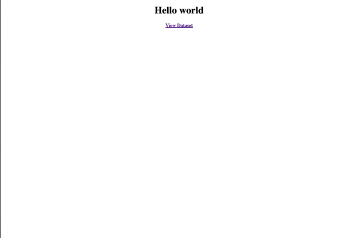
I call this app: “Hello World”, inspired on simplistic and an elegant design. Its clear and concise and clean UI greats the user with a warm message while including a link to the data sheet.
I didn’t see any rules posted on submitting multiple apps and figured with all the submissions on this forum this could be a 2nd place contender lol
Sarcastic nudge for those reading… Few Days Left in the challenge.
Might be a bit complex to read this code:
import dash
from dash import html

app = dash.Dash(__name__)

app.layout = html.Div([
    html.Center(html.H1("Hello world")),
    html.Center(html.A(html.H4("View Dataset"), href="https://github.com/plotly/datasets/blob/master/amazon-purchases-sample.csv"))
])

if __name__ == '__main__':
    app.run_server(debug=True, port=8050)
please jump in and build something better than this or I’ll create a 3rd app even more sarcastic than this and walk away the true victor of the Summer Dash App Building Challenge
Good luck! Its going to be pretty difficult to beat the clean concise design of a “Hello World” Actually saved me from a real struggle… if no one else submitted… I would have had to get pretty creative to get more sarcastic than that submission.
Here we go guys —my submission for this year’s summer challenge. The data was great, and I had countless ideas for further analysis and visualization. However, due to time constraints, I concentrated solely on exploratory analysis
Note: I’ve focused on data from 2021 only and removed all observations with missing product information for the purpose of the analysis.
The dashboard is divided into four main pages:
Exec. Overview: Displays key metrics and top performers across four major categories (product category, product items, region, states), with year-to-year comparisons.
Product Overview: Highlights the top N best-performing products, allowing users to explore the product hierarchy and identify seasonal patterns. Users can also select the top N for more detailed analysis.
Regional Overview: Provides a regional comparison of key metrics and top performers across the four major categories. Users can drill down from region to states to analyze product performance regionally.
Customer Overview: Compares various key metrics across different socio-economic categories (e.g., age group, education, income group) and allows to identify top customers.
thank you! Glad, you like it! I can’t take all the credits for the UI and layout Some of this is automatically encoded into Vizro e.g. the outer layout such as where the navigation, controls, dashboard title and logo are placed are automatically set by Vizro. The things that I control are the inner layouts of the components/charts and the styling of these. A lot of design best practices are automatically encoded into Vizro, but if you want to deviate from some of the opinionated design, there is always custom CSS, which you can see in my project for example
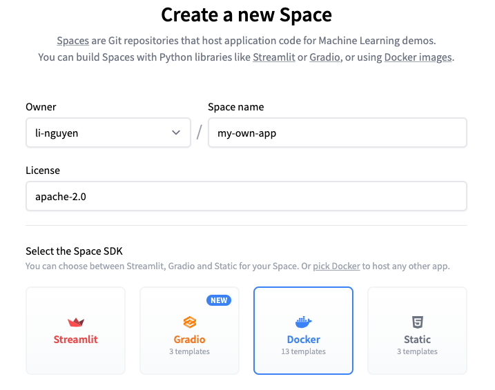
On HuggingFace, it’s actually quite straight-forward because Huggingface provides templates as well. I actually posted on this in the Plotly discord channel as well, when I was asked there and created a very simple pure Dash app example here for people to get started. That’s all the files you need to get your app running. You could just copy/paste everything or even simpler, just duplicate the space → click on the 3 dots top right and then “Duplicate the space”.
The other steps are:
Either create a new “space” on HuggingFace with a blank Docker template being selected or just duplicate the simple Dash example I’ve added to my profile
The Dash application is distinguished by its database cleaning and the use of the Parquet format, which optimizes storage and reduces the database size. Page 1: Purchase overview
The application provides a detailed view of purchases from 2018 to 2022. Data can be analyzed year-over-year using an interactive filter, allowing users to explore and understand purchases trends.
Page 2: Customer demographics
In addition to purchases data, the application provides a demographic analysis of users, including gender, age, education level, household income, and geographic distribution by state.
Page 3: Book Recommendation Chatbot
Recognizing the importance of books as the primary product sold, a dedicated page for personalized book recommendations was created. These recommendations are generated by the Gemini language model, which analyzes each user’s profile and book purchase history to offer highly relevant suggestions.
I focused on data exploration for the purchases dataset.
App Overview: This app provides an interactive dashboard to analyze Amazon purchase data. It includes various visualizations to help users explore purchase trends, metrics, and distributions.
Summary Metric Selector: Dropdown to select which metric to display in the summary charts.
Monthly Summary: A line chart showing total purchases, amount, quantity, and average metrics over time.
State Summary: A choropleth map displaying purchase metrics by state.
Category Summary: A bar chart highlighting the top 20 categories based on selected metrics.
Distribution Metric Selector: Radio buttons to choose the metric for the distribution histogram.
Metrics Distribution: Interactive histograms for visualizing the distribution of amount, quantity, and purchase price per unit.