There is no shortage of beautiful Dash apps made by the community. That is why, we’ve launched a new platform called Example Apps which showcases the best Dash apps built across multiple industries and use cases.
We would like to officially open this initiative to the community and challenge you to submit your best Dash apps. The apps selected by the Plotly Team will be displayed on the Example Apps platform, visited by thousands of community members and Dash users every day.
The more suggestions your app adheres to, the more likely it will get accepted to the Example Apps platform. List of suggestions:
Apps in the following categories: Energy & Utilities, Business, Predictive Analytics & Forecasting, NLP, Connecting to APIs
App should look as good or better than the current apps on the platform
App should use different data than the other apps and try to cover a different story
Content/story should be neutral or positive
App with live data that updates itself is preferred
App that goes beyond exploratory analysis – app that perform advanced analytics
App that uses 3rd-party libraries (e.g., SciPy, spaCy, TensorFlow, Scikit-learn)
App that solves real-life problems, app that could have practical use cases
App content and results should be easy to access (we discourage requiring log-ins or uploading data as a precursor to seeing the full app).
The winners will be announced in the next Dash Club dispatch. In addition to deploying their apps to the new Example Apps platform, the app winners will receive a reward of:
$125 USD
$75 USD
$50 USD
To submit your app, share it by replying to this Forum topic by midnight Monday, May 8. Please share the following information in the post:
live link to the app
app author’s name with a link to their linkedin profile (or any other resume platform)
app title (under to 35 characters if possible)
app description (under to 105 characters if possible)
public github repo with the app’s code (not mandatory but highly encouraged)
link to an article/post/video that talks about the app (not mandatory but encouraged)
For any questions, feel free to reply to the Forum topic or message me (Adam) directly.
Surprised by the stipulation about a “Default display state”. I feel like this is a bad idea because
it precludes multipage apps with homepages
(in my opinion) there is an elegance in leading the user intuitively through selection steps. To me, some of the apps currently displayed feel like information overload.
it precludes my submission
Also, it would be nice to distinguish between apps that take advantage of enterprise features and those that do not.
When customers are logging into a website, they want to be greeted with something called a “landing page”, this places navigation and information at their fingertips. The information directs the path that they should take to navigate normally, as well as giving them some actionable insights with ease.
I would like to share three dashboards which I’ve been working on using Dash. Since my field is NLP, all of the dashboards use NLP libraries like spaCy under the hood, and two of them are handling multilingual text. These apps are each built as a single Dash app, with the front-end code separated from business logic but still in a single application. I have made extensive use of clientside callbacks where possible to speed up the user experience.
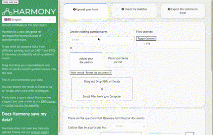
Harmony is for researchers in fields such as Psychology who want to compare scales on questionnaires such as GAD-7 when the questionnaires may be different, or even in different languages. Harmony is useful for longitudinal studies or studies across countries. This project was funded by Wellcome. The project supports English and Portuguese text and uses Transformer neural networks to compare text for similar semantic content.
There are similar dashboards as part of the same project (linked at the bottom of this dashboard) which load dynamic data as it enters via BigQuery.
All of these dashboards have a very innovative approach to multilingual text, where the Google Translate API is used to translate not just the user interface but also the data… into 133 languages! Some of the translation is done in advance and cached, while the dataframe content is translated on the fly. It was particularly challenging to get the wordcloud to render in different scripts, and in the end we used the Noto font family which covers all scripts.
The user can explore data by drilling down into categories or locations. Data has been classified using a variety of language-independent NLU algorithms such as Microsoft Azure Cognitive Services.
app title (under to 35 characters if possible)
BinDiscover
app description (under to 105 characters if possible)
Obtain a global perspective of metabolomics data by comparing >150,000 samples processed by the West Coast Metabolomics Center.
app title (under to 35 characters if possible)
Football Player Contribution Predictor
app description (under to 105 characters if possible)
Predict football matches using the user’s lineup. The model is trained 200k+ historical matches played by more than 100k players using a proprietary algorithm.
It is a dashboard I had created for demo purposes; so that I could display the possible look feel and structure of dashboards and different charts which can be used for displaying data analytics dashboards. It works as an icebreaker while gathering requirements for the new dashboard.
app description (under 105 characters if possible)
It is a demo dashboard for monitoring the performance of a wholesale trader. It is created to demo various charts which could be used in a dashboard for data visualisation. For details about this dashboard refer to dataRabbit
public GitHub repo with the app’s code (not mandatory but highly encouraged)
Not created, if anyone is interested in finding out; I would like to create a new repository and share it with them.
Being from an operations management background, monitoring performance was always a priority task in my portfolio. In this blog post Just tried to collate different representation styles I had often come across for measuring and monitoring performance. At the bottom of the blog, there is a voting app with a simple pie chart dashboard for displaying voter percentage distribution for the first three choices.
• live link to the app https://datarabbit.in/blog/blog/TargetVsAchievements
• app author’s name with a link to their LinkedIn profile (or any other resume platform)
Author Name: Ashwaghosh Wankhade
Linkedin: https://www.linkedin.com/in/ashwaghoshwankhade/
• app title (under 35 characters if possible)
Target Vs Achievement
• app description (under 105 characters if possible)
It is a blog which discusses possible alternatives which could be used to display Target assigned Vs Target Achieved. In this blog post, all charts are interactive dash apps with all default options. At the end of a blog, there is an option to post a vote for your favourite representation type.
• public GitHub repo with the app’s code (not mandatory but highly encouraged)
Not created, if anyone is interested in finding out; I would like to create a new repository and share it with them.
live link to the app:CAS OpenData Name: Xin Yu LInkedIN: https://www.linkedin.com/in/xinyu2/ App title: COVID-19 Antibody Therapeutics Tracker Description: As the COVID-19 pandemic is the global healthcare crisis, scientists worldwide are collaborating to prevent or treat COVID-19. Antibody therapeutics hold enormous promise for treatment of COVID-19. Chinese Antibody Society is collaborating with our partner The Antibody Society to track the antibody-based therapeutics targeting COVID-19, to contribute our expertise to the globally joint efforts against the pandemic. In connection with the collaboration, The Antibody Society has published a “Coronavirus in the Crosshairs” series of articles addressing different aspects of therapeutics against COVID-19, and is continuous publishing new information and analysis. Publication in peer-reviewed journal: COVID-19 antibody therapeutics tracker: a global online database of antibody therapeutics for the prevention and treatment of COVID-19 - PubMed