join the Figure Friday session on May 9, at noon Eastern Time, to showcase your creation and receive feedback from the community.
What percentage of the OECD countries have access to green space? What percentage of the OECD countries experience job strain?
Answer these and many other questions by using Plotly and Dash on the OECD dataset.
Things to consider:
- what can you improve in the app or sample figure below (dumbbell charts)?
- would you like to tell a different data story using a different graph?
- can you create a different Dash app?
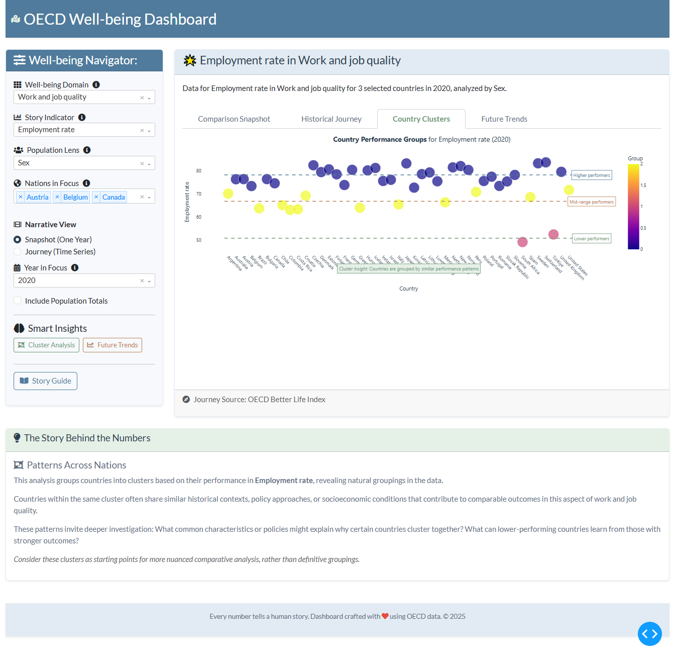
Sample figure:

Code for sample figure:
import plotly.express as px
import pandas as pd
import plotly.graph_objects as go
from dash import Dash, dcc
import dash_ag_grid as dag

# Download CSV sheet at: https://drive.google.com/file/d/1CXxOQA2uBso64VEyvQ3L76AZLxyUlQDB/view?usp=sharing
df = pd.read_csv("OECD-wellbeing.csv")

# Group the dataset
df_grouped = df.groupby(['Measure', 'Education', 'Country', 'Year'])['OBS_VALUE'].sum()
df_grouped = df_grouped.reset_index()

# focus on a specific measure, year, and education level
df_grouped = df_grouped[df_grouped['Measure'] == 'Feeling lonely']
df_grouped = df_grouped[df_grouped['Year'] == 2022]
df_grouped = df_grouped[df_grouped['Education'].isin(['Primary education', 'Secondary education'])]

# Pivot the table to get Primary and Secondary values side-by-side
df_pivot = df_grouped.pivot(index='Country', columns='Education', values='OBS_VALUE').reset_index()

df_pivot.columns.name = None # Remove the name of the index colum

df_pivot = df_pivot.rename(columns={
    'Primary education': 'Primary',
    'Secondary education': 'Secondary'
})


# Sort countries
df_pivot = df_pivot.sort_values(by='Secondary', ascending=True)

# Get the sorted list of countries for the y-axis
countries_sorted = df_pivot['Country'].tolist()

# Prepare Data for Plotly Traces
line_x = []
line_y = []
primary_vals = []
secondary_vals = []

for country in countries_sorted:
    row = df_pivot[df_pivot['Country'] == country]
    primary_val = row['Primary'].iloc[0]
    secondary_val = row['Secondary'].iloc[0]

    primary_vals.append(primary_val)
    secondary_vals.append(secondary_val)

    # For the connecting line segment
    line_x.extend([primary_val, secondary_val, None]) # Add None to break the line
    line_y.extend([country, country, None])


fig = go.Figure()
fig.add_trace(go.Scatter(
    x=line_x,
    y=line_y,
    mode='lines',
    showlegend=False,
    line=dict(color='grey', width=1),
))

# Add markers for Primary Education
fig.add_trace(go.Scatter(
    x=primary_vals,
    y=countries_sorted,
    mode='markers',
    name='Primary Education', # Legend entry
    marker=dict(color='skyblue', size=10),
    hovertemplate =
        '<b>%{y}</b><br>' +
        'Primary Education: %{x:.2f}%' +
        '<extra></extra>'
))

# Add markers for Secondary Education
fig.add_trace(go.Scatter(
    x=secondary_vals,
    y=countries_sorted,
    mode='markers',
    name='Secondary Education', # Legend entry
    marker=dict(color='royalblue', size=10),
    hovertemplate =
        '<b>%{y}</b><br>' +
        'Secondary Education: %{x:.2f}%' +
        '<extra></extra>'
))

fig.update_layout(
    title=dict(text="Feeling Lonely by Education Level (2022)", x=0.5),
    xaxis_title="Percentage Feeling Lonely (%)",
    yaxis_title="Country",
    height=900,
    yaxis=dict(tickmode='array', tickvals=countries_sorted, ticktext=countries_sorted), # Ensure all country labels are shown
    legend_title_text='Education Level',
    legend=dict(
        orientation="h", # Horizontal legend
        yanchor="bottom",
        y=1.02, # Position above plot
        xanchor="right",
        x=1
    ),
    margin=dict(l=100) # Add left margin for country names
)


grid = dag.AgGrid(
    rowData=df.to_dict("records"),
    columnDefs=[{"field": i, 'filter': True, 'sortable': True} for i in df.columns],
    dashGridOptions={"pagination": True},
    columnSize="sizeToFit"
)

app = Dash()
app.layout = [
    grid,
    dcc.Graph(figure=fig)
]


if __name__ == "__main__":
    app.run(debug=False)
Participation Instructions:
- Create - use the weekly data set to build your own Plotly visualization or Dash app. Or, enhance the sample figure provided in this post, using Plotly or Dash.
- Submit - post your creation to LinkedIn or Twitter with the hashtags
#FigureFridayand#plotlyby midnight Thursday, your time zone. Please also submit your visualization as a new post in this thread. - Celebrate - join the Figure Friday sessions to showcase your creation and receive feedback from the community.
![]() If you prefer to collaborate with others on Discord, join the Plotly Discord channel.
If you prefer to collaborate with others on Discord, join the Plotly Discord channel.
Data Source:
Thank you to OECD Data Explorer for the data.