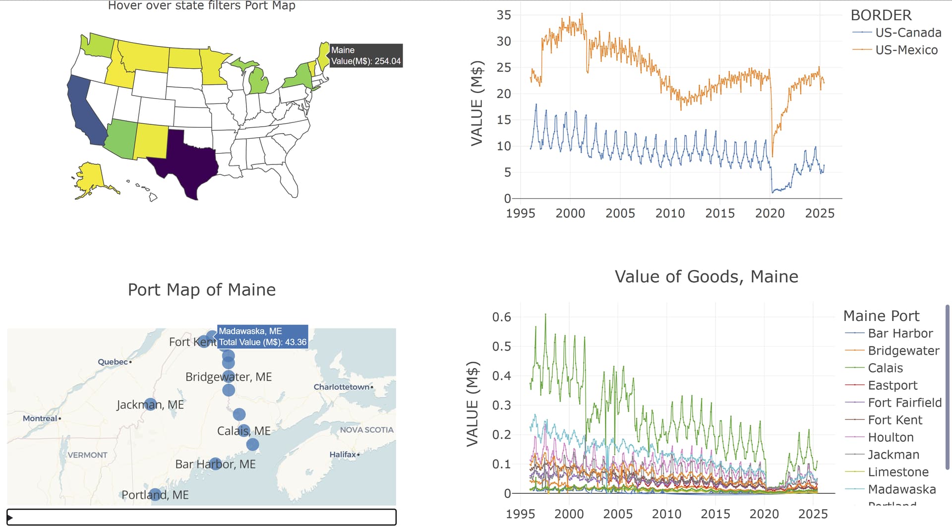
Update: Initially I misunderstood VALUE as a monetary amount when it is really the number of entries into the US. I have updated axis labels, title, and hover info – no change to the graphs.
This dashboard looks at entries into United States over land borders with Canada and Mexico.
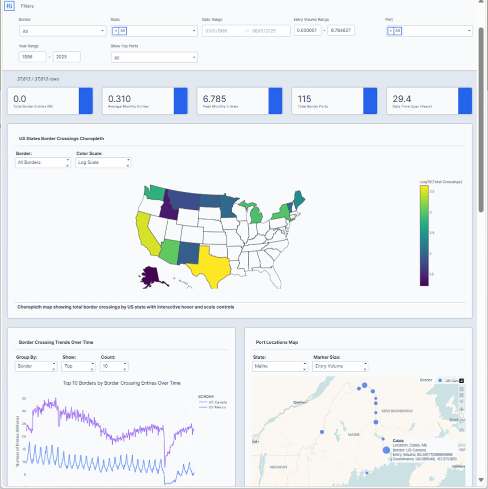
You can explore my dashboard on Plotly Cloud, here is the link:
Two take aways for me:
- The onset of Covid-19 in March 2020 had profound effect on the number of entries across all land borders
- The often cold & snowy northern border with Canada has much greater seasonal variation than the southern border with Mexico.
Regarding this dataset:
- No data for New Hampshire, a state with only 1 border crossing, not sure why.
- Maine has ports at Portland (100+ miles from Canada) and Bar Harbor (60+ miles from Canada). I left them in but don’t know why these are in the dataset.
- California ports at Calexico and East Calexico have the same GPS coordinates. I merged them into just Calexico.
- I ignored Measure, which describes the means of transport.
Upper left graph is a choropleth showing all states with border traffic. Hover on any active state sets up a bottom-left map libre scatter_map of the selected states port locations. The bottom-right shows a px.line chart of entry counts by month for the selected state’s ports.
Upper right graph is controlled by the pull-down menu, where 1 of 4 group by parameters (Border, State, top 10 or bottom 10) is selected.
Here is the code:
import polars as pl
pl.Config().set_tbl_cols(10)
import polars.selectors as cs
import plotly.express as px
import dash_ag_grid as dag
import dash
from dash import Dash, dcc, html, Input, Output
import dash_mantine_components as dmc
import dash_bootstrap_components as dbc
import os
dash._dash_renderer._set_react_version('18.2.0')
# ---- NOTES ABOUT THIS DATASET ------------------------------------------------
# California ports Calexico and Calexico East are at the same location. I merged
#     these to be noted as Calexico
# Maine ports Portland and Bar Harbor are not at or near the Canadien Border
# Seasonal variation is much greater with Canada than with Mexico
# Effect of Covid pandemic is very easy to see in these graphs.
#----- GLOBALS -----------------------------------------------------------------
style_horizontal_thick_line = {'border': 'none', 'height': '4px',
    'background': 'linear-gradient(to right, #007bff, #ff7b00)',
    'margin': '10px,', 'fontsize': 32}

style_horizontal_thin_line = {'border': 'none', 'height': '2px',
    'background': 'linear-gradient(to right, #007bff, #ff7b00)',
    'margin': '10px,', 'fontsize': 12}

style_h2 = {'text-align': 'center', 'font-size': '40px',
            'fontFamily': 'Arial','font-weight': 'bold'}
style_h3 = {'text-align': 'center', 'font-size': '24px',
            'fontFamily': 'Arial','font-weight': 'normal'}

parquet_data_source = 'Border_Crossing_Entry_Data.parquet'
csv_data_source = 'Border_Crossing_Entry_Data.csv'
date_fmt ='%b-%y'
fig_template = 'presentation'

#----- Make dataframe with STATE name and abbreviation -------------------------
state_list = [
    'Alaska',  'Arizona', 'California', 'Idaho', 'Maine', 'Michigan',
    'Minnesota', 'Montana', 'New Mexico', 'New York', 'North Dakota', 'Texas',
    'Vermont', 'Washington'
    ]
state_abbr_list = [
    'AK', 'AZ', 'CA', 'ID', 'ME', 'MI',
    'MN', 'MT', 'NM', 'NY', 'ND', 'TX',
    'VT', 'WA'
]
df_states = pl.DataFrame({  # will be  joined to add state abbreviations
    'STATE' :state_list,
    'STATE_ABBR' : state_abbr_list
})

zoom_level = {   # zoom level gives best view of all ports
    'Alaska'       : 3,
    'Arizona'      : 6,
    'California'   : 7,
    'Idaho'        : 9, # large state, where ports close to each other
    'Maine'        : 5,
    'Michigan'     : 4,
    'Minnesota'    : 5,
    'Montana'      : 5,
    'New Mexico'   : 8,
    'New York'     : 5,
    'North Dakota' : 6,
    'Texas'        : 4, # large state, where ports spread out
    'Vermont'      : 7,
    'Washington'   : 5
}

#----- GATHER AND CLEAN DATA ---------------------------------------------------
if os.path.exists(parquet_data_source): # use pre-cleaned parquet if exists
    print(f'Reading data from {parquet_data_source}')
    df = (
        pl.scan_parquet(parquet_data_source)
        .with_columns(pl.col('LAT', 'LON').cast(pl.Float64))
        .collect()
    )
else:  # read data from csv and clean, and save to parquet
    print(f'Reading data from {csv_data_source}')
    df = (
        pl.scan_csv(csv_data_source,try_parse_dates=True)
        .rename(lambda c: c.upper()) # col names to upper case
        .select(
            PORT = pl.col('PORT NAME').str.replace('Calexico East', 'Calexico'),
            STATE = pl.col('STATE'),
            BORDER = pl.col('BORDER')
                .str.replace(' Border', ''),
            DATE = pl.col('DATE').str.to_date(format=date_fmt),
            ENTRY_NUM = (pl.col('VALUE').cast(pl.Float64)* 1e-6),
            POINT = pl.col('POINT')   # get rid or parens and word POINT
                .str.replace_all('POINT ', '')
                .str.strip_chars('(')
                .str.strip_chars(')')
        )
        .filter(pl.col('ENTRY_NUM') > 0.0)
        .with_columns(  # LONG and LAT from POINT column have better resolution
            LON = pl.col('POINT').str.split(' ').list.first().cast(pl.Float64),
            LAT = pl.col('POINT').str.split(' ').list.last().cast(pl.Float64),
        )
        .drop('POINT')
        .drop_nulls(subset='STATE')
        .collect()
        .join(df_states, on='STATE', how='left')
        .with_columns(
            PORT_STATE = pl.col('PORT') +
                pl.lit(', ') +
                pl.col('STATE_ABBR')
        )
        .group_by(
            'BORDER', 'STATE', 'STATE_ABBR', 'PORT', 'PORT_STATE',
            'DATE', 'LAT', 'LON',
            )
        .agg(pl.col('ENTRY_NUM').sum())
        .sort(['BORDER', 'STATE','PORT', 'DATE'])
    )
    # define enum types, and apply to dataframe columns
    port_list = df.get_column('PORT').unique().sort()
    port_enum = pl.Enum(port_list)
    port_state_list = df.get_column('PORT_STATE').unique().sort()
    port_state_enum = pl.Enum(port_state_list)
    state_enum = pl.Enum(state_list)
    state_abbr_enum = pl.Enum(state_abbr_list)
    border_enum = pl.Enum(['US-Canada', 'US-Mexico'])
    df = (
        df
        .lazy()
        .with_columns(
            STATE=pl.col('STATE').cast(state_enum),
            STATE_ABBR=pl.col('STATE_ABBR').cast(state_abbr_enum),
            PORT=pl.col('PORT').cast(port_enum),
            PORT_STATE=pl.col('PORT_STATE').cast(port_state_enum),
            BORDER = pl.col('BORDER').cast(border_enum)
        )
        .collect()
    )
    df.write_parquet(parquet_data_source)

# #----- DASH COMPONENTS -------------------------------------------------------
dmc_select_group_by = (
    dmc.Select(
        label='Group By',
        placeholder='Select one',
        id='group-by',
        data=['BORDER', 'STATE', 'PORT (TOP 10)', 'PORT (BOTTOM 10)'],
        value='BORDER',
        size='sm',
    ),
)

fig_choro = px.choropleth(
    df.group_by('STATE', 'STATE_ABBR').agg(pl.col('ENTRY_NUM').sum()),
    locations='STATE_ABBR',
    locationmode='USA-states',
    scope='usa',
    color='ENTRY_NUM',
    template=fig_template,
    color_continuous_scale='Viridis_r',
    title=(
        'Total Number of Entries<br>' +
        '<sup>Hover over state filters Port Map</sup>'
    ),
    custom_data=['STATE', 'ENTRY_NUM',],
)
fig_choro.update_traces(
    hovertemplate =
        '%{customdata[0]}<br>' +
        '%{customdata[1]:,.2f} Million<br>' +
        '<extra></extra>'
)
fig_choro.update(layout_coloraxis_showscale=False)

# #----- FUNCTIONS ---------------------------------------------------------------
def get_port_map(selected_state):
    ''' returns scatter_map of selected state with ports '''
    df_state = (
        df
        .filter(pl.col('STATE') == selected_state)
        .group_by('STATE', 'STATE_ABBR', 'PORT', 'PORT_STATE', 'LAT', 'LON')
        .agg(pl.col('ENTRY_NUM').sum())
        .sort('PORT')
    )
    # Calculate bounding box
    min_lat, max_lat = df_state['LAT'].min(), df_state['LAT'].max()
    min_lon, max_lon = df_state['LON'].min(), df_state['LON'].max()
    # Calculate center
    center_lat = (min_lat + max_lat) / 2
    center_lon = (min_lon + max_lon) / 2
    # Create a scatter map
    fig_state_port_map = px.scatter_map(
        df_state,
        lat='LAT', lon='LON',
        text='PORT_STATE',
        center={'lat':center_lat, 'lon':center_lon},
        zoom=zoom_level[selected_state],
        title=(f'Port Map of {selected_state}'),
        map_style='basic',  # Map Libre
        opacity=0.75,
        template=fig_template,
        custom_data=['PORT_STATE', 'ENTRY_NUM',],
    )
    fig_state_port_map.update_traces(
        hovertemplate =
            '%{customdata[0]}<br>' +
            '%{customdata[1]:,.2f} Million<br>' +
            '<extra></extra>'
    )
    fig_state_port_map.update_traces(marker={'size': 20})
    fig_state_port_map.update(layout_coloraxis_showscale=False)
    return fig_state_port_map

def get_line_group_by(group_by):
    ''' returns px.line plot of entry_num by selected group_by '''
    if group_by in ['BORDER', 'STATE']:
        df_group_by = (
            df
            .group_by('DATE', group_by)
            .agg(pl.col('ENTRY_NUM').sum())
            .sort(group_by)
        )
        custom_col = group_by
    else: # by port, top 10 or bottom 10
        custom_col='PORT_STATE'
        if 'TOP' in group_by:
            ten_port_list = (
                df
                .group_by('PORT_STATE')
                .agg(pl.col('ENTRY_NUM'))
                .sort('ENTRY_NUM', descending=True)
                .head(10)
                .get_column('PORT_STATE')
                .to_list()
            )
        if 'BOTTOM' in group_by:
            ten_port_list = (
                df
                .group_by('PORT_STATE')
                .agg(pl.col('ENTRY_NUM'))
                .sort('ENTRY_NUM', descending=True)
                .tail(10)
                .get_column('PORT_STATE')
                .to_list()
            )
        df_group_by = (
            df
            .filter(pl.col('PORT_STATE').is_in(ten_port_list))
            .group_by('DATE', 'PORT_STATE')
            .agg(pl.col('ENTRY_NUM').sum())
            .sort('PORT_STATE', 'DATE')
        )
    color_by = group_by
    sort_by = [group_by, 'DATE']
    if 'PORT' in group_by:
        color_by = 'PORT_STATE'
        sort_by = ['PORT_STATE', 'DATE']
    fig_line_group_by = px.line(
        df_group_by.sort(sort_by),
        x='DATE',
        y='ENTRY_NUM',
        color=color_by,
        template=fig_template,
        markers=True,
        line_shape='spline',
        custom_data=[custom_col, 'DATE', 'ENTRY_NUM',],
    )
    fig_line_group_by.update_traces(
        hovertemplate =
            '%{customdata[0]}<br>' +
            '%{customdata[1]}<br>' +
            '%{customdata[2]:,.2f} Million<br>' +
            '<extra></extra>',
        line={'width': 1}, marker={'size': 2},
    )
    legend_title=group_by
    if 'PORT' in group_by:
        legend_title = 'PORT'
    fig_line_group_by.update_layout(
        title= (
            f'Number of Entries (Millions) by {group_by} <br>' +
            '<sup> Each date represents a full month'
        ),
        xaxis_title='',  # x-axis is for date, label is obvious, keep blank
        yaxis_title='Entry Count (Millions)',
        legend_title_text=f'{legend_title}'
    )
    return fig_line_group_by

def get_state_ports(selected_state):
    ''' returns px.line plot of entries by selected group_by '''
    df_state = (
        df
        .filter(pl.col('STATE') == selected_state)
        .group_by('PORT_STATE','PORT', 'DATE')
        .agg(pl.col('ENTRY_NUM').sum())
        .sort('PORT_STATE', 'DATE')
    )
    fig_state_ports = px.line(
        df_state, x='DATE', y='ENTRY_NUM',
        color='PORT',
        template=fig_template,
        markers=True,
        line_shape='spline',
        custom_data=['PORT_STATE', 'DATE', 'ENTRY_NUM',],
    )
    fig_state_ports.update_traces(
        hovertemplate =
            '%{customdata[0]}<br>' +
            '%{customdata[1]}<br>' +
            '%{customdata[2]:,.2f} Million<br>' +
            '<extra></extra>',
        line={'width': 1},
        marker={'size': 2},
    )
    fig_state_ports.update_traces(line={'width': 1}, marker={'size': 2},)
    fig_state_ports.update_layout(
        title= (
            f'Number of Entries (Millions), {selected_state}<br>' +
            '<sup> Each date represents a full month'
        ),
        xaxis_title='',  # x-axis is for date, label is obvious, keep blank
        yaxis_title='ENTRY_NUM (Millions)',
        legend_title_text=f'{selected_state} Port'
    )
    return fig_state_ports

# #----- DASH APPLICATION STRUCTURE-----------------------------------------------
app = dash.Dash(__name__, external_stylesheets=[dbc.themes.BOOTSTRAP])
server = app.server
app.title = 'US Border Crossings, Number of Entries'

app.layout =  dmc.MantineProvider([
    dmc.Space(h=30),
    html.Hr(style=style_horizontal_thick_line),
    dmc.Text('US Border Crossings, Number of Entries', ta='center', style=style_h2),
    html.Hr(style=style_horizontal_thick_line),
    dmc.Grid(children = [
        dmc.GridCol(dmc.Text(''), span={"base": 8, "lg":7},),  # indent space
        dmc.GridCol(dmc_select_group_by, span={"base": 3, "lg":3}),
    ]),
    dmc.Grid(
        children = [
            dmc.GridCol(dcc.Graph(figure=fig_choro,id='choro'),
                span={"base": 6, "lg":6}
            ),
            dmc.GridCol(dcc.Graph(id='line-group-by'),
                span={"base": 6, "lg":6}
            ),
        ]
    ),
    dmc.Grid(
        children = [
            dmc.GridCol(dcc.Graph(id='port-map'),
                span={"base": 6, "lg":6}
            ),
            dmc.GridCol(dcc.Graph(id='port-data'),
                span={"base": 6, "lg":6}
            ),
        ]
    ),
])

@app.callback(
    Output('port-map', 'figure'),
    Output('line-group-by', 'figure'),
    Output('port-data', 'figure'),
    Input('choro', 'hoverData'),
    Input('group-by', 'value'),
)
def update(selected_state, group_by):
    if selected_state is None:
        selected_state = 'California'
    else:
        selected_state = selected_state['points'][-1]['customdata'][0]
    port_map = get_port_map(selected_state)
    line_group_by = get_line_group_by(group_by)
    port_data_fig = get_state_ports(selected_state)
    return port_map, line_group_by, port_data_fig

if __name__ == '__main__':
    app.run_server(debug=True)
Here is a screenshot: