join the
Figure Friday session on October 3, at noon Eastern Time, to showcase your creation and receive feedback from the community. Update: Sorry I have to cancel this Friday’s session because I’m out of office.
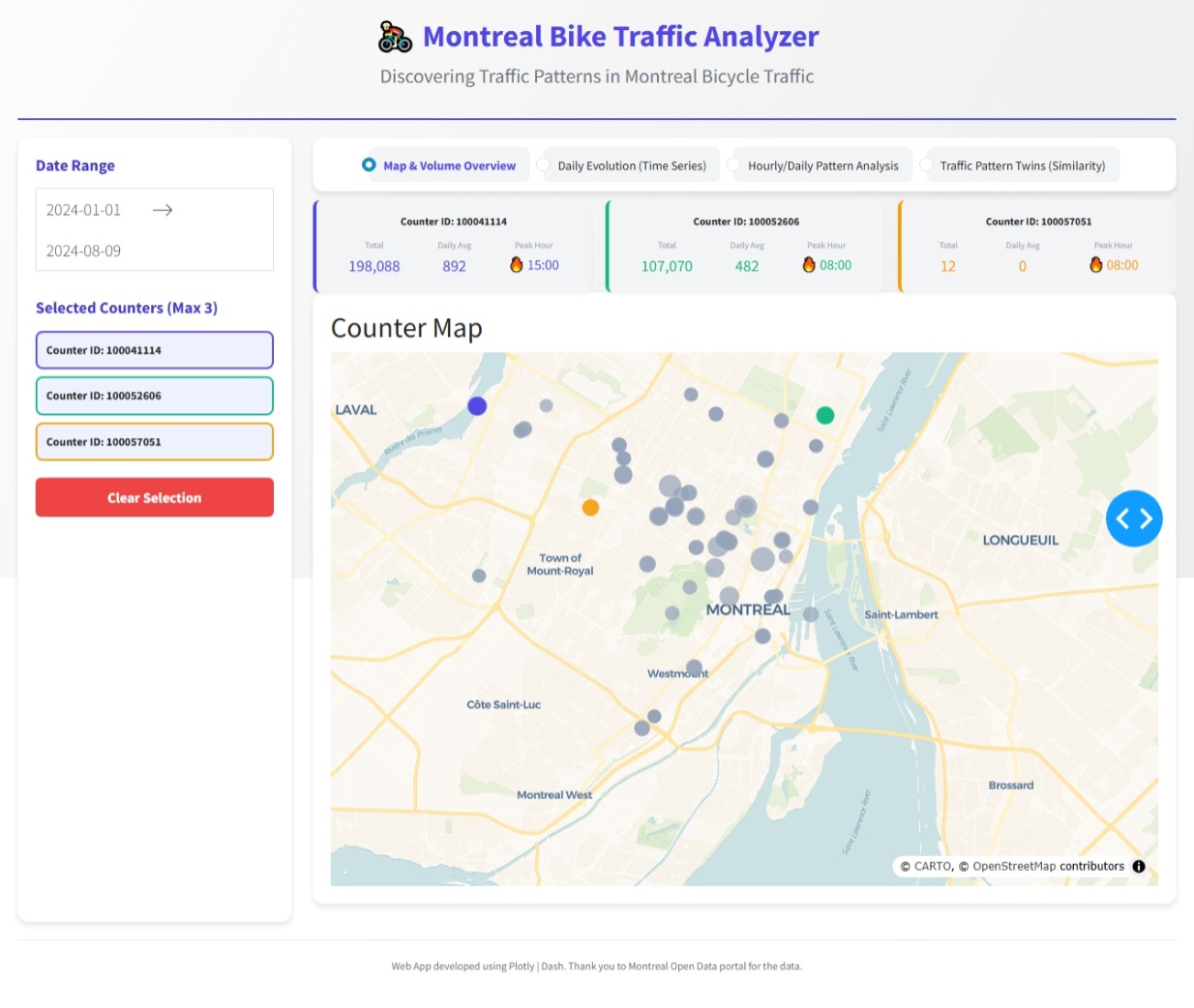
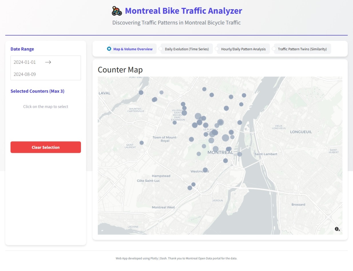
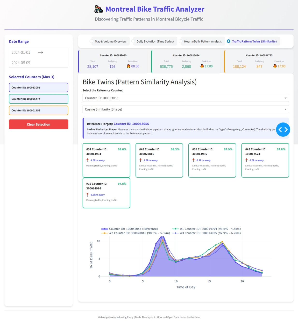
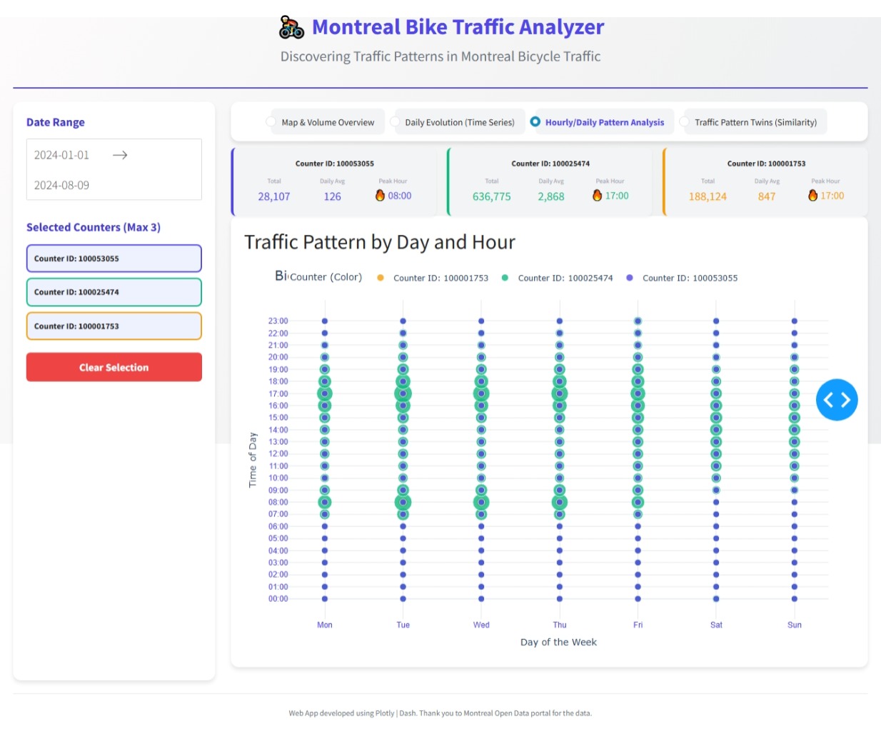
Can you discover any bicycle traffic patterns in Montreal?
Answer this question and a few others by using Plotly on the Montreal bicycle dataset.
Things to consider:
- what can you improve in the app or sample figure below (histogram)?
- would you like to tell a different data story using a Dash app?
- how can you explore the data with Plotly Studio?
Sample figure (smaller dataset for demo purposes):

Code for sample figure:
import plotly.express as px
import pandas as pd

# Download csv sheet from google drive: https://drive.google.com/file/d/1piaVJumZT6pSUiG-Xb5fMa0E6KgQG-iJ/view?usp=sharing
df = pd.read_csv("pistes-cyclables-2024.csv")  # this is a much smaller demo dataset
df_unique_location = df[df['id_compteur']==100053209]
hourly_unique_compteurs = df_unique_location.groupby('heure')['nb_passages'].sum()
hourly_unique_compteurs_df = hourly_unique_compteurs.reset_index()

fig = px.histogram(hourly_unique_compteurs_df, x='heure', y='nb_passages', title='Number of bicycles in location: 100053209')
fig.show()
For community members that would like to build the data app with Plotly Studio, simply go to the downloads page to download Plotly Studio.
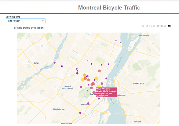
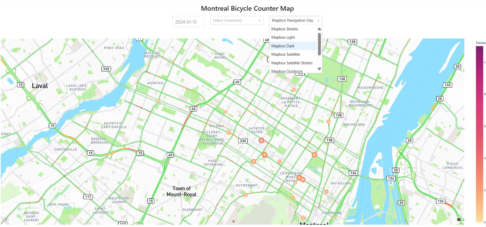
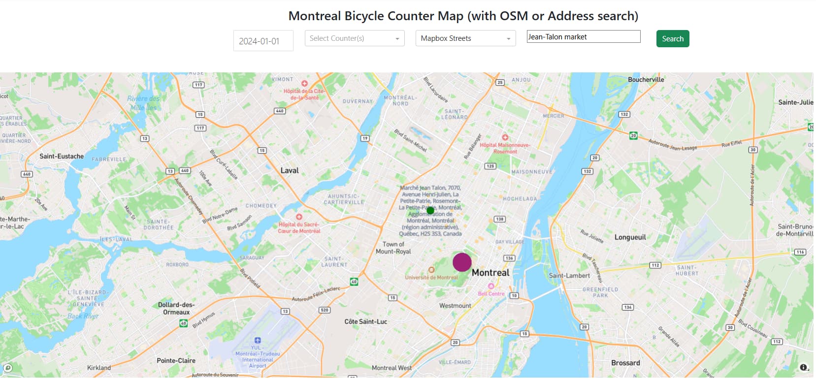
Below is a screenshot of a dropdown with a scatter map by Plotly Studio on top of this dataset:
Map prompt:
Bike counter locations and traffic volume as a scatter map plot with sliders to adjust point size by passage count and dropdown to filter by date range
Dropdown prompt:
Add a dropdown to change the map layer and include the following options
"basic"
"carto-darkmatter"
"carto-darkmatter-nolabels"
"carto-positron"
"carto-positron-nolabels"
"carto-voyager"
"carto-voyager-nolabels"
"dark"
"light"
"open-street-map"
"outdoors"
"satellite"
"satellite-streets"
"streets"

Thank you @liamc for the gif and prompt.
Participation Instructions:
- Create - use the weekly data set to build your own Plotly visualization or Dash app. Or, enhance the sample figure provided in this post, using Plotly or Dash.
- Submit - post your creation to LinkedIn or Twitter with the hashtags
#FigureFridayand#plotlyby midnight Thursday, your time zone. Please also submit your visualization as a new post in this thread. - Celebrate - join the Figure Friday sessions to showcase your creation and receive feedback from the community.
 If you prefer to collaborate with others on Discord, join the Plotly Discord channel.
Data Source:
Thank you to Montreal Open Data portal for the data.