I recently used this dataset on the Montreal Open Data Page with Plotly Studio to explore bicycle traffic data patterns in Montreal. The data set shows the number of bikes passing by specific counters in the city and includes precise locations for the counters.
Using the dataset from 2024, Plotly Studio generated a number of great charts based just on the dataset, including this heatmap that shows hourly traffic patterns, highlighting distinct traffic patterns for weekdays vs the weekend.

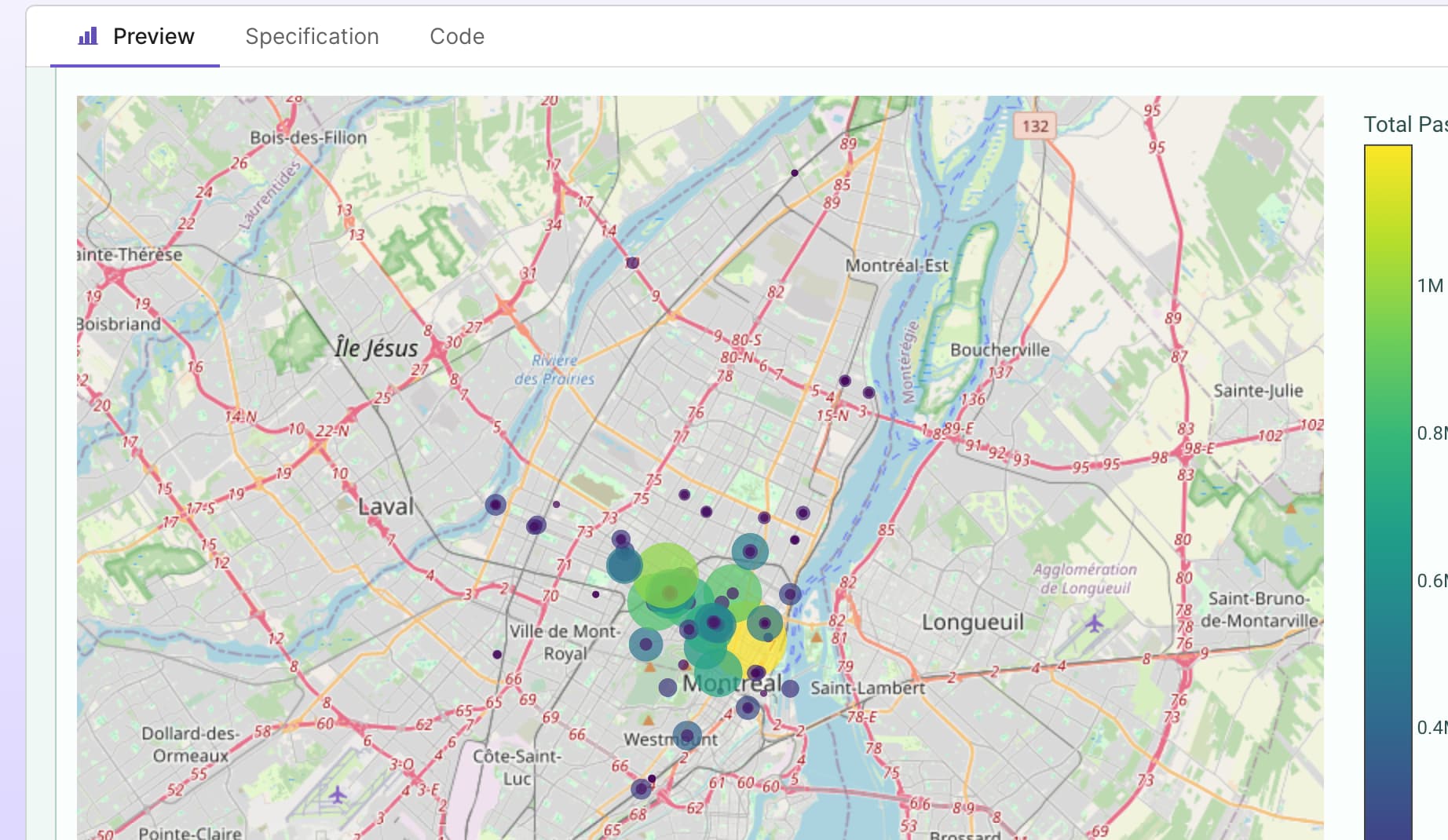
As the dataset has geospatial data, Plotly Studio was able to generate some great maps, like this scatter map view showing all the counters and their values, using the following outline:
Bike counter locations and traffic volume as a scatter map plot with sliders to adjust point size by passage count and dropdown to filter by date range
The generated map is great, but I wanted to try out some of the other map styles available on Plotly maps. I added a dropdown to the generated chart to allow me to see the different map styles available. Here’s the outline I used:
Add a dropdown to change the map layer and include the following options
"basic"
"carto-darkmatter"
"carto-darkmatter-nolabels"
"carto-positron"
"carto-positron-nolabels"
"carto-voyager"
"carto-voyager-nolabels"
"dark"
"light"
"open-street-map"
"outdoors"
"satellite"
"satellite-streets"
"streets"

Having explored the different options, I then created a new chart showing only the map style I wanted to present in the final app:
Bike counter locations and traffic volume as a scatter map plot with sliders to adjust point size by passage count and dropdown to filter by date range
Use the "satellite-streets” map layer
You can see the final app here on Plotly Cloud:
