Starting with the Comptages des véhicules, cyclistes et piétons aux intersections munies de feux de circulation - Site web des données ouvertes de la Ville de Montréal dataset which contains information about traffic flows through Montreal intersections, I wanted to create an interactive plot so I could easily drill down into the data for the intersections that I bike through in my day-to-day.
After running the data through Plotly Studio, I was happy to see that there was already a Scatter map called “Intersection Heatmap” showing all the intersections represented by the data. Its initial prompt was
Traffic intensity by intersection as a scatter plot on map coordinates with sliders to filter by hour range (0-23) and dropdown to select vehicle type and showed me a map that looked like this

To add the ability to hover over an intersection and see a graph of the traffic through it, I modified the prompt to:
two plots that each have 50% width. The first will be Traffic intensity by intersection as a scatter plot on map coordinates with sliders to filter by hour range (0-23) and dropdown to select vehicle type and the second will be traffic volume by time for the intersection that was hovered on. the second chart will show each vehicle type as a separate trace when “all” is selected
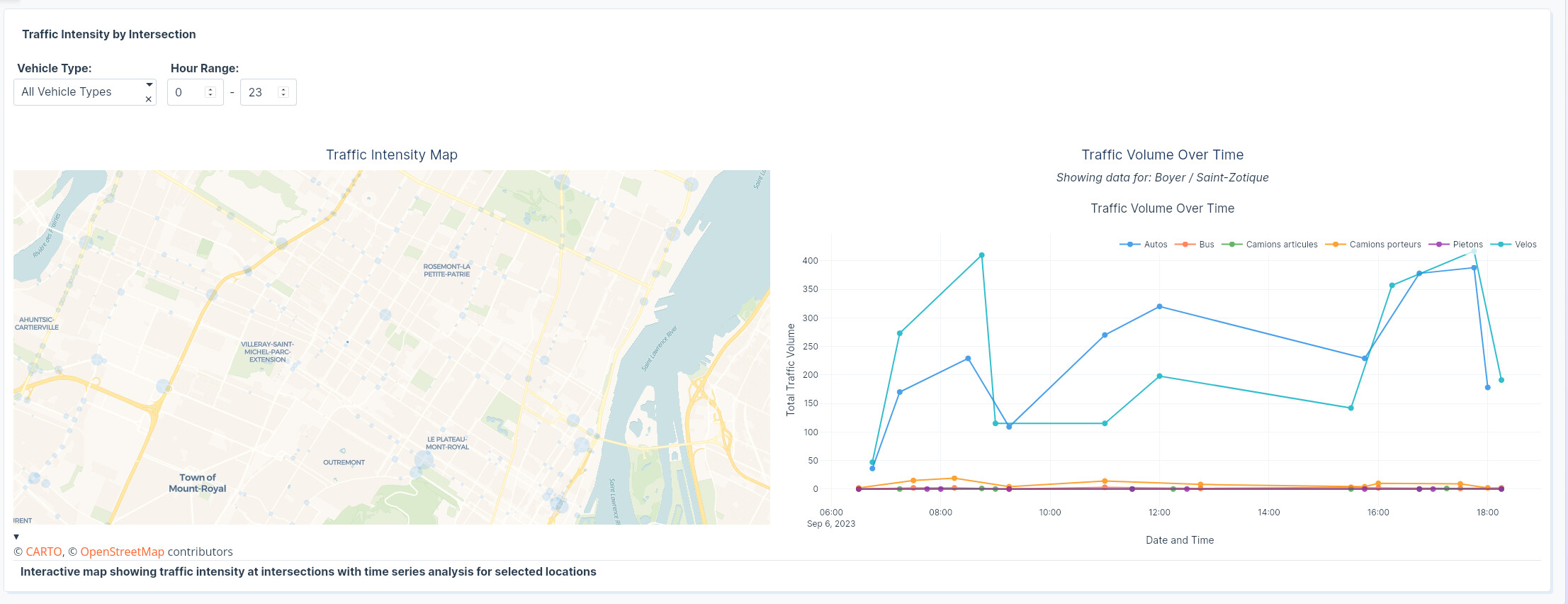
The output created the two charts side by side as I wanted but the callback initially didn’t work. The graph on the right looked like it was loading after hovering over some points but it when it finished it would just show an empty chart. I decided to give it another go with click data rather than hover data in case I was overloading my backend because there too many points too close together in the map and I was triggering an outrageous amount of callbacks.
After swapping hover with click in the prompt and clicking “remix” I got the output I was looking for 
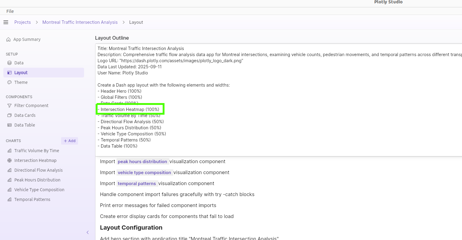
The final step was just to increase the width of this component to 100% in the layout outline since it now contains two plots (Plotly studio makes all the components take up 50% of the screen by default)
The app is deployed to Plotly Cloud if you want to take a look!