Hey everybody - Here are some quick examples showing how you can build cross-filtering and linked views in Plotly Studio.
The key is to outline multiple charts within a single card.
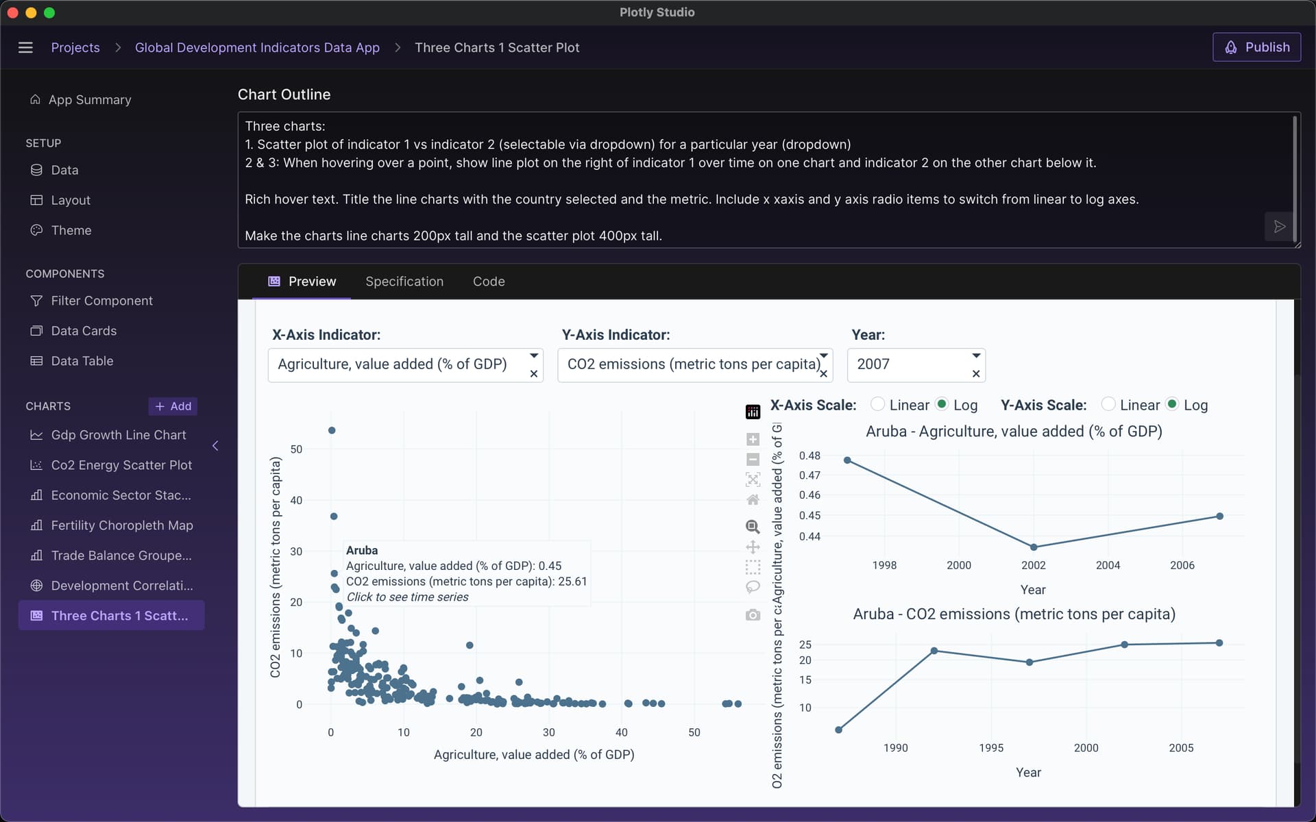
In this example, hovering over the scatter plot on the left updates the line time series plots on the right.
Here’s the prompt I used:
Three charts:
1: Scatter plot of indicator 1 vs indicator 2 (selectable via dropdown) for a particular year (dropdown)
2 and 3: When hovering over a point, show line plot on the right of indicator 1 over time on one chart and indicator 2 on the other chart below it.
Rich hover text. Title the line charts with the country selected and the metric. Include x xaxis and y axis radio items to switch from linear to log axes.
Make the charts line charts 200px tall and the scatter plot 400px tall.
(As an aside - this example is a remake of Dash’s “Interactive Graphing” example I wrote nearly 7 years ago - now entirely created with natural language instead! Incredible stuff.)
Case volume over time as a line chart with date range picker for time period selection and dropdown to group by hour/day/week/month intervals
In a separate callback, show a ag grid table that shows a sample (10 rows) of the cases as I hover over the points of the line plot. When not hovering, show the table for the most recent day in the dataset.
Table styles: Very compact (short row heights), no title, no stripped rows.
@chriddyp
I see that you modified the prompt in the graph module, after the app has been built, as opposed to the original outline in the pre-build stage.
Is this usually what you would recommend we do to create the customized chart or interactivity we desire?
Yup! I recommend iterating on a chart within the app so that you can make many modifications one after the other. The outline is good to just set the initial charts that get generated but then making edits or creating charts 1 at a time is better done once the app is created so that you don’t need to generate the entire app again.
If I have a good idea of what I want to create, I’ll usually create the initial app and look at Plotly Studio’s default suggestions and then delete the charts I don’t care for and start creating new charts from scratch.


 a
a