As some of you might know, Plotly has its headquarters in Montreal, Quebec. Bixi is Montreal’s public bike-sharing system, one of the largest and most successful bike share programs in North America. Launched in 2009, BIXI (a portmanteau of “bicycle” ![]() and “taxi”
and “taxi” ![]() ) operates thousands of bikes across Montreal and surrounding areas, allowing users to rent bikes from one station and return them to any other station in the network.
) operates thousands of bikes across Montreal and surrounding areas, allowing users to rent bikes from one station and return them to any other station in the network.
Luckily, Bixi has uploaded all of their historical trip data to their website for anyone to download.
It was super simple to get started with Plotly Studio! ![]()
![]() . I just dropped the CSV into Studio and fed it this prompt: “Analyzing BIXI bike share usage patterns across Montreal stations, examining seasonal trends, popular routes, and station performance to understand urban mobility patterns.”
. I just dropped the CSV into Studio and fed it this prompt: “Analyzing BIXI bike share usage patterns across Montreal stations, examining seasonal trends, popular routes, and station performance to understand urban mobility patterns.”
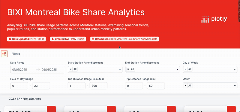
These were the final visualizations in my app
- Station popularity map
- Seasonal usage trends
- Hourly usage heatmap
- Comparison between boroughs
Check out my app here, deployed to Plotly Cloud, and try out Plotly Studio for yourselves!