UPDATE: I made a few changes to improve this dashboard:
- Set the scatter_map opacity to 0.5 - thank you Adam
- Replaced the single do-everything callback with 2 callbacks, so that I don’t regenerate the map when I am hovering on a point which updates the info table on the right
- Modified the cell alignment on the info table, so that both columns align to the top.
- Placed the legend above the plot and using the legend title as the plot title.
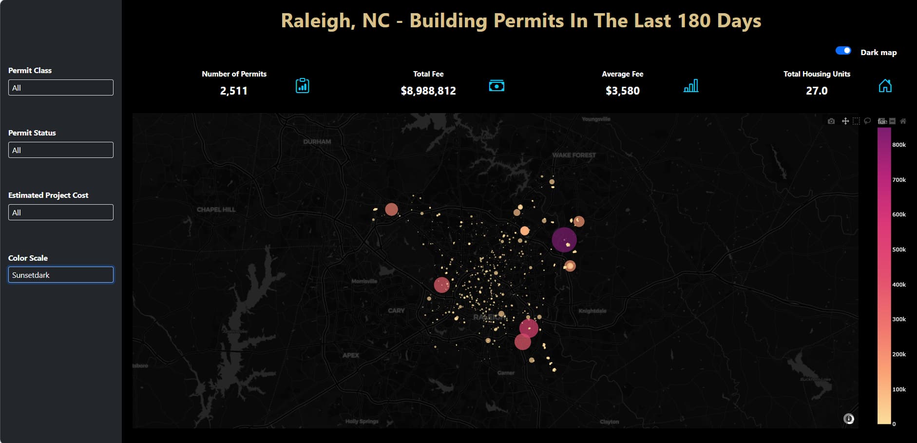
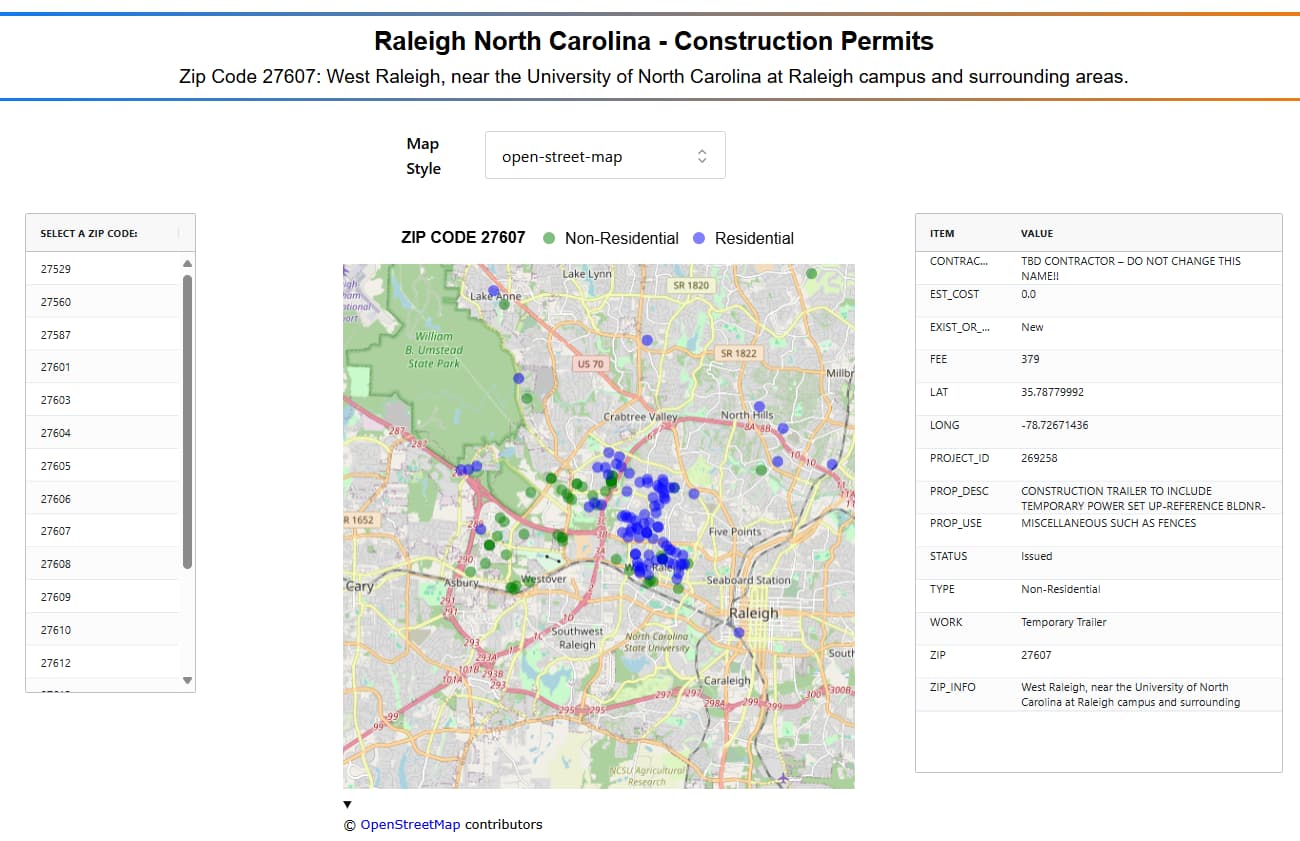
This simple dashboard uses a map libre scatter_map to show the locations of construction projects in Raleigh. Users can pick any supported Map Style with the pull-down menu.
Click on any zip code in the table on the left to filter the data. I prefer this interface over drop-down menus or radio buttons for long selection lists expected to be often invoked. For the map styles, I do not expect users to change these very often, so for those I do prefer the pulldown.
The selected zip code’s description with location info and other notes dynamically appears on the second line of the title and on the information table to the right.
The table on the right shows selected parameters of one project ID, based on the scatter_map hover.
Wishing everyone in Raleigh a great time at the plotly meetup tomorrow. If it is one tenth as much fun as the plotly meeting I attended in San Francisco 2 weeks ago, you are in for a great time.
Here is a screen shot and the code. (both updated)
import polars as pl
import plotly.express as px
import dash
from dash import Dash, dcc, html, Input, Output
import dash_mantine_components as dmc
from dash_ag_grid import AgGrid
dash._dash_renderer._set_react_version('18.2.0')

#----- GATHER AND CLEAN DATA ---------------------------------------------------
df_zip = pl.read_csv('ZIP_INFO.csv') # has descriptions of each zip code

df = (
    pl.scan_csv(
        'Building_Permits_Issued_Past_180_Days.csv',
        ignore_errors=True
    )
    .select(
        PROJECT_ID = pl.col('OBJECTID'),
        WORK = pl.col('workclass'),
        PROP_DESC = pl.col('proposedworkdescription'),
        TYPE = pl.col('permitclassmapped'),   # commercial or residential
        EST_COST = pl.col('estprojectcost'),
        CONTRACTOR = pl.col('contractorcompanyname'),
        FEE = pl.col('fee'),
        LAT = pl.col('latitude_perm'),
        LONG = pl.col('longitude_perm'),
        ZIP = pl.col('originalzip'),
        PROP_USE = pl.col('proposeduse'),
        STATUS = pl.col('statuscurrent'),
        EXIST_OR_NEW = pl.col('workclassmapped'),
    )
    .collect()
    .join(
        df_zip,
        on='ZIP',
        how='left'
    )
)

#----- GLOBALS -----------------------------------------------------------------
style_horiz_line = {'border': 'none', 'height': '4px',
    'background': 'linear-gradient(to right, #007bff, #ff7b00)',
    'margin': '10px,', 'fontsize': 32}

style_h2 = {'text-align': 'center', 'font-size': '32px',
            'fontFamily': 'Arial','font-weight': 'bold'}
style_h3 = {'text-align': 'center', 'font-size': '24px',
            'fontFamily': 'Arial','font-weight': 'normal'}

zip_code_list = sorted(df.unique('ZIP')['ZIP'])

map_styles = ['basic', 'carto-darkmatter', 'carto-darkmatter-nolabels',
    'carto-positron', 'carto-positron-nolabels', 'carto-voyager',
    'carto-voyager-nolabels', 'dark', 'light', 'open-street-map',
    'outdoors', 'satellite', 'satellite-streets', 'streets', 'white-bg'
]
legend_font_size = 20

#----- FUNCTIONS----------------------------------------------------------------

def get_info_table_df(df, selected_id):
    return (
        df
        .filter(pl.col('PROJECT_ID') ==  selected_id)
        .transpose(
            include_header=True, header_name='ITEM'
        )
        .rename({'column_0':'VALUE'})
        .sort('ITEM')
    )

def get_zip_info(zip_code):
    return df_zip.filter(pl.col('ZIP')== zip_code)['ZIP_INFO'].item()

def get_zip_table():
    df_zip_codes =pl.DataFrame({
        'SELECT A ZIP CODE:' : zip_code_list
    })
    row_data = df_zip_codes.to_dicts()
    column_defs = [{"headerName": col, "field": col} for col in df_zip_codes.columns]
    return (
        AgGrid(
            id='zip_code_table',
            rowData=row_data,
            columnDefs=column_defs,
            defaultColDef={"filter": True},
            columnSize="sizeToFit",
            getRowId='params.data.State',
            # HEIGHT IS SET TO HIGH VALUE TO SHOW MORE ROWS
            style={'height': '600px', 'width': '150%'},
        )
    )
def get_info_table(id=271601):
    select_cols = [
        'PROJECT_ID',  'PROP_DESC',  'PROP_USE', 'WORK', 'TYPE', 'CONTRACTOR',
        'EST_COST', 'FEE', 'LAT', 'LONG',  'STATUS', 'EXIST_OR_NEW', 'ZIP',
        'ZIP_INFO'
    ]
    df_info = (
        df
        .select(select_cols)
        .filter(pl.col('PROJECT_ID') ==  id)
        .transpose(
            include_header=True, header_name='ITEM',
        )
        .rename({'column_0':'VALUE'})
    )

    # set specific column width, 1st col narrow, 2nd column wide
    column_defs = [
        {
            'field': 'ITEM',
            'headerName': 'ITEM',
            'width': 100,
            'wrapText': True,
            'cellStyle': {
                'wordBreak': 'normal',  # ensures wrapping at word boundaries
                'lineHeight': 'unset',   # optional: removes extra spacing
            }
        },
        {
            'field': 'VALUE',
            'headerName': 'VALUE',
            'width': 300,
            'wrapText': True,
            'cellStyle': {
                'wordBreak': 'normal',  # ensures wrapping at word boundaries
                'lineHeight': 'unset',   # optional: removes extra spacing
            }
        },
    ]
    return (
        AgGrid(
            id='info_table',
            rowData=df_info.to_dicts(),
            columnDefs=column_defs,
            defaultColDef={'sortable': False, 'filter': False, 'resizable': False},
            columnSize="sizeToFit",
            style={'height': '700px'},
        )
    )

def get_px_scatter_map(zip_code, this_map_style):
    ''' returns plotly map_libre, type streets, magenta_r sequential  '''
    color_dict = {
            'Non-Residential'    : 'green',
            'Residential'       : 'blue'
    }
    df_map = ( # set COLOR TYPE, and filter by residential or non-residential
        df
        .filter(pl.col('ZIP') == zip_code)
    )

    fig = px.scatter_map(
        df_map,
        opacity=0.5,
        lat='LAT',
        lon='LONG',
        color='TYPE',
        color_discrete_map= color_dict,
        color_continuous_scale='Magenta_r',
        zoom=10,
        map_style=this_map_style,
        custom_data=[
            'PROJECT_ID',                 #  customdata[0]
            'ZIP',                #  customdata[1]
            'TYPE',               #  customdata[2]
            'EXIST_OR_NEW',       #  customdata[3]
        ],
        height=800, width =800
    )
    #----- APPLY HOVER TEMPLATE ------------------------------------------------
    fig.update_traces(
        hovertemplate =
            '<b>PROJECT_ID:</b> %{customdata[0]}<br>' +
            '<b>ZIP:</b> %{customdata[1]}<br>' +
            '<b>TYPE:</b> %{customdata[2]},<br>%{customdata[3]}<br>' +
            '<extra></extra>',
        marker=dict(size=15)
    )
    fig.update_layout(
        hoverlabel=dict(
            bgcolor="white",
            font_size=16,
            font_family='courier',
        ),
        legend=dict(
            orientation='h',
            yanchor='bottom',
            y=1.02,
            xanchor='center',
            x=0.5,
            font=dict(family='Arial', size=legend_font_size, color='black'),
            title=dict(
                text=f'<b>ZIP CODE {zip_code}</b>',
                font=dict(family='Arial', size=legend_font_size, color='black'),
            )
        )
    )
    return fig

#----- DASHBOARD COMPONENTS ----------------------------------------------------
dmc_select_map_type = (
    dmc.Select(
        label='Map Style',
        placeholder="Select one",
        id='id_map_style',    # default value
        value='open-street-map',
        data=[{'value' :i, 'label':i} for i in map_styles],
        maxDropdownHeight=600,
        w=400,
        mb=10,
        size='xl',
        style={'display': 'flex', 'alignItems': 'left', 'gap': '10px'},
    ),
)


#----- DASH APPLICATION STRUCTURE-----------------------------------------------
app = Dash()
app.layout =  dmc.MantineProvider([
    dmc.Space(h=30),
    html.Hr(style=style_horiz_line),
    dmc.Text('Raleigh North Carolina - Construction Permits', ta='center', style=style_h2),
    dmc.Text('', ta='center', style=style_h3, id='zip_code'),
    html.Hr(style=style_horiz_line),
    dmc.Space(h=30),
    dmc.Grid(
        children = [
            dmc.GridCol(dmc_select_map_type, span=4, offset = 4),
        ]
    ),
    dmc.Space(h=30),
    dmc.Grid(
        children = [
            dmc.GridCol(get_zip_table(), span=1, offset=1),
            dmc.GridCol(dcc.Graph(id='px_scatter_map'), span=4, offset=1),
            dmc.GridCol(get_info_table(), span=3, offset=1)
        ]
    ),
])

# callback #1 update scatter_map, filtered with selected zip code
@app.callback(
    Output('px_scatter_map', 'figure'),
    Output('zip_code', 'children'),
    Input('zip_code_table', 'cellClicked'),
    Input('id_map_style', 'value'),
)
def update_map(zip_code, map_style):
    zip = zip_code_list[0]  # default
    if zip_code is not None: # replace default if zip_code has data
        zip = zip_code['value']
    px_scatter_map = get_px_scatter_map(zip, map_style)
    return px_scatter_map, f'Zip Code {zip}: {get_zip_info(zip)}'

# callback #2 update info table using hover data
@app.callback(
    Output('info_table', 'rowData'),
    Input('px_scatter_map', 'hoverData'),
)
def update_info_table(hover_data):
    selected_id = df.sort('PROJECT_ID').item(0,'PROJECT_ID') # default
    if hover_data is not None:  # replace default if hover_data has data
        selected_id = hover_data['points'][0]['customdata'][0]
    info_table_df = get_info_table_df(df, selected_id)
    return info_table_df.to_dicts()

if __name__ == '__main__':
    app.run(debug=True)
This is from a csv file I made with the zip_code descriptions. These are joined with the main data during the data loading and cleaning steps.
| ZIP |
ZIP_INFO |
| 27529 |
A small part of Clayton, which is just outside of Raleigh to the southeast. |
| 27560 |
Morrisville, located to the west of Raleigh near the Research Triangle Park (RTP). |
| 27587 |
Wake Forest, a town just north of Raleigh. |
| 27601 |
Downtown Raleigh, the heart of the city with government buildings and local businesses. |
| 27603 |
Southeastern Raleigh, including areas near downtown and the State Fairgrounds. |
| 27604 |
North Raleigh, near the Five Points area. |
| 27605 |
Central Raleigh, surrounding the Glenwood South area. |
| 27606 |
South Raleigh, including areas near North Carolina State University (NCSU). |
| 27607 |
West Raleigh, near the University of North Carolina at Raleigh campus and surrounding areas. |
| 27608 |
Central Raleigh, close to the Cameron Village area and older historic neighborhoods. |
| 27609 |
Central Raleigh, near the North Carolina State University campus and the Crabtree Valley Mall area. |
| 27610 |
East Raleigh, including areas near the Raleigh Convention Center and historic neighborhoods. |
| 27612 |
Western Raleigh, including parts of the North Hills area. |
| 27613 |
Western Raleigh, near the Brier Creek area. |
| 27614 |
Northern Raleigh, including parts of the Leesville Road and Wakefield area. |
| 27615 |
North Raleigh, a more suburban area with neighborhoods like Bedford and Wakefield. |
| 27616 |
Northeastern Raleigh, including suburban areas and the neighborhood of Capital Boulevard. |
| 27617 |
Northern Raleigh, around the Brier Creek area and surrounding suburban communities. |