@Mike_Purtell
Good thinking with the table on the right. I like it.
Regarding the map, I like the approach of Plotly residential vs. non-residential.
I wonder if there are non-residential permit requests (green) in the city center, under the blue residential ones? It might be worth adding opacity to the markers to see possible overlap.
@adamschroeder you are spot on with the opacity suggestion, which I did not use but will make an update. Not sure if anyone noticed that the data grouped by zip codes is not always as clustered as I would expect. The dataset refers to original zip code, I am not sure what that means. Thank you.
One other improvement I want to make pertains to the scatter_map hover as callback Input, and full scatter_map redraw as a callback Output. When I zoom in on a neighborhood and hover over a point, the table on the right is updated from the hover info (good), but the map resets to unzoomed (not good). This is nice challenge for me to learn more advanced callbacks to manage this case.
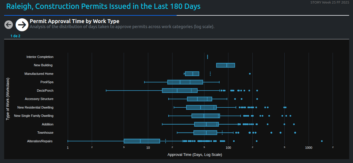
Hi, these charts first analyze the average approval time for permits based on the type of work. Then, using natural language processing (NLP), the project descriptions are examined to see if clearer or more detailed information helps reduce approval time. While some patterns emerge, other administrative factors also play a role in the process.
such a unique way to visualize the data, @U-Danny .
What is the bottom left corner of the grid telling us? I see that almost all the Fast approvals are in that area.
I made changes to my app: I added a hover effect to the KPI cards, changed the title because it wasn’t accurate, and added a dropdown for the colorscale options.