Hello FF Community, my proposal for this Week 32
Is an interactive web application that lets us explore US border crossing data. My idea is try to find hidden patterns and trends with just a few clicks.
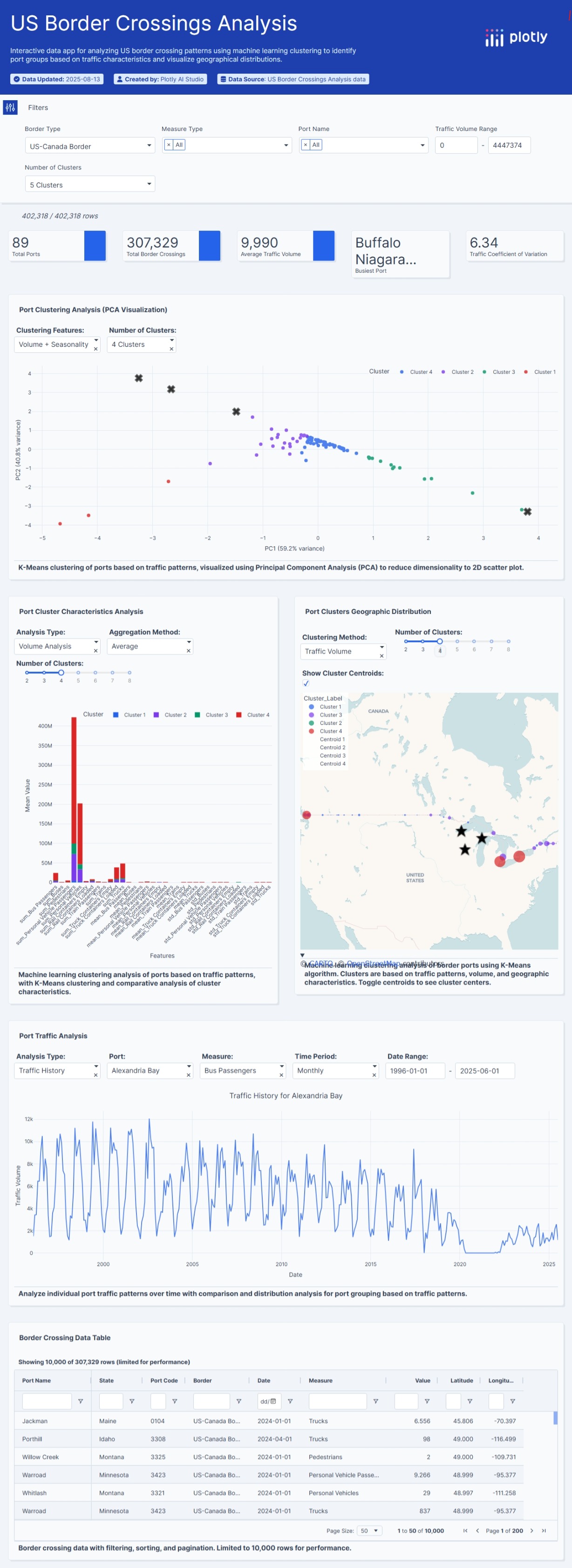
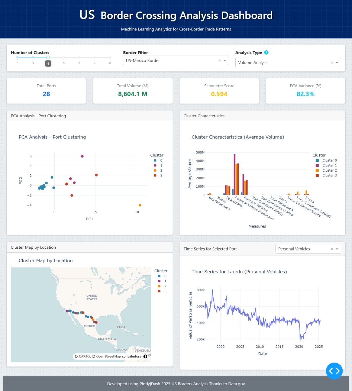
Here a brief description
Controls and Filters
- Dropdown Menus: At the top, you’ll find menus to select the measure you want to analyze (for example, the number of trucks or people) and the type of analysis (traffic volume, growth, or seasonality).
- Summary Cards: Just below that, you’ll see cards that give a quick summary of the results, like the clustering quality score (Silhouette Score), the number of clusters found, and the total of the selected measure.
The Charts
- Principal Analysis Chart (PCA): This chart uses the PCA technique to organize the ports on the screen. You’ll see the ports grouped by color, with each color representing a cluster. This helps you quickly visualize which ports behave similarly based on the analysis you chose.
- Cluster Characteristics Chart: This is a bar chart that shows the average characteristics of each cluster. It helps you understand why the ports were grouped that way, whether it’s due to high volume, rapid growth, or strong seasonality.
- Interactive Map: This is a map of the US where each point represents a border port. The color of each point corresponds to its cluster. Clicking on a port on the map will update the other charts to show only the information for that specific port.
- Time Series Chart: This line chart updates when you select a port (by clicking any dot at PCA Chart). It shows the traffic for that specific port over time, allowing you to see its historical evolution, peaks, and drops.
Here some images:

Here is the app but it does not working properly I do not know what the problem is, I´ll try to fix it, I have done a lot of things and nothing has worked so far,
Any Questions just let me know
https://us-borders-crossing.plotly.app
The code
import dash
from dash import dcc, html, Input, Output, State
import plotly.express as px
import plotly.graph_objects as go
import pandas as pd
import numpy as np
from sklearn.decomposition import PCA
from sklearn.cluster import KMeans
from sklearn.preprocessing import StandardScaler
from sklearn.metrics import silhouette_score
import dash_bootstrap_components as dbc
Inicializa la aplicación Dash con el tema Flatly de Dash Bootstrap
app = dash.Dash(name, external_stylesheets=[
dbc.themes.FLATLY,
‘https://cdn.jsdelivr.net/npm/bootstrap@5.3.3/dist/css/bootstrap.min.css’,
‘https://cdnjs.cloudflare.com/ajax/libs/font-awesome/6.0.0/css/all.min.css’
])
app.title = “US Borders-Crossing”
Define la paleta de colores para los clústeres
CLUSTER_COLORS = [‘#2E86AB’, ‘#A23B72’, ‘#F18F01’, ‘#C73E1D’, ‘#592E83’, ‘#0C7C59’, ‘#9A031E’, ‘#FB8500’]
CLUSTER_COLOR_MAP = {str(i): color for i, color in enumerate(CLUSTER_COLORS)}
— Carga de datos directa (sin try/except, sin prints) —
df = pd.read_csv(“Border_Crossing_Entry_Data.csv”)
Limpiar y procesar datos
df[‘Value’] = pd.to_numeric(df[‘Value’], errors=‘coerce’).fillna(0)
df = df.dropna(subset=[‘Port Name’, ‘Date’, ‘Measure’, ‘Latitude’, ‘Longitude’])
— Supporting Functions —
def perform_ml_analysis(data, n_clusters=4, analysis_type=‘volume’):
“”“Realiza el análisis de PCA y clustering con manejo de errores mejorado.”“”
try:
    df = pd.DataFrame(data)

    if df.empty:
        raise ValueError("No hay datos para el análisis")

    # Corrección: Conversión de la columna 'Date' a datetime con el formato correcto '%b %Y'
    df['Date'] = pd.to_datetime(df['Date'], format='%b %Y')

    if analysis_type == 'volume':
        agg_df = df.groupby(['Port Name', 'Measure', 'Latitude', 'Longitude'])['Value'].sum().reset_index()
    elif analysis_type == 'growth':
        df['Year'] = df['Date'].dt.year
        yearly = df.groupby(['Port Name', 'Measure', 'Year', 'Latitude', 'Longitude'])['Value'].sum().reset_index()
        yearly['Growth_Rate'] = yearly.groupby(['Port Name', 'Measure'])['Value'].pct_change()
        yearly['Growth_Rate'] = yearly['Growth_Rate'].replace([np.inf, -np.inf], 0).fillna(0)
        agg_df = yearly.groupby(['Port Name', 'Measure', 'Latitude', 'Longitude'])['Growth_Rate'].mean().reset_index()
        agg_df['Value'] = agg_df['Growth_Rate']
    else:  # 'seasonal'
        df['Month'] = df['Date'].dt.month
        monthly_avg = df.groupby(['Port Name', 'Measure', 'Month', 'Latitude', 'Longitude'])['Value'].mean().reset_index()
        seasonal_stats = monthly_avg.groupby(['Port Name', 'Measure', 'Latitude', 'Longitude'])['Value'].agg(['mean', 'std']).reset_index()
        seasonal_stats['mean'] = seasonal_stats['mean'].replace(0, 1)
        seasonal_stats['std'] = seasonal_stats['std'].fillna(0)
        seasonal_stats['Seasonal_Coef'] = seasonal_stats['std'] / seasonal_stats['mean']
        agg_df = seasonal_stats[['Port Name', 'Measure', 'Seasonal_Coef', 'Latitude', 'Longitude']].copy()
        agg_df['Value'] = agg_df['Seasonal_Coef']

    pivot_df = agg_df.pivot_table(
        index=['Port Name', 'Latitude', 'Longitude'],
        columns='Measure',
        values='Value',
        fill_value=0
    ).reset_index()

    if len(pivot_df) < n_clusters:
        n_clusters = max(2, len(pivot_df) - 1)

    feature_cols = [col for col in pivot_df.columns if col not in ['Port Name', 'Border', 'Latitude', 'Longitude']]

    if len(feature_cols) == 0:
        raise ValueError("No se encontraron columnas de características después del pivot")

    X = pivot_df[feature_cols].fillna(0).replace([np.inf, -np.inf], 0)

    scaler = StandardScaler()
    X_scaled = scaler.fit_transform(X)

    kmeans = KMeans(n_clusters=n_clusters, random_state=42, n_init=10)
    clusters = kmeans.fit_predict(X_scaled)

    silhouette = silhouette_score(X_scaled, clusters) if len(set(clusters)) > 1 else 0

    results_df = pivot_df.copy()
    results_df['Cluster'] = clusters

    n_components = min(X_scaled.shape[1], 4)
    if n_components > 1:
        pca = PCA(n_components=n_components)
        X_pca = pca.fit_transform(X_scaled)
        results_df['PC1'] = X_pca[:, 0]
        results_df['PC2'] = X_pca[:, 1]
        explained_variance = pca.explained_variance_ratio_
    else:
        results_df['PC1'] = X_scaled[:, 0] if X_scaled.shape[1] > 0 else np.zeros(len(X_scaled))
        results_df['PC2'] = np.zeros(len(X_scaled))
        explained_variance = np.array([1.0])

    cluster_centroids = pd.DataFrame(scaler.inverse_transform(kmeans.cluster_centers_), columns=feature_cols)
    cluster_centroids['Cluster'] = range(n_clusters)

    return {
        'results_df': results_df,
        'feature_cols': feature_cols,
        'silhouette_score': float(silhouette),
        'cluster_centroids': cluster_centroids,
        'explained_variance': explained_variance
    }

except Exception as e:
    print(f"❌ Error en el análisis ML: {str(e)}")
    return {
        'results_df': pd.DataFrame(),
        'feature_cols': [],
        'silhouette_score': 0.0,
        'cluster_centroids': pd.DataFrame(),
        'explained_variance': np.array([])
    }
— Diseño de la aplicación —
app.layout = dbc.Container(fluid=True,
style={
‘backgroundColor’: ‘#e9ecef’,
‘minHeight’: ‘100vh’,
‘backgroundImage’: ‘radial-gradient(#d1d7de 1px, transparent 1px)’,
‘backgroundSize’: ‘10px 10px’
},
children=[
# Componente para carga inicial única
dcc.Location(id='url', refresh=False),

# Encabezado y título con un diseño más limpio y un icono
dbc.Row(className="p-4 mb-4",
          style={
              'backgroundColor': '#002868',
              'backgroundImage': 'linear-gradient(rgba(255, 255, 255, 0.05) 1px, transparent 1px), linear-gradient(90deg, rgba(255, 255, 255, 0.05) 1px, transparent 1px)',
              'backgroundSize': '20px 20px',
              'position': 'relative'
          },
          children=[
    dbc.Col(className="text-center", children=[
        html.H1([
            html.Span("US ", className="me-2", style={'fontSize': '1.2em'}),
            "Border Crossing Analysis Dashboard"
        ], className="mb-3", style={'color': 'white', 'textShadow': '2px 2px 4px rgba(0, 0, 0, 0.7)'}),
        html.P("Machine Learning Analytics for Cross-Border Trade Patterns", className="mb-0", style={'color': 'white', 'textShadow': '2px 2px 4px rgba(0, 0, 0, 0.7)'})
    ])
]),

# Contenedor principal para el contenido con layout de tarjetas
dbc.Container(fluid=True, className="my-4", children=[
    # Controles y filtros
    dbc.Card(className="p-3 mb-4 shadow-sm", children=[
        dbc.Row(children=[
            dbc.Col(lg=4, md=6, children=[
                html.Label("Number of Clusters", className="fw-bold"),
                dcc.Slider(
                    id='cluster-slider',
                    min=2, max=8, step=1, value=4,
                    marks={i: str(i) for i in range(2, 9)},
                    tooltip={"placement": "bottom", "always_visible": True}
                )
            ]),
            dbc.Col(lg=4, md=6, children=[
                html.Label("Border Filter", className="fw-bold"),
                dcc.Dropdown(
                    id='border-filter',
                    options=[{'label': 'All Borders', 'value': 'all'}],
                    value='all'
                )
            ]),
            dbc.Col(lg=4, md=12, children=[
                html.Div(className="d-flex align-items-center mb-2", children=[
                    html.Label("Analysis Type", className="fw-bold me-2", style={'margin-bottom': '0'}),
                    dbc.Button(
                        html.I(className="fas fa-question-circle text-info"),
                        id="open-analysis-modal",
                        n_clicks=0,
                        className="p-0 border-0 bg-transparent"
                    )
                ]),
                dcc.Dropdown(
                    id='analysis-type',
                    options=[
                        {'label': 'Volume Analysis', 'value': 'volume'},
                        {'label': 'Growth Analysis', 'value': 'growth'},
                        {'label': 'Seasonal Analysis', 'value': 'seasonal'}
                    ],
                    value='volume'
                )
            ])
        ])
    ]),

    # Tarjetas de métricas
    dbc.Row(className="g-4 mb-4", children=[
        dbc.Col(lg=3, md=6, children=[
            dbc.Card(className="p-3 shadow-sm text-center", children=[
                html.P("Total Ports", className="text-secondary mb-1"),
                html.H4(id='total-ports', children="-", className="text-primary fw-bold")
            ])
        ]),
        dbc.Col(lg=3, md=6, children=[
            dbc.Card(className="p-3 shadow-sm text-center", children=[
                html.P("Total Volume (M)", className="text-secondary mb-1"),
                html.H4(id='total-volume', children="-", className="text-success fw-bold")
            ])
        ]),
        dbc.Col(lg=3, md=6, children=[
            dbc.Card(className="p-3 shadow-sm text-center", children=[
                html.P("Silhouette Score", className="text-secondary mb-1"),
                html.H4(id='silhouette-score', children="-", className="text-warning fw-bold")
            ])
        ]),
        dbc.Col(lg=3, md=6, children=[
            dbc.Card(className="p-3 shadow-sm text-center", children=[
                html.P("PCA Variance (%)", className="text-secondary mb-1"),
                html.H4(id='explained-variance', children="-", className="text-info fw-bold")
            ])
        ])
    ]),

    # Gráficos de análisis
    dbc.Row(className="g-4 mb-4", children=[
        dbc.Col(lg=6, md=12, children=[
            dbc.Card(className="shadow-sm", children=[
                dbc.CardHeader("PCA Analysis - Port Clustering"),
                dbc.CardBody(
                    dcc.Loading(type="circle", children=[
                        dcc.Graph(id='pca-plot', style={'height': '400px'})
                    ])
                )
            ])
        ]),
        dbc.Col(lg=6, md=12, children=[
            dbc.Card(className="shadow-sm", children=[
                dbc.CardHeader("Cluster Characteristics"),
                dbc.CardBody(
                    dcc.Loading(type="circle", children=[
                        dcc.Graph(id='cluster-centroids-plot', style={'height': '400px'})
                    ])
                )
            ])
        ])
    ]),

    # Mapa y series de tiempo
    dbc.Row(className="g-4", children=[
        dbc.Col(lg=6, md=12, children=[
            dbc.Card(className="shadow-sm", children=[
                dbc.CardHeader("Cluster Map by Location"),
                dbc.CardBody(
                    dcc.Loading(type="circle", children=[
                        dcc.Graph(id='cluster-map', style={'height': '400px'})
                    ])
                )
            ])
        ]),
        dbc.Col(lg=6, md=12, children=[
            dbc.Card(className="shadow-sm", children=[
                dbc.CardHeader(children=[
                    html.Div(className="d-flex justify-content-between align-items-center", children=[
                        html.Span("Time Series for Selected Port"),
                        dcc.Dropdown(
                            id='timeseries-measure-filter',
                            options=[],
                            value=None,
                            placeholder="Select Measure",
                            style={'width': 'fit-content', 'minWidth': '250px'},
                            className="flex-shrink-0"
                        )
                    ])
                ]),
                dbc.CardBody(
                    dcc.Loading(type="circle", children=[
                        dcc.Graph(id='timeseries-plot', style={'height': '400px'})
                    ])
                )
            ])
        ])
    ])
]),

# Analysis Explanation Modal
dbc.Modal(
    [
        dbc.ModalHeader(dbc.ModalTitle("Understanding the Analysis Types")),
        dbc.ModalBody([
            html.Div([
                html.H5("Volume Analysis"),
                html.P("This analysis groups ports based on their total traffic volumes for each measure (e.g., cars, trucks). It is useful for identifying high, medium, and low-traffic ports, and for seeing if a port is more important for one type of crossing than another."),
                html.Hr(),
                html.H5("Growth Analysis"),
                html.P("This analysis groups ports based on their average annual growth rate. It is ideal for identifying ports with accelerated or declining growth, helping to detect emerging trends or problems in border traffic."),
                html.Hr(),
                html.H5("Seasonal Analysis"),
                html.P("This analysis groups ports based on the seasonal variability of their traffic. It uses a seasonality coefficient (standard deviation / mean) to identify ports with very consistent traffic patterns throughout the year (low coefficient) versus ports with pronounced seasonal peaks and valleys (high coefficient).")
            ])
        ]),
        dbc.ModalFooter(
            dbc.Button("Close", id="close-analysis-modal", className="ms-auto", n_clicks=0)
        ),
    ],
    id="analysis-info-modal",
    is_open=False,
),

# Almacenes de datos invisibles
dcc.Store(id='stored-data', data=df.to_dict('records')),
dcc.Store(id='analysis-results'),

html.Footer(
    dbc.Container(
        dbc.Row(
            dbc.Col(
                html.P("Developed using Plotly|Dash 2025 US Borders Analysis. Thanks to Data.gov", className="text-center mb-0"),
                className="p-3"
            )
        )
    ),
    className="bg-secondary text-light mt-4",
)
])
Callback para abrir/cerrar el modal
@app.callback(
Output(“analysis-info-modal”, “is_open”),
[Input(“open-analysis-modal”, “n_clicks”), Input(“close-analysis-modal”, “n_clicks”)],
[State(“analysis-info-modal”, “is_open”)],
)
def toggle_modal(n1, n2, is_open):
if n1 or n2:
return not is_open
return is_open
========== CALLBACKS PRINCIPALES ==========
Callback principal para el análisis y las tarjetas de métricas
@app.callback(
[Output(‘analysis-results’, ‘data’),
Output(‘total-ports’, ‘children’),
Output(‘total-volume’, ‘children’),
Output(‘silhouette-score’, ‘children’),
Output(‘explained-variance’, ‘children’)],
[Input(‘stored-data’, ‘data’),
Input(‘cluster-slider’, ‘value’),
Input(‘analysis-type’, ‘value’)]
)
def update_analysis(data, n_clusters, analysis_type):
if not data:
return {}, “Error”, “Error”, “Error”, “Error”
df = pd.DataFrame(data)

unique_ports = df['Port Name'].nunique()
total_volume = df['Value'].sum() / 1_000_000

try:
    results = perform_ml_analysis(df, n_clusters, analysis_type=analysis_type)

    if results['results_df'].empty:
        return {}, unique_ports, f"{total_volume:.1f}", "-", "-"

    silhouette = f"{results['silhouette_score']:.3f}"
    explained_var = f"{sum(results['explained_variance'][:2]):.1%}" if len(results['explained_variance']) > 1 else "-"

    serializable_results = {
        'results_df': results['results_df'].to_dict('records'),
        'feature_cols': results['feature_cols'],
        'silhouette_score': results['silhouette_score'],
        'cluster_centroids': results['cluster_centroids'].to_dict('records'),
        'explained_variance': results['explained_variance'].tolist()
    }

    return (serializable_results, unique_ports, f"{total_volume:,.1f} M", silhouette, explained_var)

except Exception as e:
    print(f"❌ Error en el callback de análisis: {str(e)}")
    return {}, unique_ports, f"{total_volume:,.1f} M", "Error", "Error"
Callback para actualizar el gráfico de PCA
@app.callback(
Output(‘pca-plot’, ‘figure’),
[Input(‘analysis-results’, ‘data’)]
)
def update_pca_plot(results):
if not results or not results.get(‘results_df’):
return go.Figure().add_annotation(
text=“No analysis results available”,
xref=“paper”, yref=“paper”, x=0.5, y=0.5, showarrow=False,
font=dict(size=16)
)
df = pd.DataFrame(results['results_df'])
df = df.sort_values('Cluster')

fig = px.scatter(df, x='PC1', y='PC2',
                 color=df['Cluster'].astype(str),
                 hover_data={'Port Name': True, 'PC1': False, 'PC2': False, 'Cluster': True},
                 color_discrete_map=CLUSTER_COLOR_MAP,
                 labels={'color': 'Cluster'},
                 title="PCA Analysis - Port Clustering")

fig.update_traces(marker=dict(size=10))
fig.update_layout(height=400, template='plotly_white')
return fig
Callback para el gráfico de barras y su título dinámico
@app.callback(
Output(‘cluster-centroids-plot’, ‘figure’),
[Input(‘analysis-results’, ‘data’),
Input(‘analysis-type’, ‘value’)]
)
def update_cluster_centroids_plot(results, analysis_type):
if not results or not results.get(‘cluster_centroids’):
return go.Figure().add_annotation(
text=“No analysis results available”,
xref=“paper”, yref=“paper”, x=0.5, y=0.5, showarrow=False,
font=dict(size=16)
)
centroids_df = pd.DataFrame(results['cluster_centroids'])
centroids_df = centroids_df.sort_values('Cluster')

titles = {
    'volume': 'Cluster Characteristics (Average Volume)',
    'growth': 'Cluster Characteristics (Average Growth)',
    'seasonal': 'Cluster Characteristics (Seasonality Coefficient)'
}
y_titles = {
    'volume': 'Average Volume',
    'growth': 'Average Growth',
    'seasonal': 'Seasonality Coefficient'
}

fig = go.Figure()

for i, row in centroids_df.iterrows():
    cluster_number = int(row["Cluster"])
    cluster_color = CLUSTER_COLOR_MAP.get(str(cluster_number), CLUSTER_COLORS[0])
    fig.add_trace(go.Bar(
        x=results['feature_cols'],
        y=row[results['feature_cols']],
        name=f'Cluster {cluster_number}',
        marker_color=cluster_color
    ))

fig.update_layout(
    barmode='group',
    title=titles.get(analysis_type, 'Cluster Characteristics'),
    xaxis_title="Measures",
    yaxis_title=y_titles.get(analysis_type, 'Average Value'),
    height=400,
    template='plotly_white',
    legend_title_text='Cluster'
)
return fig
Callback para actualizar el mapa
@app.callback(
Output(‘cluster-map’, ‘figure’),
[Input(‘analysis-results’, ‘data’)]
)
def update_cluster_map(results):
if not results or not results.get(‘results_df’) or pd.DataFrame(results[‘results_df’]).empty:
return go.Figure().add_annotation(
text=“No analysis results available”,
xref=“paper”, yref=“paper”, x=0.5, y=0.5, showarrow=False,
font=dict(size=16)
)
df = pd.DataFrame(results['results_df'])
df = df.sort_values('Cluster')

fig = px.scatter_map(df,
                     lat="Latitude",
                     lon="Longitude",
                     color=df['Cluster'].astype(str),
                     hover_name="Port Name",
                     hover_data={"Latitude": False, "Longitude": False, "Cluster": True},
                     color_discrete_map=CLUSTER_COLOR_MAP,
                     labels={'color': 'Cluster'},
                     map_style='carto-voyager',
                     title="Cluster Map by Location",
                     zoom=2)

fig.update_traces(marker=dict(size=10))
fig.update_layout(
    height=400,
    margin={"r":0,"t":40,"l":0,"b":0}
)

return fig
— CALLBACK UNIFICADO Y CORREGIDO para el gráfico de series de tiempo y el menú desplegable —
@app.callback(
[Output(‘timeseries-plot’, ‘figure’),
Output(‘timeseries-measure-filter’, ‘options’),
Output(‘timeseries-measure-filter’, ‘value’)],
[Input(‘pca-plot’, ‘clickData’),
Input(‘cluster-map’, ‘clickData’)],
[State(‘stored-data’, ‘data’),
State(‘timeseries-measure-filter’, ‘value’)]
)
def handle_click_and_update_timeseries(pca_clickData, map_clickData, stored_data, current_measure):
ctx = dash.callback_context
if not ctx.triggered or not stored_data:
figure = go.Figure().add_annotation(
text=“Click on a port on the map or PCA plot to view its time series.”,
xref=“paper”, yref=“paper”, x=0.5, y=0.5, showarrow=False,
font=dict(size=16)
)
return (figure, , None)
triggered_id = ctx.triggered[0]['prop_id'].split('.')[0]
clickData = pca_clickData if triggered_id == 'pca-plot' else map_clickData

selected_port = None
if clickData and 'points' in clickData and len(clickData['points']) > 0:
    point_data = clickData['points'][0]
    selected_port = point_data.get('hover_name')
    if not selected_port and 'customdata' in point_data and len(point_data['customdata']) > 0:
        selected_port = point_data['customdata'][0]
    if not selected_port and 'text' in point_data:
        selected_port = point_data['text']

if selected_port:
    df = pd.DataFrame(stored_data)

    # Corrección: Conversión de la columna 'Date' a datetime con el formato correcto '%b %Y'
    df['Date'] = pd.to_datetime(df['Date'], format='%b %Y')

    available_measures = df[df['Port Name'] == selected_port]['Measure'].unique().tolist()
    options = [{'label': m, 'value': m} for m in available_measures]

    selected_measure = current_measure
    if not selected_measure or selected_measure not in available_measures:
        selected_measure = available_measures[0] if available_measures else None

    if not selected_measure:
        figure = go.Figure().add_annotation(
            text=f"No measures available for {selected_port}.",
            xref="paper", yref="paper", x=0.5, y=0.5, showarrow=False,
            font=dict(size=16)
        )
        return (figure, options, selected_measure)

    port_df = df[(df['Port Name'] == selected_port) & (df['Measure'] == selected_measure)]

    if port_df.empty:
        figure = go.Figure().add_annotation(
            text=f"No data available for {selected_port} and {selected_measure}",
            xref="paper", yref="paper", x=0.5, y=0.5, showarrow=False,
            font=dict(size=16)
        )
        return (figure, options, selected_measure)

    port_ts = port_df.groupby('Date')['Value'].sum().reset_index()

    fig = px.line(port_ts, x='Date', y='Value', title=f"Time Series for {selected_port} ({selected_measure})")

    fig.update_layout(
        xaxis_title="Date",
        yaxis_title=f"Value of {selected_measure}",
        height=400,
        template='plotly_white'
    )
    return (fig, options, selected_measure)

figure = go.Figure().add_annotation(
    text="Click on a port on the map or PCA plot to view its time series.",
    xref="paper", yref="paper", x=0.5, y=0.5, showarrow=False,
    font=dict(size=16)
)
return (figure, [], None)
— CALLBACK ADICIONAL para manejar los cambios del dropdown —
@app.callback(
Output(‘timeseries-plot’, ‘figure’, allow_duplicate=True),
[Input(‘timeseries-measure-filter’, ‘value’)],
[State(‘stored-data’, ‘data’),
State(‘pca-plot’, ‘clickData’),
State(‘cluster-map’, ‘clickData’)],
prevent_initial_call=True
)
def update_timeseries_from_dropdown(selected_measure, stored_data, pca_clickData, map_clickData):
if not stored_data or not selected_measure:
raise dash.exceptions.PreventUpdate
selected_port = None
if pca_clickData and 'points' in pca_clickData and len(pca_clickData['points']) > 0:
    point_data = pca_clickData['points'][0]
    selected_port = point_data.get('hover_name')
    if not selected_port and 'customdata' in point_data and len(point_data['customdata']) > 0:
        selected_port = point_data['customdata'][0]
if not selected_port and map_clickData and 'points' in map_clickData and len(map_clickData['points']) > 0:
    point_data = map_clickData['points'][0]
    selected_port = point_data.get('hover_name')

if not selected_port:
    raise dash.exceptions.PreventUpdate

df = pd.DataFrame(stored_data)

# Corrección: Conversión de la columna 'Date' a datetime con el formato correcto '%b %Y'
df['Date'] = pd.to_datetime(df['Date'], format='%b %Y')

port_df = df[(df['Port Name'] == selected_port) & (df['Measure'] == selected_measure)]

if port_df.empty:
    return go.Figure().add_annotation(
        text=f"No data available for {selected_port} and {selected_measure}",
        xref="paper", yref="paper", x=0.5, y=0.5, showarrow=False,
        font=dict(size=16)
    )

port_ts = port_df.groupby('Date')['Value'].sum().reset_index()

fig = px.line(port_ts, x='Date', y='Value', title=f"Time Series for {selected_port} ({selected_measure})")

fig.update_layout(
    xaxis_title="Date",
    yaxis_title=f"Value of {selected_measure}",
    height=400,
    template='plotly_white'
)
return fig
server = app.server