Plotly Challenge Submission: Recreating IBCS 04A (C04 Multi tier Bar Chart)
What I built
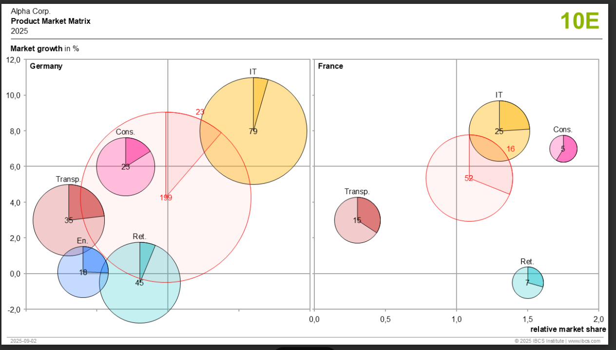
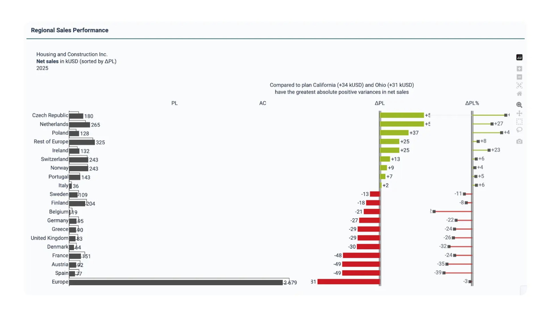
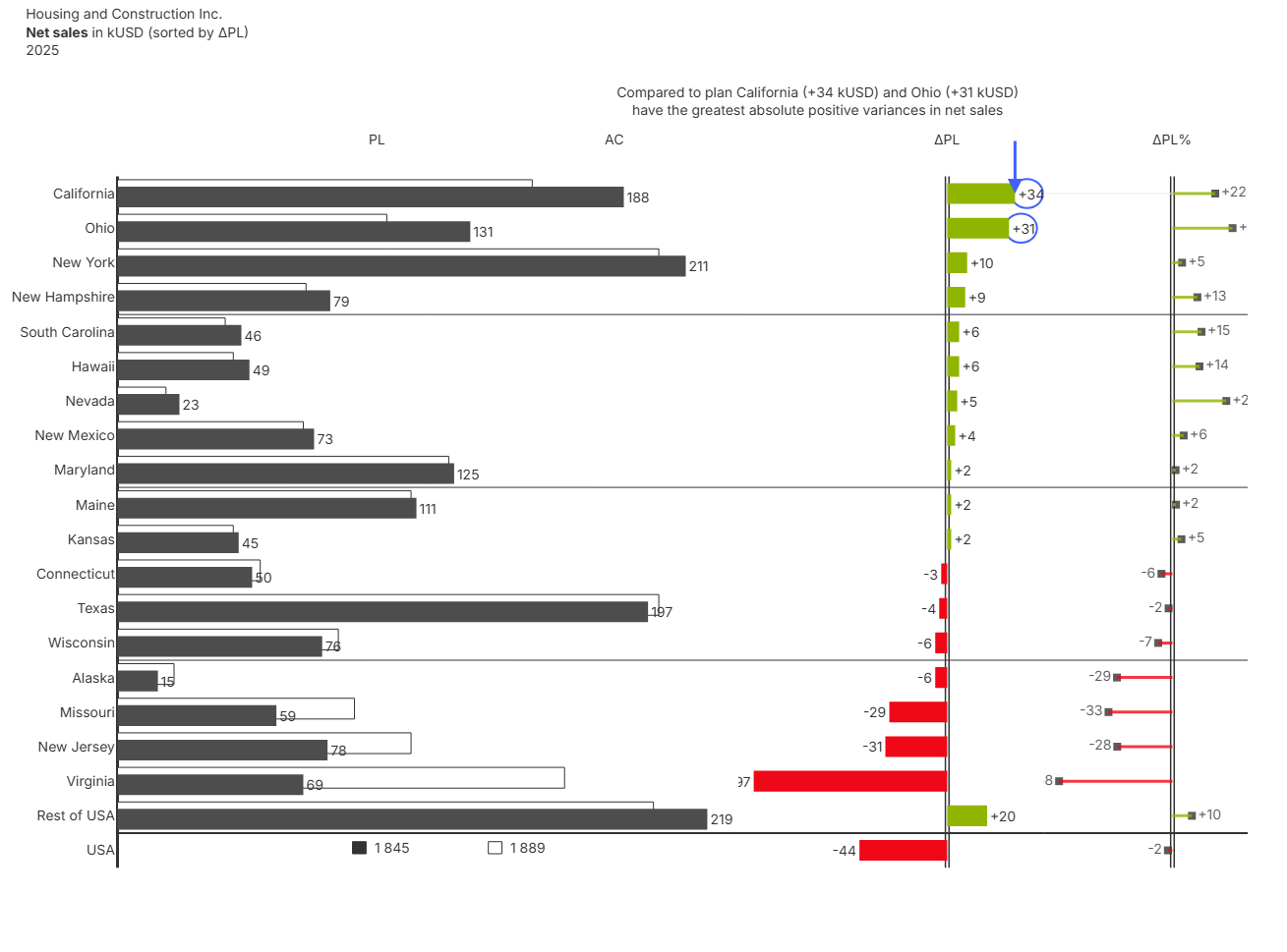
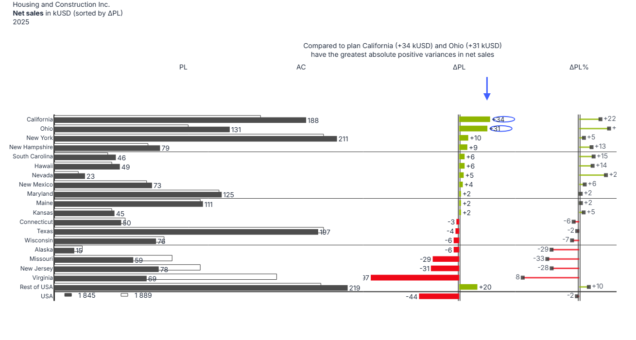
For this challenge I recreated the IBCS C04 multi tier bar chart (example 04A ) that compares Plan (PL) vs Actual (AC) net sales across regions, then shows both absolute variance (ΔPL) and relative variance (ΔPL%) in two additional panels.
Original reference

My process
1) First pass: prompt only, aiming for an 80 percent draft
I started by prompting for the overall chart structure and core encodings: three panels, PL vs AC layering, ΔPL bars, and ΔPL% pins. This was driven by a shorter prompt:
Chart:
- Type: IBCS C04 multi-tier bar chart with three panels using subplots
- Panel 1: Layered horizontal bars comparing Plan(PL) vs Actual(AC) values
  - PL bars: White fill with dark outline, positioned slightly higher(y offset +0.1)
  - AC bars: Solid dark gray fill(# 4D4D4D), positioned slightly lower (y offset -0.1)
  - Bar width: 0.6 with ~2/3 overlap
  - Data labels on AC bars only, positioned outside (e.g."1234")
- Panel 2: Horizontal variance bars(ΔPL) with dual baseline
  - Green bars(#8fb500) for positive variance, red bars (#ef0817) for negative
  - Data labels showing signed values positioned outside (e.g., "+123" or "-45")
  - Dual vertical baseline lines at zero with small offset
- Panel 3: Variance percentage pins (ΔPL % )
  - Pin heads: Dark square markers at percentage value
  - Pin stems: Colored lines from zero to value(green/red)
  - Data labels showing signed percentage values positioned outside (e.g., "+15" or "-8")
  - Dual vertical baseline lines at zero with small offset

Compute additional columns:
- Calculate `Delta_PL` as difference between `Actual_kUSD` and `Plan_kUSD`
- Calculate `Delta_PL_Pct` as percentage variance: (Delta_PL / Plan_kUSD) * 100

Sort data:
- Separate data into three groups: USA row, Rest of USA row, and other regions
- Sort other regions by `Delta_PL` in descending order
- Concatenate in final order: other regions, Rest of USA, USA

Labels:
- Chart title:
	- Text: "Housing and Construction Inc.<br><b>Net sales</b> in kUSD (sorted by ΔPL)<br>2025"
	- Position: xanchor="left", yanchor="top"
- Y-axis labels: Region names displayed on left side Reversed(top to bottom)
- X-axis labels above chart area:
  - Panel 1: "PL        AC"
  - Panel 2: "ΔPL"
  - Panel 3: "ΔPL%"

- Typography:
  - All text: 14px, color  # 333333

- Axes:
  - All gridlines, and tick marks hidden
  - X-axes: No labels or ticks visible
  - Panel 1 x-axis range: 0 to max_sales * 1.10 (excluding USA)
- Special elements:
  - Thick separator line(2px) above USA row across all three panels, no gaps between the panels
  - Don't show USA bars in Panel 1, show legend-like totals instead
	- Render 2 squares in paper coords where the
	  - Filled square for AC (fill #333333, outline #333333)
	  - Hollow square for PL (fill white, outline #333333)
	- Place numeric text next to each square with thousands separated by spaces
  - Show bars for USA for Panel 2 and Panel 3
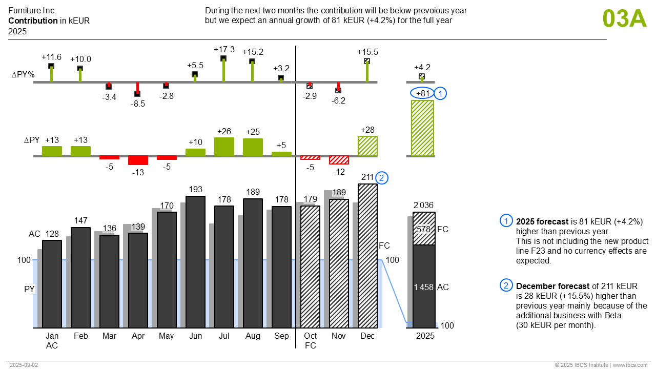
- Result (simple prompt)

This version captured the broad structure, but it was not fully reliable. Re running the same prompt sometimes missed details like:
- Some data labels
- The hollow baseline
- Correct placement or styling of smaller elements
2) Second pass: direct code edits for the hard parts
After hitting the point where prompt iteration was producing diminishing returns, I focused on the remaining elements that require precision and consistency:
- Titles, headers, and subtitle placement
- Callouts (circles and arrow)
- Separators and line weights
- Spacing, margins, and layout stability
At that point it was faster and more deterministic to edit the generated code directly.
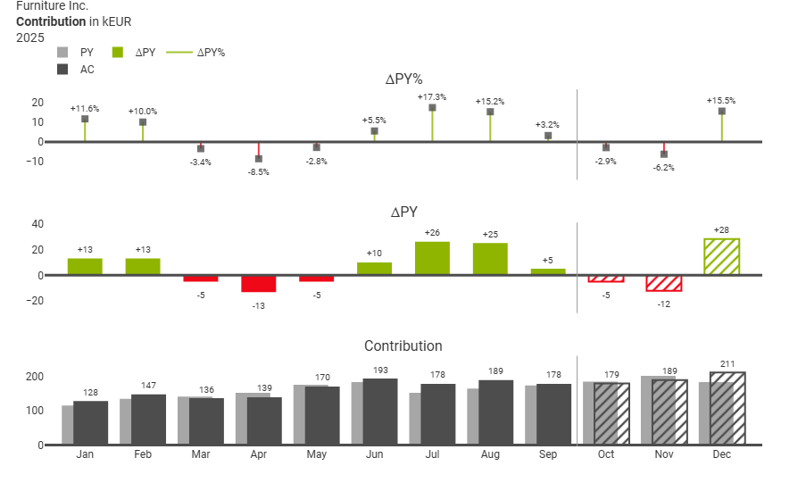
- Result (code refined version):
This is the version I am happiest with and it matches the reference very closely.
3) Third pass: turning the spec back into a huge prompt
I also experimented with using the generated spec and using it as a prompt to reproduce the polished result. This did work to a degree, but the prompt became extremely long, mainly because annotations and layout constraints are easy to break unless everything is specified explicitly.
Multi-tier Bar Chart: Regional Sales Performance (Prompt-Hardened Spec)

Goal:
- Recreate the chart layout/style from the reference: a 3-panel IBCS C04 chart with layered PL/AC bars, ΔPL variance bars, and ΔPL% pin chart.
- PRIORITY: preserve layout proportions, vertical spacing, and annotation placement. Avoid any responsive CSS sizing.

Data:
- Input columns: `Region`, `Plan_kUSD`, `Actual_kUSD`
- Compute:
  - `Delta_PL = Actual_kUSD - Plan_kUSD`
  - `Delta_PL_Pct = (Delta_PL / Plan_kUSD) * 100`
- Sort order:
  - Extract rows where Region == "USA" and Region == "Rest of USA"
  - Sort all other regions by `Delta_PL` descending
  - Concatenate: other regions (sorted) + Rest of USA + USA

Critical Y-axis implementation (DO NOT use categorical y):
- Define:
  - `regions = df_sorted["Region"].tolist()`
  - `y_positions = list(range(len(regions)))`
- All traces must use numeric y positions (`y=[i]`), NOT `y="Region"`.
- Y-axis must be:
  - `tickmode="array"`
  - `tickvals=y_positions`
  - `ticktext=regions`
  - `autorange="reversed"`

Subplots (must match exactly):
- Create the figure using:
  - `make_subplots(rows=1, cols=3, shared_yaxes=True)`
  - `specs=[[{"type":"bar"}, {"type":"bar"}, {"type":"scatter"}]]`
  - `column_widths=[0.55, 0.27, 0.18]`
  - `horizontal_spacing=0.0`

Sizing (MUST be explicit; do NOT let the environment shrink the plot area):
- Hard rules:
  - Set `fig.update_layout(autosize=False, height=height_px)`.
  - Do NOT use viewport-based sizing such as `"calc(100vh - ... )"` anywhere.
  - Do NOT rely on default height.
- Use this height formula:
  - `height_per_row = 32`
  - `min_height = 700`
  - `height_px = max(min_height, len(regions) * height_per_row)`
- Set fixed margins (do not allow auto-expansion):
  - `margin=dict(l=110, r=40, t=140, b=60)`
  - Do NOT enable any automatic margin growth to fit annotations.

If a UI container/wrapper is created (Dash/Studio component):
- The chart container must be at least as tall as `height_px`.
- Do NOT set container height via `vh` math (no `calc(100vh - ...)`).
- Prefer a fixed pixel height or a minHeight equal to `height_px`.

Colors (hex):
- Ink: `#333333`
- AC fill: `#4D4D4D`
- Positive: `#8fb500`
- Negative: `#ef0817`
- Callout blue: `#4261ff`
- White: `#ffffff`

Global fonts:
- Use font size 14 everywhere: trace labels, axis tick fonts, title, headers, annotations.
- Enforce:
  - `uniformtext=dict(minsize=14, mode="show")`
  - `fig.update_traces(textfont=dict(size=14), selector=dict(type="bar"))`
  - `fig.update_traces(textfont=dict(size=14), selector=dict(type="scatter"))`


Axes styling:
- For all X axes:
  - `showgrid=False`, `showline=False`, `zeroline=False`, `ticks=""`, `showticklabels=False`
- X ranges:
  - Panel 1 (col 1): `[0, max_sales * 1.10]` where `max_sales = max(max(Plan_kUSD), max(Actual_kUSD))` computed excluding USA
  - Panel 2 (col 2): `delta_range = [min_delta - pad_delta, max_delta + pad_delta]` where `pad_delta = max(abs(min_delta), abs(max_delta)) * 0.10` computed excluding USA
  - Panel 3 (col 3): `pct_range = [min_pct - pad_pct, max_pct + pad_pct]` where `pad_pct = max(abs(min_pct), abs(max_pct)) * 0.10` computed excluding USA
- Y axes:
  - col 1 shows tick labels (regions)
  - col 2 and col 3 hide y tick labels (`showticklabels=False`)

Panel 1: PL vs AC layered horizontal bars
- Params:
  - `bar_width = 0.6`
  - `bar_offset = 0.1`
- For each region index `i` (skip Region == "USA" in panel 1 only):
  - PL bar:
    - `go.Bar(orientation="h", x=[plan_val], y=[i - bar_offset])`
    - Fill: white
    - Outline: ink width 1
    - No label text
  - AC bar:
    - `go.Bar(orientation="h", x=[actual_val], y=[i + bar_offset])`
    - Fill: `#4D4D4D`
    - Label: outside, formatted with spaces as thousands separators

Panel 1 baseline:
- Add vertical baseline at x=0:
  - `fig.add_shape(type="line", x0=0, x1=0, y0=-0.5, y1=len(regions)-0.5, line=dict(color="#333333", width=3), layer="below", row=1, col=1)`

Panel 2: ΔPL variance bars
- For each region index `i` (including USA):
  - `delta_val = Delta_PL`
  - Color: green if delta_val >= 0 else red
  - `go.Bar(orientation="h", x=[delta_val], y=[i], width=0.6)`
  - Label: outside text `f"{delta_val:+.0f}"` (font size 14)

Panel 2 hollow baseline (two lines, NOT one line):
- Compute:
  - `delta_range_width = delta_range[1] - delta_range[0]`
  - `baseline_gap_frac = 0.006`
  - `delta_offset = delta_range_width * baseline_gap_frac`
- Add two vertical lines at x = -delta_offset and x = +delta_offset:
  - `line color #333333`, `width 1.5`, `layer="below"`, spanning `y=-0.5 .. len(regions)-0.5`, `row=1 col=2`

Panel 3: ΔPL% pin chart
- For each region index `i`:
  - `pct_val = Delta_PL_Pct`
  - Stem color: green if pct_val >= 0 else red
  - Pin head + label:
    - `go.Scatter(mode="markers+text", x=[pct_val], y=[i])`
    - Marker: square, size 8, color #333333
    - Text label: `f"{pct_val:+.0f}"` positioned middle-right if positive else middle-left
  - Stem:
    - `go.Scatter(mode="lines", x=[0, pct_val], y=[i, i], line=dict(color=stem_color, width=3))`

Panel 3 hollow baseline (two lines, scaled for pixel-equal spacing vs panel 2):
- Compute:
  - `pct_range_width = pct_range[1] - pct_range[0]`
  - `baseline_gap_frac = 0.006`
  - `width_ratio = 0.27 / 0.18`
  - `pct_offset = pct_range_width * baseline_gap_frac * width_ratio`
- Add two vertical lines at x = -pct_offset and x = +pct_offset:
  - `line color #333333`, `width 1.5`, `layer="below"`, spanning `y=-0.5 .. len(regions)-0.5`, `row=1 col=3`

Separators:
- Separator above USA row:
  - If "USA" in regions: `usa_index = regions.index("USA")`
  - Add a horizontal line across each panel domain at `y = usa_index - 0.5`
  - Color #333333 width 2
- Group separators after specific regions:
  - After: New Hampshire, Maryland, Wisconsin
  - Add horizontal line across each panel domain at `y = idx + 0.5`
  - Color #333333 width 1

Callouts:
- Draw circles around the ΔPL labels for California and Ohio in panel 2:
  - Blue outline #4261ff width 2, transparent fill, `layer="below"`
  - Circle center X is based on the label position (delta value ± label_offset), not at x=0
- Add a blue arrow pointing down toward the circled area:
  - Color #4261ff, width 3, arrowhead 2

Title + annotations:
- Title (layout.title):
  - Text: `Housing and Construction Inc.<br><b>Net sales</b> in kUSD (sorted by ΔPL)<br>2025`
  - Position: x=0.02, y=0.98, xanchor="left", yanchor="top"
- Subtitle annotation: "Compared to plan California (+34 kUSD) and Ohio (+31 kUSD)<br>have the greatest absolute positive variances in net sales" (added as separate annotation after layout update, positioned at x=0.62, y=1.0, yanchor='bottom', yshift=18, font size 14)
- Panel headers (annotations):
  - "PL" and "AC" above panel 1 at computed x positions within xaxis domain:
    - `pl_x = x1_domain[0] + (x1_domain[1] - x1_domain[0]) * 0.42`
    - `ac_x = x1_domain[0] + (x1_domain[1] - x1_domain[0]) * 0.80`
  - "ΔPL" with xref="x2" x=0
  - "ΔPL%" with xref="x3" x=0
  - All at y=0.985 (paper), yanchor="bottom", font size 14

Important: prevent annotations from shrinking the plot:
- Keep the fixed margins from the Sizing section (`t=140`, `b=60`).
- Do NOT increase top margin dynamically to accommodate title/subtitle/headers.

USA legend-like totals (bottom-left):
- Render 2 squares in paper coords at y_base=0.06:
  - Filled square for AC (fill #333333, outline #333333)
  - Hollow square for PL (fill white, outline #333333)
- Place numeric text next to each square with thousands separated by spaces
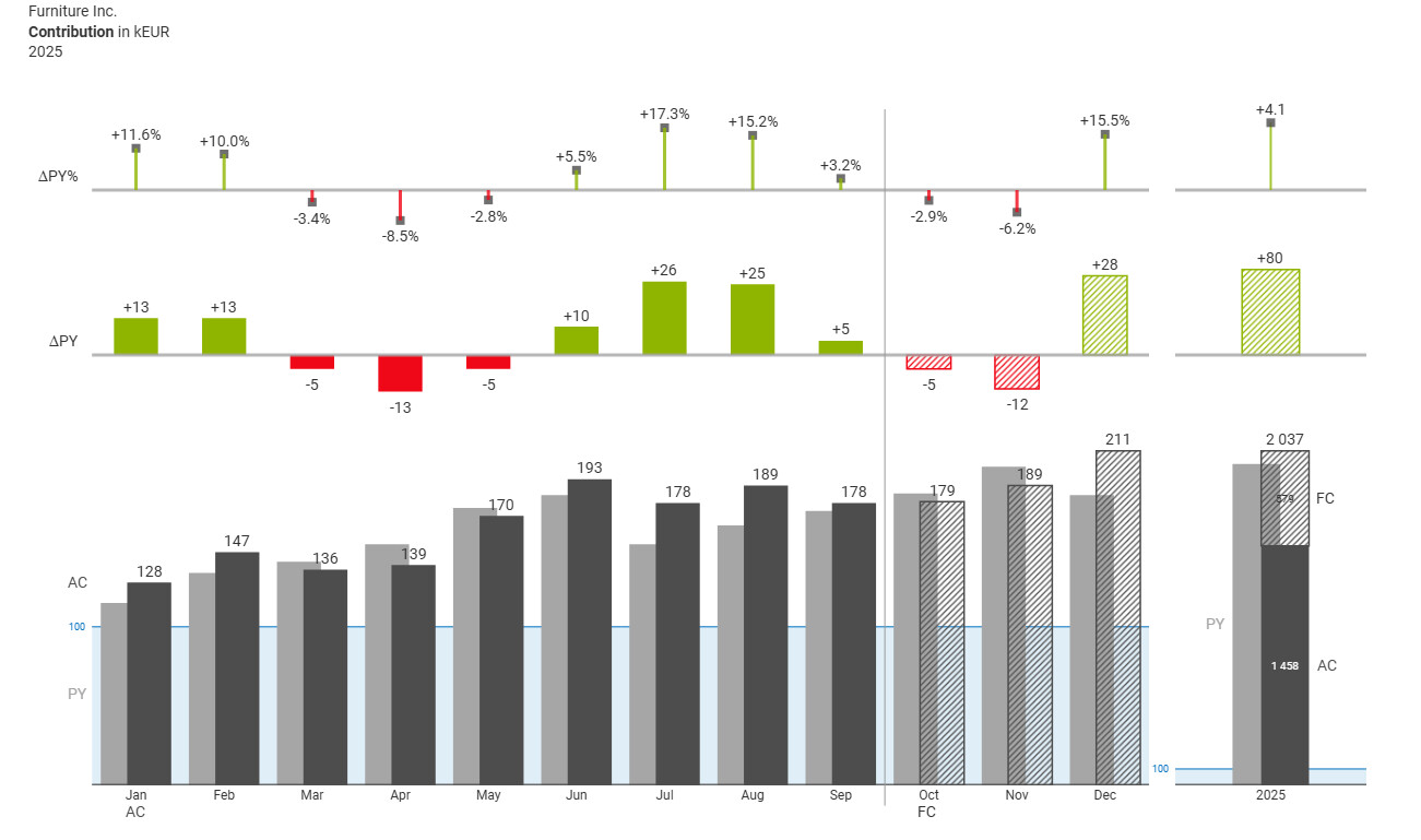
- Result (detailed prompt)
It is a decent output, but the prompt length reduces the value of prompting as the primary workflow.
I also burned through a lot of AI credits while iterating on prompts and chasing layout edge cases. Shoutout to Matthew for sponsoring me when I ran out of credits so I could finish the submission.
Takeaways
This was a fun exercise and it gave me a workflow I would actually use:
- Use a prompt to get an initial draft quickly
- Treat that draft as a starting point
- Switch to direct code edits to finish the last 20 percent where precision matters most
Thanks for putting up this challenge. It was a great way to explore the practical boundary between prompting and code first chart building.