Figure Friday 2024 - week 50

join the Figure Friday session on December 20, at noon Eastern Time, to showcase your creation and receive feedback from the community.

Did you know that Palm kernel oil saw a 27% increase in price between October and November of 2024?

In this week’s Figure-Friday we’ll look at Commodity Markets and their monthly prices, provided by the World Bank Group.

In case you’re interested in more info such as monthly indices for particular sectors (energy, agriculture, etc.) or a data description, simply download this Worldbank excel sheet and view the other 3 sheets/tabs: Monthly Indices, Description, and Index Weights.

Things to consider:

  • can you improve the sample figure below (bar plot)?
  • would a different figure tell the data story better?
  • can you create a Dash app instead?

Sample figure:

Code for sample figure:
import pandas as pd
import plotly.graph_objects as go


df = pd.read_csv("https://raw.githubusercontent.com/plotly/Figure-Friday/refs/heads/main/2024/week-50/CMO-Historical-Data-Monthly.csv")
df = df.drop([0, 1])  # drop sub headers
df.rename(columns={'Unnamed: 0': 'Time'}, inplace=True)
df['Time'] = pd.to_datetime(df['Time'], format='%YM%m')


# Convert all columns (except 'Time') to numeric
df.iloc[:, 1:] = df.iloc[:, 1:].apply(pd.to_numeric, errors='coerce')

# Recalculate values for October and November 2024 because we plan to find percentage changes between those months
oct_values = df[df['Time'] == '2024-10-01'].iloc[0, 1:]
nov_values = df[df['Time'] == '2024-11-01'].iloc[0, 1:]

# Calculate percentage change between November and October 2024
percent_change = ((nov_values - oct_values) / oct_values) * 100

# Prepare data for the Plotly bar chart
commodities = percent_change.index.tolist()
positive_changes = percent_change[percent_change > 0].values
negative_changes = -percent_change[percent_change < 0].values


fig = go.Figure()

# Add bars for percentage changes (positive and negative on the same axis)
fig.add_trace(go.Bar(
    x=percent_change,
    y=commodities,
    orientation='h',
    marker_color=percent_change.apply(lambda x: 'green' if x > 0 else 'red'),
    name='Percent Change'
))

fig.update_layout(
    title='Percent Change in Commodities (Oct 2024 vs Nov 2024)',
    barmode='relative',
    template='plotly_white',
    xaxis=dict(ticksuffix='%', zeroline=True, zerolinecolor='black')
)

fig.show()

Participation Instructions:

  • Create - use the weekly data set to build your own Plotly visualization or Dash app. Or, enhance the sample figure provided in this post, using Plotly or Dash.
  • Submit - post your creation to LinkedIn or Twitter with the hashtags #FigureFriday and #plotly by midnight Thursday, your time zone. Please also submit your visualization as a new post in this thread.
  • Celebrate - join the Figure Friday sessions to showcase your creation and receive feedback from the community.

:point_right: If you prefer to collaborate with others on Discord, join the Plotly Discord channel.

Data Source:

Thank you to the World Bank Group for the data (the Monthly Prices link).

2 Likes

What a pity AG grid with a sparkline is an enterprice feature. I was wondering since this would be my first time Figure Friday, should your work be finished to take part in the session? I’m now looking at a screen with two variations of an idea that could become something but very certain this is not a thing finished by the end of week.

7 Likes

What a great app, @marieanne . Thank you for participating.

Anyone can – and is encouraged to – join the Figure Friday sessions. Some people join even though they did not submit a figure. They simply want to learn and/or give feedback to others. I hope you can join us.

2 Likes

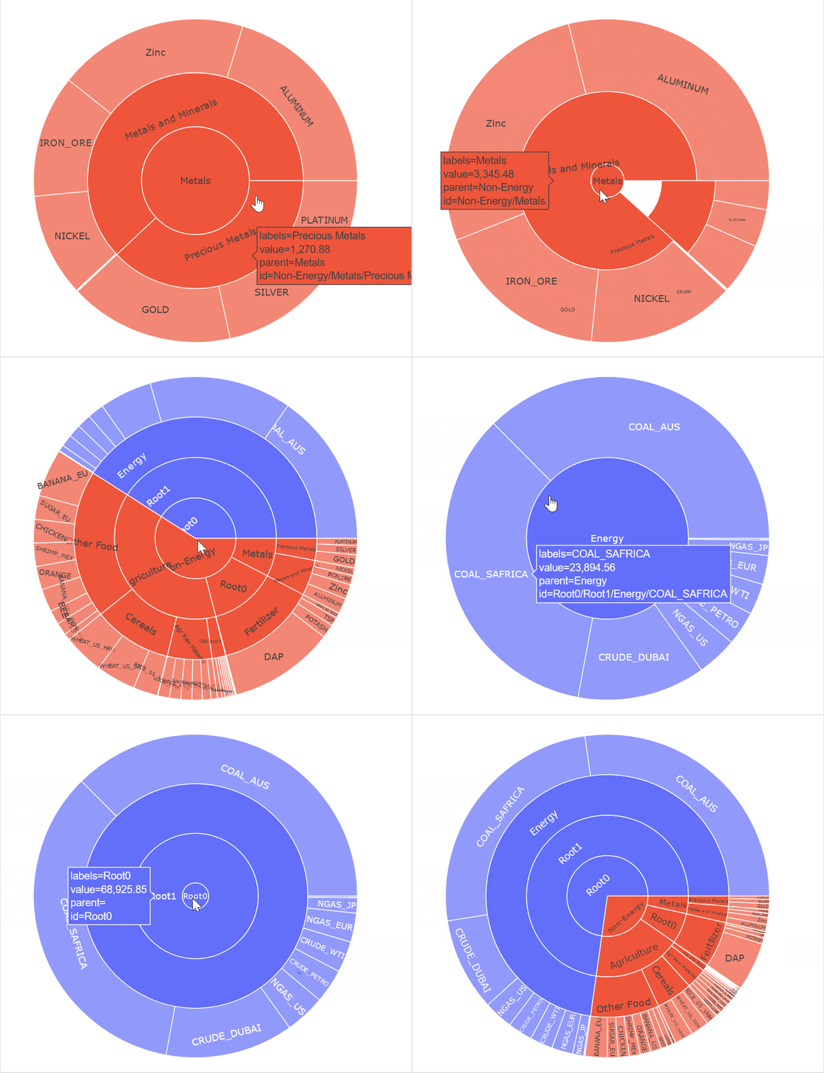
Hello guys! Trying to create a Sunburst but I guess it is not what I expected. Anyway, the tricky part here is building the hierarchical index or path, to build the hierarchy. But there is something funny with the aggregate values. Tomorrow I’ll see… But I don’t think I’ll holding the idea of a sunburst, at least for now…

commodity_w50_v1

8 Likes

Thanks to @natatsypora I now also have my ag grid with a sparkline. I do not think it’s very useful even after pimping but the idea was giving context for all products. I have no idea how Figure Friday works but to make sure, I’ll clean up my code and put it somewhere.


4 Likes

Excellent work, @marieanne :+1:
The table with sparklines looks professional and provides detailed information about the changes.

This gratitude is for @adamschroeder, his tutorial videos are really helpful. :pray:

4 Likes

so true, so true . My first thought was, let’s watch all Adams jvideos during the holidays but than it popped up in my head I have a sweater to finish. (knitting). No multitasker here.

4 Likes

Hi @JuanG
Any luck with the sunburst chart?

1 Like

:blush: Noo, completely discouraged! I’ve started from the scratch with another point of view…
I’m looking for some correlation between variables and the way to plot them together, but only for commodity groups. Work in progress.

Code
# same df ++++++++++++++++++++++++++++++
energy_time = df.iloc[:,:11].copy()  # energy_cols plus 'Time'
cols_ = energy_time.columns[1:-1].tolist()
energy_time_idxd = energy_time.set_index('Time')

# energy_time_idxd.loc['2020':'2024'].index
# energy_time_idxd.index

fig11 = px.line(energy_time_idxd.loc['2020':'2024'], x=energy_time_idxd.loc['2020':'2024'].index, y=cols_, height=600,
               labels={'variable':''})
fig11.update_layout(hovermode='x unified',
                   legend_orientation='h')
fig11.show()
4 Likes

I followed this approach. web app to show the commodities percentages changes from 2020-2024,

2 Likes

I add dropdown menu to select the commodities you want to compare,

4 Likes

I was interested in the ‘Index Weights’ sheet from the Excel file, and I wanted to create a Sankey Diagram. :upside_down_face:

Code
import pandas as pd
import plotly.graph_objects as go
import itertools 

Index_Weights = pd.read_excel('CMO-Historical-Data-Monthly.xlsx', 
                              sheet_name='Index Weights', 
                              skiprows=list(range(11))).iloc[:52, :]

def clean_data(df):
    # Drop columns and rows where all values are NaN
    df_cleaned = df.dropna(axis=1, how='all').dropna(axis=0, how='all')
    # Rename columns
    df_cleaned.columns = ['sub', 'sub1', 'sub2', 'sub3', 'index', 'index1', 'index2']
    # Fill down NaN values in specific columns until the next non-NaN value
    df_cleaned['sub'] = df_cleaned['sub'].ffill()
    # Create the mask
    mask = df_cleaned['sub'] == 'Agriculture'
    # Apply forward fill using loc
    df_cleaned.loc[mask, 'sub1'] = df_cleaned.loc[mask, 'sub1'].ffill()
    df_cleaned['sub2'] = df_cleaned['sub2'].ffill()
    #Insert Non-energy group
    df_cleaned.insert(0, 'group', 'Non-energy')
    # Filter data by condition
    df_cleaned = df_cleaned[~((df_cleaned['index1']==100 ) | (df_cleaned['index1'].isna()))].reset_index(drop=True).iloc[:, :-2]

    return df_cleaned

df = clean_data(Index_Weights)

# Extract unique nodes including subcategories
list_of_lists = [df[col].dropna().unique().tolist() for col in df.columns[:-1]]
nodes = list(itertools.chain.from_iterable(list_of_lists))
# Create a mapping from node name to index
node_indices = {node: i for i, node in enumerate(nodes)}

# Define a color scheme for sub categories
sub_color_scheme = {
    'Agriculture': '#2CA02C',
    'Metals and Minerals': '#1F77B4',
    'Fertilizers': '#FF7F0E',}

sub1_color_scheme = {
    'Food': 'lime',
    'Beverages': '#8C564B',
    'Agricultural Raw Materials': 'cadetblue',}

sub2_color_scheme = {
    'Cereals':'gold',
    'Oils and Meals':'#BCBD22',
    'Other Food':'#9467BD',
    'Timber':'lightgrey',
    'Other Raw Matrials':'#17BECF'}

# Define node colors based on categories
node_colors = ['grey' for _ in nodes]

for sub, color in sub_color_scheme.items():
    if sub in node_indices:
        node_colors[node_indices[sub]] = color

for sub1, color in sub1_color_scheme.items():
    if sub1 in node_indices:
        node_colors[node_indices[sub1]] = color

for sub2, color in sub2_color_scheme.items():
    if sub1 in node_indices:
        node_colors[node_indices[sub2]] = color

# Initialize lists for sources, targets, and values
sources = []
targets = []
values = []
colors = []

# Iterate through the DataFrame to populate sources, targets, and values
for _, row in df.iterrows():
    # From sub to group 
    sources.append(node_indices[row['group']])
    targets.append(node_indices[row['sub']])
    values.append(row['index'])
    colors.append(sub_color_scheme.get(row['sub']))

    # From sub1 to sub
    if pd.notna(row['sub1']):
        sources.append(node_indices[row['sub']])
        targets.append(node_indices[row['sub1']])
        values.append(row['index'])
        colors.append(sub_color_scheme.get(row['sub']))

    # From sub2 to sub
    if pd.isna(row['sub1']):
        sources.append(node_indices[row['sub']])
        targets.append(node_indices[row['sub2']])
        values.append(row['index'])
        colors.append(sub_color_scheme.get(row['sub']))

    # From sub2 to sub1
    if pd.notna(row['sub1']):
        sources.append(node_indices[row['sub1']])
        targets.append(node_indices[row['sub2']])
        values.append(row['index'])
        colors.append(sub1_color_scheme[row['sub1']])

    # From sub2 to sub3
    if pd.notna(row['sub3']):
        sources.append(node_indices[row['sub2']])
        targets.append(node_indices[row['sub3']])
        values.append(row['index'])
        colors.append(sub2_color_scheme[row['sub2']])
       

# Create the Sankey diagram
fig = go.Figure([
    go.Sankey(
        node=dict(
            pad=15,
            thickness=20,
            line=dict(color="black", width=0.7),
            label=nodes,
            color=node_colors),
        link=dict(
            source=sources,
            target=targets,
            value=values, color=colors))
])

fig.update_layout(
    title_text="Sankey Diagram for Non-Energy Commodity Group",
    title_font_size=22, title_y=0.97,
    font_size=12, paper_bgcolor='#F7F7F7',                 
    width=880, height=700, margin=dict(l=20, t=10, r=20, b=10))

fig.show()

node_ align='left',

5 Likes

nice usage of the pd.fill() @natatsypora .

I really like how we can see the whole path from the main sector down to the basic commodity. Great idea this Sankey diagram.

2 Likes

Nice app, @Avacsiglo21 . Are you able to share the code with us so we can learn from it?

For me, it’s kind of hard to see the percentage change with scatter markers. I wonder if a line chart would be easier, or maybe reducing the y axis range to [-40,40] would help?

3 Likes

I like the simplicity here and color tones @marieanne. In the past, I have attend the session with a working concept with some improvements in pocket to discuss. Most of the time we admire our different approaches and get inspired. I’m still novice so its nice to see the different approaches even if its minimal and unfinished.

4 Likes

Awesome Sankey chart @natatsypora, I think ribbon and barpolar are my favorite illustrations.

2 Likes

Three reasons for the simplicity: a) I am a novice too to dash/plotly (but not completely to data/development/react), b) I’m very jealous of the easy way people seem to handle data me being like “ok, this is what I have, this is what I want, now what, struggle”, I love all the coding examples and c) I’m not very visually oriented (how did I end up in data? :sweat_smile:) which means many visuals are for me beautiful colours, beautiful visual, let’s print it out and put it on the wall, no offense meant, but what are they trying to tell me, think deeper. Looking forward to friday.

3 Likes
import pandas as pd
import numpy as np
import plotly.express as px
import dash
from dash import dcc, html
from dash.dependencies import Input, Output
import dash_bootstrap_components as dbc

# Load the data
cmo_df = pd.read_csv("CMO-Historical-Data-Monthly.csv")

# Drop sub headers
cmo_df = cmo_df.drop([0, 1])

# Rename the first column to 'Date'
cmo_df.rename(columns={'Unnamed: 0': 'Date'}, inplace=True)

# Convert 'Date' column to datetime format
cmo_df['Date'] = pd.to_datetime(cmo_df['Date'], format='%YM%m')

# Convert all other columns to numeric, coercing errors to NaN
cmo_df.iloc[:, 1:] = cmo_df.iloc[:, 1:].apply(pd.to_numeric, errors='coerce')

# Filter data from 2020 onwards and calculate percentage change
cmo_2020_2024_df = (cmo_df.query("Date >= '2020-01-01'").set_index('Date').pct_change(fill_method=None) * 100).round(2)


# Initialize the Dash app with a Bootstrap theme
app = dash.Dash(__name__, external_stylesheets=[dbc.themes.SIMPLEX])

## Title
app.title = "Comodities Percentage Change"

# Define the layout of the app
app.layout = dbc.Container([
    dbc.Row([
        dbc.Col(html.H3("Commodity Percentage Changes (2020-2024)"),style={'text-align': 'center', 'margin': '10px','padding': '10px'}, width=12)
    ]),
    dbc.Row([
        dbc.Col(
        dbc.RadioItems(
            id='resample-frequency',
            options=[
                # {'label': 'Monthly', 'value': 'ME'},
                {'label': 'Quarterly', 'value': 'QE'},
                {'label': 'Yearly', 'value': 'YE'}
            ],
            value='QE',
            inline=True,
            style={'text-align': 'left', 'padding': '10px'}
            
            
        )
               )
    ]),
    dbc.Row([
        dbc.Col(
            dcc.Dropdown(
                id='commodity-dropdown',
                options=[{'label': col, 'value': col} for col in cmo_2020_2024_df.columns],
                placeholder="Select a Comodities",
                value=['Crude oil, WTI', 'Coffee, Arabica', 'Gold', 'Palm kernel oil'],
                multi=True,
                className='card border-primary mb-3',
                style={'text-align': 'left', 'padding': '10px'},
            
            
        ), width=5),
        dbc.Tooltip("Select a Commodity from the dropdown menu.", target="commodity-dropdown",
                   placement="top", style={'fontSize': '16px', 'borderRadius': '5px', 'padding': '10px'}


                   ),
       
   
    ]),
    dbc.Row([
        dbc.Col(html.H4("Monitoring the Fluctuations in Commodity Prices Through Comparative Percentage Analysis"),
                style={'text-align': 'center', 'margin': '10px','padding': '10px'}, width=12)
    ]),
    # html.Hr(),
    
    dbc.Row([
        dbc.Col(dbc.Card(
            dbc.CardBody([
                dcc.Graph(id='scatter-plot')
            ]),
        className='card border-light mb-3'), width=12)
    ])
], fluid=True
                          )

# Define callback to update graph
@app.callback(
    Output('scatter-plot', 'figure'),
    [Input('commodity-dropdown', 'value'),
     Input('resample-frequency', 'value')]
)
def update_graph(selected_commodities, resample_freq):
    # Resample data based on selected frequency
    resampled_data = cmo_2020_2024_df.resample(resample_freq).mean()
    
    fig = px.scatter(resampled_data, 
                     x=resampled_data.index, 
                     y=selected_commodities,
                     template='xgridoff', 
                     marginal_y='violin',
                     labels={'value': 'Percentage Change', 'variable': 'Commodities', 'Date':''},
                     )
    
    fig.update_traces(marker=dict(size=35))

    fig.update_layout(
        legend=dict(title=None,orientation="h", y=1.3, 
                    yanchor="top", x=0.5, xanchor="center", font=dict(size=20)),
        xaxis=dict(showline=True, showgrid=True, showticklabels=True,
                   linecolor='rgb(199, 199, 199)', linewidth=0.5,
                   ticks='inside', tickfont=dict(family='Arial', size=16, color='rgb(82, 82, 82)'),
                   
            ),
        yaxis=dict(showline=True, showgrid=True, showticklabels=True,
                   linecolor='rgb(199, 199, 199)', linewidth=0.5,
                   ticks='inside', tickfont=dict(family='Arial', size=16, color='rgb(82, 82, 82)'),
                   zeroline=True, zerolinecolor='#c7c8c9'
                  
                  )
                                 
                )
    
    fig.update_xaxes(nticks=8)


    return fig

# Run the app
if __name__ == '__main__':
    app.run_server(debug=True,jupyter_mode='external', port=8071)
type or paste code here
1 Like

Absolutely agree with you the line chart is the way to go,or at least the easiest one as you mentioned. Reducing the y axis range could work, we could just filter commodities data that are strictly between this range. Other way I´m thinking is by reducing the data points, I means by that instead of using monthly data, just focus in quarterly and yearly. I´m going to give a try. Thanks Adams.

2 Likes