Adams, focus just in quaterly, and yearly and adjusting the scatter size could work ![]()
![]()
![]()

This is looking much cleaner already @Avacsiglo21 ! ![]() I love the dropdown and the ability to compare selected commodities.
I love the dropdown and the ability to compare selected commodities. ![]() If possible, I would suggest limiting the selection to 3-4 categories to avoid overcrowding the chart, assuming the Dash dropdown supports this
If possible, I would suggest limiting the selection to 3-4 categories to avoid overcrowding the chart, assuming the Dash dropdown supports this ![]()
I agree with @adamschroeder that a line chart could make it easier to compare the dots. However, if you prefer to stick with the dots, here are two ways to enhance it even further ![]()
- Add opacity to the scatter dots to better differentiate overlapping points.
- Consider swapping the y and x-axis. This will provide more horizontal space, allowing the [-80, 80] range to expand and reveal more separation between the dots.
Hello @marieanne,
Amazing work on creating this table! I disagree with you; I think this table is incredibly useful! ![]() While tables might not always be seen as the most flashy visualizations, they are exceptionally powerful for structuring a lot of data in an easy-to-understand overview. I appreciate the simplicity of the table and the consistent formatting of numbers (e.g., adding units, using double digits for dollar amounts, and single digits for percentage numbers).
While tables might not always be seen as the most flashy visualizations, they are exceptionally powerful for structuring a lot of data in an easy-to-understand overview. I appreciate the simplicity of the table and the consistent formatting of numbers (e.g., adding units, using double digits for dollar amounts, and single digits for percentage numbers).
Here are a few suggestions to enhance the table even further:
- Left-align all textual data and right-align all numerical data. You already do this partially, but for consistency, I would also right-align the price column. There are several articles explaining why this alignment matters, here is one: Design Better Data Tables.
- The general guidelines are:
- Numerical data is right-aligned
- Textual data is left-aligned
- Headers are aligned with their data
- Don’t use center alignment.
- The general guidelines are:
- Rename some of the data columns for clarity. Initially, I wasn’t sure about the difference between “Price” and “Price pm.” Ideally, labels should be clear to anyone, even without context. In this case, I would suggest clearer labels such as “Avg. price (XXXX-2024)” and “Avg. price (Dec 2024).”
- (Optional): There are several ways to add more visual emphasis to the table, depending on the data story you want to tell. Here are two examples:
- Color-code cells: To highlight the percentage increase/decrease, you could color-code the cells in that column, allowing users to quickly identify products with positive or negative growth.
- Add max/min indicators inside sparklines: To emphasize monthly developments, you could add dots for the min/max values within the sparklines, highlighting the extreme values.
Keep up the great work! ![]() and thanks @natatsypora for helping out!
and thanks @natatsypora for helping out! ![]() Love the team work!
Love the team work!
Hello @JuanG,
I really love your initial idea! Focusing on specific commodities allows you to add more context and create a compelling data story, much more so than visualizing all commodities together. I have a suggestion, which you can choose to implement or not. Your first three line charts made me think of this idea: if you focus solely on crude oil, for example, you can craft a very engaging data narrative. Adding annotations to explain certain dips and highs, and using shaded backgrounds to highlight specific time spans, could elevate this visualization to the next level! Something like this, but with Plotly ![]()

Thank you @li.nguyen for your extensive feedback and links. I have applied almost all your advice and the result is much better :-). Except min/max in sparklines, values are calculated but I couldn’t get the right syntax for adding two dots on a screen. The code is a bit messy, I was busy creating a boilerplate for myself with a file structure but for this I’ve copied all code in one file.

from dash import Dash, html,  Input, Output,  callback
import dash_ag_grid as dag
import dash_bootstrap_components as dbc
#from data.dataprocessing2 import etl_data #data etl
#from components.theme import select_colormode #import light dark mode
from dash_bootstrap_templates import load_figure_template
# adds  templates to plotly.io
load_figure_template(["sandstone", "sandstone_dark"])
import plotly.express as px
import json
import pandas as pd


#this is not relevant for this assignment but I'm putting this all in one file
#without much thinking.

def select_colormode():


    color_mode_switch =  html.Span(
    [
        dbc.Label(className="fa fa-moon", html_for="color-mode-switch"),
        dbc.Switch( id="color-mode-switch", value=False, className="d-inline-block ms-1", persistence=True),
        dbc.Label(className="fa fa-sun", html_for="color-mode-switch"),
    ]
    )
    return color_mode_switch


# 1 DATAPROCESSING

def etl_data():

    df = df = pd.read_csv("https://raw.githubusercontent.com/plotly/Figure-Friday/refs/heads/main/2024/week-50/CMO-Historical-Data-Monthly.csv")

    df = df.drop([0, 1])  # drop sub headers

    #pick last 13 months = 12 times MoM
    df = df.tail(13)
    #it's so easy to copy from adam :-)
    df.rename(columns={'Unnamed: 0': 'Time'}, inplace=True)
    df['Time'] = pd.to_datetime(df['Time'], format='%YM%m')

    #remove a few columns with empty values, because replace three dots later, keeps giving errors
    removelist = ['Barley','Sorghum', 'Shrimps, Mexican', 'Phosphate rock']
    df = df.drop(removelist, errors = 'ignore', axis = 1)


    #create a list of all columnnames with values (except time)
    allcolumns = df.columns.values.tolist()[1:]

    dfp = pd.melt(df, id_vars=['Time'], value_vars=allcolumns)\
        .rename(columns={'variable':'Product','value':'Price'})\
            .sort_values(by=['Product','Time'], ascending=[ True, True])

    #add price previous month
    dfp['Price'] = dfp['Price'].astype(float)
    dfp['Price pm'] =dfp['Price'].shift(1).astype(float)
    dfp['MoM price'] = round(100 * ((dfp['Price'] - dfp['Price pm'])/dfp['Price pm']),1).astype(float)


    dfp = dfp.loc[dfp['Time'] != '2023-11-01']

    return dfp


#read all data and pivot
df = etl_data()


app = Dash(__name__, external_stylesheets=[dbc.themes.SANDSTONE, dbc.icons.FONT_AWESOME])

#this should be filter last month numbers but for the sake of time
#filter 2024-11-01, lazy

dfgrid = df.loc[df['Time'] == '2024-11-01'].copy()


##Try to create the mom sparkle line


dfgrid["graph"] = ''

for i, r in dfgrid.iterrows():
    filterDf = df[df["Product"] == r["Product"]]

    # #ymax and ymin and the x value,
    #no idea how to get this into the sparkle
    #with a correct marker syntax, giving up.
    ymax = filterDf['MoM price'].max().item()
    xmax = filterDf.loc[df['MoM price'] == ymax]['Time'].iloc[0].to_datetime64()
    ymin = filterDf['MoM price'].min().item()
    xmin = filterDf.loc[df['MoM price'] == ymin]['Time'].iloc[0].to_datetime64()


    fig = px.line(
       filterDf,
       x="Time",
       y="MoM price"
   )

    fig.update_layout(
       showlegend=False,
       yaxis_visible=False,
       yaxis_showticklabels=False,
       xaxis_visible=False,
       xaxis_showticklabels=False,
       margin=dict(l=0, r=0, t=0, b=0),
       template="plotly_white",
   )


    dfgrid.at[i,'graph'] = fig

#columnheadernames should be dynamically
maxmonth_label = dfgrid['Time'].max()
prevmonth_label =  dfgrid['Time'].max()+ pd.DateOffset(months=-1)

columnDefs = [

  {
      "headerName": "Product",
      "field": "Product",

      "filter": True
  },
  {"headerName": "Avg Price (" + maxmonth_label.strftime('%b %Y') + ")",
   "type": "rightAligned",
   "field": "Price",
   "valueFormatter": {"function": """d3.format("($,.2f")(params.value)"""},
   },
  {
      "headerName":"Avg Price (" + prevmonth_label.strftime('%b %Y') + ")",
      "type": "rightAligned",
      "field": "Price pm",
      "valueFormatter": {"function": """d3.format("($,.2f")(params.value)"""},
      "editable": True,
  },
   {
    "headerName": "Increase/decrease %",
  "type": "rightAligned",
  "field": "MoM price",

  "valueFormatter": {"function": """d3.format("(.1f")(params.value)"""},
  "editable": True,
  'cellStyle': {
            # Set of rules
            "styleConditions": [
                {
                    "condition": "params.value >= 3",
                    "style": {"backgroundColor": "mediumaquamarine"},
                },
                {
                    "condition": "params.value <= -3",
                    "style": {"backgroundColor": "lightcoral"},
                },
            ],
            # Default style if no rules apply
            "defaultStyle": {"backgroundColor": "white"},
        }

},

{
"field": "graph",
"cellRenderer": "DCC_GraphClickData",
"headerName": "MOM % change",
"maxWidth": 300,
"minWidth": 300,

                                                }
  ]


defaultColDef = {
  "resizable": True,
  "sortable": True,
  "editable": False,
  }


# Main layout
app.layout = dbc.Container([

        dbc.Row([
            html.Div(html.H1('Historical data until Dec. 2024'), className='col-md-6'),
            html.Div(select_colormode(), className='col-md-6')
            ]),


        html.Div([
                dag.AgGrid(
                    id="custom-component-graph-grid",
                    columnDefs=columnDefs,
                    rowData=dfgrid.to_dict("records"),
                    columnSize="autoSize",
                    defaultColDef=defaultColDef,
                    dashGridOptions={"rowHeight": 48},
                    style={"height": "700px"}
                    ),
                html.Div(id="custom-component-graph-output")

                ])


        ])#end of container


@callback(
    Output("custom-component-graph-output", "children"),
    Input("custom-component-graph-grid", "cellRendererData"),


)
def graphClickData(d):
    return json.dumps(d)

if __name__ == "__main__":
    app.run_server(debug=True)

Great job! ![]()
You only need to add two lines of code:
ymax = filterDf['MoM price'].max()
xmax = filterDf.loc[filterDf['MoM price'].idxmax(),'Time']
ymin = filterDf['MoM price'].min()
xmin = filterDf.loc[filterDf['MoM price'].idxmin(),'Time']

fig.add_scatter(x=[xmax], y=[ymax], mode='markers', marker=dict(color='red', size=7))
fig.add_scatter(x=[xmin], y=[ymin], mode='markers' , marker=dict(color='forestgreen', size=7))
or just one line of code:
fig.add_scatter(x=[xmax, xmin], y=[ymax, ymin], mode='markers', marker=dict(color=['red', 'green'], size=7))
Color and size can be changed.

Ah thank you, finishing touch, my error was the time index. Since I have no idea if increasing prices are positive or negative I would probably use more neutral colours for the dots and the %increase/decrease tablecell, but the customer waits. Changed the sparkle into MoM Price, more easy to comprehend what happens.

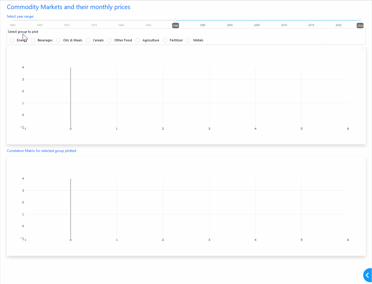
![]() I will take up the gauntlet, @li.nguyen and I’ll try to tell that story with that info… In the meantime, I don’t know why but I focused on some kind of correlation and obviously there are lot of them. So, this is the first version of an app related to that concept. I’m stopping here in this version…
I will take up the gauntlet, @li.nguyen and I’ll try to tell that story with that info… In the meantime, I don’t know why but I focused on some kind of correlation and obviously there are lot of them. So, this is the first version of an app related to that concept. I’m stopping here in this version…
Code
"""Just importing"""
from dash import Dash, html, Output, Input, State, callback, dcc, no_update, ctx
import dash_mantine_components as dmc
import dash_bootstrap_components as dbc
import pandas as pd
import numpy as np
import plotly.express as px
import plotly.io as pio
from dash_bootstrap_templates import load_figure_template

# print(pio.templates.default)
pio.templates.default = 'plotly_white'

df = pd.read_csv("https://raw.githubusercontent.com/plotly/Figure-Friday/refs/heads/main/2024/week-50/CMO-Historical-Data-Monthly.csv")
df = df.drop([0, 1])  # drop sub headers
df.rename(columns={'Unnamed: 0': 'Time'}, inplace=True)
df['Time'] = pd.to_datetime(df['Time'], format='%YM%m')

df.set_index('Time', inplace=True)
dff = df.iloc[:,:].apply(pd.to_numeric, errors='coerce')
dff.fillna(0,inplace=True)

# Convert all columns (except 'Time') to numeric ==>> didn't work
# df.iloc[:, 1:] = df.iloc[:, 1:].apply(pd.to_numeric, errors='coerce')
# dff = df.set_index('Time').convert_dtypes(convert_string=False).fillna(0)


# Preparing cols to plot group of commodities
# energy_cols = dff.columns[:10]#.tolist()
# bevg_cols = dff.columns[10:17].tolist()
# oils_meals = dff.columns[17:28].tolist()
# cereals = dff.columns[28:37].tolist()
# other_food = dff.columns[37:47].tolist()
# agric_cols = dff.columns[47:56].tolist()
# fert_cols = dff.columns[56:61].tolist()
# met_cols = dff.columns[61:].tolist()

get_cols = {
    'energy_cols': ['Crude oil, average', 'Crude oil, Brent', 'Crude oil, Dubai', 'Crude oil, WTI', 'Coal, Australian',\
                     'Coal, South African **', 'Natural gas, US', 'Natural gas, Europe', 'Liquefied natural gas, Japan', 'Natural gas index'],
    'bevg_cols': ['Cocoa', 'Coffee, Arabica', 'Coffee, Robusta', 'Tea, avg 3 auctions', 'Tea, Colombo', 'Tea, Kolkata', 'Tea, Mombasa'],
    'oils_meals': ['Coconut oil', 'Groundnuts', 'Fish meal', 'Groundnut oil **', 'Palm oil', 'Palm kernel oil', 'Soybeans', 'Soybean oil',\
                    'Soybean meal', 'Rapeseed oil', 'Sunflower oil'],
    'cereals': ['Barley', 'Maize', 'Sorghum', 'Rice, Thai 5% ', 'Rice, Thai 25% ', 'Rice, Thai A.1', 'Rice, Viet Namese 5%', 'Wheat, US SRW', 'Wheat, US HRW'],
    'other_food': ['Banana, Europe', 'Banana, US', 'Orange', 'Beef **', 'Chicken **', 'Lamb **', 'Shrimps, Mexican', 'Sugar, EU', 'Sugar, US', 'Sugar, world'],
    'agric_cols': ['Tobacco, US import u.v.', 'Logs, Cameroon', 'Logs, Malaysian', 'Sawnwood, Cameroon', 'Sawnwood, Malaysian', 'Plywood',\
                    'Cotton, A Index', 'Rubber, TSR20 **', 'Rubber, RSS3'],
    'fert_cols': ['Phosphate rock', 'DAP', 'TSP', 'Urea ', 'Potassium chloride **'],
    'met_cols': ['Aluminum', 'Iron ore, cfr spot', 'Copper', 'Lead', 'Tin', 'Nickel', 'Zinc', 'Gold', 'Platinum', 'Silver']
}

# ++++++++++++++++++++++++++++++++++++++++++++++++++++++++++++++++++++++++++++++++++++++++++++++
app = Dash(__name__, external_stylesheets=[dbc.themes.BOOTSTRAP])

range_slider = dcc.RangeSlider(
        id='year_slider',
        min = dff.index.min().year,
        max = dff.index.max().year,
        step = 2,
        tooltip={
                    "always_visible": True,
                    "template": "{value}",
                    "placement":'bottom',
                },
        marks={year: str(year) for year in range(dff.index.min().year, dff.index.max().year, 5)},
        value=[1990, 2024]
)

radio_group = dmc.RadioGroup(
    id= 'radio_groups',
    label='Select group to plot',
    value=[],
    size='sm',
    # mb=5,
    children= dmc.Group([
        dmc.Radio(label='Energy', value='energy_cols'),
        dmc.Radio(label='Beverages', value='bevg_cols'),
        dmc.Radio(label='Oils & Meals', value='oils_meals'),
        dmc.Radio(label='Cereals', value='cereals'),
        dmc.Radio(label='Other Food', value='other_food'),
        dmc.Radio(label='Agriculture', value='agric_cols'),
        dmc.Radio(label='Fertilizer', value='fert_cols'),
        dmc.Radio(label='Metals', value='met_cols'),
    ], className='m-2'), className='border ps-1 my-1',
)

# ++++++++++++++++++++++++++++++++++++++++++++++++++++++++++++++++++++++++++++++++++++++++++++++
app.layout = dbc.Container([
    dbc.Row([
        dbc.Col(html.H3("Commodity Markets and their monthly prices",
                        className="text-start text-primary my-3"),
                width=11)
    ], justify='around'), #align='center',
    dbc.Row([
        dbc.Col([
            html.Label('Select year range:', className='text-start text-primary'),
            range_slider
        ], width=11)
    ], justify='around'),
    dbc.Row([
        dbc.Col(radio_group, width=11)
    ], align='center', justify='around'),
    dbc.Row([
        dbc.Col(dcc.Graph(id="line_chart", figure={}, className='shadow rounded'), width=11),
    ], justify='around'), #align='center',
    dbc.Row([
        dbc.Col([
            html.Label('Correlation Matrix for selected group plotted', className='text-primary my-3'),
            dcc.Graph(id='corr_mat', figure={}, className='shadow rounded')],
            width=11)
    ], justify='around')
], fluid=True)

@callback(
    Output('line_chart', 'figure'),
    Input('radio_groups', 'value'),
    Input('year_slider', 'value'),
    prevent_initial_call=True
)
def update_line_chart(value, slider_value):
    cols = get_cols[value]
    new_df = dff[cols]
    # print(cols)
    # print(new_df.info())

    if ctx.triggered_id == 'radio_groups':
        fig = px.line(new_df, x=new_df.index, y=cols,
                    labels={'variable':'', 'Time':'', 'value':''})
        fig.update_layout(hovermode='x', legend_orientation='h')
        # https://plotly.com/python/hover-text-and-formatting/#advanced-hover-template  >> to check hover data

        return fig

    else:
        year_st = str(slider_value[0])
        year_end = str(slider_value[1])
        new_dff = new_df.loc[year_st:year_end]
        fig = px.line(new_dff, x=new_dff.index, y=cols,
            labels={'variable':'', 'Time':'', 'value':''})
        fig.update_layout(hovermode='x', legend_orientation='h')

        return fig
    # else: return no_update

@callback(
    Output('corr_mat', 'figure'),
    Input('radio_groups', 'value'),
    prevent_initial_call=True
)
def update_corr_mat(value):
    cols = get_cols[value]
    new_df = dff[cols]

#     # https://numpy.org/doc/stable/reference/generated/numpy.tril.html#numpy.tril
#     # np.tril(np.ones(corr_df.shape)).astype(bool)[0:5,0:5]
    corr_mat = new_df.corr(method='spearman')
    corr_mat_trim = corr_mat.where(np.tril(np.ones(corr_mat.shape), k=-1).astype(bool))
    fig2 = px.imshow(corr_mat_trim, aspect='auto',
                    color_continuous_scale=[(0, "yellow"), (0.6, "orange"), (1, "brown")],
                    template='simple_white',
                    height=600)#'YlGnBu_r', # color_continuous_midpoint=0.5)


    return fig2

if __name__ == '__main__':
    app.run(debug=True, jupyter_mode='external')
UPDATE: minor code and typo cleanup
This visualization compares the average prices of Coffee and Tea. Average tea prices were included in the dataset, average coffee prices were calculated. Big question is why coffee price fluctuations are so much larger than tea price fluctuations? I can’t explain why now, will try to get more info before the Friday hang out. Here is a screen shot and the code.

import plotly.express as px
import polars as pl

#-------------------------------------------------------------------------------
#    Read excel speadsheet to polars dataframe, df_source.
#-------------------------------------------------------------------------------
df_source = list_col_names = (
    pl.read_excel(
        'CMO-Historical-Data-Monthly.xlsx',
        sheet_name='Monthly Prices',
        has_header=True,
        read_options={'header_row': 4}
    )
    .rename({'__UNNAMED__0': 'MONTH'})
)
#-------------------------------------------------------------------------------
#    Make a list of useful columns names using rows 7 & 6
#-------------------------------------------------------------------------------
df_header_info = (
    df_source
    .head(2)
    .transpose(include_header=True)
    .rename({
        'column'         : 'DESC',
        'column_0'       : 'UNITS',
        'column_1'       : 'ITEM',
        })
    .with_columns(
         column_names = # if units column is blank, just take name without units
             pl.when(pl.col('ITEM').is_not_null())
               .then(pl.col('ITEM') + pl.lit(' ') + pl.col('UNITS'))
               .otherwise(pl.col('DESC'))
    )
)
list_column_names = (
    df_header_info
    .select(pl.col('column_names'))
    .to_series().to_list()
)

#-------------------------------------------------------------------------------
#    Make a working dataframe, convert data columns from strings to floats
#-------------------------------------------------------------------------------

data_col_names = df_source.columns[1:]

df = (
    df_source
    .with_row_index()
    .filter(pl.col('index') > 1)
    .drop('index')
    .with_columns(pl.col(data_col_names).cast(pl.Float64, strict=False))
    .with_columns(YEAR_STR = pl.col('MONTH').str.slice(0,4))
    .with_columns(MONTH_STR = pl.col('MONTH').str.slice(-2,2))
    .with_columns(DATE_STR = (pl.col('YEAR_STR') + '-' + pl.col('MONTH_STR')))
    .with_columns(DATE = pl.col('DATE_STR').str.to_date('%Y-%m'))
    .drop(['YEAR_STR', 'MONTH_STR', 'DATE_STR'])  # temporary cols to make DATE

)
# rename all columns, and add newly added DATE column to this list
df.columns=list_column_names + ['DATE']
# reorder the columns, with DATE at the far left, followed by data columns
df = (
    df
    .select(['DATE'] + list_column_names)
    .drop('MONTH')
)

#-------------------------------------------------------------------------------
#    use px line to plot commodity prices - Coffee or Tea?
#-------------------------------------------------------------------------------
df_plotting = (   # add average coffee price
    df
    .with_columns(
        (   # calculate average coffee prices, AVG_TEA included in dataset
            (pl.col('COFFEE_ARABIC ($/kg)') +
             pl.col('COFFEE_ROBUS ($/kg)'))
            /2.0).alias('COFFEE_AVG ($/kg)')
        )
)
fig = px.line(
    df_plotting,
    'DATE',
    ['TEA_AVG ($/kg)', 'COFFEE_AVG ($/kg)'],
    template='simple_white',
    height=400, width=800
)

#-------------------------------------------------------------------------------
#    Touch up and annotate
#-------------------------------------------------------------------------------
tea_color = '#006400'
coffee_color = '#D2691E'
fig['data'][0]['line']['color']=tea_color
fig['data'][1]['line']['color']=coffee_color
date_newest = df_plotting['DATE'].to_list()[-1]
coffee_newest = df_plotting['COFFEE_AVG ($/kg)'].to_list()[-1]
tea_newest = df_plotting['TEA_AVG ($/kg)'].to_list()[-1]
offset = 10
fig.add_annotation(
    x=date_newest, xanchor='left',
    y=coffee_newest,
    showarrow=False,
    text='<b>COFFEE</b>',
    align='right',
    font=dict(size=14, color=coffee_color),
)
fig.add_annotation(
    x=date_newest, xanchor='left',
    y=tea_newest,
    showarrow=False,
    text='<b>TEA</b>',
    font=dict(size=14, color=tea_color),
)
fig.update_layout(
    showlegend=False,
    title_text = (
        'COFFEE OR TEA?<br>' +
        '<sup>Coffee jitter is not just biological</sup>'
        ),
    xaxis_title='', yaxis_title='AVERAGE PRICE ($/kg)'
    )

fig.show()
Awesome line chart, @Mike_Purtell . I love your sub-header: Coffee jitter is not just biological ![]()
You should be a data story teller.
That spike in coffee price in 2021 piqued my interest as well. It seems like it’s all Brazil’s fault ![]()
Hi,
I wanted to sort the data and this is what it looked like. Isn’t there too much color? I like it when it’s colorful.

# Calculate percentage change between November and October 2024
percent_change = ((nov_values - oct_values) / oct_values) * 100

# Sort the percentage change in descending order
percent_change_sorted = percent_change.sort_values(ascending=False)

# Prepare sorted commodities for the bar chart
commodities_sorted = percent_change_sorted.index.tolist()

# Create a horizontal bar chart for percentage changes with gradient colors and rounded corners
fig = go.Figure()

# Add bars for percentage changes with gradient colors and rounded corners
fig.add_trace(go.Bar(
    y=commodities_sorted,
    x=percent_change_sorted,
    orientation='h',  # Horizontal bars
    marker=dict(
        color=percent_change_sorted,  # Apply gradient color based on percentage change
        colorscale='RdYlGn',  # Color scale: Red to Green
        line=dict(width=1, color='white'),  # White outline for rounded effect
        showscale=True  # Show the color scale on the chart
    ),
    name='Percent Change'
))

# Update layout with titles and axis labels
fig.update_layout(
    title='Percent Change in Commodities (Oct 2024 vs Nov 2024) - Sorted Descending',
    xaxis_title='Percentage Change',
    yaxis_title='Commodity',
    template='plotly_white',
    yaxis=dict(tickangle=0),  # No need to rotate y-axis labels
    bargap=0.15,  # Gap between bars
    bargroupgap=0.1  # Gap between groups of bars (useful for multi-bar charts)
)

fig.show()
I don’t think there are too many colors in your graph, @Ester . I think it’s very clear and a good use of the ‘RdYlGn’ colorscale because we instinctively associate red with negative numbers and green with positive ones.
The only thing I would change is the center or range of the colors on the legend. Right now the small positive percentage points (like 1%-3%) look a bit orangy-reddish, and I would expect them to be more greennish.
We can try to adjust the cmin and cmax points:
    marker=dict(
        color=percent_change_sorted,  # Apply gradient color based on percentage change
        colorscale='RdYlGn',  # Color scale: Red to Green
        cmin=-15,
        cmax=15,
        line=dict(width=1, color='white'),  # White outline for rounded effect
        showscale=True  # Show the color scale on the chart
    ),

That said, this could be improved further, because the legend ends at -15 and +15, which is not accurate because the max value is 23%.
@adamschroeder Many thanks for the help. ![]() )
)
I’m very visually oriented, so I often print out colorful graphs and hang them on my wall. ![]()
Creating and looking at vibrant charts brings me a lot of joy.
By the way, I also love knitting—especially with colorful yarn. ![]()
I like this code to highlight selected points of interest, very well done.
Another week with interesting Figure Friday submissions. Expect an interesting Figure Friday session, about 2 hours and change from now. Hope everyone can make it. @adamschroeder has posted a link to it at the top of this page.
Hi @JuanG , This screenshot is the book I mentioned on yesterday’s FIgure Friday phone call. This book has made a difference in how I approach many data visualization projects.

Hi ![]()
In addition to the Sankey diagrams, I decided to compare the World Bank Commodity Price indices over the last 15 years.
The data allows us to build a chart similar to the Zebra chart for Excel or Power BI.

- Code on PyCafe
These graphs are so good, @natatsypora . I rarely see this type of scatter plot and bar charts in Plotly. Really cool.
Thank you for sharing.