Figure Friday 2025 - week 26

join the Figure Friday session on July 4, at noon Eastern Time, to showcase your creation and receive feedback from the community. There will be no session on July 4 because of the holiday.

How has the unemployment rate changed over time? What has happened to the gender pay gap?

In this week’s Figure Friday, we will be assessing the state of the global labor market, using 4 different datasets.

Things to consider:

  • what can you improve in the app or sample figure below (line chart with list of attributes)?
  • would you like to tell a different data story using a different graph?
  • can you create a different Dash app?

Sample figure:

Code for sample figure:
from dash import Dash, dcc
import dash_ag_grid as dag
import plotly.express as px
import pandas as pd

df = pd.read_csv("https://raw.githubusercontent.com/plotly/Figure-Friday/refs/heads/main/2025/week-26/labor-productivity.csv")

fig = px.line(df, x='Year', y=df.columns[1:].tolist())

grid = dag.AgGrid(
    rowData=df.to_dict("records"),
    columnDefs=[{"field": i, 'filter': True, 'sortable': True} for i in df.columns],
    dashGridOptions={"pagination": True},
    columnSize="sizeToFit"
)

app = Dash()
app.layout = [
    grid,
    dcc.Graph(figure=fig)
]


if __name__ == "__main__":
    app.run(debug=False)

Participation Instructions:

  • Create - use the weekly data set to build your own Plotly visualization or Dash app. Or, enhance the sample figure provided in this post, using Plotly or Dash.
  • Submit - post your creation to LinkedIn or Twitter with the hashtags #FigureFriday and #plotly by midnight Thursday, your time zone. Please also submit your visualization as a new post in this thread.
  • Celebrate - join the Figure Friday sessions to showcase your creation and receive feedback from the community.

:point_right: If you prefer to collaborate with others on Discord, join the Plotly Discord channel.

Data Source:

Thank you to the International Labour Organization for the data.

2 Likes

Hi everyone! As a preliminary exploration of the dataset:


6 Likes

Hi, the topic of salaries, the gender pay gap, and gender equality is highly relevant, even though the available data is still limited. I’ve reviewed some previous analyses and decided to explore a few ideas using this data. The results show interesting patterns that, with deeper analysis, could reveal structural issues across various dimensions, both regionally and globally.

Application code

5 Likes

Hey everyone in the Figure Friday community! For week 26, right in the middle of the year, I’ve opted for a simple approach using these straightforward datasets. I designed a dashboard that provides a dynamic exploration of global labor market trends from 1991 to 2024, focusing on female participation in management and regional unemployment rates. Users can navigate different historical eras, each offering unique narrative context, key events, and trends in these fields.
Here’s what you can do with this dashboard:

  • Explore Eras: Pick a decade, like “The 90s: The Awakening,” to get the big picture of what was happening in the world of work back then.
  • Dive into Specific Years: Once you’re in an era, you can easily select any year to see its unique story, key facts, and important numbers.
  • See the Data Clearly:
    • Quick Snapshots (Gauge and Big Numbers with Sparklines): Get instant readings on things like “Women in Management” and “Unemployment” for the year you’ve chosen.
    • Big Picture Trends (Long-Term Chart): See how female leadership and global unemployment have changed over 30 years, and where your chosen year fits in.
    • Regional View (Bar Chart): Get a simple breakdown of unemployment rates across different parts of the world for that year.
  • Understand the Story: Every year and era comes with insights and context, explaining important events and helping you make sense of the data.
    I welcome any questions, comments, or suggestions you’d like to share!


4 Likes

Hi @U-Danny
I didn’t know about the Kuznets Curve, but very fitting for this data.
Can you join us at the next Figure Friday session to explain this graph in more depth?

2 Likes

Nice visualizations showing the change over time, @Xavi.LL . I recommend updating the y-axis label of the line chart and the color bar legend of the heatmap to indicate that these values are changes in labour productivity (as a percentage)

2 Likes

@Avacsiglo21 did you come up with the text for the key events and Historical reflections sections?

And why did you choose to highlight 40 in red in this chart?

1 Like

My script, gemini’s text :rofl:
That’s an arbitrary choice since 40-50 are significant numbers based on the fact that the growth in female managers is quite slow.

In fact, I think I read that the European Union considers that 40% as a goal to be achieved by 2026 for management positions.

1 Like

Thank you very much for the comment and for the recommendation @adamschroeder . I have updated the images and the code on PyCafe

2 Likes

Labour Market and Gender Equality Dashboard

Navigation is provided by two main tabs: “Labour Market” and “Gender & Income.” Four KPI cards display Unemployment, GDP Growth, Female share by income group, and Female in Management, each with a colored icon and value. A multi-select dropdown allows filtering by region, updating all metrics and charts dynamically. Visualizations include a line chart for unemployment trends, a heatmap for GDP growth, a stacked area chart for female share by income group, and a scatter chart for female share in employment vs. management. The layout uses a gray background, white cards with rounded corners and subtle shadows, and a consistent, vibrant color palette. Tabs have custom styling for active/inactive states.


Code:
from dash import dcc, html, Input, Output
import dash_bootstrap_components as dbc
import plotly.graph_objects as go
import plotly.express as px
import pandas as pd

# --- Load data ---
df_unemp = pd.read_csv("unemployment.csv")
df_gdp = pd.read_csv("labor-productivity.csv")
df_digital = pd.read_csv("gender-pay-gap.csv")  # Actually: female share by income group
df_female = pd.read_csv("gender-parity-in-managerial-positions.csv")

years = sorted(list(set(df_unemp['Year']) & set(df_gdp['Year']) & set(df_digital['Year']) & set(df_female['Year'])))
regions = ['Africa', 'Americas', 'Arab States', 'Asia and the Pacific', 'Europe and Central Asia', 'World']
income_groups = ['Low income', 'Lower-middle income', 'Upper-middle income', 'High income']

color_palette = px.colors.qualitative.Plotly
area_palette = ["#00bcd4", "#ff9800", "#8e24aa", "#43a047"]
bubble_palette = ['#ff9800', '#8e24aa', '#00bcd4']
heatmap_palette = ['#7b1fa2', '#ff7043', '#fff176']

external_stylesheets = [
    dbc.themes.BOOTSTRAP,
    "https://cdn.jsdelivr.net/npm/bootstrap-icons@1.10.5/font/bootstrap-icons.css"
]

def kpi_card(title, value, icon, color):
    """Return a single KPI card with a white background and colored icon/number."""
    return dbc.Card(
        dbc.CardBody([
            html.Div([
                html.I(className=f"bi {icon}", style={"font-size": "2.2rem", "color": color}),
            ], className="d-flex justify-content-center mb-2"),
            html.Div(title, className="mb-2", style={
                "fontWeight": "bold",
                "fontSize": "1.15rem",
                "textAlign": "center"
            }),
            html.Div(value, style={
                "fontWeight": "bold",
                "fontSize": "2.3rem",
                "color": color,
                "textAlign": "center",
                "lineHeight": "1.1"
            }),
        ]),
        style={
            "border": "2px solid #eee",
            "borderRadius": "18px",
            "background": "#fff",
            "color": "#111",
            "minWidth": "180px",
            "margin": "0 8px",
            "padding": "0.5rem",
            "boxShadow": "0 2px 8px rgba(0,0,0,0.04)"
        },
        className="text-center"
    )

def chart_card(question, graph_id, height="440px", small_question=False):
    """Return a chart card with a question and a Plotly graph, fixed height."""
    return dbc.Card(
        dbc.CardBody([
            html.H5(question, className="mb-2", style={
                "fontWeight": "bold",
                "fontSize": "1.05rem" if small_question else "1.25rem",
                "whiteSpace": "nowrap" if small_question else "normal",
                "overflow": "hidden",
                "textOverflow": "ellipsis"
            }),
            dcc.Graph(id=graph_id, config={"displayModeBar": False}, style={"height": height})
        ]),
        style={
            "border": "2px solid #eee",
            "borderRadius": "18px",
            "background": "#fff",
            "margin": "0 8px 24px 8px",
            "boxShadow": "0 2px 8px rgba(0,0,0,0.04)",
            "height": f"calc({height} + 80px)",
            "display": "flex",
            "flexDirection": "column",
            "justifyContent": "stretch"
        }
    )

# Custom gradient background CSS and black tab style (active: black, inactive: white)
app = dash.Dash(__name__, external_stylesheets=external_stylesheets)
app.index_string = '''
<!DOCTYPE html>
<html>
    <head>
        {%metas%}
        <title>{%title%}</title>
        {%favicon%}
        {%css%}
        <style>
            body {
                background: linear-gradient(135deg, #fafdff 0%, #e0f7fa 100%);
            }
            .custom-tabs .nav-link {
                background: #fff !important;
                color: #111 !important;
                border: 1px solid #111 !important;
                border-bottom: none !important;
                border-radius: 18px 18px 0 0 !important;
                margin-right: 4px;
                font-weight: 500;
            }
            .custom-tabs .nav-link.active {
                background: #111 !important;
                color: #fff !important;
                border: 1px solid #111 !important;
                border-bottom: none !important;
            }
        </style>
    </head>
    <body>
        {%app_entry%}
        <footer>
            {%config%}
            {%scripts%}
            {%renderer%}
        </footer>
    </body>
</html>
'''

app.layout = dbc.Container([
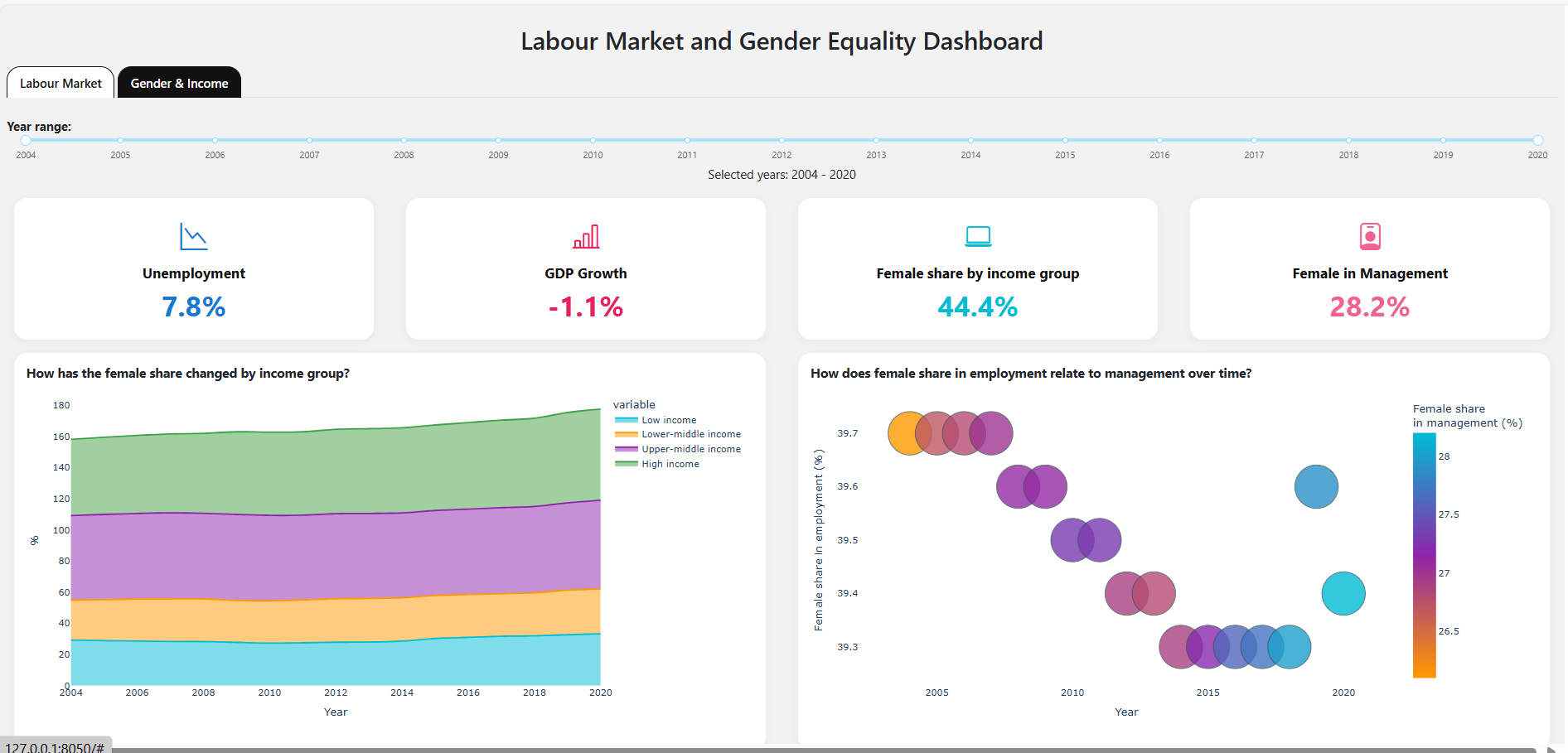
    html.H2("Labour Market and Gender Equality Dashboard", className="my-3 text-center"),
    dbc.Tabs([
        dbc.Tab(
            html.Div([
                dbc.Row([
                    dbc.Col(id="kpi-unemp", width=3),
                    dbc.Col(id="kpi-gdp", width=3),
                    dbc.Col(id="kpi-digital", width=3),
                    dbc.Col(id="kpi-mgmt", width=3),
                ], className="mb-3 justify-content-center"),
                dbc.Row([
                    dbc.Col([
                        html.Label("Region(s):", style={"fontWeight": "bold"}),
                        dcc.Dropdown(
                            id='region-dropdown',
                            options=[{'label': r, 'value': r} for r in regions],
                            value=['Africa', 'Americas', 'Europe and Central Asia'],
                            multi=True,
                            clearable=False,
                            style={"fontSize": "0.95rem"}
                        ),
                    ], width=12),
                ], className="mb-4"),
                dbc.Row([
                    dbc.Col(chart_card(
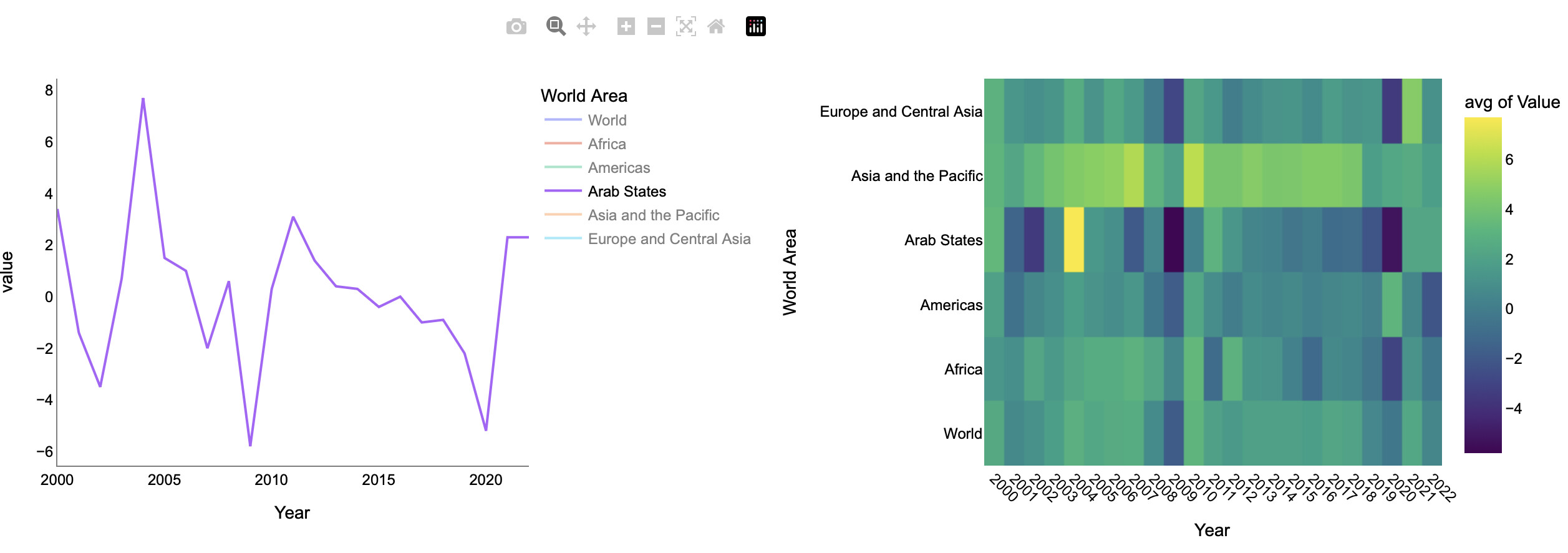
                        "How has unemployment changed over time in different regions?",
                        'unemp-line'
                    ), width=6),
                    dbc.Col(chart_card(
                        "Which regions and years had the highest or lowest GDP growth?",
                        'gdp-heatmap'
                    ), width=6),
                ]),
            ]),
            label="Labour Market",
            tab_class_name="custom-tabs"
        ),
        dbc.Tab(
            html.Div([
                dbc.Row([
                    dbc.Col(id="kpi-unemp-2", width=3),
                    dbc.Col(id="kpi-gdp-2", width=3),
                    dbc.Col(id="kpi-digital-2", width=3),
                    dbc.Col(id="kpi-mgmt-2", width=3),
                ], className="mb-3 justify-content-center"),
                dbc.Row([
                    dbc.Col(chart_card(
                        "How has the female share changed by income group?",
                        'digital-area',
                        height="440px",
                        small_question=True
                    ), width=6),
                    dbc.Col(chart_card(
                        "How does female share in employment relate to management over time?",
                        'female-bubble',
                        height="440px",
                        small_question=True
                    ), width=6),
                ]),
            ]),
            label="Gender & Income",
            tab_class_name="custom-tabs"
        ),
    ], className="mb-4 custom-tabs"),
], fluid=True, style={"minHeight": "100vh", "padding": "10px 10px"})

@app.callback(
    Output('kpi-unemp', 'children'),
    Output('kpi-gdp', 'children'),
    Output('kpi-digital', 'children'),
    Output('kpi-mgmt', 'children'),
    Output('kpi-unemp-2', 'children'),
    Output('kpi-gdp-2', 'children'),
    Output('kpi-digital-2', 'children'),
    Output('kpi-mgmt-2', 'children'),
    Output('unemp-line', 'figure'),
    Output('gdp-heatmap', 'figure'),
    Output('digital-area', 'figure'),
    Output('female-bubble', 'figure'),
    Input('region-dropdown', 'value'),
)
def update_dashboard(regions_selected):
    if not isinstance(regions_selected, list):
        regions_selected = [regions_selected]
    latest_year = max(years)
    # --- KPIs (same for both tabs) ---
    unemp_row = df_unemp[df_unemp['Year'] == latest_year]
    unemp_vals = [unemp_row[r].values[0] for r in regions_selected if not unemp_row.empty and r in unemp_row.columns]
    unemp_val = f"{sum(unemp_vals)/len(unemp_vals):.1f}%" if unemp_vals else "-"
    kpi1 = kpi_card("Unemployment", unemp_val, "bi-graph-down", "#1976d2")
    gdp_row = df_gdp[df_gdp['Year'] == latest_year]
    gdp_vals = [gdp_row[r].values[0] for r in regions_selected if not gdp_row.empty and r in gdp_row.columns]
    kpi2 = kpi_card("GDP Growth", f"{sum(gdp_vals)/len(gdp_vals):.1f}%" if gdp_vals else "-", "bi-bar-chart-line", "#e91e63")
    digital_row = df_digital[df_digital['Year'] == latest_year]
    digital_vals = [digital_row[g].values[0] for g in income_groups if not digital_row.empty and g in digital_row.columns]
    kpi3 = kpi_card("Female share by income group", f"{sum(digital_vals)/len(digital_vals):.1f}%" if digital_vals else "-", "bi-laptop", "#00bcd4")
    mgmt_row = df_female[df_female['Year'] == latest_year]
    mgmt_val = mgmt_row['Female share in management'].values[0] if not mgmt_row.empty else None
    kpi4 = kpi_card("Female in Management", f"{mgmt_val:.1f}%" if mgmt_val is not None else "-", "bi-person-badge", "#f06292")
    # --- Charts ---
    # 1. Unemployment line (spline, colored lines, max red marker only, legend right, only regions in legend)
    df1 = df_unemp.copy()
    fig1 = go.Figure()
    for i, region in enumerate(regions_selected):
        y = df1[region]
        x = df1['Year']
        color = color_palette[i % len(color_palette)]
        fig1.add_trace(go.Scatter(
            x=x, y=y, mode='lines', name=region, line_shape='spline', line=dict(color=color), showlegend=True
        ))
        # Highlight max
        max_idx = y.idxmax()
        max_year = df1.loc[max_idx, 'Year']
        max_val = y[max_idx]
        fig1.add_trace(go.Scatter(
            x=[max_year], y=[max_val],
            mode='markers',
            marker=dict(size=14, color='#e53935', line=dict(width=2, color='white')),
            name=None,
            showlegend=False
        ))
    fig1.update_layout(
        yaxis_title="%",
        xaxis_title="Year",
        legend=dict(orientation="v", x=1.02, y=1, xanchor="left", yanchor="top", bgcolor="rgba(0,0,0,0)"),
        margin=dict(l=30, r=120, t=10, b=30),
        paper_bgcolor="#fff",
        plot_bgcolor="#fff"
    )
    # 2. GDP heatmap (white-blue-pink-red, so the highest is vivid red)
    df_heat = df_gdp.melt(id_vars='Year', var_name='Region', value_name='GDP growth')
    df_heat = df_heat[df_heat['Region'].isin(regions_selected)]
    heat_pivot = df_heat.pivot(index='Region', columns='Year', values='GDP growth')
    fig2 = px.imshow(
        heat_pivot,
        color_continuous_scale=heatmap_palette,
        aspect='auto',
        labels=dict(color="GDP growth (%)"),
        title=None
    ) if not heat_pivot.empty else px.imshow([[None]], title="No data")
    fig2.update_layout(margin=dict(l=30, r=10, t=10, b=30), paper_bgcolor="#fff", plot_bgcolor="#fff")
    # 3. Female share by income group area (area chart, custom palette, white background)
    df3 = df_digital.copy()
    if not df3.empty:
        fig3 = px.area(
            df3,
            x='Year',
            y=income_groups,
            title=None,
            line_shape="spline",
            color_discrete_sequence=area_palette
        )
        fig3.update_traces(mode="lines")
    else:
        fig3 = px.area(title="No data")
    fig3.update_layout(
        yaxis_title="%",
        xaxis_title="Year",
        margin=dict(l=30, r=10, t=10, b=30),
        paper_bgcolor="#fff",
        plot_bgcolor="#fff"
    )
    # 4. Female share in employment vs. management (bubble chart, orange→purple→turquoise scale)
    df4 = df_female.copy()
    if not df4.empty:
        fig4 = px.scatter(
            df4,
            x='Year',
            y='Female share in employment',
            size='Female share in the working-age population',
            color='Female share in management',
            color_continuous_scale=bubble_palette,
            title=None
        )
    else:
        fig4 = px.scatter(title="No data")
    fig4.update_layout(
        yaxis_title="Female share in employment (%)",
        xaxis_title="Year",
        margin=dict(l=30, r=10, t=10, b=30),
        paper_bgcolor="#fff",
        plot_bgcolor="#fff"
    )
    # Show KPIs on both tabs
    return kpi1, kpi2, kpi3, kpi4, kpi1, kpi2, kpi3, kpi4, fig1, fig2, fig3, fig4

if __name__ == '__main__':
    app.run(debug=True) ```
5 Likes

This dashboard covering global labor attributes uses px.line to visualize each data set. The left plot has raw data, the right has normalized values.

A Mantine Group/Radio selects one of the four data sets. The Mantine RangeSlider (first time used by me) is used to narrow the range of years.

The dash ag table at the bottom shows the raw and normalized data in the same table, where each column of raw data is placed next to that same column’s normalized data. I am improving my ability to control the appearance of tables like this, including number formats which I have limited to 2 decimal places.

This screen shot shows Management Gender Parity for all years in the dataset. The raw data shows that the percentages of women in management positions compared with percentages of women in the workplace and in the general population is very poor. A silver lining is that gender parity is slowly improving, emphasis on the word slowly.


This screen shot used the RangeSlider to look at unemployment in the Americas, by selecting years from the 2008 great recession through the onset of Covid 19 (2022). The interactive legend was used to deselect all regions except for the Americas. The data look correct to me

Here is the code:

import plotly.express as px
import polars as pl
import polars.selectors as cs
import dash
import dash_ag_grid as dag
from dash import Dash, dcc, html, Input, Output
import dash_mantine_components as dmc
dash._dash_renderer._set_react_version('18.2.0')

#----- GATHER DATA -------------------------------------------------------------
df_gender_parity_mgmt = (
    pl.scan_csv('gender-parity-in-managerial-positions.csv')
    .select(
       YEAR = pl.col('Year').cast(pl.UInt16),
       FEM_SHR_MGMT = pl.col('Female share in management'),
       FEB_SHR_EMP = pl.col('Female share in employment'),
       FEM_SHR_WRKN_POP = pl.col('Female share in the working-age population'),
    )
    .with_columns(pl.col(pl.Float64).cast(pl.Float32))
    .sort('YEAR')
    .collect()
)

df_gender_pay_gap = (
    pl.scan_csv('gender-pay-gap.csv')
    .select(
       YEAR = pl.col('Year').cast(pl.UInt16),
       WORLD = pl.col('World'),
       LOW_INCOME = pl.col('Low income'),
       LOWER_MID = pl.col('Lower-middle income'),
       UPPER_MID = pl.col('Upper-middle income'),
       HIGH_INCOME = pl.col('High income'),
    )
    .with_columns(pl.col(pl.Float64).cast(pl.Float32))
    .sort('YEAR')
    .collect()
)

df_labor_productivity = (
    pl.scan_csv('labor-productivity.csv')
    .select(
       YEAR = pl.col('Year').cast(pl.UInt16),
       WORLD = pl.col('World'),
       AFRICA = pl.col('Africa'),
       AMERICAS = pl.col('Americas'),
       ARAB_STATES = pl.col('Arab States'),
       ASIA_PACIFIC = pl.col('Asia and the Pacific'),
       EUR_CENT_ASIA = pl.col('Europe and Central Asia'),
    )
    .with_columns(pl.col(pl.Float64).cast(pl.Float32))
    .sort('YEAR')
    .collect()
)

df_unemployment = (
    pl.scan_csv('unemployment.csv')
    .select(
       YEAR = pl.col('Year').cast(pl.UInt16),
       WORLD = pl.col('World'),
       AFRICA = pl.col('Africa'),
       AMERICAS = pl.col('Americas'),
       ARAB_STATES = pl.col('Arab States'),
       ASIA_PACIFIC = pl.col('Asia and the Pacific'),
       EUR_CENT_ASIA = pl.col('Europe and Central Asia'),
    )
    .with_columns(pl.col(pl.Float64).cast(pl.Float32))
    .collect()
)

#----- GLOBALS -----------------------------------------------------------------
style_horiz_line = {'border': 'none', 'height': '4px', 
    'background': 'linear-gradient(to right, #007bff, #ff7b00)', 
    'margin': '10px,', 'fontsize': 32}

style_h2 = {'text-align': 'center', 'font-size': '32px', 
            'fontFamily': 'Arial','font-weight': 'bold'}

legend_font_size = 10
min_year = min([
    df_gender_parity_mgmt['YEAR'].min(),
    df_gender_pay_gap['YEAR'].min(),
    df_labor_productivity['YEAR'].min(),
    df_unemployment['YEAR'].min(),
])
max_year = max([
    df_gender_parity_mgmt['YEAR'].max(),
    df_gender_pay_gap['YEAR'].max(),
    df_labor_productivity['YEAR'].max(),
    df_unemployment['YEAR'].max()
])

dataset_names = [
    'Management Gender Parity',
    'Gender Pay Gap',
    'Labor Productivity',
    'Unemployment'
]

#----- FUNCTIONS----------------------------------------------------------------
def get_px_line(df, title):
    df_cols = df.columns
    if title.endswith('NORMALIZED'):
        y_title='PERCENT CHANGE'
    else:
        y_title='RAW DATA'
    fig=px.line(
        df,
        'YEAR',
        df_cols[1:],
        template='simple_white',
        line_shape='spline',
        title=title,
        markers=True
    )
    fig.update_traces(line=dict(width=0.5), hovertemplate=None)
    fig.update_layout(
        hoverlabel=dict(
            bgcolor="white",
            font_size=10,
            font_family='arial',
        ),
        legend=dict(
            orientation='h',
            yanchor='bottom',
            y=-0.5,
            xanchor='center',
            x=0.5,
            font=dict(family='Arial', size=legend_font_size, color='black'),
            title=dict(
                text='',
                font=dict(family='Arial', size=legend_font_size, color='black'),
            )
        ),
        xaxis_title='',  # x-axis YEAR not needed, it is obvious
        yaxis_title=y_title, 
        hovermode="x unified",
    )
    return fig

def get_df_raw(dataset_name, x_year_range):
    '''returns requested data set, with years filtered by range slider'''
    if dataset_name == 'Management Gender Parity':
        df = df_gender_parity_mgmt
    elif dataset_name == 'Gender Pay Gap':
        df = df_gender_pay_gap
    elif dataset_name == 'Labor Productivity':
        df = df_labor_productivity
    elif dataset_name == 'Unemployment':
        df =df_unemployment
    else:
        print(f'NO VALID SELECION FOR {dataset_name}')
    return (
        df
        .select(first:=cs.by_name('YEAR'), ~first)
        .filter(pl.col('YEAR') >= x_year_range[0])
        .filter(pl.col('YEAR') <= x_year_range[1])
        )

def get_df_norm(df_to_norm):
    ''' returns dataframe with values normalized'''
    for col in df_to_norm.columns[1:]:  # skips first column, which is the year
        df_to_norm = (
            df_to_norm
            .with_columns(
                ((100*pl.col(col)/pl.col(col).first()-100)).alias(col)
            )
        )
    return df_to_norm
    
def get_dataset_radio_picker():
    ''' radio picker selects desired dataset'''
    return(
    dmc.RadioGroup(
        children=dmc.Group(
            [dmc.Radio(item, value=item) for item in dataset_names]),
        id='dataset_radio',
        value=dataset_names[0],
        label='',
        ),
    )

def get_range_slider():
    '''used for setting min and max years to evaluate'''
    range_year = max_year - min_year
    return(
        dmc.RangeSlider(
            id='range-slider-input',
            min=min_year,
            max=max_year,
            value=[min_year, max_year],
            step=1,
            marks=[
                {"value": min_year+(0.25*range_year), "label": "25%"},
                {"value": min_year+(0.5*range_year), "label": "50%"},
                {"value": min_year+(0.75*range_year), "label": "75%"},
            ],
            mb=50,
            minRange=1,
        ),
        dmc.Text(id='range-slider-output'),
    )

def join_by_year(df1, df2):
    ''' merges raw and normalized datasets for display in dash ag table'''
    df_all = (
        df1.join(
        df2,
        on='YEAR',
        how='left',
        suffix='_NORM'
        )
    )
    float_cols = [c for c in sorted(df_all.columns[1:])]
    df_all_sorted_cols = (['YEAR'] + float_cols)
    df_all = (
        df_all
        .select(df_all_sorted_cols)
    )
    return(df_all)

def get_ag_col_defs(columns):
    ''' return setting for ag columns, with numeric formatting '''
    ag_col_defs = [{   # applies to YEAR column, integer
        'field':'YEAR', 
        'pinned':'left', # pin the YEAR column to keep visible while scrolling
        'width': 100, 
        'suppressSizeToFit': True
    }]
    for col in columns[1:]:   # applies to data columns, floating point
        ag_col_defs.append({
            'headerName': col,
            'field': col,
            'type': "numericColumn",
            'valueFormatter': {"function": "d3.format('.2f')(params.value)"},
            'columnSize':'sizeToFit'
        })
    return ag_col_defs

#----- DASH APPLICATION STRUCTURE-----------------------------------------------
app = Dash()
app.layout =  dmc.MantineProvider([
    dmc.Space(h=30),
    html.Hr(style=style_horiz_line),
    dmc.Text('Global Labor Attributes', ta='center', style=style_h2),
    dmc.Space(h=30),
    dmc.Grid(  
        children = [ 
            dmc.GridCol(
                dmc.Text('Select a Dataset', size='xl'), span=5, offset=1),
            dmc.GridCol(
                dmc.Text('Adjust min and max year', size='xl'),
                span=5, offset=0),
        ]
    ),
    dmc.Space(h=30),
    dmc.Grid(  
        children = [ 
            dmc.GridCol(get_dataset_radio_picker(), span=5, offset=1),
            dmc.GridCol(get_range_slider(), span=5, offset=0),
        ]
    ),
     html.Hr(style=style_horiz_line),
    dmc.Space(h=30),
    dmc.Grid(  # px_line_data on the left, px_line_norm on the right
        children = [ 
            dmc.GridCol(dcc.Graph(id='px_line_data'), span=5, offset=1),
            dmc.GridCol(dcc.Graph(id='px_line_norm'), span=5, offset=0),
        ]
    ),
    dmc.Space(h=30),
    dmc.Grid(
        children = [
            dmc.GridCol(
                dag.AgGrid(
                    id='ag_grid'
                ),
                span=10, offset=1
            ),
        ]
    ),
])

@app.callback(
    Output('px_line_data', 'figure'),
    Output('px_line_norm', 'figure'),
    Output('range-slider-output', 'children'),
    Output('ag_grid', 'columnDefs'),  # columns vary by dataset
    Output('ag_grid', 'rowData'),   
    Input('dataset_radio', 'value'),
    Input('range-slider-input', 'value'), 
)
def update(from_radio, x_year_range):
    dataset_name = from_radio
    slider_label = f'{x_year_range[0]} to {x_year_range[1]} inclusive'

    df_raw = get_df_raw(dataset_name, x_year_range)
    px_line_data = get_px_line(
        df_raw, title=dataset_name.upper() + ' -- RAW DATA')
    
    df_norm = get_df_norm(df_raw)
    px_line_norm = get_px_line(
        df_norm, title=dataset_name.upper() + ' -- NORMALIZED')
    
    df_all = join_by_year(df_raw, df_norm)
    ag_col_defs = get_ag_col_defs(df_all.columns)    
    ag_row_data = df_all.to_dicts()

    return (
        px_line_data,
        px_line_norm, 
        slider_label,
        ag_col_defs,
        ag_row_data,
    )

if __name__ == '__main__':
    app.run(debug=True)

4 Likes

I made the first page for the following years as well, I just saw from the above dashboards that it doesn’t include anything after 2020, because the common year in the 4 datasets was only until 2020. Unemployment now shows something different.

3 Likes