The code
import pandas as pd
import dash
from dash import dcc, html, dash_table
from dash.dependencies import Input, Output, State
import plotly.graph_objects as go
import dash_bootstrap_components as dbc
import numpy as np
— 1. CONFIGURATION AND DATA PREPARATION —
FILE_NAME = ‘airline-safety.csv’
DAYS_IN_15_YEARS = 15 * 365.25
df = pd.read_csv(FILE_NAME)
Metrics Calculation
df[‘Days_Between_Incidents_85_99’] = df[‘incidents_85_99’].apply(
lambda x: DAYS_IN_15_YEARS / x if x > 0 else DAYS_IN_15_YEARS
)
df[‘Days_Between_Incidents_00_14’] = df[‘incidents_00_14’].apply(
lambda x: DAYS_IN_15_YEARS / x if x > 0 else DAYS_IN_15_YEARS
)
df[‘Days_Improvement_PCT’] = ((df[‘Days_Between_Incidents_00_14’] - df[‘Days_Between_Incidents_85_99’]) / df[‘Days_Between_Incidents_85_99’]) * 100
df[‘ASK_LOG’] = np.log10(df[‘avail_seat_km_per_week’])
df[‘TIE_00_14’] = (df[‘incidents_00_14’] / df[‘avail_seat_km_per_week’]) * 1e9
Global Metrics
MEAN_DAYS_85_99 = (DAYS_IN_15_YEARS * len(df)) / df[‘incidents_85_99’].sum()
MEAN_DAYS_00_14 = (DAYS_IN_15_YEARS * len(df)) / df[‘incidents_00_14’].sum()
IMPROVEMENT_PCT = ((MEAN_DAYS_00_14 - MEAN_DAYS_85_99) / MEAN_DAYS_85_99) * 100
Slider Config
MIN_ASK_LOG = df[‘ASK_LOG’].min()
MAX_ASK_LOG = df[‘ASK_LOG’].max()
STEP_ASK_LOG = (MAX_ASK_LOG - MIN_ASK_LOG) / 40
ask_quantiles = df[‘avail_seat_km_per_week’].quantile([0.05, 0.25, 0.50, 0.75, 0.95])
slider_marks = {
np.log10(ask_quantiles[0.05]): {‘label’: ‘Regional’, ‘style’: {‘color’: ‘#94A3B8’, ‘white-space’: ‘nowrap’}},
np.log10(ask_quantiles[0.25]): {‘label’: ‘Medium’, ‘style’: {‘color’: ‘#CBD5E1’, ‘white-space’: ‘nowrap’}},
np.log10(ask_quantiles[0.50]): {‘label’: ‘Large’, ‘style’: {‘color’: ‘#E2E8F0’, ‘white-space’: ‘nowrap’}},
np.log10(ask_quantiles[0.75]): {‘label’: ‘Global’, ‘style’: {‘color’: ‘#F1F5F9’, ‘white-space’: ‘nowrap’}},
np.log10(ask_quantiles[0.95]): {‘label’: ‘Giant’, ‘style’: {‘color’: ‘#FFFFFF’, ‘white-space’: ‘nowrap’, ‘font-weight’: ‘bold’}},
}
def human_format(num):
num = float(‘{:.3g}’.format(num))
magnitude = 0
while abs(num) >= 1000:
magnitude += 1
num /= 1000.0
return ‘{}{}’.format(‘{:f}’.format(num).rstrip(‘0’).rstrip(‘.’), [‘’, ‘K’, ‘M’, ‘B’, ‘T’][magnitude])
— 2. AIRLINE STATUS & HISTORY —
status_data = [
# EUROPE
{“Airline”: “Aer Lingus”, “Region”: “Europe”, “Status”: “ Operational”, “History”: “Founded 1936. Flag carrier of Ireland. Part of IAG group.”},
{“Airline”: “Aeroflot*”, “Region”: “Europe”, “Status”: “ Operational”, “History”: “Founded 1923. Ex-Soviet, still Russia’s national carrier.”},
{“Airline”: “Air France”, “Region”: “Europe”, “Status”: “ Operational”, “History”: “Founded 1933. Merged with KLM in 2004 (Air France-KLM Group).”},
{“Airline”: “Alitalia”, “Region”: “Europe”, “Status”: “ Ceased operations”, “History”: “Closed in 2021 after years of crisis. Succeeded by ITA Airways.”},
{“Airline”: “Austrian Airlines”, “Region”: “Europe”, “Status”: “ Operational”, “History”: “Founded 1957. Owned by Lufthansa Group since 2009.”},
{“Airline”: “British Airways*”, “Region”: “Europe”, “Status”: “ Operational”, “History”: “Founded 1974. UK flag carrier, Oneworld founder.”},
{“Airline”: “Condor”, “Region”: “Europe”, “Status”: “ Operational”, “History”: “Founded 1955. Survived Thomas Cook bankruptcy.”},
{“Airline”: “Finnair”, “Region”: “Europe”, “Status”: “ Operational”, “History”: “Founded 1923. Specialist in Europe-Asia polar routes.”},
{“Airline”: “Iberia”, “Region”: “Europe”, “Status”: “ Operational”, “History”: “Founded 1927. Leader Europe-Latam. Part of IAG.”},
{“Airline”: “KLM*”, “Region”: “Europe”, “Status”: “ Operational”, “History”: “Founded 1919. Oldest operating under original name.”},
{“Airline”: “Lufthansa*”, “Region”: “Europe”, “Status”: “ Operational”, “History”: “Refounded 1953. European giant, owns Swiss and Austrian.”},
{“Airline”: “SAS*”, “Region”: “Europe”, “Status”: “ Operational”, “History”: “Founded 1946. Joint airline of Denmark, Norway, and Sweden.”},
{“Airline”: “SWISS*”, “Region”: “Europe”, “Status”: “ Operational”, “History”: “Founded 2002 on remains of Swissair. Owned by Lufthansa.”},
{“Airline”: “TAP - Air Portugal”, “Region”: “Europe”, “Status”: “ Operational”, “History”: “Founded 1945. Main bridge to Brazil and Africa.”},
{“Airline”: “Turkish Airlines”, “Region”: “Europe”, “Status”: “ Operational”, “History”: “Founded 1933. Flies to more countries than any other airline.”},
{“Airline”: “Virgin Atlantic”, “Region”: “Europe”, “Status”: “ Operational”, “History”: “Founded 1984 by Richard Branson. Famous for its style.”},
# NORTH AMERICA
{“Airline”: “Air Canada”, “Region”: “North America”, “Status”: “ Operational”, “History”: “Founded 1937. Flag carrier of Canada, Star Alliance member.”},
{“Airline”: “Alaska Airlines*”, “Region”: “North America”, “Status”: “ Operational”, “History”: “Acquired Hawaiian Airlines in 2024. Seattle based.”},
{“Airline”: “American*”, “Region”: “North America”, “Status”: “ Operational”, “History”: “World’s largest. Absorbed US Airways in 2013.”},
{“Airline”: “Delta / Northwest*”, “Region”: “North America”, “Status”: “ Delta / NW”, “History”: “Delta bought NW in 2008. NW brand disappeared in 2010.”},
{“Airline”: “Hawaiian Airlines”, “Region”: “North America”, “Status”: “ Operational”, “History”: “Founded 1929. Acquired by Alaska Airlines in 2024.”},
{“Airline”: “Southwest Airlines”, “Region”: “North America”, “Status”: “ Operational”, “History”: “Pioneer of the global Low-Cost model.”},
{“Airline”: “United / Continental*”, “Region”: “North America”, “Status”: “ United / Cont.”, “History”: “Merged in 2010. Used United name and Continental logo.”},
{“Airline”: “US Airways / America West*”, “Region”: “North America”, “Status”: “ Merged”, “History”: “Merged with American Airlines. Brand disappeared in 2015.”},
# LATIN AMERICA
{“Airline”: “Aerolineas Argentinas”, “Region”: “Latam”, “Status”: “ Operational”, “History”: “Founded 1950. State-owned. Historic connectivity in Argentina.”},
{“Airline”: “Aeromexico*”, “Region”: “Latam”, “Status”: “ Operational”, “History”: “Founded 1934. Mexico’s flag carrier. SkyTeam member.”},
{“Airline”: “Avianca”, “Region”: “Latam”, “Status”: “ Operational”, “History”: “Founded 1919. 2nd oldest in the world still operating.”},
{“Airline”: “COPA”, “Region”: “Latam”, “Status”: “ Operational”, “History”: “Founded 1947. Famous for its ‘Hub of the Americas’ in Panama.”},
{“Airline”: “LAN Airlines”, “Region”: “Latam”, “Status”: “ Rebranded”, “History”: “Now LATAM. Merged with TAM in 2012.”},
{“Airline”: “TACA”, “Region”: “Latam”, “Status”: “ Rebranded”, “History”: “Merged with Avianca. Brand disappeared in 2013.”},
{“Airline”: “TAM”, “Region”: “Latam”, “Status”: “ Rebranded”, “History”: “Now LATAM Brazil. Merged with LAN in 2012.”},
# ASIA / OCEANIA
{“Airline”: “Air India*”, “Region”: “Asia”, “Status”: “ Operational”, “History”: “Returned to Tata Group in 2022 for revitalization.”},
{“Airline”: “Air New Zealand*”, “Region”: “Oceania”, “Status”: “ Operational”, “History”: “Famous for creative marketing and safety.”},
{“Airline”: “All Nippon Airways”, “Region”: “Asia”, “Status”: “ Operational”, “History”: “Japan’s largest, 5-star service.”},
{“Airline”: “Cathay Pacific*”, “Region”: “Asia”, “Status”: “ Operational”, “History”: “Hong Kong based. Historic leader in premium service.”},
{“Airline”: “China Airlines”, “Region”: “Asia”, “Status”: “ Operational”, “History”: “Flag carrier of Taiwan (not to be confused with Air China).”},
{“Airline”: “Garuda Indonesia”, “Region”: “Asia”, “Status”: “ Operational”, “History”: “Flag carrier of Indonesia. Recently restructured.”},
{“Airline”: “Japan Airlines”, “Region”: “Asia”, “Status”: “ Operational”, “History”: “Resurged after 2010 bankruptcy. Flag carrier of Japan.”},
{“Airline”: “Korean Air”, “Region”: “Asia”, “Status”: “ Operational”, “History”: “Flag carrier of South Korea. In process of buying Asiana.”},
{“Airline”: “Malaysia Airlines”, “Region”: “Asia”, “Status”: “ Operational”, “History”: “Nationalized after 2014 tragedies (MH370/MH17).”},
{“Airline”: “Pakistan International”, “Region”: “Asia”, “Status”: “ Operational”, “History”: “Historic, currently facing severe financial problems.”},
{“Airline”: “Philippine Airlines”, “Region”: “Asia”, “Status”: “ Operational”, “History”: “Asia’s oldest commercial airline (1941).”},
{“Airline”: “Qantas*”, “Region”: “Oceania”, “Status”: “ Operational”, “History”: “The ‘Flying Kangaroo’. Impeccable safety record.”},
{“Airline”: “Singapore Airlines”, “Region”: “Asia”, “Status”: “ Operational”, “History”: “Global benchmark for luxury and customer service.”},
{“Airline”: “Sri Lankan / AirLanka”, “Region”: “Asia”, “Status”: “ Operational”, “History”: “Rebranded as SriLankan in 1999.”},
{“Airline”: “Thai Airways”, “Region”: “Asia”, “Status”: “ Operational”, “History”: “Flag carrier of Thailand. In financial rehabilitation.”},
{“Airline”: “Vietnam Airlines”, “Region”: “Asia”, “Status”: “ Operational”, “History”: “Rapid growth in Southeast Asia.”},
{“Airline”: “Xiamen Airlines”, “Region”: “Asia”, “Status”: “ Operational”, “History”: “China’s first private airline.”},
# MIDDLE EAST / AFRICA
{“Airline”: “Egyptair”, “Region”: “Africa”, “Status”: “ Operational”, “History”: “Founded 1932. Africa’s oldest.”},
{“Airline”: “El Al”, “Region”: “Middle East”, “Status”: “ Operational”, “History”: “Israel. Famous for extreme safety.”},
{“Airline”: “Ethiopian Airlines”, “Region”: “Africa”, “Status”: “ Operational”, “History”: “Current leader of African aviation.”},
{“Airline”: “Gulf Air”, “Region”: “Middle East”, “Status”: “ Operational”, “History”: “Flag carrier of Bahrain. Gulf pioneer.”},
{“Airline”: “Kenya Airways”, “Region”: “Africa”, “Status”: “ Operational”, “History”: “Known as ‘The Pride of Africa’.”},
{“Airline”: “Royal Air Maroc”, “Region”: “Africa”, “Status”: “ Operational”, “History”: “Key connector Africa-Europe.”},
{“Airline”: “Saudi Arabian”, “Region”: “Middle East”, “Status”: “ Operational”, “History”: “Saudia. Massive expansion for Vision 2030.”},
{“Airline”: “South African”, “Region”: “Africa”, “Status”: “ Operational”, “History”: “Restarted reduced operations after crisis in 2021.”}
]
df_status = pd.DataFrame(status_data)
— 3. CHART FUNCTIONS —
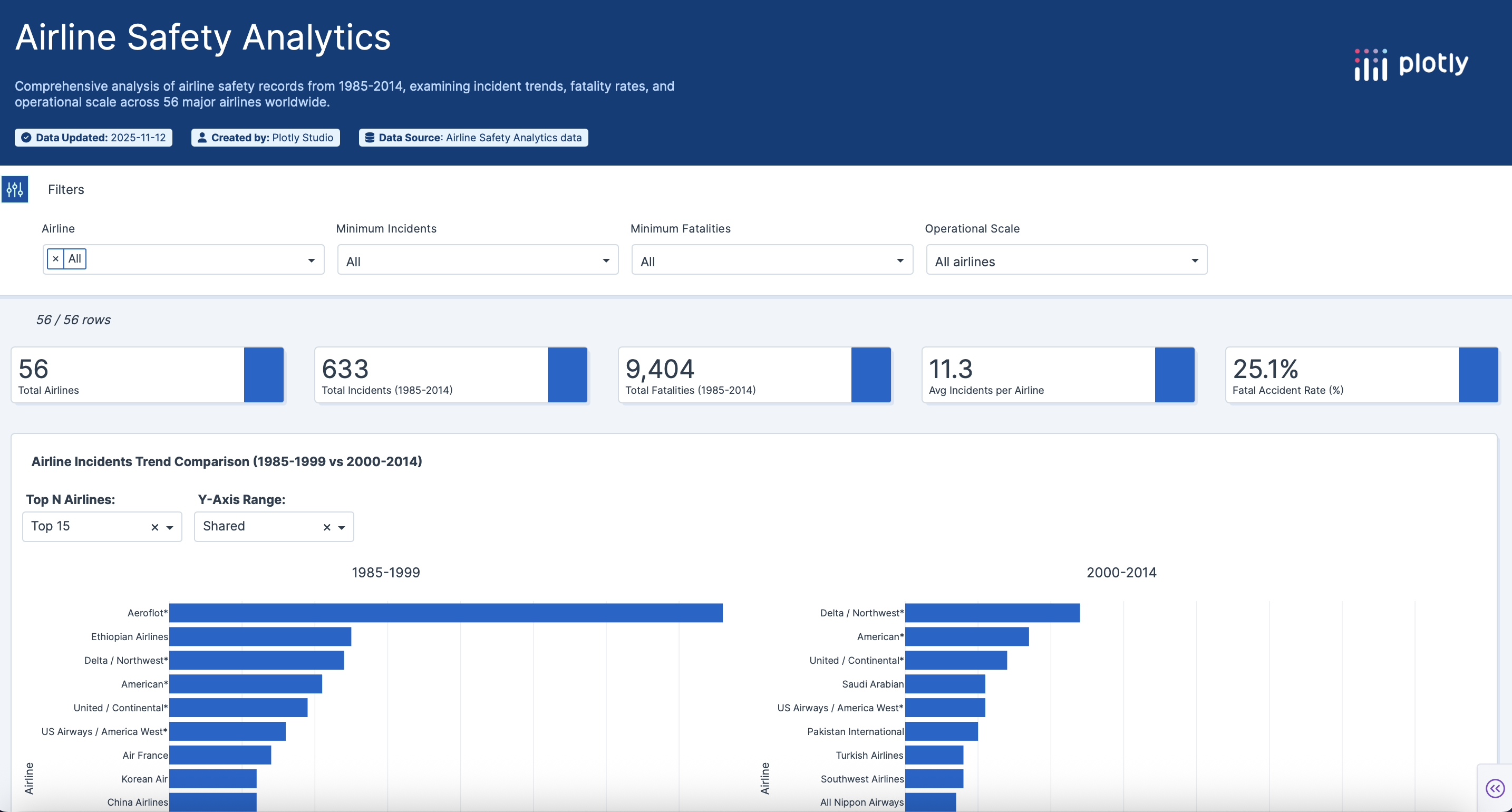
def create_evolution_chart(ask_log_range):
try: min_log, max_log = ask_log_range
except: min_log, max_log = MIN_ASK_LOG, MAX_ASK_LOG
df_filtered = df[(df['ASK_LOG'] >= min_log) & (df['ASK_LOG'] <= max_log)].copy()
if df_filtered.empty: return go.Figure().update_layout(title="No data", paper_bgcolor='#1E293B', plot_bgcolor='#1E293B', font_color='#E2E8F0')

df_plot = df_filtered.sort_values(by='Days_Improvement_PCT', ascending=True)
custom_data = df_plot['airline'].values

fig = go.Figure()
fig.add_trace(go.Bar(name='1985-1999', x=df_plot['airline'], y=df_plot['Days_Between_Incidents_85_99'], marker_color='#64748B', hovertemplate='<b>%{x}</b><br>Days: %{y:,.0f}<extra></extra>', customdata=custom_data))
fig.add_trace(go.Bar(name='2000-2014', x=df_plot['airline'], y=df_plot['Days_Between_Incidents_00_14'], marker_color='#3B82F6', hovertemplate='<b>%{x}</b><br>Days: %{y:,.0f}<extra></extra>', customdata=custom_data))

fig.update_layout(
    clickmode='event+select', barmode='group', paper_bgcolor='#1E293B', plot_bgcolor='#0F172A', font=dict(color='#E2E8F0', size=12),
    xaxis=dict(showgrid=False, title='', tickangle=-45), yaxis=dict(showgrid=True, gridcolor='#334155', title='Days Between Incidents'),
    legend=dict(orientation="h", yanchor="bottom", y=1.02, xanchor="right", x=1), margin=dict(t=40, b=150, l=60, r=40), hovermode='x unified', transition_duration=500, title_text='Evolution of Days Between Incidents'
)
return fig
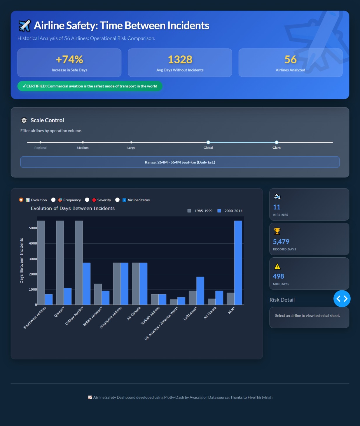
def create_incidents_chart(ask_log_range):
try: min_log, max_log = ask_log_range
except: min_log, max_log = MIN_ASK_LOG, MAX_ASK_LOG
df_filtered = df[(df['ASK_LOG'] >= min_log) & (df['ASK_LOG'] <= max_log)].copy()
if df_filtered.empty: return go.Figure().update_layout(title="No data", paper_bgcolor='#1E293B', plot_bgcolor='#1E293B', font_color='#E2E8F0')

df_plot = df_filtered[df_filtered['incidents_00_14'] >= 1]
if df_plot.empty: return go.Figure().update_layout(title="✅ Success: 0 incidents in this group (2000-2014).", paper_bgcolor='#1E293B', plot_bgcolor='#0F172A', font_color='#10B981')

df_sorted = df_plot.sort_values(by='incidents_00_14', ascending=False)
colors = ['#EF4444' if x > 5 else '#F59E0B' if x > 2 else '#3B82F6' for x in df_sorted['incidents_00_14']]
custom_data = df_sorted['airline'].values

fig = go.Figure(go.Scatter(
    x=df_sorted['incidents_00_14'], y=df_sorted['airline'], mode='markers',
    marker=dict(size=16, color=colors, line=dict(width=2, color='#0F172A')),
    hovertemplate='<b>%{y}</b><br>Incidents: %{x}<extra></extra>', customdata=custom_data
))

fig.update_layout(
    clickmode='event+select', paper_bgcolor='#1E293B', plot_bgcolor='#0F172A', font=dict(color='#E2E8F0', size=11),
    xaxis=dict(showgrid=True, gridcolor='#334155', title='Number of Incidents'), yaxis=dict(showgrid=False, title=''),
    margin=dict(t=40, b=60, l=150, r=40), transition_duration=500, title_text='Incident Frequency (2000–2014)'
)
return fig
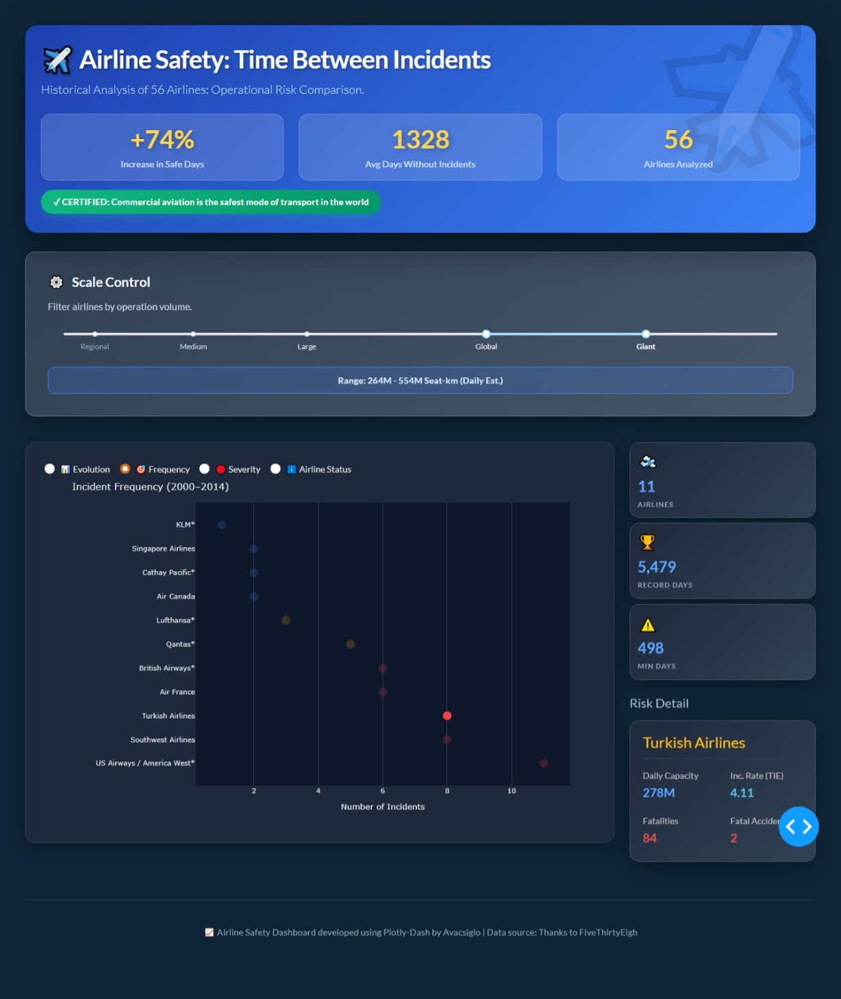
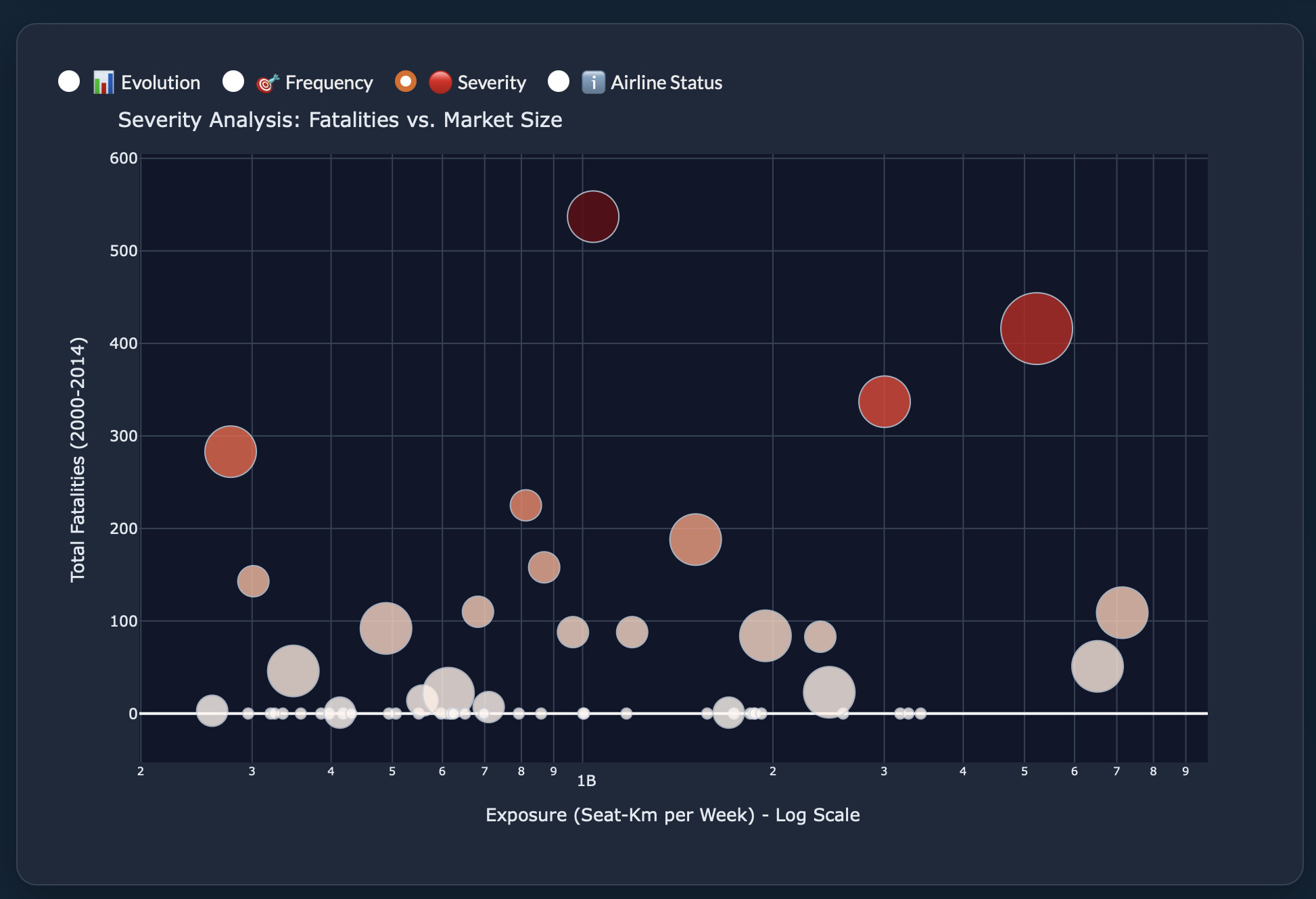
def create_risk_bubble_chart(ask_log_range):
try: min_log, max_log = ask_log_range
except: min_log, max_log = MIN_ASK_LOG, MAX_ASK_LOG
df_filtered = df[(df['ASK_LOG'] >= min_log) & (df['ASK_LOG'] <= max_log)].copy()

custom_data = df_filtered['airline'].values

fig = go.Figure(go.Scatter(
    x=df_filtered['avail_seat_km_per_week'],
    y=df_filtered['fatalities_00_14'],
    mode='markers',
    marker=dict(
        size=(df_filtered['fatal_accidents_00_14'] * 15) + 8,
        color=df_filtered['fatalities_00_14'],
        colorscale='Reds',
        showscale=False,
        line=dict(width=1, color='#CBD5E1'),
        opacity=0.8
    ),
    hovertemplate='<b>%{customdata}</b><br>Fatalities: %{y}<br>Capacity: %{x:.2s}<extra></extra>',
    customdata=custom_data
))

fig.update_layout(
    clickmode='event+select',
    paper_bgcolor='#1E293B',
    plot_bgcolor='#0F172A',
    font=dict(color='#E2E8F0', size=11),
    xaxis=dict(type='log', showgrid=True, gridcolor='#334155', title='Exposure (Seat-Km per Week) - Log Scale'),
    yaxis=dict(showgrid=True, gridcolor='#334155', title='Total Fatalities (2000-2014)'),
    margin=dict(t=40, b=60, l=60, r=40),
    transition_duration=500,
    title_text='Severity Analysis: Fatalities vs. Market Size'
)
return fig
— 4. APP INITIALIZATION —
app = dash.Dash(name, external_stylesheets=[dbc.themes.SUPERHERO])
app.title = “Airline Safety Dashboard”
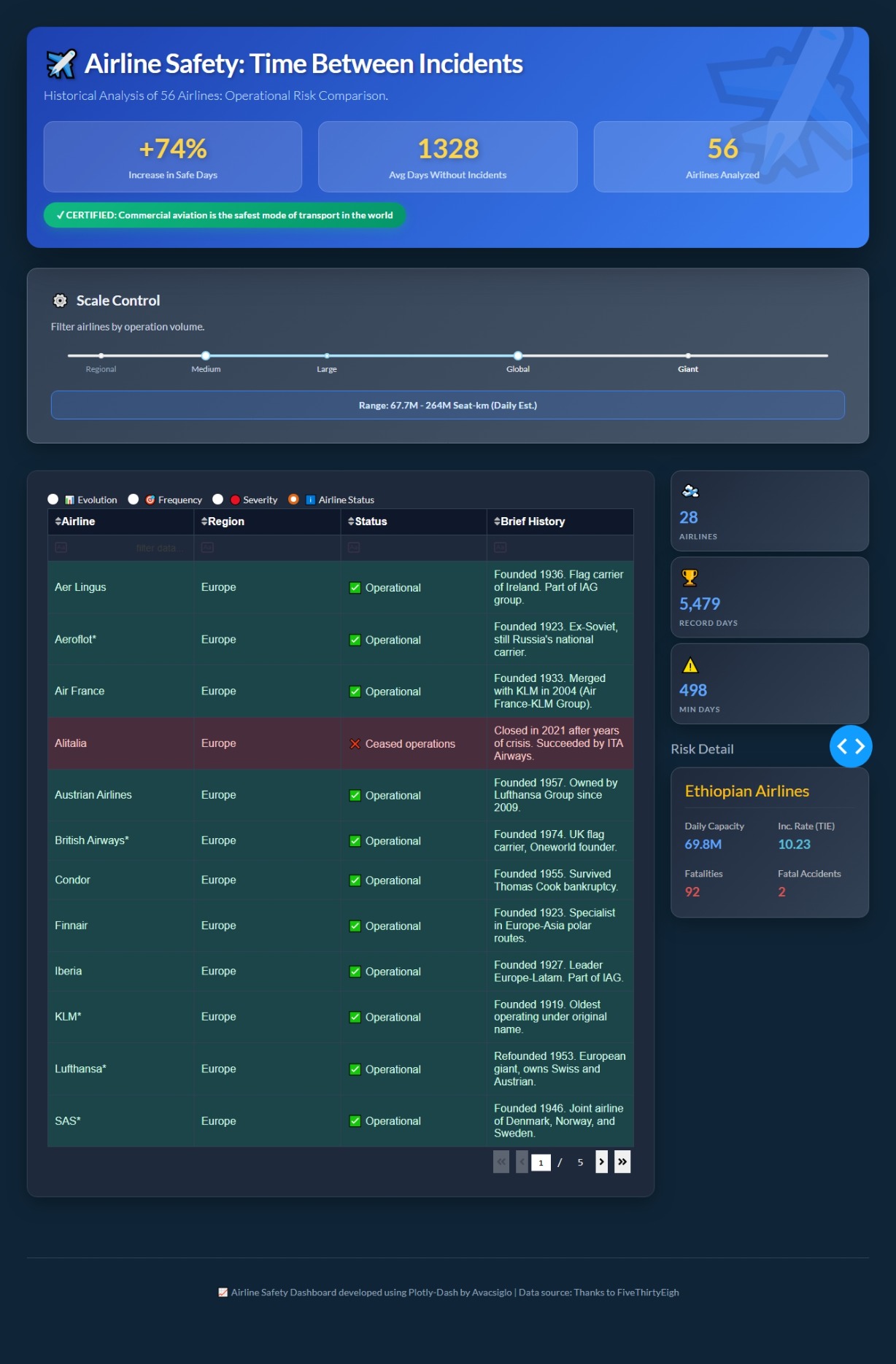
app.layout = html.Div([
dcc.Store(id=‘selected-airline-store’, data=None),
dbc.Container([
    # HERO
    html.Div([
        html.H1("✈️ Airline Safety: Time Between Incidents", className="hero-title"),
        html.P("Historical Analysis of 56 Airlines: Operational Risk Comparison.", className="hero-subtitle"),
        dbc.Row([
            dbc.Col([html.Div([html.H2(f"+{IMPROVEMENT_PCT:.0f}%", className="mb-0"), html.P("Increase in Safe Days")], className="stat-mega")], md=4),
            dbc.Col([html.Div([html.H2(f"{MEAN_DAYS_00_14:.0f}", className="mb-0"), html.P("Avg Days Without Incidents")], className="stat-mega")], md=4),
            dbc.Col([html.Div([html.H2(f"{len(df)}", className="mb-0"), html.P("Airlines Analyzed")], className="stat-mega")], md=4),
        ], className="mt-4"),
        html.Div("✓ CERTIFIED: Commercial aviation is the safest mode of transport in the world", className="badge-safe")
    ], className="hero-section"),

    # FILTERS
    html.Div([
        html.H3([html.Span("⚙️"), " Scale Control"], className="filter-title"),
        html.P("Filter airlines by operation volume.", className="filter-description"),
        dcc.RangeSlider(
            id='ask-slider',
            min=MIN_ASK_LOG, max=MAX_ASK_LOG, step=STEP_ASK_LOG,
            value=[MIN_ASK_LOG, MAX_ASK_LOG],
            marks=slider_marks,
            tooltip={"placement": "bottom", "always_visible": False}
        ),
        html.Div(id='slider-output', className="slider-output")
    ], className="filter-section"),

    # MAIN SECTION
    dbc.Row([
        dbc.Col([
            html.Div([
                # UPDATED RADIO ITEMS
                dbc.RadioItems(
                    id='chart-selector',
                    options=[
                        {'label': '📊 Evolution', 'value': 'evolution'},
                        {'label': '🎯 Frequency', 'value': 'incidents'},
                        {'label': '🔴 Severity', 'value': 'severity'},
                        {'label': 'ℹ️ Airline Status', 'value': 'status'}  # <-- NEW OPTION ADDED
                    ],
                    value='evolution', inline=True, className="chart-radio-selector"
                ),

                # GRAPHS
                dcc.Graph(id='days-bar-chart', figure=create_evolution_chart([MIN_ASK_LOG, MAX_ASK_LOG]), config={'displayModeBar': False}, style={'height': '550px'}),
                dcc.Graph(id='perfection-dot-plot', figure=create_incidents_chart([MIN_ASK_LOG, MAX_ASK_LOG]), config={'displayModeBar': False}, style={'height': '0px', 'display': 'none'}),
                dcc.Graph(id='severity-bubble-chart', figure=create_risk_bubble_chart([MIN_ASK_LOG, MAX_ASK_LOG]), config={'displayModeBar': False}, style={'height': '0px', 'display': 'none'}),

                # NEW TABLE CONTAINER (Hidden by default)
                html.Div(id='status-table-container', style={'display': 'none'}, children=[
                    dash_table.DataTable(
                        id='status-table',
                        data=df_status.to_dict('records'),
                        columns=[
                            {'name': 'Airline', 'id': 'Airline'},
                            {'name': 'Region', 'id': 'Region'},
                            {'name': 'Status', 'id': 'Status'},
                            {'name': 'Brief History', 'id': 'History'},
                        ],
                        sort_action="native",
                        filter_action="native",
                        page_size=12,
                        # Styling adapted for Dark Theme (Superhero)
                        style_table={'overflowX': 'auto'},
                        style_cell={
                            'textAlign': 'left',
                            'padding': '10px',
                            'backgroundColor': '#1E293B', # Dark background
                            'color': '#E2E8F0', # Light text
                            'border': '1px solid #334155',
                            'fontFamily': 'Arial, sans-serif',
                            'minWidth': '100px', 'width': '150px', 'maxWidth': '300px',
                            'whiteSpace': 'normal'
                        },
                        style_header={
                            'backgroundColor': '#0F172A', # Darker header
                            'fontWeight': 'bold',
                            'color': 'white',
                            'border': '1px solid #334155'
                        },
                        style_filter={
                            'backgroundColor': '#1E293B',
                            'color': 'white',
                            'border': '1px solid #334155'
                        },
                        style_data_conditional=[
                            {
                                'if': {'filter_query': '{Status} contains "❌"'},
                                'backgroundColor': 'rgba(239, 68, 68, 0.2)', # Red tint
                                'color': '#FECACA'
                            },
                            {
                                'if': {'filter_query': '{Status} contains "✅"'},
                                'backgroundColor': 'rgba(16, 185, 129, 0.2)', # Green tint
                                'color': '#D1FAE5'
                            }
                        ]
                    )
                ])
            ], className="chart-container")
        ], md=9),

        dbc.Col([
            html.Div([
                # KPIs
                html.Div([html.Span("🛫", className="kpi-icon"), html.Div([html.Div(id='kpi-count', className="kpi-value"), html.Div("Airlines", className="kpi-label")])], className="kpi-card mb-2"),
                html.Div([html.Span("🏆", className="kpi-icon"), html.Div([html.Div(id='kpi-max-days', className="kpi-value"), html.Div("Record Days", className="kpi-label")])], className="kpi-card mb-2"),
                html.Div([html.Span("⚠️", className="kpi-icon"), html.Div([html.Div(id='kpi-min-days', className="kpi-value"), html.Div("Min Days", className="kpi-label")])], className="kpi-card mb-4"),
                # DETAIL CARD
                html.H5("Risk Detail", className="text-light mb-3"),
                html.Div(id='airline-detail-container', className="kpi-card", style={'display': 'block', 'padding': '20px'}, children=[
                    html.Div(id='airline-detail-body', children=[html.P("Select an airline to view technical sheet.", className="text-muted small")])
                ])
            ], style={'position': 'sticky', 'top': '20px'})
        ], md=3),
    ], className="mb-5"),

    html.Div([html.P("📈 Airline Safety Dashboard developed using Plotly-Dash by Avacsiglo | Data source: Thanks to FiveThirtyEigh")], className="footer-info")
], fluid=True, style={'padding': '40px'})
])
— 5. CALLBACKS —
@app.callback(
[Output(‘days-bar-chart’, ‘style’),
Output(‘perfection-dot-plot’, ‘style’),
Output(‘severity-bubble-chart’, ‘style’),
Output(‘status-table-container’, ‘style’)], # Added Table Output
[Input(‘chart-selector’, ‘value’)]
)
def toggle_charts(selected_chart):
hide_style = {‘height’: ‘0px’, ‘display’: ‘none’}
show_graph = {‘height’: ‘550px’}
show_table = {‘display’: ‘block’}
if selected_chart == 'evolution':
    return (show_graph, hide_style, hide_style, hide_style)
elif selected_chart == 'incidents':
    return (hide_style, show_graph, hide_style, hide_style)
elif selected_chart == 'severity':
    return (hide_style, hide_style, show_graph, hide_style)
elif selected_chart == 'status': # Logic for new option
    return (hide_style, hide_style, hide_style, show_table)
else:
    return (show_graph, hide_style, hide_style, hide_style)
@app.callback(
Output(‘selected-airline-store’, ‘data’),
[Input(‘days-bar-chart’, ‘clickData’),
Input(‘perfection-dot-plot’, ‘clickData’),
Input(‘severity-bubble-chart’, ‘clickData’)]
)
def update_selected_airline(click_bar, click_dot, click_bubble):
ctx = dash.callback_context
if not ctx.triggered: return None
triggered_id = ctx.triggered[0]['prop_id'].split('.')[0]
data = None

if triggered_id == 'days-bar-chart' and click_bar: data = click_bar['points'][0]
elif triggered_id == 'perfection-dot-plot' and click_dot: data = click_dot['points'][0]
elif triggered_id == 'severity-bubble-chart' and click_bubble: data = click_bubble['points'][0]

if data:
    custom_val = data.get('customdata')
    if isinstance(custom_val, list): return custom_val[0]
    if custom_val: return custom_val
    # Fallbacks based on chart type
    if triggered_id == 'days-bar-chart': return data.get('x')
    if triggered_id == 'perfection-dot-plot': return data.get('y')

return None
@app.callback(
Output(‘airline-detail-body’, ‘children’),
[Input(‘selected-airline-store’, ‘data’)]
)
def update_airline_detail_card(airline_name):
if not airline_name: return html.P(“Select an airline to view technical sheet.”, className=“text-muted small”)
# Try strict match
data_row = df[df[‘airline’] == airline_name]
# Fallback: try partial match if strict fails (useful for matching "Airline*" with "Airline")
if data_row.empty:
    # Try finding if airline_name starts with...
    data_row = df[df['airline'].str.startswith(airline_name.replace('*', ''))]

if data_row.empty:
    return html.P(f"Error: Data not found for '{airline_name}'", className="text-danger small")

data = data_row.iloc[0]

return html.Div([
    html.H4(f"{airline_name}", className="text-warning mb-3", style={'border-bottom': '1px solid #334155', 'padding-bottom': '10px'}),
    dbc.Row([
        dbc.Col([html.Div("Daily Capacity", className="text-muted small"), html.Div(f"{human_format(data['avail_seat_km_per_week']/7)}", className="kpi-value", style={'font-size': '1.2rem'})], width=6, className="mb-3"),
        dbc.Col([html.Div("Inc. Rate (TIE)", className="text-muted small"), html.Div(f"{data['TIE_00_14']:.2f}", className="kpi-value text-info", style={'font-size': '1.2rem'})], width=6, className="mb-3"),
    ]),
    dbc.Row([
        dbc.Col([html.Div("Fatalities", className="text-muted small"), html.Div(f"{data['fatalities_00_14']}", className="kpi-value text-danger", style={'font-size': '1.2rem'})], width=6),
        dbc.Col([html.Div("Fatal Accidents", className="text-muted small"), html.Div(f"{data['fatal_accidents_00_14']}", className="kpi-value text-danger", style={'font-size': '1.2rem'})], width=6),
    ])
])
@app.callback(
Output(‘slider-output’, ‘children’), [Input(‘ask-slider’, ‘value’)]
)
def update_slider_output(r):
try: return f"Range: {human_format((10r[0])/7)} - {human_format((10r[1])/7)} Seat-km (Daily Est.)"
except: return “Range: Calculation Error.”
@app.callback(
[Output(‘kpi-count’, ‘children’), Output(‘kpi-max-days’, ‘children’), Output(‘kpi-min-days’, ‘children’),
Output(‘days-bar-chart’, ‘figure’), Output(‘perfection-dot-plot’, ‘figure’), Output(‘severity-bubble-chart’, ‘figure’)],
[Input(‘ask-slider’, ‘value’)]
)
def update_all_charts_and_kpis(ask_log_range):
try: min_log, max_log = ask_log_range
except: min_log, max_log = MIN_ASK_LOG, MAX_ASK_LOG
df_filtered = df[(df['ASK_LOG'] >= min_log) & (df['ASK_LOG'] <= max_log)]
if len(df_filtered) == 0: kpi_results = ("0", "N/A", "N/A")
else: kpi_results = (str(len(df_filtered)), f"{df_filtered['Days_Between_Incidents_00_14'].max():,.0f}", f"{df_filtered['Days_Between_Incidents_00_14'].min():,.0f}")

return (*kpi_results, create_evolution_chart(ask_log_range), create_incidents_chart(ask_log_range), create_risk_bubble_chart(ask_log_range))
server = app.server