Hi all, I’m working on some cross-clicking between charts.
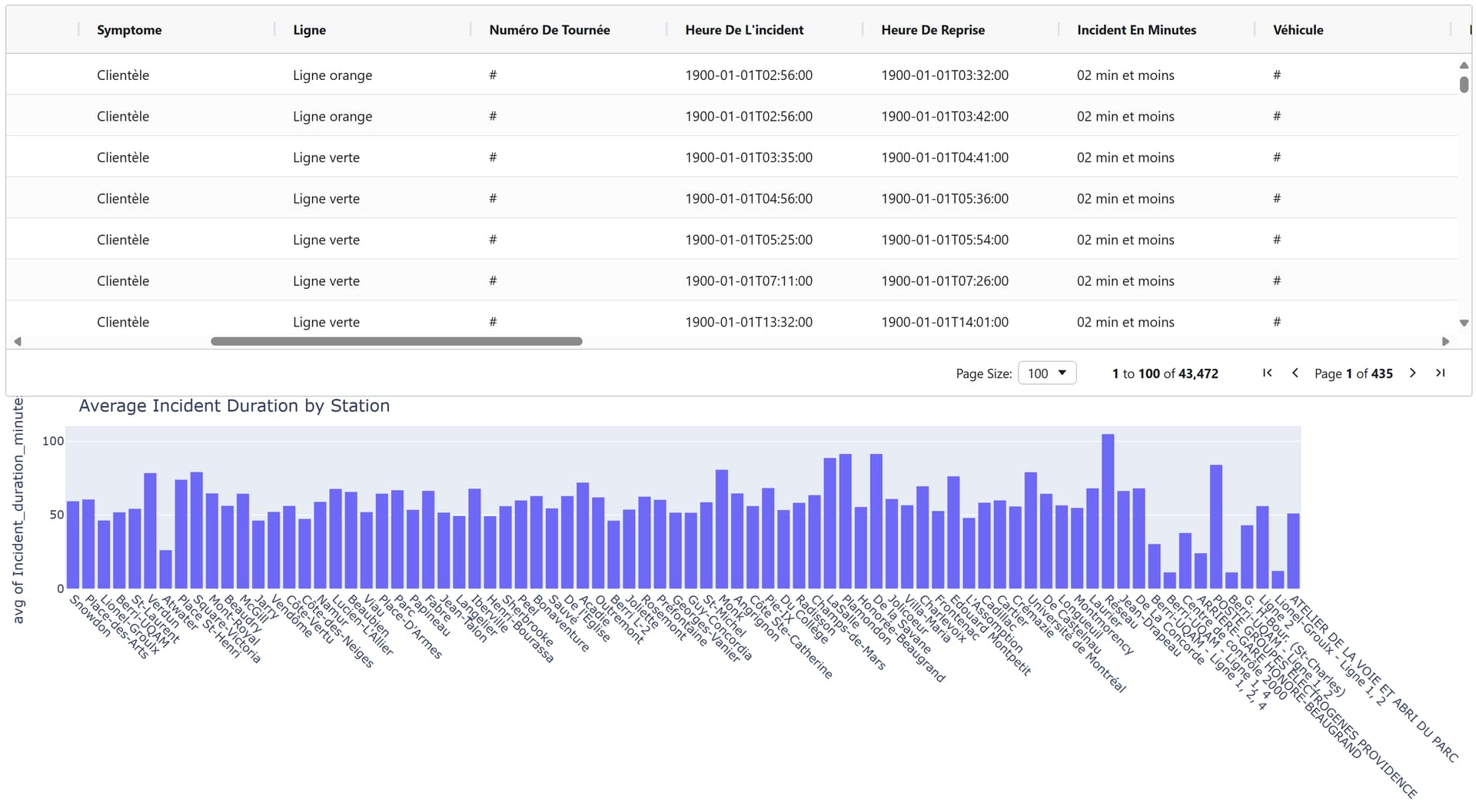
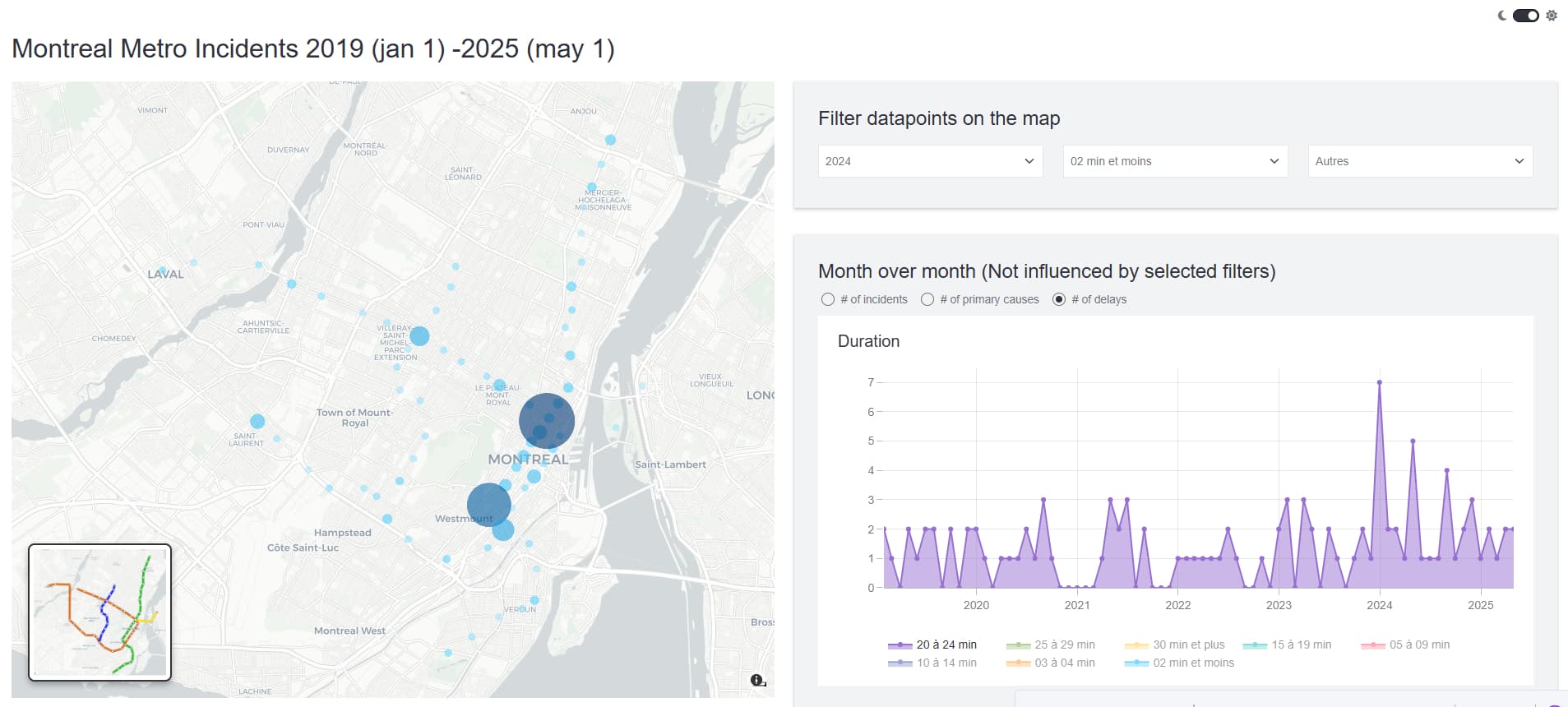
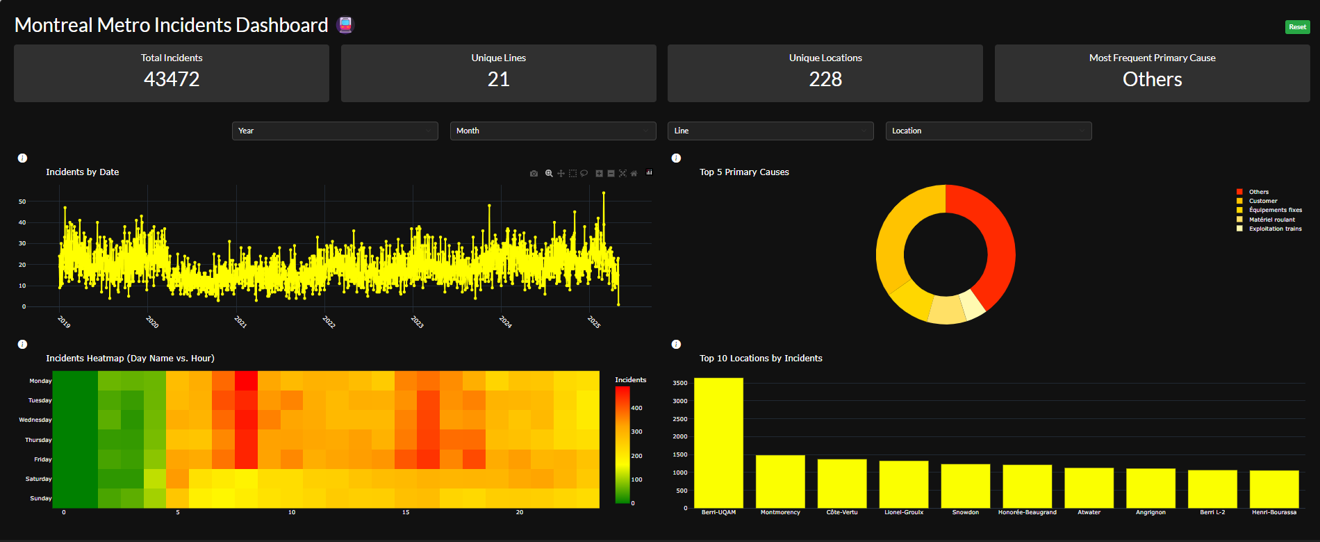
This project is an interactive dashboard for visualizing Montreal Metro incident data. Built with Dash, Plotly, and AG Grid, it features dynamic charts. Users can filter incidents by year, month, metro line, and location, and explore trends by cause, time, and place. The dashboard uses a modern dark theme and includes a metro icon for a professional look. Additionally, I implemented cross-filtering between the charts, allowing users to click on chart elements (such as pie slices or heatmap cells) to dynamically filter the data across the entire dashboard.
I think this dashboard is mobile-friendly:)
Code
import dash
from dash import dcc, html, Input, Output, State, no_update
import dash_bootstrap_components as dbc
import pandas as pd
import plotly.graph_objects as go
import calendar

# --- Load and preprocess data ---
df = pd.read_csv("incidents.csv")
df["Calendar Day"] = pd.to_datetime(df["Calendar Day"], errors="coerce")
df["Incident Time"] = pd.to_datetime(
    df["Incident Time"], format="%H:%M:%S", errors="coerce"
).dt.hour

days_map = {
    1: "Monday",
    2: "Tuesday",
    3: "Wednesday",
    4: "Thursday",
    5: "Friday",
    6: "Saturday",
    7: "Sunday",
}
df["Day Name"] = df["Day of Week"].map(days_map)

year_options = sorted(df["Calendar Year"].dropna().unique())
month_options = [
    {"label": calendar.month_name[i], "value": i}
    for i in range(1, 13)
]
line_options = sorted(df["Line"].dropna().unique())
location_options = sorted(df["Location Code"].dropna().unique())

def make_select(id, options, placeholder):
    return dbc.Col(
        dbc.Select(
            id=id,
            options=options,
            value=None,
            placeholder=placeholder,
            style={
                "backgroundColor": "#222",
                "color": "white",
                "borderColor": "#444",
            },
        ),
        xs=12, sm=6, md=3, lg=3, xl=2,
        className="mb-2"
    )

def info_button(id):
    return html.Span(
        [
            html.I(
                className="bi bi-info-circle-fill",
                id=id,
                style={
                    "cursor": "pointer",
                    "color": "#fff",
                    "marginLeft": "8px",
                    "fontSize": "1.2em"
                }
            ),
        ]
    )

def kpi_card(title, value):
    return dbc.Card(
        dbc.CardBody(
            [
                html.H5(title, className="card-title text-center", style={"color": "white", "marginBottom": "8px"}),
                html.H2(value, className="card-text text-center", style={"color": "white", "margin": "0"}),
            ]
        ),
        color="dark",
        inverse=True,
        className="mb-3",
        style={"minHeight": "120px", "backgroundColor": "#222", "border": "none"},
    )

app = dash.Dash(
    __name__,
    external_stylesheets=[
        dbc.themes.DARKLY,
        "https://cdn.jsdelivr.net/npm/bootstrap-icons@1.10.5/font/bootstrap-icons.css"
    ]
)

server = app.server


app.layout = dbc.Container(
    [
        # --- Title and Reset button in one row ---
        dbc.Row(
            [
                dbc.Col(
                    html.H2("Montreal Metro Incidents Dashboard 🚇", className="text-center", style={"color": "white"}),
                    xs=8, sm=8, md=8, lg=10, xl=10,
                    style={"display": "flex", "alignItems": "center"},
                ),
                dbc.Col(
                    dbc.Button(
                        "Reset",
                        id="reset-btn",
                        color="success",
                        outline=False,
                        size="sm",
                        style={
                            "backgroundColor": "#28a745",
                            "color": "white",
                            "border": "none",
                            "fontWeight": "bold",
                            "boxShadow": "0 2px 6px rgba(0,0,0,0.15)",
                            "marginBottom": "8px",
                            "marginTop": "8px",
                            "float": "right",
                        },
                    ),
                    xs=4, sm=4, md=4, lg=2, xl=2,
                    style={"display": "flex", "justifyContent": "flex-end", "alignItems": "center"},
                ),
            ],
            className="mb-2",
            style={"alignItems": "center"},
        ),
        dbc.Row(
            [
                dbc.Col(id="kpi-total", xs=12, sm=6, md=3, lg=3, xl=3),
                dbc.Col(id="kpi-lines", xs=12, sm=6, md=3, lg=3, xl=3),
                dbc.Col(id="kpi-locations", xs=12, sm=6, md=3, lg=3, xl=3),
                dbc.Col(id="kpi-most-cause", xs=12, sm=6, md=3, lg=3, xl=3),
            ],
            className="mb-4 justify-content-center",
        ),
        dbc.Row(
            [
                make_select("year-filter", [{"label": str(y), "value": str(y)} for y in year_options], "Year"),
                make_select("month-filter", month_options, "Month"),
                make_select("line-filter", [{"label": str(l), "value": str(l)} for l in line_options], "Line"),
                make_select("location-filter", [{"label": str(l), "value": str(l)} for l in location_options], "Location"),
            ],
            className="mb-3 justify-content-center flex-wrap",
        ),
        dbc.Row(
            [
                dbc.Col(
                    html.Div([
                        info_button("info-line"),
                        dbc.Popover(
                            "Shows the number of incidents per day. Click a day to filter.",
                            target="info-line",
                            body=True,
                            trigger="hover",
                            placement="right",
                        ),
                        dcc.Graph(id="line-chart", style={"height": "350px"}),
                    ]),
                    xs=12, sm=12, md=6, lg=6, xl=6,
                ),
                dbc.Col(
                    html.Div([
                        info_button("info-pie"),
                        dbc.Popover(
                            "Shows the top 5 primary causes as a pie chart. Click a slice to filter.",
                            target="info-pie",
                            body=True,
                            trigger="hover",
                            placement="left",
                        ),
                        dcc.Graph(id="pie-chart", style={"height": "350px"}),
                    ]),
                    xs=12, sm=12, md=6, lg=6, xl=6,
                ),
            ],
            className="mb-2 justify-content-center flex-wrap",
        ),
        dbc.Row([
            dbc.Col(
                html.Div([
                    info_button("info-heatmap"),
                    dbc.Popover(
                        "Shows incidents by day of week and hour. Click a cell to filter.",
                        target="info-heatmap",
                        body=True,
                        trigger="hover",
                        placement="right",
                    ),
                    dcc.Graph(id="heatmap", style={"height": "350px"}),
                ]),
                xs=12, sm=12, md=6, lg=6, xl=6,
            ),
            dbc.Col(
                html.Div([
                    info_button("info-location"),
                    dbc.Popover(
                        "Shows top 10 locations by incident count. Click a bar to filter.",
                        target="info-location",
                        body=True,
                        trigger="hover",
                        placement="right",
                    ),
                    dcc.Graph(id="location-chart", style={"height": "350px"}),
                ]),
                xs=12, sm=12, md=6, lg=6, xl=6,
            ),
        ], className="mb-2"),
        html.Div(id="last-click", style={"display": "none"}),
    ],
    fluid=True,
    style={"backgroundColor": "#111", "padding": "32px"},
)

@app.callback(
    Output("year-filter", "value"),
    Output("month-filter", "value"),
    Output("line-filter", "value"),
    Output("location-filter", "value"),
    Output("last-click", "children"),
    Input("reset-btn", "n_clicks"),
    Input("line-chart", "clickData"),
    Input("pie-chart", "clickData"),
    Input("heatmap", "clickData"),
    Input("location-chart", "clickData"),
    State("last-click", "children"),
    prevent_initial_call=True,
)
def handle_all_events(reset_click, line_click, pie_click, heatmap_click, location_click, prev_last_click):
    ctx = dash.callback_context
    if not ctx.triggered:
        return no_update, no_update, no_update, no_update, no_update

    trigger = ctx.triggered[0]["prop_id"].split(".")[0]

    if trigger == "reset-btn":
        return None, None, None, None, ""

    if trigger == "line-chart" and line_click:
        point = line_click["points"][0]
        return no_update, no_update, no_update, no_update, f"line:{point['x']}"
    elif trigger == "pie-chart" and pie_click:
        point = pie_click["points"][0]
        return no_update, no_update, no_update, no_update, f"pie:{point['label']}"
    elif trigger == "heatmap" and heatmap_click:
        point = heatmap_click["points"][0]
        return no_update, no_update, no_update, no_update, f"heatmap:{point['y']}:{point['x']}"
    elif trigger == "location-chart" and location_click:
        point = location_click["points"][0]
        return no_update, no_update, no_update, no_update, f"location:{point['x']}"

    return no_update, no_update, no_update, no_update, prev_last_click

@app.callback(
    Output("line-chart", "figure"),
    Output("pie-chart", "figure"),
    Output("heatmap", "figure"),
    Output("location-chart", "figure"),
    Output("kpi-total", "children"),
    Output("kpi-lines", "children"),
    Output("kpi-locations", "children"),
    Output("kpi-most-cause", "children"),
    Input("year-filter", "value"),
    Input("month-filter", "value"),
    Input("line-filter", "value"),
    Input("location-filter", "value"),
    Input("last-click", "children"),
)
def update_charts_and_kpis(year, month, line, location, last_click):
    dff = df.copy()
    filter_info = ""
    if year:
        dff = dff[dff["Calendar Year"] == int(year)]
        filter_info += f"Year: {year} "
    if month:
        dff = dff[dff["Calendar Month"] == int(month)]
        filter_info += f"Month: {calendar.month_name[int(month)]} "
    if line:
        dff = dff[dff["Line"] == line]
        filter_info += f"Line: {line} "
    if location:
        dff = dff[dff["Location Code"] == location]
        filter_info += f"Location: {location} "
    if last_click:
        if last_click.startswith("line:"):
            daystr = last_click.split(":", 1)[1]
            dff = dff[dff["Calendar Day"].dt.strftime("%Y-%m-%d") == daystr]
            filter_info += f"Date: {daystr} "
        elif last_click.startswith("pie:"):
            cause = last_click.split(":", 1)[1]
            dff = dff[dff["Primary Cause"] == cause]
            filter_info += f"Primary Cause: {cause} "
        elif last_click.startswith("heatmap:"):
            _, day_name, hour = last_click.split(":")
            dff = dff[(dff["Day Name"] == day_name) & (dff["Incident Time"] == int(hour))]
            filter_info += f"Day: {day_name}, Hour: {hour} "
        elif last_click.startswith("location:"):
            loc = last_click.split(":", 1)[1]
            dff = dff[dff["Location Code"] == loc]
            filter_info += f"Location: {loc} "

    # --- KPI values ---
    total_incidents = len(dff)
    unique_lines = dff["Line"].nunique()
    unique_locations = dff["Location Code"].nunique()
    most_cause = dff["Primary Cause"].mode()[0] if not dff.empty and "Primary Cause" in dff.columns else "N/A"

    # --- Line chart: incidents by year-month-day ---
    dff["DateStr"] = dff["Calendar Day"].dt.strftime("%Y-%m-%d")
    date_order = sorted(dff["DateStr"].unique())
    line_data = (
        dff.groupby("DateStr")
        .size()
        .reindex(date_order, fill_value=0)
        .reset_index()
    )
    line_fig = go.Figure()
    line_fig.add_trace(
        go.Scatter(
            x=line_data["DateStr"],
            y=line_data[0] if 0 in line_data.columns else line_data[1],
            mode="lines+markers",
            line=dict(color="yellow", width=3, shape="spline"),
            marker=dict(color="yellow", size=6),
            name="Incidents",
        )
    )
    line_fig.update_layout(
        title="Incidents by Date" + (f" | {filter_info}" if filter_info else ""),
        template="plotly_dark",
        font_color="white",
        margin=dict(t=40, b=20, l=10, r=10),
        height=350,
        xaxis=dict(showticklabels=True, title=None, tickangle=45),
        yaxis=dict(title=None),
    )

    # --- Pie chart: top 5 Primary Cause, yellow gradient, darkest for largest ---
    pie_data = (
        dff.groupby("Primary Cause")
        .size()
        .reset_index(name="Incidents")
        .sort_values("Incidents", ascending=False)
        .head(5)
    )
    yellow_gradient = ["#FF2A00", "#FFC300", "#FFD700", "#FFE066", "#FFF9B0"]
    colors = [yellow_gradient[i] for i in range(len(pie_data))]
    pie_fig = go.Figure(
        data=[
            go.Pie(
                labels=pie_data["Primary Cause"],
                values=pie_data["Incidents"],
                hole=0.6,
                marker=dict(colors=colors),
                textinfo="none"
            )
        ]
    )
    pie_fig.update_layout(
        title="Top 5 Primary Causes" + (f" | {filter_info}" if filter_info else ""),
        template="plotly_dark",
        font_color="white",
        margin=dict(t=40, b=20, l=10, r=10),
        height=350,
    )

    # --- Heatmap: Day Name vs Hour ---
    heatmap_data = (
        dff.groupby(["Day Name", "Incident Time"])
        .size()
        .reset_index(name="Count")
    )
    all_days = [
        "Monday",
        "Tuesday",
        "Wednesday",
        "Thursday",
        "Friday",
        "Saturday",
        "Sunday",
    ]
    all_hours = list(range(0, 24))
    heatmap_matrix = (
        heatmap_data.pivot(index="Day Name", columns="Incident Time", values="Count")
        .reindex(index=all_days, columns=all_hours, fill_value=0)
    )
    custom_colorscale = [
        [0.0, "green"],
        [0.33, "yellow"],
        [0.66, "orange"],
        [1.0, "red"],
    ]
    heatmap_fig = go.Figure(
        data=go.Heatmap(
            z=heatmap_matrix.values,
            x=heatmap_matrix.columns,
            y=heatmap_matrix.index,
            colorscale=custom_colorscale,
            colorbar=dict(title="Incidents"),
        )
    )
    heatmap_fig.update_layout(
        title="Incidents Heatmap (Day Name vs. Hour)" + (f" | {filter_info}" if filter_info else ""),
        template="plotly_dark",
        font_color="white",
        margin=dict(t=40, b=20, l=10, r=10),
        height=350,
        yaxis=dict(autorange="reversed"),
    )

    # --- Location chart: Top 10 locations ---
    location_data = (
        dff.groupby("Location Code")
        .size()
        .reset_index(name="Incidents")
        .sort_values("Incidents", ascending=False)
        .head(10)
    )
    location_fig = go.Figure(
        data=[
            go.Bar(
                x=location_data["Location Code"],
                y=location_data["Incidents"],
                marker=dict(color="#FBFF00"),
            )
        ]
    )
    location_fig.update_layout(
        title="Top 10 Locations by Incidents" + (f" | {filter_info}" if filter_info else ""),
        template="plotly_dark",
        font_color="white",
        margin=dict(t=40, b=20, l=10, r=10),
        height=350,
        xaxis=dict(showticklabels=True, title=None),
        yaxis=dict(title=None),
    )

    # --- KPI cards ---
    kpi_total = kpi_card("Total Incidents", total_incidents)
    kpi_lines = kpi_card("Unique Lines", unique_lines)
    kpi_locations = kpi_card("Unique Locations", unique_locations)
    kpi_most_cause = kpi_card("Most Frequent Primary Cause", most_cause)

    return line_fig, pie_fig, heatmap_fig, location_fig, kpi_total, kpi_lines, kpi_locations, kpi_most_cause

if __name__ == "__main__":
    app.run(debug=True)