Sorry Here is the full code. I filtered the data according to user input. I have deleted some code to fit the 32000 character limit of this post but it doesn’t relate to the question I asked.
Code:
import random
import pandas as pd
import numpy as np
import plotly_express as px
from plotly.subplots import make_subplots
import plotly
from plotly import tools
import plotly.graph_objects as go
import dash
import dash_core_components as dcc
import dash_html_components as html
import dash_bootstrap_components as dbc
from dash.dependencies import Input, Output, State
df_copy = pd.read_csv("data.csv")
#############
card_graph2 = dbc.Card(
[
dbc.CardBody(
dcc.Graph(
id="id-graph2",
figure={},
config={
"displaylogo": False,
"doubleClick": False,
"modeBarButtonsToRemove": [
"pan2d",
"select2d",
"lasso2d",
"zoomIn2d",
"zoomOut2d",
"autoScale2d",
"toggleSpikelines",
"hoverCompareCartesian",
],
},
)
),
]
)
card_graph1 = dbc.Card([dbc.CardBody([dcc.Graph(id="id-graph1", figure={}),],),])
card_bar_control = dbc.Card(
[
dbc.CardBody(
[
dcc.Dropdown(
id="demo-dropdown",
options=[
{"label": str(item), "value": str(item)}
for item in sorted(df_copy["country_txt"].unique())
],
placeholder="Select a country...",
value="United States",
optionHeight=25,
searchable=True,
search_value="",
clearable=True,
),
]
)
]
)
card_graph3 = dbc.Card(
[
dbc.CardBody(
[
dcc.Graph(
id="cities",
figure={},
config={
"displaylogo": False,
"doubleClick": False,
"modeBarButtonsToRemove": [
"select2d",
"lasso2d",
"autoScale2d",
"toggleSpikelines",
"hoverCompareCartesian",
],
},
),
]
)
]
)
card_graph4 = dbc.Card(
[
dbc.CardBody(
[
dcc.Graph(
id="donut",
figure={},
config={
"displaylogo": False,
"doubleClick": False,
"modeBarButtonsToRemove": [
"select2d",
"lasso2d",
"autoScale2d",
"toggleSpikelines",
"hoverCompareCartesian",
],
},
),
]
)
]
)
card_graph5 = dbc.Card(
[
dbc.CardBody(
[
dcc.Graph(
id="casualities",
figure={},
config={
"displaylogo": False,
"doubleClick": False,
"modeBarButtonsToRemove": [
"select2d",
"lasso2d",
"autoScale2d",
"toggleSpikelines",
"hoverCompareCartesian",
],
},
),
]
)
]
)
card_graph6 = dbc.Card(
[
dbc.CardBody(
[
dcc.Graph(
id="terror-group",
figure={},
config={
"displaylogo": False,
"doubleClick": False,
"modeBarButtonsToRemove": [
"select2d",
"lasso2d",
"autoScale2d",
"toggleSpikelines",
"hoverCompareCartesian",
],
},
),
]
)
]
)
card_stat = dbc.Card(
[
dbc.CardBody(
[
dcc.Graph(
id="attacks",
figure={},
config={
"displaylogo": False,
"doubleClick": False,
"modeBarButtonsToRemove": [
"select2d",
"lasso2d",
"autoScale2d",
"toggleSpikelines",
"hoverCompareCartesian",
],
},
)
]
)
]
)
card_killed = dbc.Card(
[
dbc.CardBody(
[
dcc.Graph(
id="killed",
figure={},
config={
"displaylogo": False,
"doubleClick": False,
"modeBarButtonsToRemove": [
"select2d",
"lasso2d",
"autoScale2d",
"toggleSpikelines",
"hoverCompareCartesian",
],
},
),
]
)
]
)
card_tab = dcc.Tabs(
id="tabs-with-classes",
value="tab-2",
parent_className="custom-tabs",
className="custom-tabs-container",
children=[
dcc.Tab(
label="Every Life matters",
value="tab-1",
className="custom-tab",
selected_className="custom-tab--selected",
children=[
dbc.Row(
[
dbc.Col(
dbc.Card(dbc.CardBody(card_graph5)),
style={
"width": "49.5%",
"display": "inline-block",
"margin-top": "0.25%",
"margin-bottom": "0%",
"margin-right": "0.5%",
"border-radius": "10px",
"box-shadow": "0 4px 8px 0 rgba(0, 0, 0, 0.2), 0 6px 20px 0 rgba(0, 0, 0, 0.19)",
},
),
dbc.Col(
dbc.Card(dbc.CardBody(card_killed)),
style={
"width": "49.5%",
"display": "inline-block",
"margin-top": "0.25%",
"margin-bottom": "0%",
"margin-left": "0.5%",
"border-radius": "10px",
"box-shadow": "0 4px 8px 0 rgba(0, 0, 0, 0.2), 0 6px 20px 0 rgba(0, 0, 0, 0.19)",
},
),
],
style={"background-color": "#f4f4f4"},
) # put card inside tabs
],
),
dcc.Tab(
label="More Details Here",
value="tab-2",
className="custom-tab",
selected_className="custom-tab--selected",
children=[
dbc.Row(
[
dbc.Col(
dbc.Card(dbc.CardBody(card_graph3)),
style={
"width": "49.5%",
"display": "inline-block",
"margin-top": "0.25%",
"margin-right": "0.5%",
"border-radius": "10px",
"box-shadow": "0 4px 8px 0 rgba(0, 0, 0, 0.2), 0 6px 20px 0 rgba(0, 0, 0, 0.19)",
},
),
dbc.Col(
dbc.Card(dbc.CardBody(card_graph4)),
style={
"width": "49.5%",
"display": "inline-block",
"margin-top": "0.25%",
"margin-left": "0.5%",
"border-radius": "10px",
"box-shadow": "0 4px 8px 0 rgba(0, 0, 0, 0.2), 0 6px 20px 0 rgba(0, 0, 0, 0.19)",
},
),
],
style={"background-color": "#f4f4f4"},
),
dbc.Row(
[
dbc.Col(
dbc.Card(dbc.CardBody(card_graph2)),
style={
"width": "49.5%",
"display": "inline-block",
"margin-top": "0.25%",
"margin-right": "0.5%",
"border-radius": "10px",
"box-shadow": "0 4px 8px 0 rgba(0, 0, 0, 0.2), 0 6px 20px 0 rgba(0, 0, 0, 0.19)",
},
),
dbc.Col(
dbc.Card(dbc.CardBody(card_graph6)),
style={
"width": "49.5%",
"display": "inline-block",
"margin-top": "0.25%",
"margin-left": "0.5%",
"border-radius": "10px",
"box-shadow": "0 4px 8px 0 rgba(0, 0, 0, 0.2), 0 6px 20px 0 rgba(0, 0, 0, 0.19)",
},
),
],
style={"background-color": "#f4f4f4"},
),
],
),
],
style={
"background-color": "#f4f4f4",
"box-shadow": "0 4px 8px 0 rgba(0, 0, 0, 0.2), 0 6px 20px 0 rgba(0, 0, 0, 0.19)",
},
)
mapbox_access_token = "pk.eyJ1IjoibWF0c3VqanUiLCJhIjoiY2tmcXFiczFiMGRpdzMybzBxZmxtaTVxbiJ9.0zdao0fZdKyGb7CO8dPAVg"
app = dash.Dash(__name__)
app.config.suppress_callback_exceptions = True
server = app.server
app.layout = html.Div(
[
dbc.Row(
[
dbc.Col(
[
dbc.CardHeader(
[
html.H1("Terrorism Around the Globe"),
html.P(
[
"To be considered an act of terrorism, an action must be violent, or threaten violence.As such, political dissent, activism, and nonviolent resistance do not constitute terrorism. There are, however, many instances around the world of authorities restricting individuals’ freedom of expression under the pretext of counter-terrorism measures. Human rights groups, such as",
html.A(
" Amnesty International ",
href="https://www.amnesty.org/en/latest/news/",
),
"and",
html.A(
" Human Rights Watch ",
href="https://www.hrw.org/topic/free-speech",
),
"publish reports on such cases of censorship.",
]
),
]
)
],
style={
"text-align": "left",
"font-size": "100%",
"color": "black",
"font-weight": "bold",
"padding-top": "1px",
"padding-right": "1px",
"padding-bottom": " 1px",
"padding-left": "1px",
"margin-left": "2%",
"margin-right": "2%",
"border-radius": "10px",
},
),
# dbc.Col(
# html.Img(
# src=app.get_asset_url("dash-logo.png"),
# style={
# "height": "60px",
# "width": "auto",
# "margin-right": "2%",
# "padding-top": "0px",
# "padding-bottom": "0px",
# "display": "inline",
# "float": "right",
# },
# )
# ),
],
className="one-third column",
),
dbc.Row(
[
dbc.Col(
card_bar_control,
style={
"width": "30%",
"display": "inline-block",
"margin-left": "2%",
"margin-right": "2%",
"margin-bottom": "1%",
"box-shadow": "0 4px 8px 0 rgba(0, 0, 0, 0.2), 0 6px 20px 0 rgba(0, 0, 0, 0.19)",
"border-radius": "10px",
},
),
dbc.Col(
popover,
style={
"width": "22.65%",
"display": "inline-block",
"margin-left": "40%",
"margin-right": "2%",
"margin-bottom": "1%",
"box-shadow": "0 4px 8px 0 rgba(0, 0, 0, 0.2), 0 6px 20px 0 rgba(0, 0, 0, 0.19)",
# "border-radius": "10px",
"background-color": "#fefefe",
},
),
dbc.Col(
[
html.H3("Drag the Slider to Change the Year:"),
dcc.RangeSlider(
id="year_slider",
min=df_copy["year"].min(),
max=df_copy["year"].max(),
step=1,
value=[2010, 2014],
marks={
item: str(item)
for item in df_copy["year"].unique().tolist()[::3]
},
),
],
style={
"margin-left": "2%",
"margin-right": "2%",
"margin-bottom": "1%",
"box-shadow": "0 4px 8px 0 rgba(0, 0, 0, 0.2), 0 6px 20px 0 rgba(0, 0, 0, 0.19)",
"border-radius": "7px",
"background-color": "#fefefe",
"padding-left": "20px",
"padding-top": "7px",
},
),
],
no_gutters=True,
),
dbc.Row(
[
dbc.Col(
card_graph1,
style={
"width": "47%",
"display": "inline-block",
"margin-left": "2%",
"padding-top": "0px",
"border-radius": "10px",
"box-shadow": "0 4px 8px 0 rgba(0, 0, 0, 0.2), 0 6px 20px 0 rgba(0, 0, 0, 0.19)",
},
),
dbc.Col(
card_stat,
style={
"width": "47%",
"display": "inline-block",
"margin-right": "2%",
"margin-left": "2%",
"border-radius": "10px",
"box-shadow": "0 4px 8px 0 rgba(0, 0, 0, 0.2), 0 6px 20px 0 rgba(0, 0, 0, 0.19)",
},
),
],
justify="around",
),
dbc.Row(
dbc.Col(
card_tab,
style={
"width": "96%",
"margin-left": "2%",
"display": "inline-block",
"margin-top": "1%",
"margin-right": "2%",
"border-radius": "10px",
"box-shadow": "0 4px 8px 0 rgba(0, 0, 0, 0.2), 0 6px 20px 0 rgba(0, 0, 0, 0.19)",
# "height": "575px",
},
),
),
],
style={"background-color": "#f4f4f4"},
)
@app.callback(
Output("id-graph1", "figure"),
[Input("demo-dropdown", "value"), Input("year_slider", "value")],
)
def update_map(drop_value, year_value):
# print(year_value)
df_sub = df_copy.loc[
(df_copy["year"] >= year_value[0]) & (df_copy["year"] <= year_value[1])
]
df_sub = df_sub.loc[df_sub["country_txt"] == drop_value]
# print(df_sub.city.head())
random.seed(11)
# print(df_sub.head())
# create graph
fig = go.Figure()
new_customdatadf = np.stack( # stacking of columns along last axis
(
df_sub["casualities_median"],
df_sub["city"],
df_sub["year"],
df_sub["province"],
),
axis=-1,
)
fig.add_traces(
go.Scattermapbox(
lon=df_sub["longitude"],
lat=df_sub["latitude"],
mode="markers",
marker=dict(size=10, allowoverlap=False, opacity=0.7, color="crimson"),
# text=df_sub["casualities_median"],
customdata=new_customdatadf, # we have to first stack the columns along the last axis
hovertemplate="""<extra></extra>lat: %{lat}<br>long: %{lon}<br>casualities: %{customdata[0]}<br>city: %{customdata[1]}<br>State: %{customdata[3]}<br>attack happened in: %{customdata[2]}""",
),
)
fig.update_layout(
title=dict(
text=f"<b>Satellite Overview of {drop_value}</b>",
font=dict(family="Gravitas One", size=20, color="black",),
xanchor="left",
xref="container",
),
uirevision="foo",
hovermode="closest",
hoverdistance=2,
mapbox=dict(
accesstoken=mapbox_access_token,
style="dark",
center=dict(
lat=random.choice(df_sub["latitude"].tolist()),
lon=random.choice(df_sub["longitude"].tolist()),
),
zoom=5,
),
)
return fig
@app.callback(
Output("attacks", "figure"),
[Input("demo-dropdown", "value"), Input("year_slider", "value")],
)
def attack_kill(drop_value, year_value):
dff = attack_killed.loc[
(attack_killed["year"] >= year_value[0])
& (attack_killed["year"] <= year_value[1])
]
dff = dff.loc[dff["country_txt"] == drop_value]
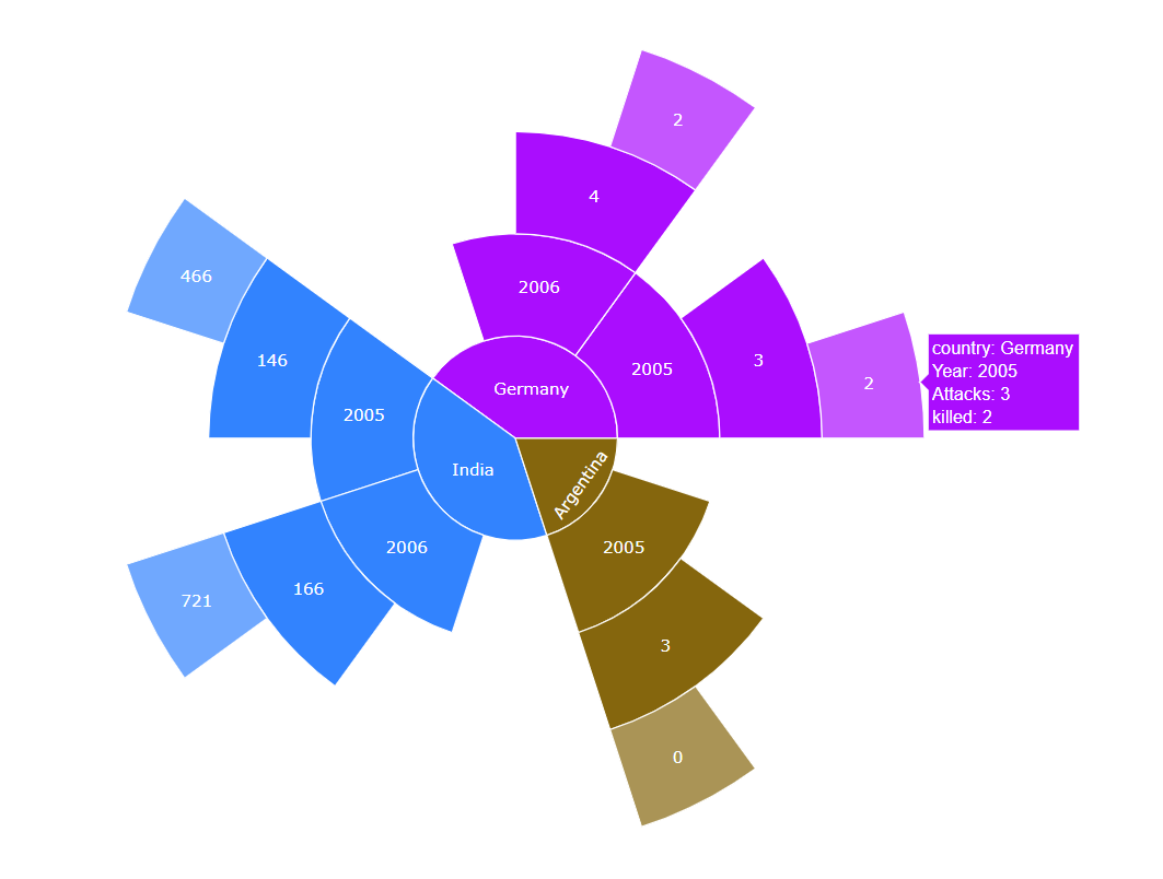
fig = px.sunburst(
dff,
path=["country_txt", "year", "Attacks", "killed"],
color="year",
color_discrete_sequence=[
"#0d0887",
"#46039f",
"#7201a8",
"#9c179e",
"#bd3786",
"#d8576b",
"#ed7953",
"#fb9f3a",
"#fdca26",
"#f0f921",
],
maxdepth=-1,
branchvalues="remainder",
hover_data=["country_txt", "year", "Attacks", "killed"],
# template="ggplot2",
title=f"<b>Terror Attacks Vs People Killed in {drop_value}</b>",
)
fig.update_traces(
# textinfo="text",
hovertemplate="<b>Country: %{customdata[0]}</b><br>"
+ "<b>Year Selected: %{customdata[1]}</b><br>"
+ "<b>Terror Attacks: %{customdata[2]}</b><br>"
+ "<b>People Killed: %{customdata[3]}</b><br>"
+ "<extra></extra>",
)
fig.update_layout(
title=dict(
font=dict(family="Gravitas One", size=20, color="black",),
xanchor="left",
xref="container",
),
coloraxis_showscale=False,
)
return fig
@app.callback(Output("id-graph2", "figure"), [Input("demo-dropdown", "value")])
def pie2(drop_value):
dff = df_copy.loc[df_copy["country_txt"] == drop_value]
fig = px.pie(
dff,
names=dff["weapon_type"].value_counts()[:9].index,
values=dff["weapon_type"].value_counts()[:9],
# labels={"index": "", "value": ""},
color=dff["weapon_type"].value_counts()[:9],
hole=0.4,
# color_discrete_sequence=["#bdbdbd", "#969696", "#737373", "#525252",],
# color_discrete_sequence=["#ff6969", "#d34949", "#da3232", "#b80000", "#620000"],
# ffffcc #ffeda0 #fed976 #feb24c #fd8d3c #fc4e2a #e31a1c #bd0026 #800026
# ffffcc
# ffeda0
# fed976
# feb24c
# fd8d3c
# fc4e2a
# e31a1c
# bd0026
# 800026
color_discrete_sequence=[
# "#800026",
"#bd0026",
"#e31a1c",
"#fc4e2a",
"#fd8d3c",
" #feb24c",
"#fed976",
" #ffeda0",
" #ffffcc",
],
# hover_name=dff["weapon_type"].value_counts()[:10].index,
)
fig.update_traces(
hovertemplate=None, hoverinfo="all", rotation=45,
)
fig.update_layout(
title=dict(
text=f"<b>Weapons used in {drop_value}</b>",
font=dict(family="Gravitas One", size=20, color="black",),
xanchor="left",
xref="container",
),
)
return fig
@app.callback(Output("cities", "figure"), [Input("demo-dropdown", "value")])
def bar_graph2(drop_value):
dff_sub = df_copy.loc[df_copy["country_txt"] == drop_value]
# Figure1
fig = px.bar(
dff_sub["city"].value_counts()[:10].sort_values(ascending=True),
orientation="h",
title="<b>Top 10 cities which are badly affected by Terrorism</b> <br> <i>(Cities vs Attack Counts)</i></br>",
labels={"index": "", "value": ""},
color=dff_sub["city"].value_counts()[:10].sort_values(ascending=True),
# color_continuous_scale=["#bdbdbd", "#969696", "#737373", "#525252",],
color_continuous_scale=["#ff6969", "#d34949", "#da3232", "#b80000", "#620000"],
)
fig.update_layout(
title=dict(
font=dict(family="Gravitas One", size=20, color="black",),
xanchor="left",
xref="container",
),
coloraxis_showscale=False,
plot_bgcolor="#FFFFFF",
legend={"bordercolor": "red", "borderwidth": 1},
xaxis=dict(
showticklabels=True,
visible=True,
showgrid=False,
ticks="outside",
# title=dict(font=dict(family="Balto", size=15)),
),
yaxis=dict(
showticklabels=True,
visible=True,
showgrid=False,
# title=dict(font=dict(family="Balto", size=15)),
tickfont=dict(family="Balto", size=19, color="black"),
ticksuffix=" ",
),
)
return fig
# Figure2
@app.callback(Output("donut", "figure"), [Input("demo-dropdown", "value")])
def pie1(drop_value):
dff_sub = df_copy.loc[df_copy["country_txt"] == drop_value]
dic = {0: "Unsuccessful Attempt", 1: "Successful Attempt"}
dff_sub["success"] = dff_sub["success"].map(dic)
fig = px.pie(
dff_sub,
names=dff_sub["success"].value_counts().index,
values=dff_sub["success"].value_counts(),
hole=0.4,
# hover_name=dff_sub["success"].value_counts().index,
color_discrete_sequence=["#bd0026", " #ffffcc"],
)
fig.update_traces(hovertemplate=None, hoverinfo="all")
fig.update_layout(
title=dict(
text=f"<b>Success Rate of Terror Attacks in {drop_value}</b>",
font=dict(family="Gravitas One", size=20, color="black",),
xanchor="left",
xref="container",
)
)
return fig
# Figure3
@app.callback(Output("casualities", "figure"), [Input("demo-dropdown", "value")])
def line_graph1(drop_value):
dff_sub = (
df_copy.loc[df_copy["country_txt"] == drop_value]
.groupby(["year"])["casualities"]
.sum()
)
fig = px.line(
x=dff_sub.index,
y=dff_sub.values,
labels={"x": "Year", "y": "Casualities"},
# color="rgb(220, 20, 60)",
color_discrete_sequence=["rgb(220, 20, 60)"],
# height=575,
)
fig.update_traces(line=dict(color="crimson", width=3), mode="lines+markers",),
fig.update_layout(
title=dict(
text="<b> Casualities over the Year </b> ",
font=dict(family="Gravitas One", size=20, color="black",),
xanchor="left",
xref="container",
),
hovermode="x", # it shows the value along x-axis ticks on hovering in plot
hoverdistance=20000, # distance above/right of the plot till where the user can hover
spikedistance=20000, # length of spike according to data max value
xaxis=dict(
tickmode="linear", # how tick value will change
tick0=1970, # starting tick in plot along respective axis
dtick=1, # gap between each ticks
visible=True,
showgrid=False,
showspikes=True, # Show spike line for X-axis
# Format spike
spikethickness=2,
spikedash="dot",
spikecolor="#999999",
spikemode="across",
linecolor="#737373",
range=[1970, 2017],
),
margin=dict(autoexpand=True, r=20, l=40, t=100),
plot_bgcolor="#FFFFFF",
yaxis=dict(
visible=True,
showgrid=False,
linecolor="#737373",
ticks="outside",
ticksuffix=" ",
),
)
return fig
# Figure4
@app.callback(Output("killed", "figure"), [Input("demo-dropdown", "value")])
def line_graph2(drop_value):
dff_sub = (
df_copy.loc[df_copy["country_txt"] == drop_value]
.groupby(["year"])["killed"]
.sum()
)
fig = px.line(
x=dff_sub.index,
y=dff_sub.values,
labels={"x": "Year", "y": "Killed"},
# color="rgb(220, 20, 60)",
color_discrete_sequence=["rgb(220, 20, 60)"],
# height=575,
)
fig.update_traces(line=dict(color="crimson", width=3), mode="lines+markers",),
fig.update_layout(
title=dict(
text="<b> Killings over the Year </b> ",
font=dict(family="Gravitas One", size=20, color="black",),
xanchor="left",
xref="container",
),
hovermode="x", # it shows the value along x-axis ticks on hovering in plot
hoverdistance=20000, # distance above/right of the plot till where the user can hover
spikedistance=20000, # length of spike according to data max value
xaxis=dict(
tickmode="linear", # how tick value will change
tick0=1970, # starting tick in plot along respective axis
dtick=1, # gap between each ticks
visible=True,
showgrid=False,
showspikes=True, # Show spike line for X-axis
# Format spike
spikethickness=2,
spikedash="dot",
spikecolor="#999999",
spikemode="across",
linecolor="#737373",
range=[1970, 2017],
),
margin=dict(autoexpand=True, r=20, l=40, t=100),
plot_bgcolor="#FFFFFF",
yaxis=dict(
visible=True,
showgrid=False,
linecolor="#737373",
ticks="outside",
ticksuffix=" ",
),
)
return fig
@app.callback(Output("terror-group", "figure"), [Input("demo-dropdown", "value")])
def bar_graph3(drop_value):
dff_sub = df_copy.loc[df_copy["country_txt"] == drop_value]
fig = px.bar(
dff_sub["group"].value_counts()[:10],
orientation="v", # orientation of axes
title=f"<b>Terror Groups Active/was active in {drop_value}</b> <br> <i> (Attack Counts vs Terror Groups)</i></br>",
labels={"index": "", "value": ""}, # renaming axes titles
color=dff_sub["group"].value_counts()[:10],
# color_continuous_scale=["#bdbdbd", "#969696", "#737373", "#525252",],
color_continuous_scale=["#ff6969", "#d34949", "#da3232", "#b80000", "#620000"],
# height=575, # height of chart (not plot area)
)
fig.update_layout(
# changes related to title of chart
title=dict(
font=dict(family="Gravitas One", size=20, color="black",),
xanchor="left", # title start from left of chart area
xref="container", # where to put the title along x-direction (container: whole chart length is used)
),
margin=dict(autoexpand=True, b=280), # margin of chart area (l ,r ,t, b ,pad)
coloraxis_showscale=False, # hide colorscale
plot_bgcolor="#FFFFFF", # color of plot area
# changes related to yaxis
yaxis=dict(
visible=True, # show the ticks and labels
showgrid=False, # hide the gridlines
ticks="outside",
ticksuffix=" ",
# title=dict(font=dict(family="Balto", size=15)) # changes in title of y-axis
),
# changes related to x-axis
xaxis=dict(
visible=True,
showgrid=False,
# title=dict(font=dict(family="Balto", size=15), standoff=5),
tickfont=dict(
family="Balto", size=17, color="black"
), # changes related to ticks
ticksuffix=" ", # manages gap between ticks and axis title
automargin=True, # self-explanatory
tickangle=45, # changes the angle of ticks
),
)
return fig
if __name__ == "__main__":
app.run_server(debug=False)