Hello Everyone,
Here is my Figure Friday Dashboard. This is a brief description of the WebApp/Dashboard:
- Data Filtering: The hurricane data can be filtered by year range using a slider and by selecting specific US states from a dropdown menu.
- Data Visualizations:
- A polar chart displaying hurricane intensity by plotting wind speed (angle) against pressure (distance from the center), with point size representing hurricane category. Since this type of chart may be challenging to understand, an information button is included to explain how to interpret the visualization.
- A geographic map displaying hurricane distribution across affected states, with color coding for categories and size indicating wind speed.
- Statistics showing the total number of hurricanes, average wind speed, average central pressure, and category distribution for the selected filters.
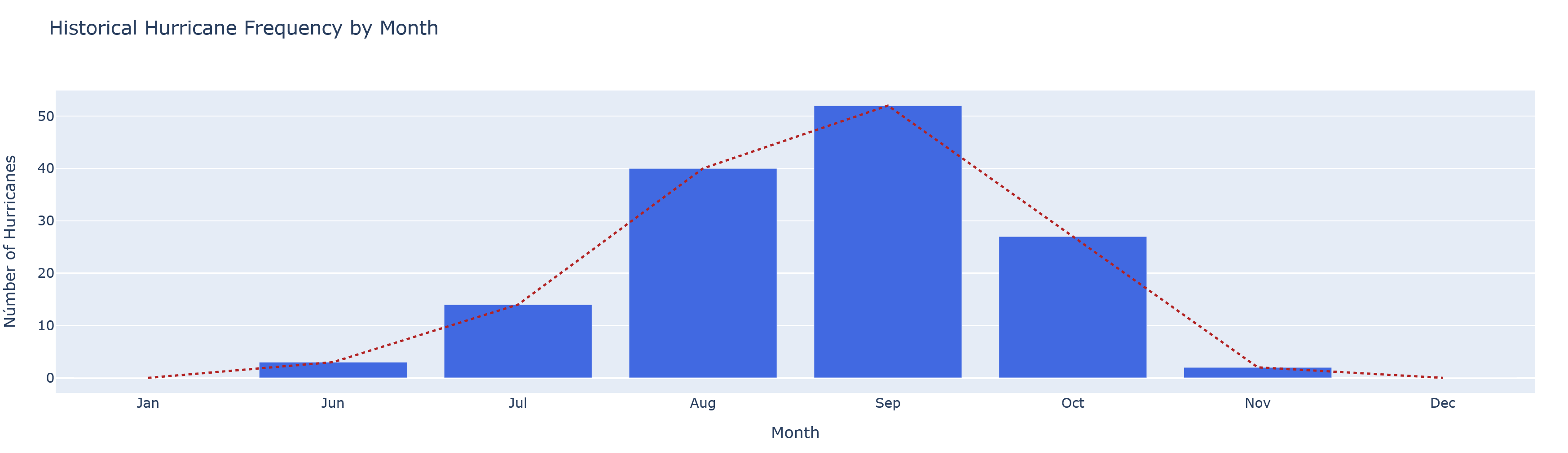
- Predictive Analysis: A seasonal hurricane probability chart displaying historical hurricane frequency by month, showing both bar graph data and a trend line.
The code
import pandas as pd
import numpy as np
import plotly.express as px
import plotly.graph_objects as go
from dash import Dash, dcc, html, Input, Output, callback, State
import dash_bootstrap_components as dbc

df = pd.read_csv("us-hurricanes.csv").rename(columns={"states-affected-and-category-by-states":"states_affected"}).dropna()
df['category'] = df['category'].replace('TS', pd.NA)
df['states_affected'] = df.states_affected.str.split(",", expand=True)[0]

def clean_state(state):
    state = state.replace('* ', '').replace('# ', '').replace('& ', '').replace('&', '').replace(' 1', '').replace(' - TS', '').upper()
    return state

df['states_affected'] = df['states_affected'].apply(clean_state)

# Coordenadas de los estados
state_coords = {
    'FL': [27.6648, -81.5158],
    'AL': [32.3182, -86.9023],
    'GA': [33.0406, -83.6431],
    'TX': [31.9686, -99.9018],
    'LA': [31.1695, -91.8678],
    'NY': [42.6648, -74.0158],
    'NC': [35.7596, -79.0193],
    'RI': [41.7001, -71.4221],
    'ME': [45.2538, -69.4455],
    'SC': [33.8361, -81.1637],
    'MA': [42.4072, -71.3824]
}


app = Dash(__name__, external_stylesheets=[dbc.themes.LUMEN])

app.title="Hurricane Dashboard"

# App Layout
app.layout = dbc.Container([
    dbc.Row([
        dbc.Col([
            html.H1("US-Hurricane Dashboard", className="text-center bg-primary text-white p-3 mb-4"),
            html.P("Hurricane Data Visualization", className="text-center mb-4")
        ])
    ]),
    dbc.Row([
        dbc.Col([
            dbc.Card([
                dbc.CardHeader("Filters"),
                dbc.CardBody([
                    dbc.Row([
                        dbc.Col([
                            html.Label("Years Range:"),
                            dcc.RangeSlider(
                                id='year-range-slider',
                                min=df['year'].min(),
                                max=df['year'].max(),
                                value=[df['year'].min(), df['year'].max()],
                                marks={i: str(i) for i in range(df['year'].min(), df['year'].max() + 1, 10)},
                                step=5
                            )
                        ], width=6),
                        dbc.Col([
                            html.Label("State:"),
                            dcc.Dropdown(
                                id='state-dropdown',
                                options=[{'label': 'All States', 'value': 'all'}] +
                                        [{'label': state, 'value': state} for state in state_coords.keys()],
                                value='all',
                                clearable=False
                            )
                        ], width=6)
                    ])
                ])
            ], className="mb-4")
        ])
    ]),
    dbc.Row([
        dbc.Col([
            dbc.Card([
                dbc.CardHeader([
                    dbc.Row([
                        dbc.Col("Wind Speed vs. Pressure Polar Chart", width=9),
                        dbc.Col([
                            dbc.Button(
                                [html.I(className="fas fa-info-circle me-1"), "How to read this chart"],
                                id="polar-info-button",
                                color="info",
                                size="sm",
                                className="float-end"
                            ),
                        ], width=3),
                    ]),
                ]),
                dbc.CardBody([
                    dcc.Graph(id='polar-chart', style={'height': '500px'}),
                    dbc.Collapse(
                        dbc.Card(
                            dbc.CardBody([
                                html.H6("How to Interpret the Polar Chart:", className="card-title"),
                                html.Ul([
                                    html.Li([
                                        html.Strong("Angle (Theta): "),
                                        "Represents the normalized wind speed. Higher angles indicate higher wind speeds relative to the minimum and maximum in the dataset."
                                    ]),
                                    html.Li([
                                        html.Strong("Distance from Center (Radius): "),
                                        "Represents the inverted pressure value (1000 - pressure). The further from center, the lower the hurricane's pressure."
                                    ]),
                                    html.Li([
                                        html.Strong("Point Size: "),
                                        "Increases with hurricane category - larger points indicate higher category hurricanes."
                                    ]),
                                    html.Li([
                                        html.Strong("Color: "),
                                        "Different colors represent different hurricane categories, as shown in the legend."
                                    ]),
                                    html.Li([
                                        html.Strong("Interpretation: "),
                                        "The most intense hurricanes (higher categories) typically appear larger, further from center (lower pressure), and at higher angles (higher wind speeds)."
                                    ])])
                            ]), className="mt-2 border-info"),
                        id="polar-info-collapse",
                        is_open=False,)])])
        ], width=6),
        dbc.Col([
            dbc.Card([
                dbc.CardHeader("Geographic Distribution of Hurricanes"),
                dbc.CardBody([
                    dcc.Graph(id='map-chart', style={'height': '500px'})
                ])])], width=6)
    ]),
    dbc.Row([
        dbc.Col([
            dbc.Card([
                dbc.CardHeader("Hurricane Information"),
                dbc.CardBody([
                    html.Div(id='hurricane-details', className="p-3")
                ])
            ], className="mt-4")])]),
    dbc.Row([
        dbc.Col([
            dbc.Card([
                dbc.CardHeader("Predictive Analysis"),
                dbc.CardBody([
                    html.H5("Seasonal Hurricane Probability"),
                    html.P("Based on historical patterns of the selected filters"),
                    dcc.Graph(id='prediction-chart')
                ])
            ], className="mt-4")])]),

    # Adding FontAwesome for the Icons
    html.Link(
        rel="stylesheet",
        href="https://cdnjs.cloudflare.com/ajax/libs/font-awesome/5.15.3/css/all.min.css")
], fluid=True)

# Callback information Button
@app.callback(
    Output("polar-info-collapse", "is_open"),
    [Input("polar-info-button", "n_clicks")],
    [State("polar-info-collapse", "is_open")],
)
def toggle_collapse(n, is_open):
    if n:
        return not is_open
    return is_open

# Callback update the chart
@app.callback(
    [Output('polar-chart', 'figure'),
     Output('map-chart', 'figure'),
     Output('hurricane-details', 'children'),
     Output('prediction-chart', 'figure')],
    [Input('year-range-slider', 'value'),
     Input('state-dropdown', 'value')]
)
def update_charts(year_range, state):
    # Filtrar los datos
    filtered_df = df
    filtered_df = filtered_df[(filtered_df['year'] >= year_range[0]) & (filtered_df['year'] <= year_range[1])]
    if state != 'all':
        filtered_df = filtered_df[filtered_df['states_affected'].str.contains(state)]

    # Gráfico polar
    polar_fig = go.Figure()

    if not filtered_df.empty:
        for cat in sorted(filtered_df['category'].dropna().unique()):
            cat_df = filtered_df[filtered_df['category'] == cat]
            if not cat_df.empty:
                max_wind = cat_df['max-wind-(kt)'].max()
                min_wind = cat_df['max-wind-(kt)'].min()
                if max_wind > min_wind:
                    theta = ((cat_df['max-wind-(kt)'] - min_wind) / (max_wind - min_wind)) * 360
                else:
                    theta = cat_df['max-wind-(kt)'] * 0 + 180
                radius = 1000 - cat_df['central-pressure-(mb)']
                color_map = {str(c): px.colors.qualitative.Plotly[i % len(px.colors.qualitative.Plotly)]
                            for i, c in enumerate(sorted(filtered_df['category'].dropna().unique()))}
                size_map = {str(c): (i + 1) * 5 for i, c in enumerate(sorted(filtered_df['category'].dropna().unique()))}
                polar_fig.add_trace(
                    go.Scatterpolar(r=radius, theta=theta, mode='markers',
                                    marker=dict(size=size_map[cat],
                                                color=color_map[cat], opacity=0.7),
                                    name=f'Category {cat}',
                                    text=cat_df['name'].fillna('Unnamed') + '<br>' + 'Year: ' + cat_df['year'].astype(str) + '<br>' + 'Pressure: ' + cat_df['central-pressure-(mb)'].astype(str) + ' mb<br>' + 'Wind: ' + cat_df['max-wind-(kt)'].astype(str) + ' kt', hoverinfo='text'))

    polar_fig.update_layout(
        polar=dict(radialaxis=dict(visible=True, range=[0, 100]),
                   angularaxis=dict(direction='clockwise')),
        title={
            'text': 'Hurricane Intensity Chart',
            'y': 0.95,
            'x': 0.5,
            'xanchor': 'center',
            'yanchor': 'top'
        },
        annotations=[
            dict(
                text="Click the info button above for help interpreting this chart",
                showarrow=False,
                xref="paper", yref="paper",
                x=0.5, y=-0.1,
                font=dict(size=10, color="gray")
            )
        ],
        showlegend=True)

    # Gráfico del mapa
    map_fig = go.Figure()

    if not filtered_df.empty:
        lats = []
        lons = []
        for state_str in filtered_df['states_affected']:
            primary_state = state_str.split(',')[0]
            if primary_state in state_coords:
                lats.append(state_coords[primary_state][0])
                lons.append(state_coords[primary_state][1])
            else:
                lats.append(30.0)
                lons.append(-85.0)
                print(f"Warning: State '{primary_state}' not found in state_coords. Usando coordenadas predeterminadas.")

        if len(lats) == len(filtered_df) and len(lons) == len(filtered_df):
            map_df = filtered_df.copy()
            map_df['lat'] = lats
            map_df['lon'] = lons

            map_fig = px.scatter_mapbox(map_df, lat='lat', lon='lon', color='category',
                                        size='max-wind-(kt)', size_max=20, zoom=3,
                                        center=dict(lat=30, lon=-85),
                                        hover_name='name', hover_data=['year', 'month', 'central-pressure-(mb)', 'max-wind-(kt)'],
                                        category_orders={'category':['1', '2', '3', '4', '5']},
                                        color_discrete_map={str(c): px.colors.qualitative.Plotly[i % len(px.colors.qualitative.Plotly)]
                                                            for i, c in enumerate(sorted(filtered_df['category'].dropna().unique()))},
                                       )

            map_fig.update_layout(mapbox_style="open-street-map", margin={"r": 0, "t": 30, "l": 0, "b": 0})
        else:
            print("Error: Length mismatch between filtered_df and coordinate lists.")
            map_fig.update_layout(mapbox_style="open-street-map",
                                  mapbox=dict(center=dict(lat=30, lon=-85), zoom=3),
                                  margin={"r": 0, "t": 30, "l": 0, "b": 0},
                                  title='Geographic Distribution of Hurricanes')
    else:
        map_fig.update_layout(mapbox_style="open-street-map",
                              mapbox=dict(center=dict(lat=30, lon=-85), zoom=3),
                              margin={"r": 0, "t": 30, "l": 0, "b": 0})

    # Hurricane Details
    if not filtered_df.empty:
        total_hurricanes = len(filtered_df)
        avg_wind = filtered_df['max-wind-(kt)'].mean()
        avg_pressure = filtered_df['central-pressure-(mb)'].mean()
        category_counts = filtered_df['category'].value_counts().to_dict()

        details = [
            dbc.Row([
                dbc.Col([html.Div([html.H5("Total of Hurricanes"), html.P(f"{total_hurricanes}", className="fs-2 fw-bold text-primary")],
                                  className="border rounded p-3 text-center")]),
                dbc.Col([html.Div([html.H5("Average Wind Speed"), html.P(f"{avg_wind:.1f} kt", className="fs-2 fw-bold text-primary")],
                                  className="border rounded p-3 text-center")]),
                dbc.Col([html.Div([html.H5("Average Central Pressure"),
                                   html.P(f"{avg_pressure:.1f} mb",
                                          className="fs-2 fw-bold text-primary")],
                                  className="border rounded p-3 text-center")]),
                dbc.Col([html.Div([html.H5("Category Distribution"),
                                   html.P([html.Span(f"Cat {cat}: {count}",
                                                     className=f"badge {'bg-warning' if cat == '3' else 'bg-danger' if cat == '4' else 'bg-dark'} me-2") for cat, count in category_counts.items()])], className="border rounded p-3 text-center")])
            ])
        ]
    else:
        details = [html.P("No hurricanes match the selected filters", className="text-center fs-4 text-muted")]

    # Gráfico de predicción
    prediction_fig = go.Figure()
    if not filtered_df.empty:
        month_counts = filtered_df['month'].value_counts()
        ordered_months = ['Jan', 'Jun', 'Jul', 'Aug', 'Sep', 'Oct', 'Nov', 'Dec']
        month_data = [month_counts.get(m, 0) for m in ordered_months]

        prediction_fig.add_trace(go.Bar(x=ordered_months, y=month_data, marker_color='royalblue'))
        prediction_fig.add_trace(go.Scatter(x=ordered_months, y=month_data, mode='lines', line=dict(color='firebrick', dash='dot'), name='Trend'))
        prediction_fig.update_layout(title='Historical Hurricane Frequency by Month', xaxis_title='Month', yaxis_title='Númber of Hurricanes', showlegend=False)
    else:
        prediction_fig.add_annotation(x=0.5, y=0.5, text="No data available for prediction based on current filters", showarrow=False, font=dict(size=16))

    return polar_fig, map_fig, details, prediction_fig

if __name__ == '__main__':
    app.run_server(debug=True)
Any suggestions or comments are highly appreciated.