Actually, what @adamschroeder remarked is what I deleted. The lat, ,lon part. Even if my “thing” would work I would have the same problem as you have. . My grid was a quickfix to show what actually happened in the state. What maybe would work is if you add a summary of the second part of your app (if you scroll down) as hoverinfo, it would solve a lot of confusion. Or, there is an option that you have a number in the dot (can not find the page at the moment, cooking) or, but that’s a stupid idea, a donut popup to summarize category, number of times it occurred.
Update, I meant Dash Leaflet, somewhere @ 75% of this page, it adds the numbers if the coordinates are to close together for the zoomview but maybe, you never know, Dash
The ‘Predictive Analysis’ section of the dashboard is not actually a prediction in the strict sense of machine learning models, but rather a visualization of historical patterns that can serve as a basis for inferences about the probability of hurricanes.
Bars (in blue): Represent the count of hurricanes per month.
Dashed line (in red): Shows the frequency trend between months.
Basic Interpretation: Months with higher bars indicate a greater historical frequency of hurricanes, implying a higher seasonal probability."
Possible improvements for a real prediction:
If you wanted to turn this section into a true predictive tool, you could:
Incorporate time series models (ARIMA, Prophet, etc.) to project future trends.
May be in the near future take these ideas for other apps.
Absolutely, that’s why I added a polar chart to complement the map information. Of course, this dashboard/app, due to time constraints, is always an initial step. Ideally, I would create a map chart showing the route of each hurricane, but that requires more work. If you use the Plotly side button and click on each category, you can see the other circles. In this case, of course, they are overlapping
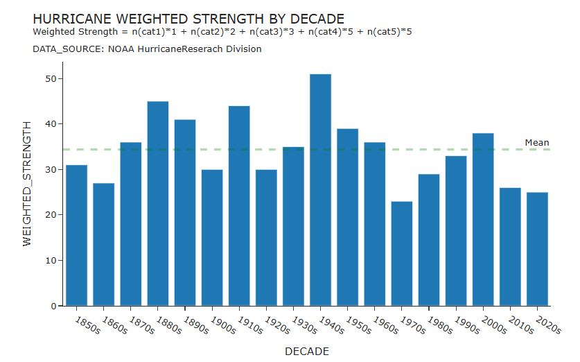
This visualization uses an invented metric of “weighted strength by decade”, where each decade gets 1 point for every cat 1, 2 points for every cat 2, up to 5 points for every cat 5. My null hypotheses that hurricane strengths have increased over the years due to global warming is not proven in this data set. I still believe that global warming is real.
I think it’s a bug with Dash 3.0. If I put dash<3 in @marieanne 's example it works fine. If I run it locally with dash==3.0 I also get the same error.
I apologize for the delayed response—I’ve had an incredibly hectic week at work. I’ll look into the error with the dash_bootstrap_components package and see what I can do to resolve it.