that was a lot of work, some great visuals I’m missing the historical movie chloropleth, did you remove it?
I think your app would improve for users who do not know the data, if you add a little (more) context to some pages.
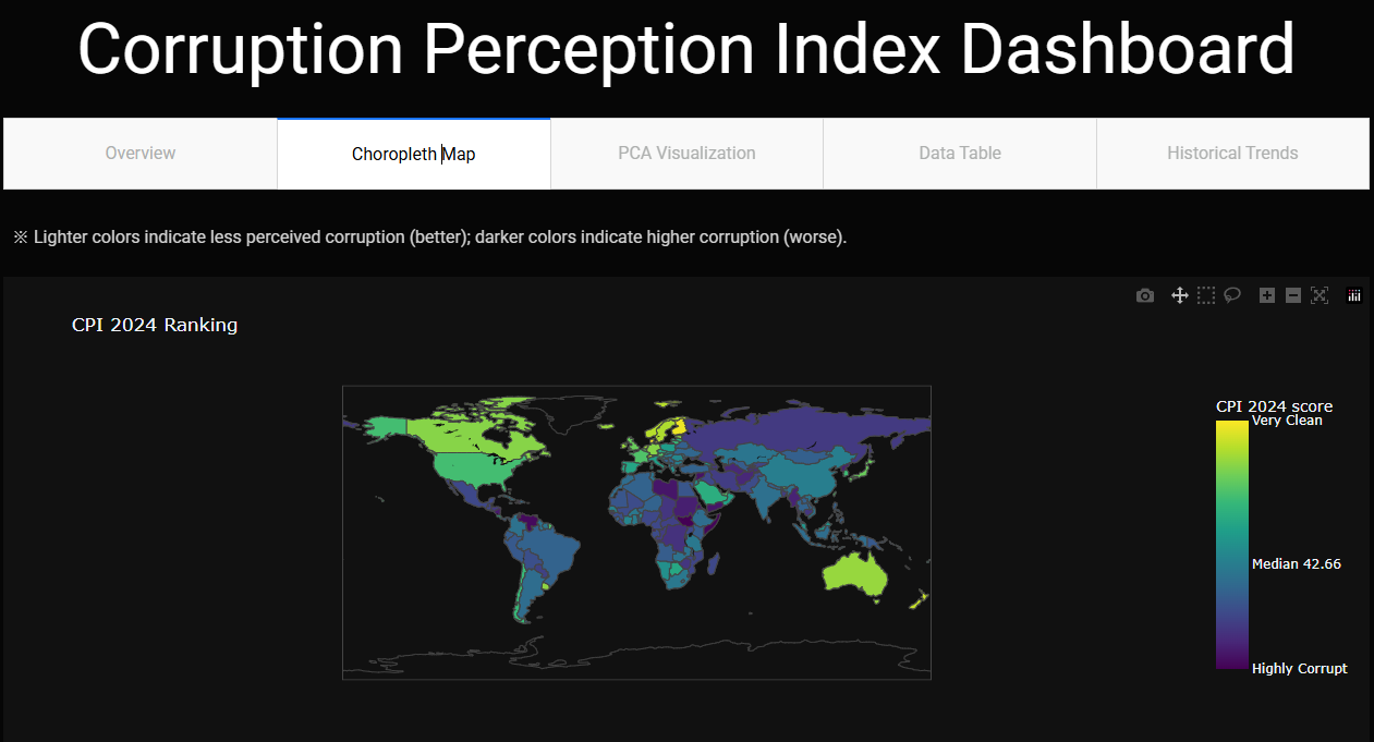
Example: if I go to the chloropleth page, I could be easily tricked into thinking “the more yellow or the higher the number” the better. That’s how it usually works and at least I do not read every word on a screen. Assuming we prefer less corruption, it’s exactly the other way around. The more yellow & higher rank, the more corruption thoughts.
You could add context by using something like this for the chloropleth, with other values and text:
or in another way. I only know this (changing ticktext for the colorbar) because I used it for the first time this ff And after that removed the map, but it works very well.
My thoughts, and I should study PCA, I still do not understand what I’m looking at, but that’s my thing.
Very nice app, @feanor_92 .
I agree with @marieanne 's suggestion regarding the colorbar. I tend to view the colorbar and immediately assume that the higher (more yellow) the number the better.
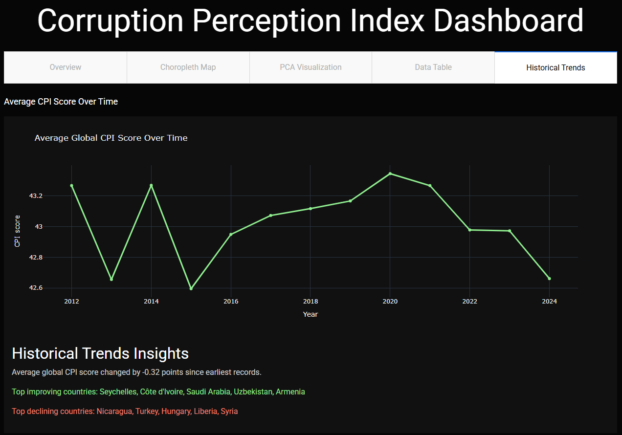
I liked the historical trends line chart. Interesting to see 2024 as one of the lowest points since 2012.
Thank you so much for this feedback—I actually didn’t even notice this yesterday
I’ve just pushed an update that adds contextual guidance on the map. Now, right above the map, users will see a note:
I’ve also customized the colorbar ticks to clearly label “Highly Corrupt,” “Median CPI,” and “Very Clean.” I hope this makes the dashboard more intuitive for first‑time viewers
Thanks for the kind words! I’ve also updated the colorbar per @marieanne suggestion so that the tick labels (“Highly Corrupt,” “Median CPI,” “Very Clean”) make it clear that lighter shades are better and darker shades worse.
As for PCA tab:
PCA1 (x‑axis): the combination of all numeric CPI measures that explains the most variation among countries.
PCA2 (y‑axis): the next most important, independent direction of variation.
In short, the PCA chart is a quick way to spot groupings or unusual cases beyond just the single CPI score: Countries that close together have very similar overall CPI profiles.
HI, This topic is very interesting. I find it notable how the range of CPI values can be visualized, and with that purpose, I have developed two complementary charts. Both aim to highlight clustering patterns and the temporal evolution of perceived corruption levels at the country level.
Thank you so much!
In this version I didn’t run a formal clustering algorithm—those “groups” you see are simply countries colored by their CPI‐quartile (High → Very Low corruption). The PCA scatter just projects the data, and any visual clusters emerge naturally from those quartile labels.
 I’m missing the historical movie chloropleth, did you remove it?
 And after that removed the map, but it works very well.


 I’ve also updated the colorbar per