Figure Friday 2025 - week 27

join the Figure Friday session on July 11, at noon Eastern Time, to showcase your creation and receive feedback from the community.

Groundwater (water in the open space in rocks) is often pumped from deep underground for agricultural, domestic, and industrial use—particularly in western states during times of drought. As groundwater wells are getting deeper to reach more water, there is an increased need to understand how far down groundwater resources exist. Recent work has developed new methods to map water deep underground in order to assess water resources.

This week’s Figure Friday will be dedicated to the Plotly Graphing library, using data from the recent work to create a 3-d graph of groundwater salinity and underground rock layers. The 3-d graph from the published work is in this html file.

Plotting challenge:

The sample figure and code below plot model-predicted salinity point data and the land surface in the study area. A few ways to put your Plotly skills into practice:

  • Add underground rock layer surfaces using data from “rock-layer-1.csv” and “rock-layer-2.csv” (similar to how the land surface was added in the sample code).

  • Interpolate the discrete salinity data into a continuous 2-d surface using scipy’s griddata. Keep in mind the salinity values are indexed by three spatial coordinates (x, y, and z) unlike the land surface and rock layers that are indexed by only x and y coordinates. Therefore, the salinity interpolation model will be in 3-d and we can hold one of the dimensions constant (e.g., z = -100 everywhere) and create a 2-d “slice” of the 3-d data at some certain location.

  • Extra challenge: add vertical 2-d “slices” by holding the x-dimension constant then holding the y-dimension constant.

  • Or use a different graph type to visualize the data

Sample figure:

Code for sample figure:
import pandas as pd
import numpy as np
from scipy.interpolate import griddata
import plotly.graph_objects as go
import plotly

# Groundwater salinity data from recent work.
df = pd.read_csv("model-grid-subsample.csv")
df = df[df.dem_m > df.zkm * 1e3] # Remove data above the ground.

grid = df[['xkm', 'ykm', 'zkm', 'mean_tds']].to_numpy()
x = grid[:, 0] * 1e3 # Kilometers to meters.
y = grid[:, 1] * 1e3
z = grid[:, 2] * 1e3
u = grid[:, 3]


# Digital Elevation Model (DEM) - the land surface in the study area.
dem_grid = df[['xkm', 'ykm', 'dem_m']].to_numpy()

x_dem = dem_grid[:, 0] * 1e3
y_dem = dem_grid[:, 1] * 1e3
z_dem = dem_grid[:, 2]


# Interpolate the land surface point data.
xi_dem = np.linspace(min(x_dem), max(x_dem), 200)
yi_dem = np.linspace(min(y_dem), max(y_dem), 200)
zi_dem = griddata((x_dem, y_dem), z_dem, 
                  (xi_dem.reshape(1, -1), yi_dem.reshape(-1, 1)))


# Make the 3-d graph.
trace_dem = go.Surface(x=xi_dem, y=yi_dem, z=zi_dem,
                       colorscale='Earth',
                       name='Land surface',
                       showscale=False,
                       showlegend=True
                         )

trace_groundwater = go.Scatter3d(
    x=x, y=y, z=z, 
    mode='markers',
    name='Groundwater salinity',
    showlegend=True,
    marker=dict(size=3, symbol='square', 
                colorscale='RdYlBu_r', color=np.log10(u), # Log the colorscale.
                colorbar=dict(title=dict(text='Salinity (mg/L)', side='right'),
                                                        x=0.94,  # Move cbar over.
                                                        len=0.5,  # Shrink cbar.
                                                        ticks='outside',
                              tickvals=np.log10([400, 500, 600, 700, 800, 900, 1000, 
                                                 2000, 3000, 4000, 5000, 6000, 7000, 8000, 9000, 10000]),
                              ticktext=[400, 500, 600, 700, 800, 900, 1000, 
                                        2000, 3000, 4000, 5000, 6000, 7000, 8000, 9000, 10000],
                                                        ))
)

data = [
    trace_dem,
    trace_groundwater
]

fig = go.Figure(data=data)

fig.update_layout(
    margin=dict(l=20, r=50, b=20, t=20),
    scene=dict(
             xaxis=dict(title='Easting (m)', color='black', showbackground=True, backgroundcolor='gray'), 
             yaxis=dict(title='Northing (m)', color='black', showbackground=True, backgroundcolor='gray'), 
             zaxis=dict(title='Elevation (m)', color='black', showbackground=True, backgroundcolor='gray'), 
             aspectratio=dict(x=1, y=1, z=0.25), # Scale the z-direction.
             camera = dict( # Make north pointing up.
                        up=dict(x=0, y=0, z=1),
                        center=dict(x=0, y=0, z=-0.2),
                        eye=dict(x=-1., y=-1.3, z=1.)
                        )
                    ),
    legend=dict(x=0, y=0.8,
               font=dict(size=13, color='black'),
               bgcolor='rgb(230,230,230)',
               bordercolor='black',
               borderwidth=2,
               title='<b> Explanation </b><br> (click each to toggle) <br>'
                              ),
    )


plotly.offline.plot(fig, filename='3d-salinity-example.html')

Participation Instructions:

  • Create - use the weekly data set to build your own Plotly visualization or Dash app. Or, enhance the sample figure provided in this post, using Plotly or Dash.
  • Submit - post your creation to LinkedIn or Twitter with the hashtags #FigureFriday and #plotly by midnight Thursday, your time zone. Please also submit your visualization as a new post in this thread.
  • Celebrate - join the Figure Friday sessions to showcase your creation and receive feedback from the community.

:point_right: If you prefer to collaborate with others on Discord, join the Plotly Discord channel.

Data Source:

Thank you to USGS for the data and to Michael for putting this Figure Friday together.

9 Likes

That’s some sample figure! :heart_eyes:

3 Likes

Beatiful graph

2 Likes

Yes, these type of graphs are challenging to build but if done right, they’re beautiful to look at and they give a lot of information :slight_smile:

6 Likes

Hi,

This one is way out of my league but am intrigued to find out what others produce and how.

3 Likes

@mike_finko you can try to have AI help you better understand the data and potential ways to visualize it :slight_smile:

For example, maybe you choose a different graph instead of the 3d chart…

1 Like

Hi @adamschroeder yes, I could try another graph, however I downloaded the datasets and the data dictionary, wow, it’s intense! this one would take me a few months, no kidding :laughing: I’ll definitely have to skip this one, job hunting takes precedence now. Hopefully next week I’ll be able to join in.

2 Likes

I did it with the help of AI, but I need to double check it before I show it.

1 Like

Good luck with the job search, @mike_finko

1 Like

This colorful 3-d graph shows the Groundwater salinity, and I liked it so much that I definitely wanted to try it myself. :rocket::bar_chart::slightly_smiling_face:
Its main features are that it is interactive, animated, and displays the changes in salinity through different depth slices. It also visualizes the surface topography and rock layers, giving a complex picture of the subsurface conditions.
I created the visualization with the help of AI, which explained the process step by step so I could get started easily. The result is an interactive HTML file that anyone can open and explore. I adjusted the opacity in several places to make sure that everything is visible.


Code:
import numpy as np
from scipy.interpolate import griddata
import plotly.graph_objects as go
import plotly

# --- Load Data ---

df = pd.read_csv("model-grid-subsample.csv")
df = df[df.dem_m > df.zkm * 1e3]

x = df['xkm'].to_numpy() * 1e3
y = df['ykm'].to_numpy() * 1e3
z = df['zkm'].to_numpy() * 1e3
u = df['mean_tds'].to_numpy()

rock1 = pd.read_csv("rock-layer-1.csv")
rock2 = pd.read_csv("rock-layer-2.csv")

# DEM surface
xi_dem = np.linspace(x.min(), x.max(), 100)
yi_dem = np.linspace(y.min(), y.max(), 100)
zi_dem = griddata(
    (x, y), df.dem_m.to_numpy(),
    (xi_dem[None, :], yi_dem[:, None]),
    method='linear'
)

# Rock layers
xi_rock1 = np.linspace(rock1['xkm'].min()*1e3, rock1['xkm'].max()*1e3, 200)
yi_rock1 = np.linspace(rock1['ykm'].min()*1e3, rock1['ykm'].max()*1e3, 200)
zi_rock1 = griddata(
    (rock1['xkm']*1e3, rock1['ykm']*1e3),
    rock1['mean_pred'],
    (xi_rock1[None, :], yi_rock1[:, None]),
    method='linear'
)

xi_rock2 = np.linspace(rock2['xkm'].min()*1e3, rock2['xkm'].max()*1e3, 200)
yi_rock2 = np.linspace(rock2['ykm'].min()*1e3, rock2['ykm'].max()*1e3, 200)
zi_rock2 = griddata(
    (rock2['xkm']*1e3, rock2['ykm']*1e3),
    rock2['mean_pred'],
    (xi_rock2[None, :], yi_rock2[:, None]),
    method='linear'
)

# --- Plotly Traces (Static) ---

trace_dem = go.Surface(
    x=xi_dem, y=yi_dem, z=zi_dem,
    colorscale='Earth',
    name='Land surface',
    showscale=False,
    showlegend=True,
    opacity=1.0
)

trace_rock1 = go.Surface(
    x=xi_rock1, y=yi_rock1, z=zi_rock1,
    surfacecolor=np.zeros_like(zi_rock1),
    colorscale=[[0, 'rgba(255,0,0,1)'], [1, 'rgba(255,0,0,1)']],  # red
    name='Rock Layer 1',
    showscale=False,
    showlegend=True,
    opacity=0.4
)

trace_rock2 = go.Surface(
    x=xi_rock2, y=yi_rock2, z=zi_rock2,
    surfacecolor=np.zeros_like(zi_rock2),
    colorscale=[[0, 'rgba(0,255,0,1)'], [1, 'rgba(0,255,0,1)']],  # green
    name='Rock Layer 2',
    showscale=False,
    showlegend=True,
    opacity=0.4
)

trace_groundwater = go.Scatter3d(
    x=x, y=y, z=z,
    mode='markers',
    name='Groundwater salinity',
    showlegend=True,
    marker=dict(
        size=3, symbol='square',
        colorscale='RdYlBu_r', color=np.log10(u),
        showscale=False
    ),
    hovertemplate=
        'Easting: %{x:.0f} m<br>' +
        'Northing: %{y:.0f} m<br>' +
        'Elevation: %{z:.0f} m<br>' +
        'TDS: %{customdata[0]:.0f} mg/L<br>' +
        'log10(TDS): %{marker.color:.2f}<extra></extra>',
    customdata=np.stack([u], axis=-1)
)

# --- Animation Frames ---

xi = np.linspace(x.min(), x.max(), 100)
yi = np.linspace(y.min(), y.max(), 100)
z_slices = np.linspace(z.min(), z.max(), 25)

# Initial slice
z_slice0 = z_slices[0]
salinity_slice0 = griddata(
    (x, y, z), u,
    (xi[None, :, None], yi[:, None, None], np.full((100, 100, 1), z_slice0)),
    method='linear'
).squeeze()

trace_slice = go.Surface(
    x=xi,
    y=yi,
    z=np.full_like(salinity_slice0, z_slice0),
    surfacecolor=np.log10(salinity_slice0),
    cmin=np.log10(400),
    cmax=np.log10(10000),
    colorscale='RdYlBu_r',
    opacity=0.7,  
    showscale=True,
    colorbar=dict(
        title=dict(text='Salinity (mg/L)', side='right'),
        x=1.02, len=0.5, ticks='outside',
        tickvals=np.log10([400, 1000, 5000, 10000]),
        ticktext=[400, 1000, 5000, 10000]
    ),
    name='Salinity slice',
    showlegend=True  
)

frames = []
for i, z_slice in enumerate(z_slices):
    salinity_slice = griddata(
        (x, y, z), u,
        (xi[None, :, None], yi[:, None, None], np.full((100, 100, 1), z_slice)),
        method='linear'
    ).squeeze()

    
    frame = go.Frame(
        name=f'{z_slice:.1f}',
        data=[
            trace_dem,
            trace_groundwater,
            trace_rock1,
            trace_rock2,
            go.Surface(
                x=xi,
                y=yi,
                z=np.full_like(salinity_slice, z_slice),
                surfacecolor=np.log10(salinity_slice),
                cmin=np.log10(400),
                cmax=np.log10(10000),
                colorscale='RdYlBu_r',
                opacity=0.3,
                showscale=True,
                colorbar=dict(
                    title=dict(text='Salinity (mg/L)', side='right'),
                    x=1.02, len=0.5, ticks='outside',
                    tickvals=np.log10([400, 1000, 5000, 10000]),
                    ticktext=[400, 1000, 5000, 10000]
                ),
                name='Salinity slice',
                showlegend=(i == 0)  
            )
        ],
        layout=go.Layout(
            annotations=[
                dict(
                    text=f"<b>Z = {z_slice:.1f} m</b>",
                    x=0.5, y=1.08, xref='paper', yref='paper',
                    showarrow=False,
                    font=dict(size=24, color='black'),
                    align='center',
                    bgcolor='rgba(255,255,255,0.7)',
                    bordercolor='black',
                    borderwidth=1
                )
            ]
        )
    )
    frames.append(frame)

# --- Initial Slice ---

initial_slice = [
    trace_dem,
    trace_groundwater,
    trace_rock1,
    trace_rock2,
    trace_slice
]

# --- Create Figure ---

fig = go.Figure(
    data=initial_slice,
    frames=frames
)

fig.update_layout(
    title='<b>Groundwater salinity</b>',
    title_x=0.0,  
    title_y=0.95,
    title_font=dict(size=44, color='black'),
    margin=dict(l=20, r=50, b=20, t=100),
    scene=dict(
        xaxis=dict(title='Easting (m)', color='black', showbackground=True, backgroundcolor='gray'),
        yaxis=dict(title='Northing (m)', color='black', showbackground=True, backgroundcolor='gray'),
        zaxis=dict(title='Elevation (m)', color='black', showbackground=True, backgroundcolor='gray'),
        aspectratio=dict(x=1, y=1, z=0.25),
        camera=dict(
            up=dict(x=0, y=0, z=1),
            center=dict(x=0, y=0, z=-0.2),
            eye=dict(x=-1., y=-1.3, z=1.)
        )
    ),
    legend=dict(
        x=0, y=0.8,
        font=dict(size=13, color='black'),
        bgcolor='rgb(230,230,230)',
        bordercolor='black',
        borderwidth=2,
        title='<b> Explanation </b><br> (click each to toggle) <br>'
    ),
    updatemenus=[dict(
        type='buttons',
        showactive=False,
        x=0.05, y=0,
        buttons=[
            dict(label='▶ Play', method='animate', args=[None, {
                'frame': {'duration': 500, 'redraw': True},
                'fromcurrent': True, 'transition': {'duration': 0}
            }]),
            dict(label='⏸ Pause', method='animate', args=[[None], {
                'mode': 'immediate',
                'frame': {'duration': 0, 'redraw': False},
                'transition': {'duration': 0}
            }])
        ]
    )],
    sliders=[dict(
        steps=[dict(method='animate', args=[[f'{z:.1f}'], {
            'mode': 'immediate',
            'frame': {'duration': 0, 'redraw': True},
            'transition': {'duration': 0}
        }], label=f'{z:.1f} m') for z in z_slices],
        x=0.1, y=0,
        len=0.8,
        currentvalue=dict(prefix='Z-slice: ', font=dict(size=14)),
        pad=dict(b=10)
    )]
)

# --- Save and Show ---

plotly.offline.plot(fig, filename='3d-salinity-animated.html')
6 Likes

@adamschroeder an ongoing task, thanks!

1 Like

great strategy, pick one very specific part to focus on for learning. :+1:

2 Likes

Hi, this week I found the chart very interesting. Additionally, the reference to the paper was helpful for understanding the context. The visualizations are very well done. I was particularly interested in being able to visualize the volumes segmented by the proposed ranges..

Application code

5 Likes

Well said hah, sample figure you provided might be the best match - data to graph I have ever seen to kick off Figure Fridays haha.

1 Like

well done and intriguing visualizations so far :fire:
@mjs what do you think of the graphs submitted so far?

These are very interesting! I like the sliders and volume calculations, very cool.

1 Like

Here is the end result, I finally managed to upload the html to render.
The points are very limited, but that’s all I could fit on my github at the moment. I uploaded it because it works.

Application link

1 Like

Hey everyone! :waving_hand:

For this week’s intriguing Figure Friday Week 27 challenge, my goal was to develop visualizations that enhance and work alongside the already impressive 3D graphs. My core idea was to design and create an interactive dashboard to help us better understand and explore groundwater quality. This tool lets us visualize important properties of the water—from its salinity (saltiness) to its temperature, and even how porous the ground is.


What Can It Do?

This dashboard lets you explore groundwater data in a few key ways:

  • See What’s Underground: You can select different water properties, like salinity (TDS), temperature, electrical resistivity, porosity, and bicarbonate levels. Each parameter has a detailed description and interpretation to help you understand its significance.
  • Horizontal View (Depth Slices): Ever wondered what the water looks like at a specific depth? Choose a depth using the slider, and the dashboard will show you a heatmap-style map of that property across our area. You can easily spot where values are higher or lower in a given horizontal layer.
  • Vertical View (Cross-Sections): Get a “slice” through the earth! Pick a location (either a latitude or longitude line), and you’ll see how the water properties change as you go deeper underground. This is super helpful for understanding how things vary with depth and identifying layers.
  • Quick Info and Statistics: For each property, you’ll find a brief explanation of what it means, why it’s important, and what different levels (like “Good” or “Poor” for salinity) indicate. Plus, you get quick statistics like the average value and how many data points are available for your selected view.

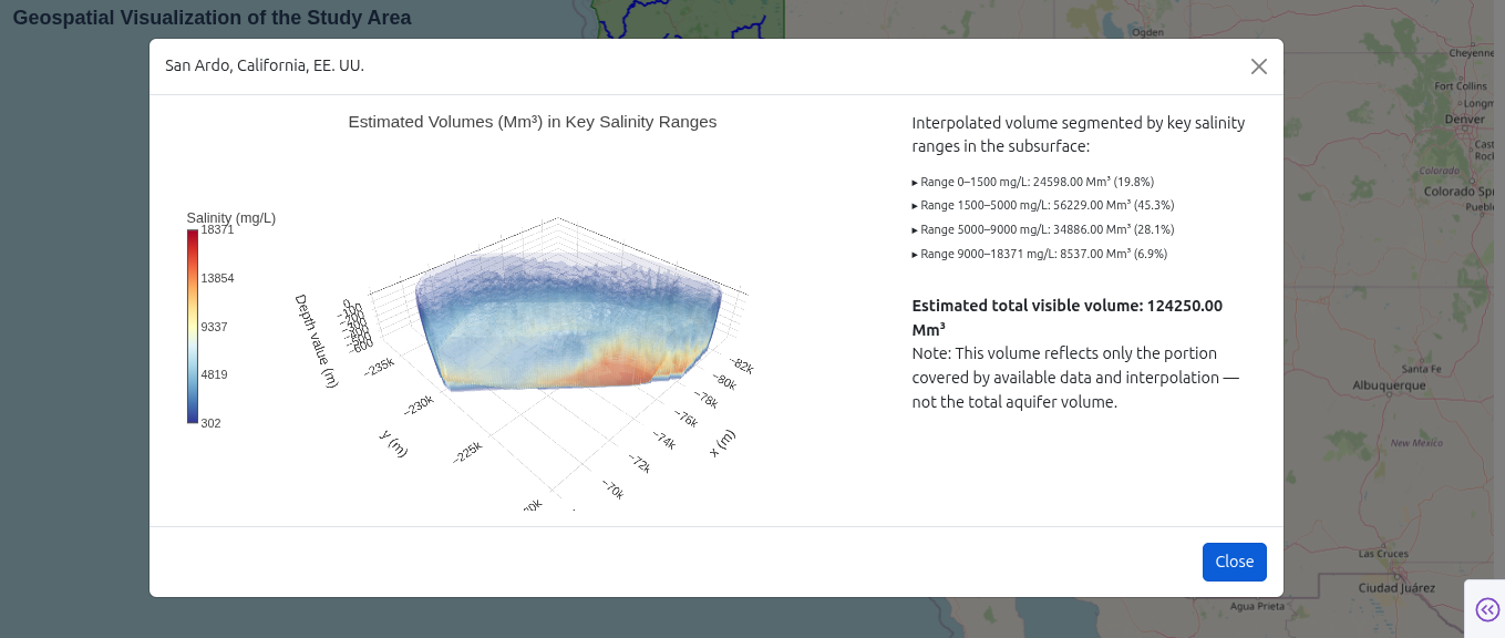
As always this proposal is far from being perfect so let me know your thoughts or any questions you might have

the code:

The code

import pandas as pd
import plotly.graph_objects as go
from dash import Dash, dcc, html, Input, Output, State, dash_table
import dash_bootstrap_components as dbc
import numpy as np
from scipy.interpolate import griddata
import plotly.express as px

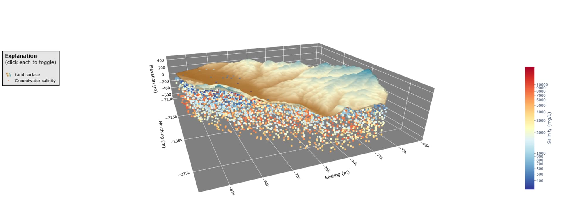
— 1. Data Loading and Preparation —

try:
df = pd.read_csv(“model-grid-subsample.csv”)
# Filter data to eliminate points above ground
df = df[df.dem_m > df.zkm * 1e3]

# Round depths for discrete slider points
df['zm_depth_rounded'] = (df['zm_depth'] / 5).round() * 5

# Get ranges for sliders
min_lat, max_lat = df['Latitude'].min(), df['Latitude'].max()
min_lon, max_lon = df['Longitude'].min(), df['Longitude'].max()
min_depth, max_depth = df['zm_depth'].min(), df['zm_depth'].max()

# Determine unique depths for the slider
available_depths = sorted(df['zm_depth_rounded'].unique())
if len(available_depths) > 100:
    available_depths = np.linspace(min_depth, max_depth, 100).round(0).astype(int)
    available_depths = sorted(list(set(available_depths)))

# Enhanced parameter information with risk levels and interpretations
param_info = {
    'mean_tds': {
        'name': 'Total Dissolved Solids (TDS)',
        'short_name': 'Salinity',
        'unit': 'mg/L',
        'desc': 'Measures the total amount of dissolved substances in water. Higher values indicate saltier water.',
        'interpretation': 'High TDS can indicate saltwater intrusion, contamination, or natural mineral dissolution.',
        'thresholds': {'excellent': 300, 'good': 600, 'poor': 1000, 'very_poor': 2000},
        'color_scale': 'Reds',
        'icon': 'fas fa-tint'
    },
    'mean_temp': {
        'name': 'Temperature',
        'short_name': 'Temperature',
        'unit': '°C',
        'desc': 'Water temperature affects chemical reactions and biological processes underground.',
        'interpretation': 'Temperature anomalies can indicate geothermal activity or surface water infiltration.',
        'thresholds': {'cold': 10, 'cool': 15, 'normal': 20, 'warm': 25},
        'color_scale': 'RdYlBu_r',
        'icon': 'fas fa-thermometer-half'
    },
    'mean_res': {
        'name': 'Electrical Resistivity',
        'short_name': 'Resistivity',
        'unit': 'Ohm-m',
        'desc': 'Measures how well the material resists electrical current. Lower values indicate higher salinity.',
        'interpretation': 'Low resistivity suggests high salt content or contamination.',
        'thresholds': {'very_low': 1, 'low': 10, 'moderate': 100, 'high': 1000},
        'color_scale': 'Viridis',
        'icon': 'fas fa-bolt'
    },
    'mean_por': {
        'name': 'Porosity',
        'short_name': 'Porosity',
        'unit': '%',
        'desc': 'Percentage of empty space in rock or sediment that can hold water.',
        'interpretation': 'Higher porosity means more water storage capacity.',
        'thresholds': {'very_low': 5, 'low': 15, 'moderate': 25, 'high': 35},
        'color_scale': 'Blues',
        'icon': 'fas fa-circle-notch'
    },
    'mean_bicarb': {
        'name': 'Bicarbonate (HCO₃⁻)',
        'short_name': 'Bicarbonate',
        'unit': 'mg/L',
        'desc': 'Common ion that affects water pH and hardness. Part of natural buffering system.',
        'interpretation': 'Moderate levels are normal. Very high levels may indicate specific geological conditions.',
        'thresholds': {'low': 100, 'moderate': 300, 'high': 500, 'very_high': 800},
        'color_scale': 'Greens',
        'icon': 'fas fa-atom'
    }
}

# Calculate statistics for each parameter
param_stats = {}
for param in param_info.keys():
    param_stats[param] = {
        'min': df[param].min(),
        'max': df[param].max(),
        'mean': df[param].mean(),
        'std': df[param].std(),
        'median': df[param].median()
    }

except FileNotFoundError:
print(“Error: ‘model-grid-subsample.csv’ not found. Please ensure the file is in the correct path.”)
exit()

— 2. Helper Functions —

def get_quality_category(value, thresholds):
“”“Categorize parameter values based on thresholds”“”
if ‘excellent’ in thresholds:
if value <= thresholds[‘excellent’]:
return ‘Excellent’
elif value <= thresholds[‘good’]:
return ‘Good’
elif value <= thresholds[‘poor’]:
return ‘Poor’
else:
return ‘Very Poor’
else:
# For other parameters, use descriptive categories
thresh_keys = list(thresholds.keys())
for i, key in enumerate(thresh_keys):
if value <= thresholds[key]:
return key.title()
return thresh_keys[-1].title()

def create_summary_stats_table(param, depth):
“”“Create a summary statistics table for the selected parameter and depth”“”
filtered_df = df[df[‘zm_depth_rounded’] == depth]
if filtered_df.empty:
return dbc.Alert(“No data available for this depth”, color=“warning”)

stats = filtered_df[param].describe()
return dash_table.DataTable(
    data=[
        {'Statistic': 'Count', 'Value': f"{stats['count']:.0f}"},
        {'Statistic': 'Mean', 'Value': f"{stats['mean']:.2f}"},
        {'Statistic': 'Median', 'Value': f"{stats['50%']:.2f}"},
        {'Statistic': 'Std Dev', 'Value': f"{stats['std']:.2f}"},
        {'Statistic': 'Min', 'Value': f"{stats['min']:.2f}"},
        {'Statistic': 'Max', 'Value': f"{stats['max']:.2f}"},
    ],
    columns=[{'name': 'Statistic', 'id': 'Statistic'}, {'name': 'Value', 'id': 'Value'}],
    style_cell={'textAlign': 'left', 'fontSize': '12px', 'padding': '8px'},
    style_header={'backgroundColor': '#3498DB', 'color': 'white', 'fontWeight': 'bold'},
    style_data={'backgroundColor': '#F8F9FA'},
    style_table={'height': '200px', 'overflowY': 'auto'}
)

— 3. Dash App Initialization —

app = Dash(name, external_stylesheets=[
dbc.themes.MINTY,
https://cdnjs.cloudflare.com/ajax/libs/font-awesome/6.0.0/css/all.min.css
])

app.title=‘Groundwater Salinity Dashboard’

— 4. Enhanced Layout with Bootstrap Cards —

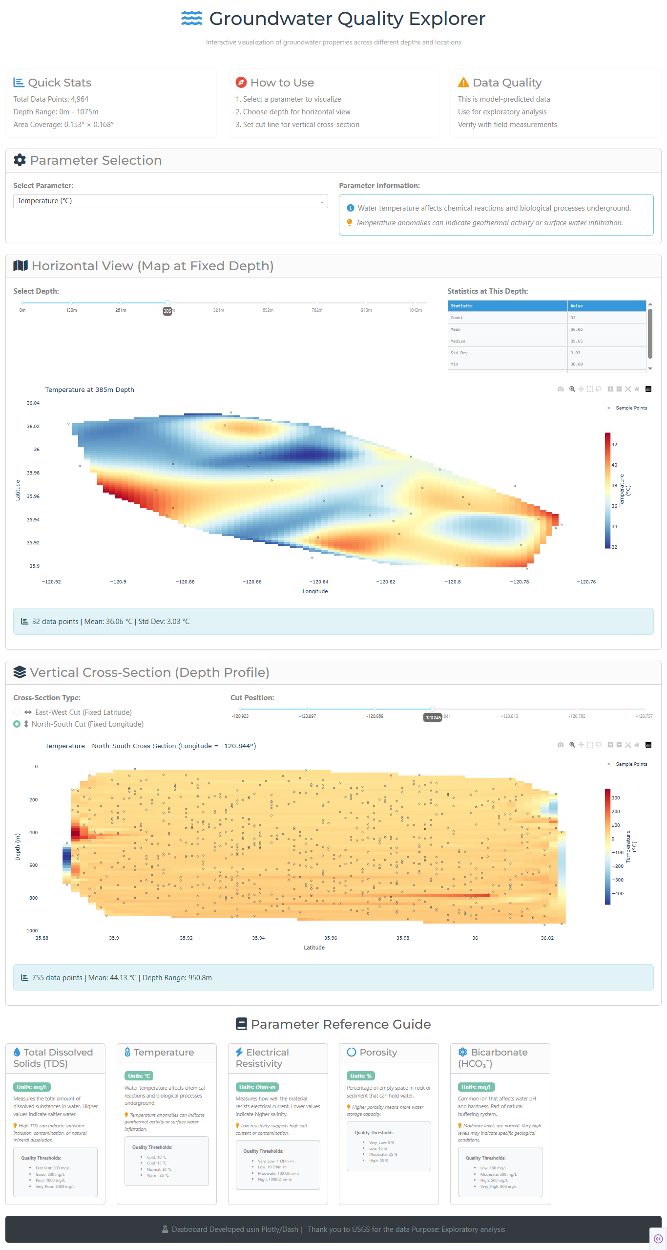
app.layout = dbc.Container([
# Header Section
dbc.Row([
dbc.Col([
html.H1([
html.I(className=“fas fa-water me-3”, style={‘color’: ‘#3498DB’}),
“Groundwater Quality Explorer”
], className=“text-center mb-3”, style={‘color’: ‘#2C3E50’}),
html.P(“Interactive visualization of groundwater properties across different depths and locations”,
className=“text-center text-muted mb-4”, style={‘fontSize’: ‘18px’}),
])
], className=“mb-4”),

# Quick Stats Cards Row
dbc.Row([
    dbc.Col([
        dbc.Card([
            dbc.CardBody([
                html.H4([
                    html.I(className="fas fa-chart-bar me-2", style={'color': '#3498DB'}),
                    "Quick Stats"
                ], className="card-title"),
                html.P(f"Total Data Points: {len(df):,}", className="mb-1"),
                html.P(f"Depth Range: {min_depth:.0f}m - {max_depth:.0f}m", className="mb-1"),
                html.P(f"Area Coverage: {(max_lat-min_lat):.3f}° × {(max_lon-min_lon):.3f}°", className="mb-0"),
            ])
        ], color="light", outline=True, className="h-100")
    ], width=4),
    
    dbc.Col([
        dbc.Card([
            dbc.CardBody([
                html.H4([
                    html.I(className="fas fa-compass me-2", style={'color': '#E74C3C'}),
                    "How to Use"
                ], className="card-title"),
                html.P("1. Select a parameter to visualize", className="mb-1"),
                html.P("2. Choose depth for horizontal view", className="mb-1"),
                html.P("3. Set cut line for vertical cross-section", className="mb-0"),
            ])
        ], color="light", outline=True, className="h-100")
    ], width=4),
    
    dbc.Col([
        dbc.Card([
            dbc.CardBody([
                html.H4([
                    html.I(className="fas fa-exclamation-triangle me-2", style={'color': '#F39C12'}),
                    "Data Quality"
                ], className="card-title"),
                html.P("This is model-predicted data", className="mb-1"),
                html.P("Use for exploratory analysis", className="mb-1"),
                html.P("Verify with field measurements", className="mb-0"),
            ])
        ], color="light", outline=True, className="h-100")
    ], width=4),
], className="mb-4"),

# Parameter Selection Card
dbc.Row([
    dbc.Col([
        dbc.Card([
            dbc.CardHeader([
                html.H3([
                    html.I(className="fas fa-cog me-2", style={'color': '#2C3E50'}),
                    "Parameter Selection"
                ], className="mb-0")
            ]),
            dbc.CardBody([
                dbc.Row([
                    dbc.Col([
                        dbc.Label("Select Parameter:", className="fw-bold mb-2"),
                        dcc.Dropdown(
                            id='main-param-dropdown',
                            options=[{'label': f"{info['name']} ({info['unit']})", 'value': key} 
                                    for key, info in param_info.items()],
                            value='mean_tds',
                            clearable=False,
                            className="mb-2"
                        ),
                    ], width=6),
                    dbc.Col([
                        dbc.Label("Parameter Information:", className="fw-bold mb-2"),
                        dbc.Card([
                            dbc.CardBody(id='param-info-display', className="p-3")
                        ], color="info", outline=True)
                    ], width=6),
                ])
            ])
        ])
    ])
], className="mb-4"),

# Horizontal View Card
dbc.Row([
    dbc.Col([
        dbc.Card([
            dbc.CardHeader([
                html.H3([
                    html.I(className="fas fa-map me-2", style={'color': '#2C3E50'}),
                    "Horizontal View (Map at Fixed Depth)"
                ], className="mb-0")
            ]),
            dbc.CardBody([
                dbc.Row([
                    dbc.Col([
                        dbc.Label("Select Depth:", className="fw-bold mb-2"),
                        dcc.Slider(
                            id='depth-slider',
                            min=min(available_depths),
                            max=max(available_depths),
                            step=5,
                            value=min(available_depths) if available_depths else 0,
                            marks={str(int(d)): {'label': f'{int(d)}m', 'style': {'fontSize': '12px'}} 
                                   for d in available_depths[::max(1, len(available_depths)//8)]},
                            tooltip={"placement": "bottom", "always_visible": True},
                            className="mb-3"
                        ),
                    ], width=8),
                    
                    dbc.Col([
                        dbc.Label("Statistics at This Depth:", className="fw-bold mb-2"),
                        html.Div(id='depth-stats-table')
                    ], width=4),
                ], className="mb-3"),

                dcc.Graph(
                    id='horizontal-slice-map',
                    config={'displayModeBar': True, 'scrollZoom': True},
                    style={'height': '600px'}
                ),
                
                dbc.Alert(id='horizontal-slice-info', color="info", className="mt-3")
            ])
        ])
    ])
], className="mb-4"),

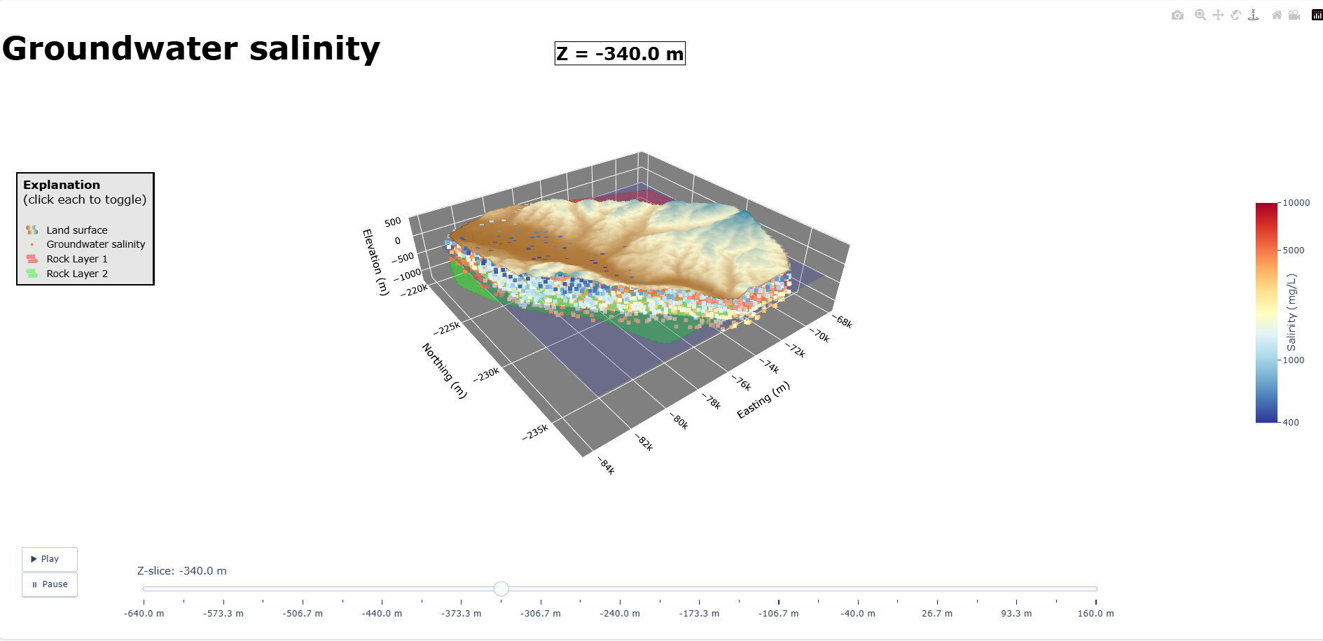
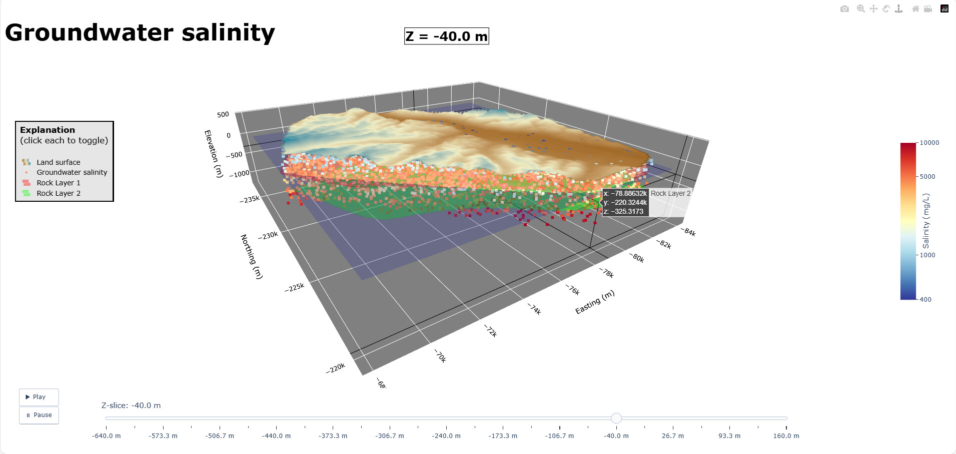
# Vertical Cross-Section Card
dbc.Row([
    dbc.Col([
        dbc.Card([
            dbc.CardHeader([
                html.H3([
                    html.I(className="fas fa-layer-group me-2", style={'color': '#2C3E50'}),
                    "Vertical Cross-Section (Depth Profile)"
                ], className="mb-0")
            ]),
            dbc.CardBody([
                dbc.Row([
                    dbc.Col([
                        dbc.Label("Cross-Section Type:", className="fw-bold mb-2"),
                        dbc.RadioItems(
                            id='cut-type-radio',
                            options=[
                                {'label': [html.I(className="fas fa-arrows-alt-h me-2"), 'East-West Cut (Fixed Latitude)'], 'value': 'lat'},
                                {'label': [html.I(className="fas fa-arrows-alt-v me-2"), 'North-South Cut (Fixed Longitude)'], 'value': 'lon'}
                            ],
                            value='lat',
                            className="mb-3"
                        )
                    ], width=4),
                    
                    dbc.Col([
                        dbc.Label("Cut Position:", className="fw-bold mb-2"),
                        dcc.Slider(
                            id='cut-value-slider',
                            min=min_lat,
                            max=max_lat,
                            step=0.01,
                            value=df['Latitude'].mean(),
                            marks={round(v, 2): {'label': str(round(v, 2)), 'style': {'fontSize': '12px'}} 
                                   for v in np.linspace(min_lat, max_lat, 5).round(2)},
                            tooltip={"placement": "bottom", "always_visible": True},
                            className="mb-3"
                        ),
                    ], width=8),
                ]),

                dcc.Graph(
                    id='vertical-slice-plot',
                    config={'displayModeBar': True},
                    style={'height': '600px'}
                ),
                
                dbc.Alert(id='vertical-slice-info', color="info", className="mt-3")
            ])
        ])
    ])
], className="mb-4"),

# Parameter Reference Cards Row
dbc.Row([
    dbc.Col([
        html.H3([
            html.I(className="fas fa-book me-2", style={'color': '#2C3E50'}),
            "Parameter Reference Guide"
        ], className="text-center mb-4")
    ])
]),

dbc.Row([
    dbc.Col([
        dbc.Card([
            dbc.CardHeader([
                html.H5([
                    html.I(className=info['icon'] + " me-2", style={'color': '#3498DB'}),
                    info['name']
                ], className="mb-0")
            ]),
            dbc.CardBody([
                dbc.Badge(f"Units: {info['unit']}", color="primary", className="mb-2"),
                html.P(info['desc'], className="mb-2", style={'fontSize': '14px'}),
                html.P([
                    html.I(className="fas fa-lightbulb me-1", style={'color': '#F39C12'}),
                    info['interpretation']
                ], className="mb-2", style={'fontSize': '13px', 'fontStyle': 'italic'}),
                
                dbc.Card([
                    dbc.CardBody([
                        html.P("Quality Thresholds:", className="fw-bold mb-2", style={'fontSize': '12px'}),
                        html.Ul([
                            html.Li(f"{k.title()}: {v} {info['unit']}", style={'fontSize': '11px'})
                            for k, v in info['thresholds'].items()
                        ], className="mb-0")
                    ])
                ], color="light", className="mt-2")
            ])
        ], className="h-100")
    ], width=12//5) for key, info in param_info.items()
], className="mb-4"),

# Footer
dbc.Row([
    dbc.Col([
        dbc.Card([
            dbc.CardBody([
                html.P([
                    html.I(className="fas fa-flask me-2", style={'color': '#7F8C8D'}),
                    "Dasbooard Developed usin Plotly/Dash | ",
                    html.I(className="fas fa-target me-2", style={'color': '#7F8C8D'}),
                    "Thank you to USGS for the data Purpose: Exploratory analysis"
                ], className="text-center mb-0", style={'color': '#7F8C8D'})
            ])
        ], color="dark", className="text-white")
    ])
])

], fluid=True, className=“py-3”)

— 5. Enhanced Callbacks —

@app.callback(
Output(‘param-info-display’, ‘children’),
Input(‘main-param-dropdown’, ‘value’)
)
def update_param_info(selected_param):
if selected_param:
info = param_info[selected_param]
return html.Div([
html.P([
html.I(className=“fas fa-info-circle me-2”, style={‘color’: ‘#3498DB’}),
info[‘desc’]
], className=“mb-2”),
html.P([
html.I(className=“fas fa-lightbulb me-2”, style={‘color’: ‘#F39C12’}),
info[‘interpretation’]
], className=“mb-0”, style={‘fontStyle’: ‘italic’})
])
return “Select a parameter to see details”

@app.callback(
Output(‘depth-stats-table’, ‘children’),
Input(‘main-param-dropdown’, ‘value’),
Input(‘depth-slider’, ‘value’)
)
def update_depth_stats(selected_param, selected_depth):
if selected_param and selected_depth:
return create_summary_stats_table(selected_param, selected_depth)
return dbc.Alert(“Select parameters to see statistics”, color=“secondary”)

@app.callback(
Output(‘cut-value-slider’, ‘min’),
Output(‘cut-value-slider’, ‘max’),
Output(‘cut-value-slider’, ‘step’),
Output(‘cut-value-slider’, ‘value’),
Output(‘cut-value-slider’, ‘marks’),
Input(‘cut-type-radio’, ‘value’)
)
def update_cut_slider_ranges(cut_type):
if cut_type == ‘lat’:
min_val, max_val = df[‘Latitude’].min(), df[‘Latitude’].max()
step = 0.005
marks = {round(v, 3): {‘label’: str(round(v, 3)), ‘style’: {‘fontSize’: ‘12px’}}
for v in np.linspace(min_val, max_val, 7).round(3)}
value = df[‘Latitude’].mean()
else:
min_val, max_val = df[‘Longitude’].min(), df[‘Longitude’].max()
step = 0.005
marks = {round(v, 3): {‘label’: str(round(v, 3)), ‘style’: {‘fontSize’: ‘12px’}}
for v in np.linspace(min_val, max_val, 7).round(3)}
value = df[‘Longitude’].mean()
return min_val, max_val, step, value, marks

@app.callback(
Output(‘horizontal-slice-map’, ‘figure’),
Output(‘horizontal-slice-info’, ‘children’),
Input(‘depth-slider’, ‘value’),
Input(‘main-param-dropdown’, ‘value’)
)
def update_horizontal_slice(selected_depth, selected_prop):
filtered_df = df[df[‘zm_depth_rounded’] == selected_depth].copy()

fig = go.Figure()

if not filtered_df.empty:
    info = param_info[selected_prop]
    
    # Create interpolated surface
    grid_lat = np.linspace(filtered_df['Latitude'].min(), filtered_df['Latitude'].max(), 80)
    grid_lon = np.linspace(filtered_df['Longitude'].min(), filtered_df['Longitude'].max(), 80)
    
    points = filtered_df[['Latitude', 'Longitude']].values
    values = filtered_df[selected_prop].values
    
    grid_data = griddata(points, values, (grid_lat[None,:], grid_lon[:,None]), method='cubic')
    
    fig.add_trace(go.Heatmap(
        x=grid_lon,
        y=grid_lat,
        z=grid_data,
        colorscale=info['color_scale'],
        colorbar=dict(
            title=f"{info['short_name']}<br>({info['unit']})",
            titleside='right',
            thickness=15,
            len=0.7
        ),
        hovertemplate='<b>Latitude:</b> %{y:.4f}<br><b>Longitude:</b> %{x:.4f}<br><b>' + 
                     info['short_name'] + ':</b> %{z:.2f} ' + info['unit'] + '<extra></extra>'
    ))
    
    # Add sample points
    fig.add_trace(go.Scatter(
        x=filtered_df['Longitude'],
        y=filtered_df['Latitude'],
        mode='markers',
        marker=dict(size=4, color='white', opacity=0.8, line=dict(width=1, color='black')),
        name='Sample Points',
        hovertemplate='<b>Sample Point</b><br>Lat: %{y:.4f}<br>Lon: %{x:.4f}<br>' + 
                     info['short_name'] + ': %{text}<extra></extra>',
        text=[f"{val:.2f} {info['unit']}" for val in filtered_df[selected_prop]]
    ))
    
    fig.update_layout(
        title=f"{info['name']} at {selected_depth}m Depth",
        xaxis_title="Longitude",
        yaxis_title="Latitude",
        margin={"r":60,"t":60,"l":60,"b":60},
        hovermode='closest',
        showlegend=True,
        height=500,
        plot_bgcolor='white'
    )
    
    # Statistics info
    mean_val = filtered_df[selected_prop].mean()
    std_val = filtered_df[selected_prop].std()
    count = len(filtered_df)
    
    info_text = [
        html.I(className="fas fa-chart-bar me-2"),
        f"{count} data points | Mean: {mean_val:.2f} {info['unit']} | Std Dev: {std_val:.2f} {info['unit']}"
    ]
    
else:
    fig.add_annotation(
        text="No data available for this depth<br>Try selecting a different depth",
        xref="paper", yref="paper", x=0.5, y=0.5,
        showarrow=False, font=dict(size=16, color='gray')
    )
    fig.update_layout(
        title="No Data Available",
        xaxis_title="Longitude",
        yaxis_title="Latitude",
        margin={"r":60,"t":60,"l":60,"b":60},
        plot_bgcolor='white'
    )
    info_text = [html.I(className="fas fa-exclamation-triangle me-2"), "No data available for the selected depth"]

return fig, info_text

@app.callback(
Output(‘vertical-slice-plot’, ‘figure’),
Output(‘vertical-slice-info’, ‘children’),
Input(‘main-param-dropdown’, ‘value’),
Input(‘cut-type-radio’, ‘value’),
Input(‘cut-value-slider’, ‘value’)
)
def update_vertical_slice(selected_prop, cut_type, cut_value):
fig = go.Figure()

tolerance = 0.01

if cut_type == 'lat':
    filtered_df = df[(df['Latitude'] >= cut_value - tolerance) & 
                    (df['Latitude'] <= cut_value + tolerance)].copy()
    x_axis_col = 'Longitude'
    xaxis_title = 'Longitude'
    title_extra = f"Latitude = {cut_value:.3f}°"
    cut_direction = "East-West"
else:
    filtered_df = df[(df['Longitude'] >= cut_value - tolerance) & 
                    (df['Longitude'] <= cut_value + tolerance)].copy()
    x_axis_col = 'Latitude'
    xaxis_title = 'Latitude'
    title_extra = f"Longitude = {cut_value:.3f}°"
    cut_direction = "North-South"

if not filtered_df.empty:
    info = param_info[selected_prop]
    
    # Create interpolated surface
    grid_x = np.linspace(filtered_df[x_axis_col].min(), filtered_df[x_axis_col].max(), 60)
    grid_y_depth = np.linspace(filtered_df['zm_depth'].min(), filtered_df['zm_depth'].max(), 60)
    
    points = filtered_df[[x_axis_col, 'zm_depth']].values
    values = filtered_df[selected_prop].values
    
    grid_data = griddata(points, values, (grid_x[None,:], grid_y_depth[:,None]), method='cubic')
    
    fig.add_trace(go.Heatmap(
        x=grid_x,
        y=grid_y_depth,
        z=grid_data,
        colorscale=info['color_scale'],
        colorbar=dict(
            title=f"{info['short_name']}<br>({info['unit']})",
            titleside='right',
            thickness=15,
            len=0.7
        ),
        hovertemplate=f'<b>{xaxis_title}:</b> %{{x:.4f}}<br><b>Depth:</b> %{{y:.1f}}m<br><b>' + 
                     info['short_name'] + ':</b> %{z:.2f} ' + info['unit'] + '<extra></extra>'
    ))
    
    # Add sample points
    fig.add_trace(go.Scatter(
        x=filtered_df[x_axis_col],
        y=filtered_df['zm_depth'],
        mode='markers',
        marker=dict(size=4, color='white', opacity=0.8, line=dict(width=1, color='black')),
        name='Sample Points',
        hovertemplate=f'<b>Sample Point</b><br>{xaxis_title}: %{{x:.4f}}<br>Depth: %{{y:.1f}}m<br>' + 
                     info['short_name'] + ': %{text}<extra></extra>',
        text=[f"{val:.2f} {info['unit']}" for val in filtered_df[selected_prop]]
    ))
    
    fig.update_layout(
        title=f"{info['name']} - {cut_direction} Cross-Section ({title_extra})",
        xaxis_title=xaxis_title,
        yaxis_title='Depth (m)',
        yaxis=dict(autorange='reversed'),
        margin={"r":60,"t":60,"l":60,"b":60},
        hovermode='closest',
        showlegend=True,
        height=500,
        plot_bgcolor='white'
    )
    
    # Statistics info
    mean_val = filtered_df[selected_prop].mean()
    count = len(filtered_df)
    depth_range = filtered_df['zm_depth'].max() - filtered_df['zm_depth'].min()
    
    info_text = [
        html.I(className="fas fa-chart-bar me-2"),
        f"{count} data points | Mean: {mean_val:.2f} {info['unit']} | Depth Range: {depth_range:.1f}m"
    ]
    
else:
    fig.add_annotation(
        text="No data available for this cross-section<br>Try adjusting the cut position",
        xref="paper", yref="paper", x=0.5, y=0.5,
        showarrow=False, font=dict(size=16, color='gray')
    )
    fig.update_layout(
        title="No Data Available",
        xaxis_title=xaxis_title,
        yaxis_title='Depth (m)',
        yaxis=dict(autorange='reversed'),
        margin={"r":60,"t":60,"l":60,"b":60},
        plot_bgcolor='white'
    )
    info_text = [html.I(className="fas fa-exclamation-triangle me-2"), "No data available for the selected cross-section"]

return fig, info_text

— 6. Run the App —

if name == ‘main’:
app.run(debug=True, jupyter_mode=‘external’, port=8052)


6 Likes

@Avacsiglo21
Wow - this is great! I love the way you explain the parameters and how to use the site to make it easy to use for people who are not subject matter experts!

2 Likes

Thanks a lot AnnMarie that´s the idea :smiling_face_with_three_hearts:

1 Like