Cool dashboard @Avacsiglo21!
I should have mentioned earlier that all the data columns are described here if you are interested.
Oh thanks a Lot I’m going to check it out
Such an informative Dash app, @Avacsiglo21 . Really nice job!
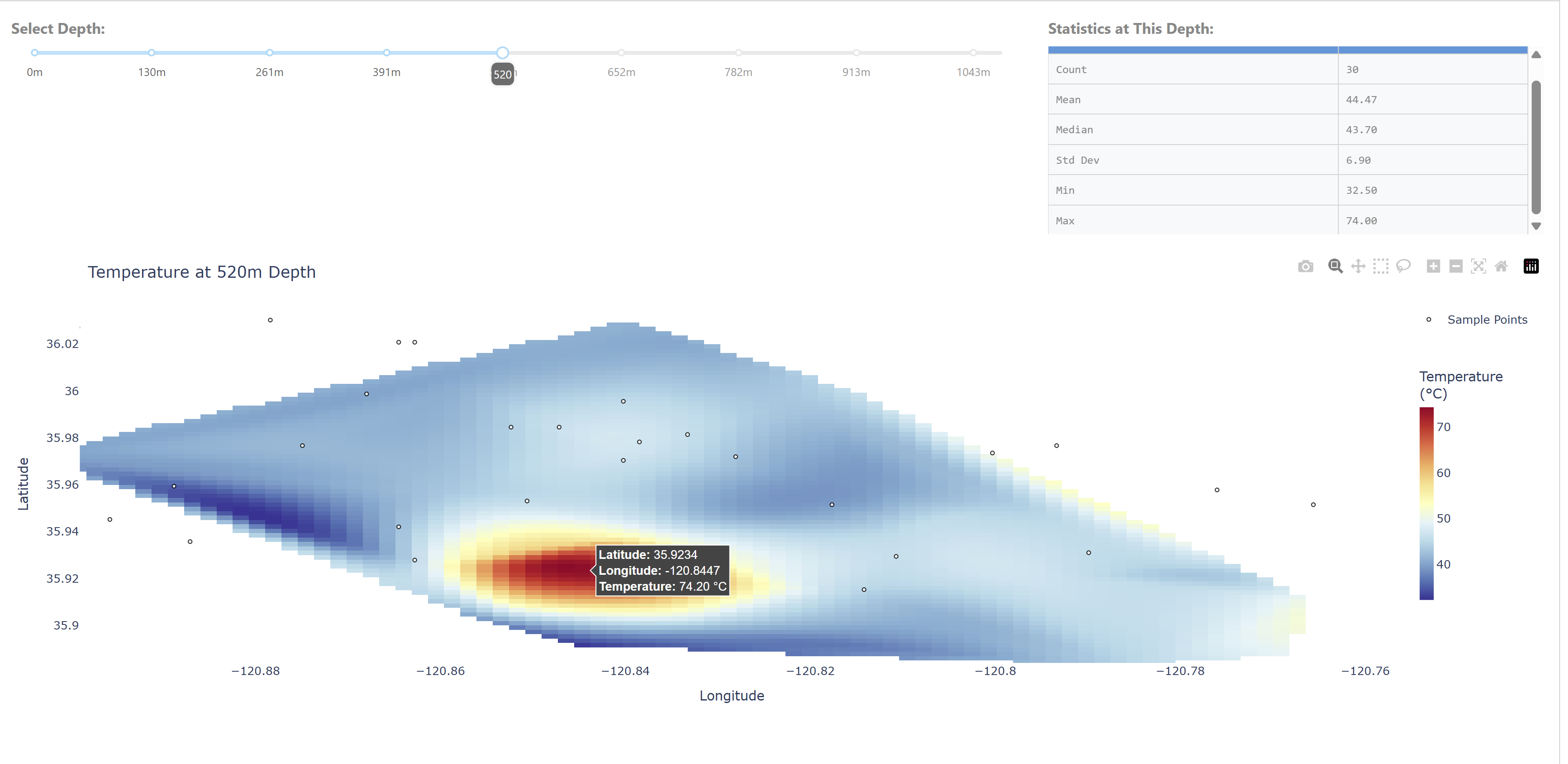
I was surprised to find water 520 meters underground at 74 C.
Thank you for providing the Parameter Reference Guide. That is really helpful, especially for people outside the field.
Hey Adams,
Thanks to you and @mjs for sharing this really interesting data.
That’s a great question: ‘I was surprised to find water 520 meters underground at 74 °C.’ You always have such keen eyes! ![]()
![]()

@ThomasD21M I think that it is the ID.
Exactly. I think Is the ID that remains after modeling the data and converting in csv file.
Yes, it’s an index, sorry I didn’t label it. I took a random subset of the original data file for the plotting challenge. The full data files are in the USGS data release here Data and model for mapping groundwater total dissolved solids at the San Ardo Oil Field, Monterey County, California, USA - ScienceBase-Catalog.
You’re right, it is hotter than you’d expect. Oil producers inject steam into the reservoir to loosen thick oil so it will flow into producing wells. There are more details in section 4.1 in the paper.
ok thanks you very much for your clarification.
I knew about the Scipy library, but I didn’t know how it worked. This interpolation function in particular is excellent. ![]()
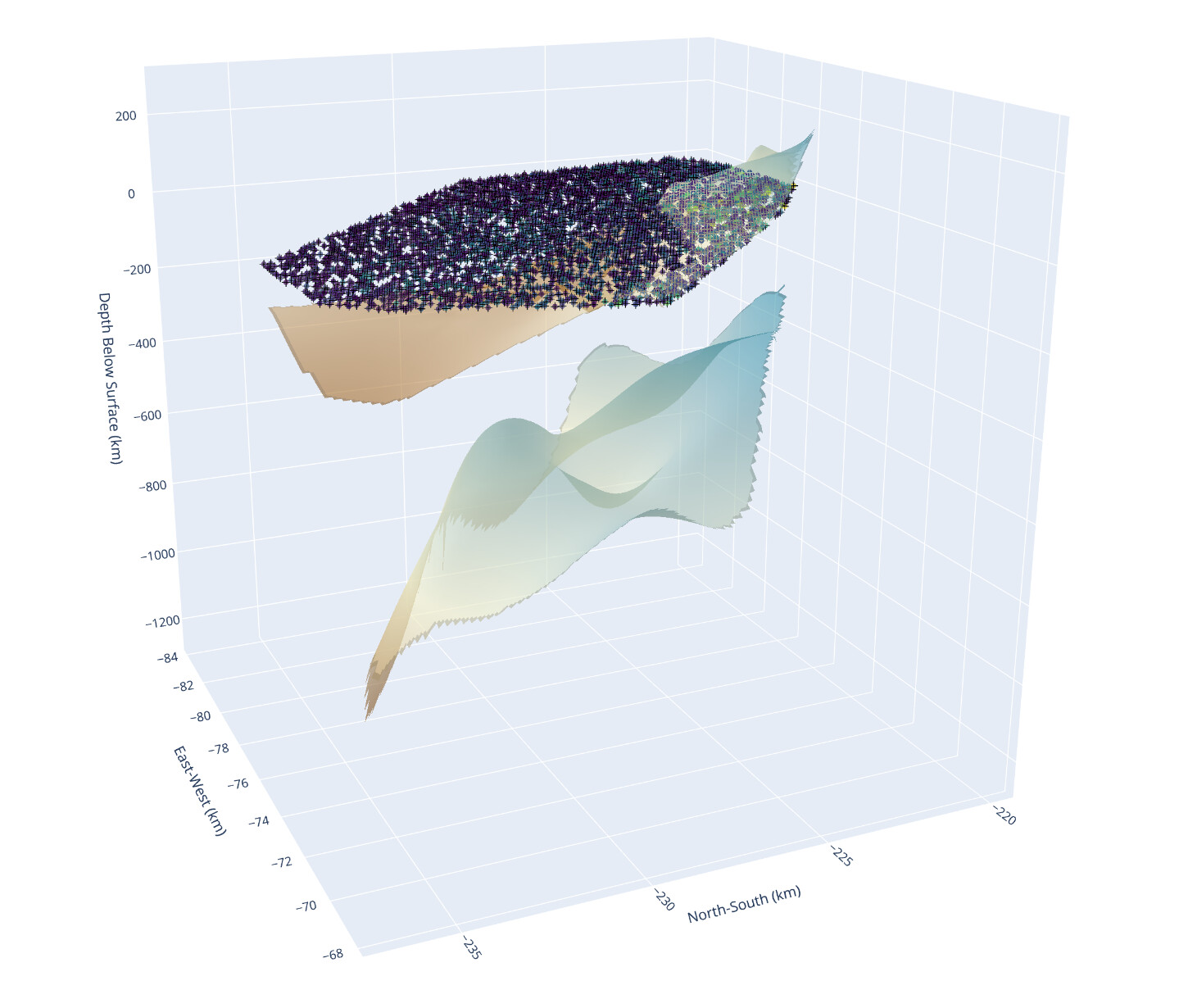
Built a 3D groundwater salinity dashboard in Dash using Plotly to visualize Total Dissolved Solids (TDS) across rock layers at the San Ardo Oil Field.
![]() Features:
Features:
- Rock layers from interpolated surface data (
go.Surface) - 3D TDS volume rendering (
go.Volume) - Measured sample locations and injection wells (
go.Scatter3d) - Sidebar to toggle layers and filter by TDS range
![]() Lessons learned:
Lessons learned:
- I spent too long deciphering what each column meant in the raw data (nothing was labeled clearly).
- At one point, I had the rock layers flipped — my “top” layer was hundreds of meters deep. Negative z-values made that obvious… eventually.
All built in Dash with scipy.griddata for interpolation and a responsive layout for toggling visibility and thresholds.
import dash
from dash import dcc, html, Input, Output
import plotly.graph_objects as go
import pandas as pd
import numpy as np
from scipy.interpolate import griddata

# ---- Load and clean data ----
def load_clean_csv(file):
    return pd.read_csv(file).drop(columns=["Unnamed: 0"], errors="ignore")

salinity_df = load_clean_csv("model-grid-subsample.csv")
rock1_df = load_clean_csv("rock-layer-1.csv")
rock2_df = load_clean_csv("rock-layer-2.csv")

# ---- Interpolate rock surfaces ----
def make_surface(df, z_col='mean_pred'):
    xi = np.linspace(df['xkm'].min(), df['xkm'].max(), 100)
    yi = np.linspace(df['ykm'].min(), df['ykm'].max(), 100)
    xi, yi = np.meshgrid(xi, yi)
    zi = griddata((df['xkm'], df['ykm']), df[z_col], (xi, yi), method='linear')
    return xi, yi, zi

x1, y1, z1 = make_surface(rock1_df)  # Shallow surface
x2, y2, z2 = make_surface(rock2_df)  # Deep surface

# ---- Prepare TDS volume grid ----
grid_x = np.linspace(salinity_df['xkm'].min(), salinity_df['xkm'].max(), 50)
grid_y = np.linspace(salinity_df['ykm'].min(), salinity_df['ykm'].max(), 50)
grid_z = np.linspace(salinity_df['zkm'].min(), salinity_df['zkm'].max(), 50)
gx, gy, gz = np.meshgrid(grid_x, grid_y, grid_z, indexing='ij')

points = salinity_df[['xkm','ykm','zkm']].values
values = salinity_df['mean_tds'].values
tds_grid = griddata(points, values, (gx, gy, gz), method='linear')
tds_flat = tds_grid.flatten()
mask = ~np.isnan(tds_flat)

tds_min, tds_max = np.nanpercentile(tds_flat[mask], [5,95])

# Coordinates for scatter
df_coords = salinity_df[['xkm','ykm','zkm']]
df_tds = salinity_df['mean_tds']

# ---- Dash app ----
app = dash.Dash(__name__)

app.layout = html.Div(
    style={
        'display': 'flex',
        'height': '100vh',
        'overflow': 'hidden'
    },
    children=[
        # Sidebar with controls
        html.Div(
            style={
                'flex': '0 0 25%',
                'padding': '20px',
                'backgroundColor': '#f0f0f0',
                'overflowY': 'auto'
            },
            children=[
                html.H2("3D Visualization Controls"),
                html.P("Toggle the visibility of geologic layers and TDS data below:"),
                dcc.Checklist(
                    id='layer-toggle',
                    options=[
                        {'label': 'Rock Layer 1 (Shallow)', 'value': 'rock1'},
                        {'label': 'Rock Layer 2 (Deep)', 'value': 'rock2'},
                        {'label': 'TDS Volume (Interpolated)', 'value': 'volume'},
                        {'label': 'Injection Well Locations', 'value': 'injection'},
                        {'label': 'Measured TDS Points', 'value': 'measured'}
                    ],
                    value=['rock1','rock2','volume','injection','measured'],
                    labelStyle={'display': 'block', 'padding': '5px'}
                ),
                html.Br(),
                html.Label("TDS Range (5th–95th percentile)"),
                dcc.RangeSlider(
                    id='tds-range',
                    min=float(np.nanmin(values)),
                    max=float(np.nanmax(values)),
                    step=10,
                    value=[float(tds_min), float(tds_max)],
                    tooltip={'always_visible': False},
                    marks={
                        float(tds_min): str(int(tds_min)),
                        float(tds_max): str(int(tds_max))
                    }
                ),
                html.P("\n- 'TDS Volume' shows the 3D interpolated salinity field.\n- 'Measured TDS Points' shows raw sample values with hover details.\n- 'Injection Well Locations' marks well coordinates for injection data."),
            ]
        ),
        # Main graph area
        html.Div(
            style={
                'flex': '1',
                'padding': '10px',
                'position': 'relative'
            },
            children=[
                dcc.Graph(
                    id='main-graph',
                    config={'displayModeBar': True},
                    style={'width': '100%', 'height': '100%'}
                )
            ]
        )
    ]
)

@app.callback(
    Output('main-graph', 'figure'),
    Input('layer-toggle', 'value'),
    Input('tds-range', 'value')
)
def update_figure(selected, tds_range):
    low, high = tds_range
    fig = go.Figure()

    # Rock surfaces
    if 'rock1' in selected:
        fig.add_trace(go.Surface(x=x1, y=y1, z=z1,
                                 colorscale='Earth', name='Rock Layer 1', opacity=0.6))
    if 'rock2' in selected:
        fig.add_trace(go.Surface(x=x2, y=y2, z=z2,
                                 colorscale='Earth', name='Rock Layer 2', opacity=0.6))

    # TDS Volume
    if 'volume' in selected:
        fig.add_trace(go.Volume(
            x=gx.flatten()[mask], y=gy.flatten()[mask], z=gz.flatten()[mask],
            value=tds_flat[mask],
            isomin=low, isomax=high,
            opacity=0.4, opacityscale=[[0,0],[0.2,0.1],[0.5,0.4],[1,0.8]],
            surface_count=25, colorscale='Viridis',
            name='TDS Volume', showscale=True,
            colorbar=dict(title='TDS (mg/L)', x=0.95, len=0.5)
        ))

    # Injection well locations (black markers)
    if 'injection' in selected:
        fig.add_trace(go.Scatter3d(
            x=df_coords['xkm'], y=df_coords['ykm'], z=df_coords['zkm'],
            mode='markers', marker=dict(size=4, color='black', symbol='cross'),
            name='Injection Well Locations',
            hovertemplate='Well at (%{x:.1f}, %{y:.1f}, %{z:.1f})<extra></extra>'
        ))

    # Measured TDS points with hovertemplate
    if 'measured' in selected:
        fig.add_trace(go.Scatter3d(
            x=df_coords['xkm'], y=df_coords['ykm'], z=df_coords['zkm'],
            mode='markers', marker=dict(size=3, color=df_tds, colorscale='Viridis', opacity=0.7),
            name='Measured TDS Points',
            hovertemplate='TDS: %{marker.color:.0f} mg/L<br>x: %{x:.1f} km<br>y: %{y:.1f} km<br>z: %{z:.1f} km<extra></extra>'
        ))

    # Layout
    fig.update_layout(
        title_text='3D Groundwater TDS & Rock Layers',
        showlegend=True,
        legend=dict(x=0.01, y=0.99),
        scene=dict(
            xaxis_title='East-West (km)',
            yaxis_title='North-South (km)',
            zaxis_title='Depth Below Surface (km)'
        ),
        margin=dict(l=0, r=0, t=60, b=0)
    )
    return fig

if __name__ == '__main__':
    app.run(debug=True)
The focus of week 27 on 3D visualizations gives me great enjoyment. Only wish I had more time to work on this.
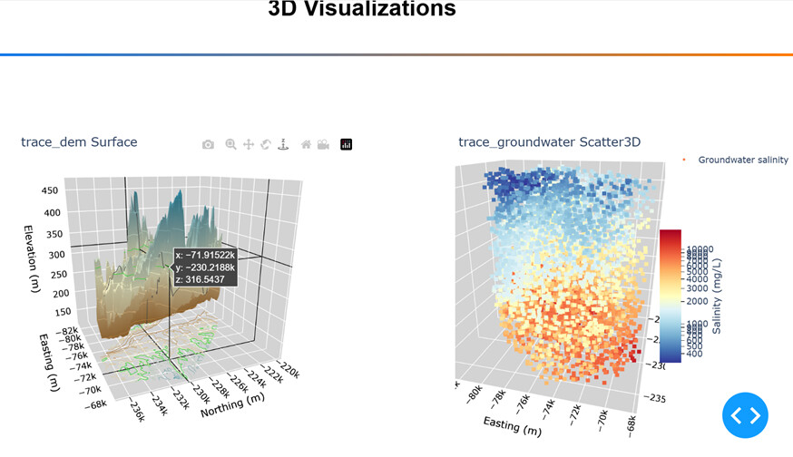
I separated the 3D scatter plot and the 3D contour plot into separate figures. I am no subject matter expertise on this data, but in my view these are better as separate visualizations. There may a reason why these plots were placed together in the code sample, but I just don’t see it.
Also, I added a contour projection to the Surface plot, and if Scatter and Surface stayed within the same figure it would be too crowed in my opinion.
My process was to
- Replaced pandas with polars
- Separated 3D scatter and 3D surface plots
- Put both plots into a simple dashboard with no callbacks
- Replace hardcoded tickvals and ticklabels with list comprehensions
- Updated the layout on the surface plot to show contour projection lines on the XY plane, below the surface plot.
- Tweaked the height and the background color of 3 planes. The background color needed more contrast with the projection lines
Here is a screen shot with the Surface plot on the left (notice the projection on the bottom), and the Scatter3D on the right.
Here is the code:
import polars as pl
import numpy as np
from scipy.interpolate import griddata
import plotly.graph_objects as go
import dash
from dash import Dash, dcc, html
import dash_mantine_components as dmc
dash._dash_renderer._set_react_version('18.2.0')

# Groundwater salinity data from recent work.
df = (
    pl.read_csv("model-grid-subsample.csv")
    .filter(pl.col('dem_m') > (pl.col('zkm')* 1e3))
)

grid = df[['xkm', 'ykm', 'zkm', 'mean_tds']].to_numpy()
x = grid[:, 0] * 1e3 # Kilometers to meters.
y = grid[:, 1] * 1e3
z = grid[:, 2] * 1e3
u = grid[:, 3]

# Digital Elevation Model (DEM) - the land surface in the study area.
dem_grid = df[['xkm', 'ykm', 'dem_m']].to_numpy()

x_dem = dem_grid[:, 0] * 1e3
y_dem = dem_grid[:, 1] * 1e3
z_dem = dem_grid[:, 2]

# Interpolate the land surface point data.
xi_dem = np.linspace(min(x_dem), max(x_dem), 200)
yi_dem = np.linspace(min(y_dem), max(y_dem), 200)
zi_dem = griddata(
    (
        x_dem,
        y_dem
    ),
    z_dem,
    (
        xi_dem.reshape(1, -1),
        yi_dem.reshape(-1, 1)
    )
)


#----- GLOBALS -----------------------------------------------------------------
style_horiz_line = {'border': 'none', 'height': '4px',
    'background': 'linear-gradient(to right, #007bff, #ff7b00)',
    'margin': '10px,', 'fontsize': 32}

style_h2 = {'text-align': 'center', 'font-size': '32px',
            'fontFamily': 'Arial','font-weight': 'bold'}
bg_color = 'lightgray'

#----- FUNCTIONS ---------------------------------------------------------------

def update_3d_layout(fig, fig_title):
    fig.update_layout(
        title=fig_title,
        title_automargin=True,
        # margin=dict(l=20, r=50, b=20, t=20),
        margin=dict(l=20, r=50, b=20, t=0),
        scene=dict(
                xaxis=dict(
                    title='Easting (m)',
                    color='black',
                    showbackground=True,
                    backgroundcolor=bg_color
                ),
                yaxis=dict(
                    title='Northing (m)',
                    color='black',
                    showbackground=True,
                    backgroundcolor=bg_color
                ),
                zaxis=dict(
                    title='Elevation (m)',
                    color='black',
                    showbackground=True,
                    backgroundcolor=bg_color
                ),
                aspectratio=dict(x=1, y=1, z=1), # changed z from 0.25 to 1.
                camera = dict( # Make north pointing up.
                            up=dict(x=0, y=0, z=1),
                            center=dict(x=0, y=0, z=-0.2),
                            eye=dict(x=-1., y=-1.3, z=1.)
                            )
                        ),
        )
    return fig
# Make the 3-d graph.
trace_dem = go.Figure(go.Surface(
    x=xi_dem, y=yi_dem, z=zi_dem,
    colorscale='Earth',
    name='Land surface',
    showscale=False,
    showlegend=False,
))
trace_dem = update_3d_layout(trace_dem, 'trace_dem Surface')
trace_dem.update_traces(contours_z=dict(
    show=True, usecolormap=True,
    highlightcolor="limegreen",
    project_z=True))

scatter_ticks = (  # replaced hardcoded values with list compreshensions
    [t for t in range(400, 1000, 100)] +     # 200 to 800, step 100
    [t for t in range(1000, 11000, 1000)]    # 1K to 10K, step 1K
)

trace_groundwater = go.Figure(go.Scatter3d(
    x=x, y=y, z=z,
    mode='markers',
    name='Groundwater salinity',
    showlegend=True,
    marker=dict(
        size=3,
        symbol='square',
        colorscale='RdYlBu_r',
        color=np.log10(u), # Log the colorscale.
        colorbar=dict(
            title=dict(
                text='Salinity (mg/L)', side='right'
            ),
            x=0.94,  # Move cbar over.
            len=0.5,  # Shrink cbar.
            ticks='outside',
            tickvals=np.log10(scatter_ticks),
            ticktext=scatter_ticks,                                                       ))
))
trace_groundwater = update_3d_layout(trace_groundwater, 'trace_groundwater Scatter3D')

#----- DASH APPLICATION STRUCTURE-----------------------------------------------
app = Dash()
app.layout =  dmc.MantineProvider([
    dmc.Space(h=30),
    html.Hr(style=style_horiz_line),
    dmc.Text('3D Visualizations', ta='center', style=style_h2),
    dmc.Space(h=30),
    html.Hr(style=style_horiz_line),
    dmc.Space(h=100),
    dmc.Grid(
        children = [
            dmc.GridCol(dcc.Graph(figure=trace_dem),span=5, offset=1),
            dmc.GridCol(dcc.Graph(figure=trace_groundwater),span=5, offset=1),
        ]
    ),
])
if __name__ == '__main__':
    app.run(debug=True)
@Mike_Purtell Just ran this locally, that trace_dem_Surface chart is very fun to move around.
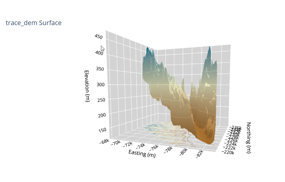
Thank you @ThomasD21M , I feel the same way. I wish I had more time this week to take the further.
It’s like eye candy. Such a beautiful graph to look at.
@ThomasD21M what do the two slices under the scatter markers represent? what’s the difference between the two?
@Mike_Purtell I liked the trace_dem Surface graph. Will you join us today at noon ET to showcase it to us live?
From the Rock1 and Rock2 Layers? Questioning myself because I dont have confidence I even built it correctly lol. But it looks aesthetically awesome so ill take it.
Hi Alex,
As always your dashboards are on a very high level, great job!
When testing it out, the only thing I noticed was that I kept going to the bottom to look at the explanations (which are very nice and useful). I’m wondering whether you might have tried putting them closer to the top (nearthe dropdown)? Or, maybe it’s only because I didn’t use the graph enough - if it’s a regular user, it could even get in the way at the top? Or maybe in some type of fade/toggle so it’s hidden but can be expanded?
Just sharing a few thoughts.
Br,
Mike
Hello Mike,
Thanks a lot for the kind words and for checking out the dashboard! Your suggestion is spot on – I totally agree. I actually thought about adding that info from the beginning, but figured I’d see what the community thought. You’re right, it makes so much sense to give users that context about the parameters and variables right away.