Show and Tell - Encarta Inspired WORLD ATLAS in Dash!

===
Update: choropleth geo-3d-map! (9 Nov 2020)

Implemented version 1 of a 3d globe choropleth map! This will display the selected dataset in 3d showing the selected dataset values as a hover tooltip. I had to convert multipolygon JSON data from Natural Earth to single Polygon (pain), clean some JSON that deck.gl did not like parsing (more pain), then colour it using a linear colour interpolation algorithm I’ve hacked up that is based on the colour array I can return from the figure data on the main map (so much pain). You can change the colour scheme in settings! Thoughts/ideas/feedback welcomed! See Gifs below :smiley:

===
Update: choropleth geo-bar-map! (7 Nov 2020)

People we have lift off. Choropleth geo-bar-graph is a thing (see screenshots below). Essentially I’m mimicking the colorwheel palette from the underlying choroplethmapbox figure. I’ve had to basically implement my own linear colour interpolation algorithm based on a colour array I can get from the figure state (so much pain). It’s not perfect but it’s close. This means you can try out different colour schemes by changing the colour palette in settings.

===

Update: dash-deck implemented!

I have got the GeojsonLayer running to build what I’m coining the “JIGSAW” view, ha. Looks like some kind of crazy lego puzzle. Also starting work on implementing the “GLOBE” view. All based on dash-deck. Screenshots below

===

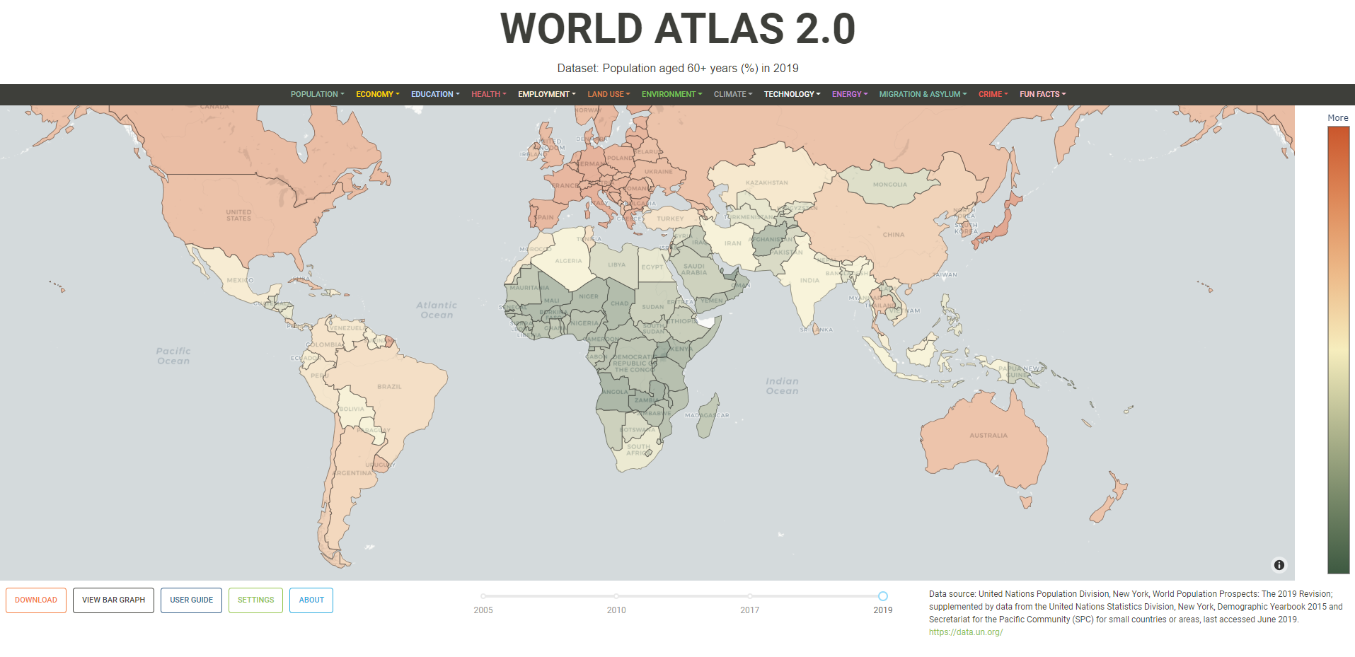
PITCH: World Atlas 2.0

Hi everyone

Well I think it’s time to share my progress so far on a little labour of love I’ve been tinkering away at over the last few months in Dash. I would love to get your feedback, guidance, and ideas for improvement!

What I’m trying to build
I want to build a modern world atlas as a web application that takes inspiration from Encarta 95.
It should be fun and intuitive to look at country-scale public datasets in a visual way, using the latest open-source web and data science tools available.

Why I’m trying to build it
To be honest I’ve been really disappointed that global scale statistical datasets like those on the UN data portal don’t seem to be centralised in a visual medium. Sure you can rip down the .csv but there is lots of cleaning to do to get it in a format that is useful to interpret (i.e. it’s not very accessible to the public). You can find one-off maps on govt websites and through wikipedia but I’ve yet to find a single powerful place to view these datasets all in the one place.

I want to build a visual interface to this kind of data that kicks ass.

The pitch is really this: 25 years on from the days of Encarta, where the hell is the World Atlas equivalent of what Wikipedia is for the encyclopaedia? I haven’t been able to find it, so I’ve attempted to start building it on principle. How hard could it be? I thought to myself about 200 hours of coding ago…ha.

What I’ve done

  1. Ripped down and cleaned ~80 datasets from the UN data portal (about 100,000 observations) each with a unique set of years
  2. Grabbed some JSON polygon data (3 different resolutions)
  3. Used the choroplethmapbox map as the centrepiece, I’ve essentially built an interface around it; the book if you will, of the Atlas :slight_smile:
  4. Added buttons to download data, view charts, and adjust the settings (mapbox tile set, colorscale, and polygon resolution)
  5. Users can zoom, in, pan and seamlessly flick between datasets (When you change data sets I try to give the impression of a simple colour change, but what is actually happening is I’m rebuilding the whole graph object with the map state variables of the previous one)
  6. The time slider is programmatically rebuilt at run-time as you change selections
  7. I’ve got continuous and discrete datasets going and I’m using a simple logarithmic scale on continuous data to get good colour contrast between countries as much of the data is skewed. The goal here is communicating the information to mainstream public more than academics, so I care less about binning data and more about making continuous data readily accessible in the hover-over info etc.
  8. I’ve managed to get a download button working (with great pain) that generates a .csv file from the active selection (just a simple dataframe selection spitting out a string to the HREF with a header, by wrapping a button in a html.A component).
  9. Probably made the worlds worst call-back for my main loop

The performance seems to be pretty decent with map reload times of about 1-2 seconds with low resolution JSON polygons. It chugs up big-time if you go to high resolution. Slug size is about 120MB and I have no idea how it will scale with more users etc as I’ve never done this sort of thing before. (This is my first Dash app and I’m very new to Flask and the Python ecosystem so please go easy on me. I’m sure I’ve done something stupid.)

It’s best viewed in 1920x1080 resolution as I haven’t optimised it for much else yet. I’ve just spun it up on 3 x performance dynos on Heroku so we’ll see how it goes for a little while until my credit card catches fire.

The sorts of things I want to add in future are proper curated datasets like climate and energy data from the IPCC, IEA and UN, plus fun stuff that is interesting like visualising languages spoken etc.

Is this something you see as useful in the community? Are there specific datasets you want to see? Am I doing anything stupid or has this already been done?

Anyway, I really hope you like it and I’d love your ideas.

www.worldatlas2.org

Dan


WORLD ATLAS 2.0 (14)
WORLD ATLAS 2.0 (19)
WORLD ATLAS 2.0 (18)

15 Likes

This is really cool, @dan_baker
I love be the idea and very neat speach audio that starts when you hit the about button :grin:
Is it too complicated to put numbers to the color bar on the right, instead of less, more labels?

Very nice! I remember visiting the CIA World Factbook in school and thinking how cool that website was. Very similar to Encarta and agreed, nice to have all of this data in one place!

Nice work on your first Dash app. Looks like you’ve explored many of Dash’s features too!

1 Like

It looks great and feels responsive! An easy way to add a download button is via the Download component.

2 Likes

Nice one! Very clean interface.

1 Like

I like the popover feature scaling according to website…I am getting hard time scaling this as feature in my Dash app

1 Like

Can you share the github link of this project?

Thanks Adam. Yes I did experiment a bit with the color bar but it becomes problematic for different continuous datasets and orders of magnitude. For example sometimes displaying scientific notation (3.2 x 10^5) and effectively becomes not very useful as it is logarithmic and basically very hard to interpret. My hack was to change the top label to “More” which just indicates values at the upper end of the colour spectrum are much more than those in the lower. It can probably be tweaked but requires lots of tedius work!

Thanks @chriddyp !

Yeh I test drove lots of the dash and dbc components so it’s almost like a working demo of many of these collective features. Also I just wanted to say thank you for all the videos and relentless tutorial posts you and the crew have done on Dash; have helped me tons.

I will grind on with the Encarta vision!

Thanks @matsujju

Happy to help out with any design problems you have if you want to message me direct. To be honest I’m not sure I’m ready to share this project publicly yet as I have a few little ideas for it in the pipeline. Very happy to share specific problem solutions though, so hit me up.

This looks really great! Kudos!

1 Like

Major kudos for sure, and I’ll be keeping an eye on this! One thing that didn’t seem intuitive to me is that More corresponds to a lighter color. I would expect darker colors (more intensity visually) to indicate More. For better graphical decoding, can you use a sequential, rather than diverging, palette? Light-to-dark color schemes usually represent more or less of something.

Thanks @ajr :slight_smile:

Yes I totally know what you mean. From the 93 colour palettes I chose one that is kind of cold to warm as default (green - white - red) but midway it’s a little misleading with the lighter white. If there is a better one you can find from playing around with the live SETTINGS please let me know and I’ll update the default one, which is fall.

I think I can invert any colour scheme too so, for example, the plasma one inverted might be a better go. What do you think??

Voilla!

This is much more logical @ajr thank you.

Set plasma as default, and reversed. Shoot any feedback my way for how it goes. I’ll look to add a button in settings to allow users to reverse colour scale too.

1 Like

Ready for Beta Testers!

Hey all. So I’ve added a lot of polish to the site over the last few months including:

  • responsive layout
  • interactive charts (bar, line, bubble, sunburst)
  • button panels for all charts with pop-overs for instructions, and custom downloads
  • upgraded .csv downloads and formatting
  • upgraded WebGL 3d visualisations using dash-deck (deck.gl, pydeck)
  • custom linear colour interpolation for 3d visualisations (globe & jigsaw)
  • search dropdown in main navigation for rapidly finding dataset
  • SSL HTTPS
  • new user guide video showcasing all main site features in high resolution
  • new loaders to clearly indicate when things are loading
  • custom colour schemes for main map and selected chart (over 180 combinations)
  • custom CSS for pop overs
  • client side javascript callback to make tooltips disappear properly

I think I’ve got the platform almost there. The entire navigation menu is now fully programmatic and constructed (with callbacks) at run-time. I’m looking into adding new datasets soon, but presently 77 are available.

Would love some beta testers to give it a run and give me feedback on functionality and things you would like to see in the site :slight_smile:

Currently running on Heroku standard 2-x dyno with 3 x gunicorn workers (3 concurrent HTTP workers) so it should be able to handle a bit of traffic.

Coming soon:

  • new datasets
  • chart downloads (pdf/png)
  • alternative map projections (other than mercator)

Cheers
Dan

worldatlas2.org

1 Like

Super neat thanks Dan, I am currently working on a project that would really benefit from starting with what you developed as a template (and thanks so much for your Herokyu guide). I would forever be greatful if you could also make this repo public, I will give you full credit for what I will be building next. Best, Derek.

1 Like

Hey just thought I would share another update on the site as it’s been a while, but I think I’m getting close to a proper beta launch. Still have a few bugs to iron out but the site is starting to come together I think. The site might periodically be down while I’m doing updates FYI.

New features:

  • 12 Million observations added from 2700+ open datasets (World Bank, Gapminder, OpenNumbers, United Nations)
  • complete make over (new look, full screen map)
  • floating buttons and title
  • year slider auto adapt scale based on number of years in selection
  • new domain obtained
  • nested navigation menus (still a bit buggy)
  • curated datasets
  • fully containerised with docker and hosted on Azure infrastructure
  • current master dataframe around 5GB per instance and live queried

https://worldatlas.org

3 Likes

Hey snowde. I’ve sent you a direct message regarding help with your project. I’m not sure I want to make this repo public at this stage, but very happy to help you solve any problems or chat design approach with you direct. :slight_smile: Dan.

Love the style of the links in the header and the full bleed map!

1 Like

Hey everyone. Well, after 18 months I have finally had a crack at a public launch of the beta site.

I’ve just published a white paper on Towards Data Science (Medium) and they have flagged it as an ‘editors pick’ for wider promotion, so I guess we’ll see what the reception is like! :smiley:

The latest version of the site now has 2,500 datasets to explore from UN Data, Worldbank, Gapminder and OpenNumbers. I’ve made a few improvements to performance and queries are now down to 1-3 seconds which is not bad. Also added downloadable charts as pdf/svg etc.

The mission for the site is to make important data super-accessible for the mainstream public, and fill the void left by the paper Atlas.

Cheers all,
Dan

4 Likes