Figure Friday 2024 - week 47

join the Figure Friday session on November 29, at noon Eastern Time, to showcase your creation and receive feedback from the community.

There have been thousands of UFO sightings in north America since the 20th century. So this week we will be exploring a data set by the National UFO Reporting Center (Kaggle) on UFO sightings from 1998 to 2014.

Thank you to Chris for the data set suggestion. The sample map below is based on Chris’s post and app.

Things to consider:

  • can you improve the sample scatter map built?
  • would a different figure tell the data story better?
  • can you create a Dash app instead?

Sample scatter map:
ufos

Code for sample figure:
import plotly.express as px
import pandas as pd

df = pd.read_csv('https://raw.githubusercontent.com/plotly/Figure-Friday/refs/heads/main/2024/week-47/scrubbed.csv')

df['year'] = pd.to_datetime(df['date posted']).dt.year

# sort dataset by year
df.sort_values(['year'], inplace=True)

# Drop rows with missing values in the following columns
df = df.dropna(subset=["latitude", "longitude", "shape", "year"])

# Convert latitude and longitude columns to numeric, forcing errors to NaN for cleaning
df['latitude'] = pd.to_numeric(df['latitude'], errors='coerce')
df['longitude'] = pd.to_numeric(df['longitude'], errors='coerce')


fig = px.scatter_map(
    df,
    lat="latitude",
    lon="longitude",
    color="shape",
    animation_frame="year",
    map_style="dark",
    zoom=3,
    title="UFO Sightings by Year and Shape",
    hover_data={"latitude": False, "longitude": False, "city":True, "shape": True, "year": True}
)

fig.update_layout(map_center_lon=-100, map_center_lat=40)
fig.show()

Participation Instructions:

  • Create - use the weekly data set to build your own Plotly visualization or Dash app. Or, enhance the sample figure provided in this post, using Plotly or Dash.
  • Submit - post your creation to LinkedIn or Twitter with the hashtags #FigureFriday and #plotly by midnight Thursday, your time zone. Please also submit your visualization as a new post in this thread.
  • Celebrate - join the Figure Friday sessions to showcase your creation and receive feedback from the community.

:point_right: If you prefer to collaborate with others on Discord, join the Plotly Discord channel.

Data Source:

Thank you to National UFO Reporting Center (on Kaggle) for the data.
2 Likes

Hello Adam,

I am not available for the Figure Friday session on November 29 (black Friday), but I will look at the data set and try to contribute a visualization.

Thank you,

Mike Purtell

3 Likes

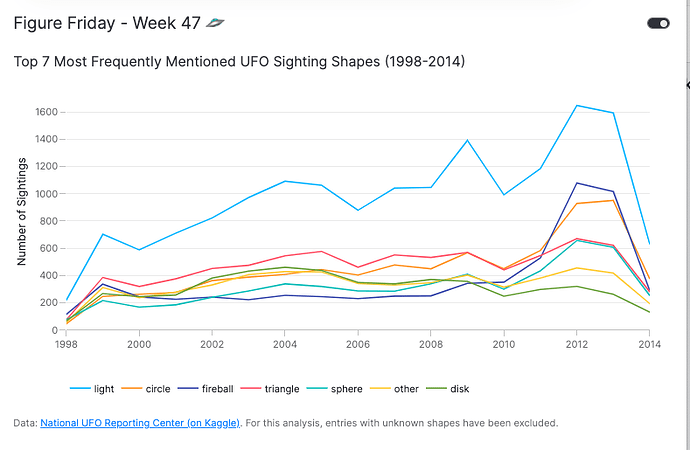
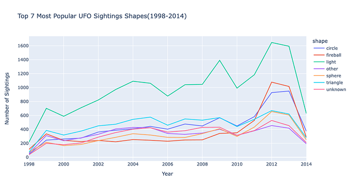
I transformed the scatter map into a run chart displaying the top 7 shapes of UFO sightings over time.
The previous map displayed mostly geographical data, so I focused on highlighting quantitative data.

Please feel free to advise me on how to improve, cheers.

Code:

import plotly.express as px
import pandas as pd

df = pd.read_csv('https://raw.githubusercontent.com/plotly/Figure-Friday/refs/heads/main/2024/week-47/scrubbed.csv',
                 low_memory=False)

df['year'] = pd.to_datetime(df['date posted']).dt.year
df = df.dropna(subset=["shape", "year"])

shape_counts = df['shape'].value_counts() 
top_7_shapes = shape_counts.nlargest(7).index

df_top_7 = df[df['shape'].isin(top_7_shapes)] 
df_grouped = df_top_7.groupby(['year', 'shape'])['shape'].count().reset_index(name='sightings')

fig = px.line(
    df_grouped,
    x='year',
    y='sightings',
    color='shape',
    title='Top 7 Most Popular UFO Sightings Shapes(1998-2014)',
    labels={'sightings': 'Number of Sightings', 'year': 'Year'},
) 
fig.show()
3 Likes

pretty good idea for a UFO visualization, @RomarReid . Thank you. And welcome to the community.

Are you able to share your code?

1 Like

Sure, I updated my original post with code.

1 Like

Thank you. I just modified your post to put the code in preformatted text so it’s easier to read.

1 Like

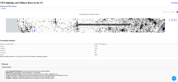
Hi All :alien:, I found a shapefile that required some cleaning but I was able to get what seems to be a fairly accurate US Military base coordinates file to match up with the sightings I wanted to visually illustrate if there was any UFO sighting concentration around these marked bases in blue.

The phenomenon seems to be strongly associated with proximity to larger population centers and not military bases. I am interested if certain shapes of the sighted crafts have strong correlation or are in closer proximity to the bases though.

I explored the creation of a table below the map that would show statistical, generally have the concept figured out but would need assistance from an LLM to further refine and implement something that advanced.

Concept table underneath the map

Script:

import dash
from dash import dcc, html
import dash.dependencies as dd
import plotly.express as px
import pandas as pd

# Load data
ufo_data = pd.read_csv()  # Replace with the path to your UFO data
military_bases = pd.read_csv()  # Replace with the path with military bases data

# Initialize Dash app
app = dash.Dash(__name__)

# Extract unique shapes for dropdown options
ufo_shapes = ufo_data['shape'].dropna().unique()
shape_options = [{'label': shape, 'value': shape} for shape in ufo_shapes]

# Layout of the app
app.layout = html.Div([
    html.H1("UFO Sightings and Military Bases in the US"),
    html.Div([
        dcc.Checklist(
            id='data-selection',
            options=[
                {'label': 'Military Bases', 'value': 'military'},
                {'label': 'UFO Sightings', 'value': 'ufo'}
            ],
            value=['military', 'ufo'],
            inline=True
        ),
        dcc.Dropdown(
            id='shape-selection',
            options=[{'label': 'All Shapes', 'value': 'all'}] + shape_options,
            value='all',
            placeholder="Select a UFO Shape",
            multi=False
        )
    ], style={'margin-bottom': '20px'}),
    dcc.Graph(id='scatter-plot', config={'scrollZoom': True}),
    dcc.Store(id='map-view', data={'center': {'lat': 39.8283, 'lon': -98.5795}, 'zoom': 4}),  # Default view
])

# Callback to update the scatter plot
@app.callback(
    [dd.Output('scatter-plot', 'figure'),
     dd.Output('map-view', 'data')],
    [dd.Input('data-selection', 'value'),
     dd.Input('shape-selection', 'value'),
     dd.State('scatter-plot', 'relayoutData'),
     dd.State('map-view', 'data')]
)
def update_plot(selected_datasets, selected_shape, relayout_data, map_view):
    # Preserve the map view if available
    if relayout_data and 'mapbox.center' in relayout_data:
        map_view['center'] = relayout_data['mapbox.center']
        map_view['zoom'] = relayout_data.get('mapbox.zoom', map_view['zoom'])

    # Initialize a mapbox scatter plot
    fig = px.scatter_mapbox(
        lat=[], lon=[], zoom=map_view['zoom'],
        mapbox_style="carto-positron",
        title="UFO Sightings and Military Bases"
    )

    # Add data layers based on user selection
    if 'military' in selected_datasets:
        fig.add_scattermapbox(
            lat=military_bases['Latitude'],
            lon=military_bases['Longitude'],
            mode='markers',
            marker=dict(size=8, color='blue'),
            name='Military Bases'
        )

    if 'ufo' in selected_datasets:
        # Filter UFO data by selected shape
        if selected_shape != 'all':
            filtered_ufo_data = ufo_data[ufo_data['shape'] == selected_shape]
        else:
            filtered_ufo_data = ufo_data

        fig.add_scattermapbox(
            lat=filtered_ufo_data['latitude'],
            lon=filtered_ufo_data['longitude'],
            mode='markers',
            marker=dict(
                size=6,
                color='black'  # Explicitly set the color for UFO sightings
            ),
            name='UFO Sightings',
            hoverinfo='text',
            hovertext=filtered_ufo_data['comments']
        )

    # Set the layout to retain the view
    fig.update_layout(
        height=800,  # Increase this value to make the map larger
        title={'x': 0.5},  # Center-align the title
        mapbox=dict(
            center=map_view['center'],
            zoom=map_view['zoom']
        )
    )

    return fig, map_view

# Run the app
if __name__ == '__main__':
    app.run_server(debug=True)

4 Likes

@adamschroeder , Also been reviewing your Plotly videos again and started Maven Analytics and Chris Bruehl’s training videos. I have developed a boilerplate or template understanding of a dash app at this point (plenty of work to go!). But for the life of me I can’t seem to comprehend the ] and ) use as it sometimes seem quite arbitrary

Any tools of the trade you recommend that are simple reminders like below but for alignment?
gets data
() does something
{} nested dictionaries (really struggling with the alignment)
This helped me understand the difference, but alignment i’m stuck on.

For examples in the app.layout section of my script, the brackets and parentheses aren’t intuitively placed for me, struggling with this.

app.layout = html.Div([
    html.H1("UFO Sightings and Military Bases in the US"),
    html.Div([
        dcc.Checklist(
            id='data-selection',
            options=[
                {'label': 'Military Bases', 'value': 'military'},
                {'label': 'UFO Sightings', 'value': 'ufo'}
            ],
            value=['military', 'ufo'],
            inline=True
        ), 
        dcc.Dropdown(
            id='shape-selection',
            options=[{'label': 'All Shapes', 'value': 'all'}] + shape_options,
            value='all',
            placeholder="Select a UFO Shape",
            multi=False
        )
    ], style={'margin-bottom': '20px'}),
    dcc.Graph(id='scatter-plot', config={'scrollZoom': True}),
    dcc.Store(id='map-view', data={'center': {'lat': 39.8283, 'lon': -98.5795}, 'zoom': 4}),  # Default view
])
1 Like

Update

4 Likes

This is an interesting way to explore the data @ThomasD21M . Is there a higher correlation between sightings and military bases when filtering for sphere-shaped or triangle-shaped UFOs?

2 Likes

@ThomasD21M are you referring to the html.Div right after the app.layout = ?

In older versions of Dash you needed to use a Div to wrap your Dash layout:

app.layout = html.Div([...])

But in newer Dash versions, you can forgo the Div and wrap everything inside a list.

app.layout = [...]
1 Like

@adamschroeder, Not quite, Ill explain the next time we connect. I struggling to explain in this format haha.

1 Like

Hello @RomarReid,

Congratulations on your first contribution to FigureFriday! :raised_hands:

Great job on your line chart - it already looks fantastic! Since you asked for suggestions on improvement, here are a few tips to declutter the chart even further. These changes are mostly minor and some are based on personal preference, so feel free to use what resonates with you :+1:

Suggestions

  • Remove the “unknown” category from the data set. Since your analysis focuses on the most commonly mentioned shapes, the “unknown” category might not add much value. You could remove it from the data set and mention this removal in your chart footer.
  • Sort the legend entries. Organizing the legend entries in descending order can help users quickly identify the hierarchy without needing to map all the colors to the entries.
  • Remove the y-axis gridlines, align the y-axis zero line with the x-axis line, and remove the xaxis title to reduce visual clutter.
  • Move the legend to the bottom to create more horizontal space for the chart and consider removing the grey background color for a cleaner look (this one is a personal preference).

Here’s an example of how it could look. Since Py.Cafe doesn’t support pure Plotly charts yet, I’ve embedded the Plotly chart in a Vizro dashboard. However, you can definitely achieve the same results using pure Plotly!

Code: PyCafe - Vizro - Top UFO Sighting Shapes Over Time (1998-2014)

5 Likes

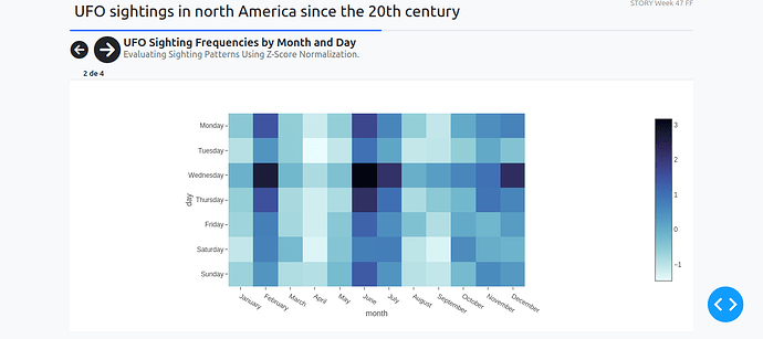
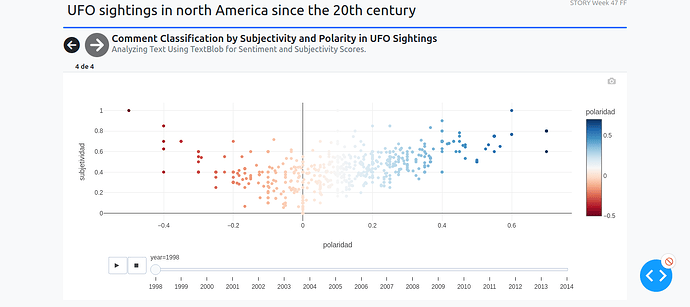
Analyzing this dataset is very interesting. I created graphs on the frequency of sightings by month, day, and hour to identify patterns and trends over time. Additionally, a preliminary analysis of opinions on the sightings was conducted, including word frequency using TF-IDF in a wordcloud, as well as an analysis of subjectivity and polarity to understand the emotions and perspectives of the witnesses.


Application code

5 Likes

Great idea to use a wordcloud! Also, what the heck is up with Wednesdays?!

1 Like

@U-Danny these are really interesting figures, especially the hourly distribution one.
It pretty much confirmed my assumptions that people would report seeing UFO in the dark hours. After all, in daylight it’s a lot easier to identify what that object might be.

Will you be joining our Figure Friday session today?

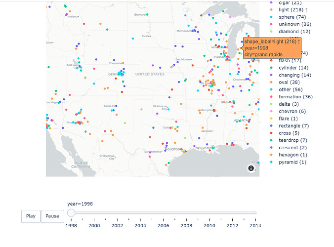
The initial graph was great, according to me, if we consider only the shape of the UFO without considering the cities with more report. So, I improved it to show the number of UFO reports based on their yearly shape, show shapes reported 200 times or more, and slow it a little so viewers can digest the information better.

Code :

import plotly.express as px
import pandas as pd
import numpy as np

# Load the dataset
df = pd.read_csv('https://raw.githubusercontent.com/plotly/Figure-Friday/refs/heads/main/2024/week-47/scrubbed.csv')

# Process the data
df['year'] = pd.to_datetime(df['date posted']).dt.year

# Sort dataset by year
df.sort_values(['year'], inplace=True)

# Drop rows with missing values in the following columns
df = df.dropna(subset=["latitude", "longitude", "shape", "year", "city"])

# Convert latitude and longitude columns to numeric, forcing errors to NaN for cleaning
df['latitude'] = pd.to_numeric(df['latitude'], errors='coerce')
df['longitude'] = pd.to_numeric(df['longitude'], errors='coerce')

# Group by shape and year to calculate the number of UFO sightings for each shape
shape_year_counts = df.groupby(['shape', 'year']).size().reset_index(name='yearly_count')

# Add arrow condition for shapes with 200 or more yearly sightings
shape_year_counts['arrow_condition'] = np.where(
    shape_year_counts['yearly_count'] >= 200, '↑', ''
)

# Add the count and arrow condition to the shape label
shape_year_counts['shape_label'] = (
    shape_year_counts['shape'] +
    " (" + shape_year_counts['yearly_count'].astype(str) + ") " +
    shape_year_counts['arrow_condition']
)

# Merge the updated shape labels back into the main dataframe
df = df.merge(shape_year_counts[['shape', 'year', 'shape_label']], on=['shape', 'year'])

# Create the map visualization
fig = px.scatter_mapbox(
    df,
    lat="latitude",
    lon="longitude",
    color="shape_label",
    animation_frame="year",
    mapbox_style="carto-positron",  # Public Mapbox style
    zoom=3.5,
    title="UFO Sightings in North America by Year and Shape",
    hover_data={
        "latitude": False,
        "longitude": False,
        "city": True,
        "shape_label": True,
        "year": True
    }
)

# Center the map on North America
fig.update_layout(
    mapbox=dict(
        center={"lat": 40, "lon": -100},  # Center on North America
        zoom=3.5
    ),
    height=800,
    width=800,
    title_x=0.5  # Center the title
)

# Add Play and Pause Buttons
fig.update_layout(
    updatemenus=[
        {
            "buttons": [
                {
                    "args": [None, {"frame": {"duration": 2000, "redraw": True}, "transition": {"duration": 1500}}],
                    "label": "Play",
                    "method": "animate"
                },
                {
                    "args": [[None], {"mode": "immediate", "frame": {"duration": 0, "redraw": False}, "transition": {"duration": 0}}],
                    "label": "Pause",
                    "method": "animate"
                }
            ],
            "direction": "left",
            "pad": {"r": 10, "t": 87},
            "showactive": False,
            "type": "buttons",
            "x": 0.1,
            "xanchor": "right",
            "y": 0,
            "yanchor": "top"
        }
    ]
)

# Show the map
fig.show()
2 Likes

I like how you slowed the animation speed down. Now, it’s much easier to appreciate every year.
The one thing that is still hard to see through is the amount of categories (shapes of UFOs) in the legend, which is also the case in the original figure posted. I think having a dropdown that allows the user to focus on 1 to 3 shapes at a time would make it easier to explore the data.