Figure Friday 2024 - week 43

The Open Repair Alliance report estimates that there are 4,000 community repair groups, operating in 31 countries. These groups of people come together to repair their devices while bringing together their communities.

Figure Friday week 43 repair data comes from activities at the Repair Café International. If you’d like to explore data sets from other Open Repair initiatives, you can find them on the downloads page.

Each row in the data set represents a citizen who tried to repair their device, noted the problem, the device category, the outcome, and some other relevant information.

Things to consider:

  • can you improve the sample figure built?
  • would a different figure tell the data story better?
  • can you create a Dash app instead?

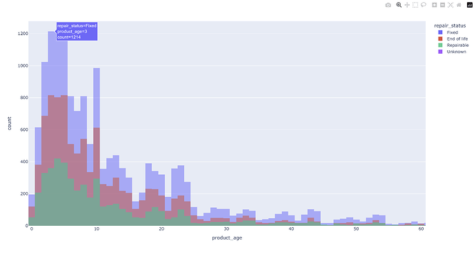
Sample figure (zoomed in slightly):

Code for sample figure:
import plotly.express as px
import pandas as pd

df = pd.read_csv("https://raw.githubusercontent.com/plotly/Figure-Friday/refs/heads/main/2024/week-43/OpenRepair_Data_RepairCafeInt_202407.csv")

fig = px.histogram(df, color='repair_status', x='product_age', barmode='overlay')
fig.show()

Participation Instructions:

  • Create - use the weekly data set to build your own Plotly visualization or Dash app. Or, enhance the sample figure provided in this post, using Plotly or Dash.
  • Submit - post your creation to LinkedIn or Twitter with the hashtags #FigureFriday and #plotly by midnight Thursday, your time zone. Please also submit your visualization as a new post in this thread.
  • Celebrate - join the Figure Friday sessions to showcase your creation and receive feedback from the community.

:point_right: If you prefer to collaborate with others on Discord, join the Plotly Discord channel .
Thank you to the OpenRepair project for the data.

3 Likes

As much as we use plotly, which is indeed a lot, at the same time I can also say I really don’t spend much time with Plotly…if you see what I mean…

I wonder how many thousands of users you have like my organization.

https://fpi.gsfc.nasa.gov/#/

Thank for sharing this challenge with me. Definitely I will try this one by Wednesday.

See you on this Friday session.

Hi @rstrub, I think I see what you mean. I spend considerable time preparing & cleaning data for plotly visualizations, at least as much time as I spend on the plotly visualizations themselves. If that is your point, it is a nice compliment to plotly, and one that I agree with.

1 Like

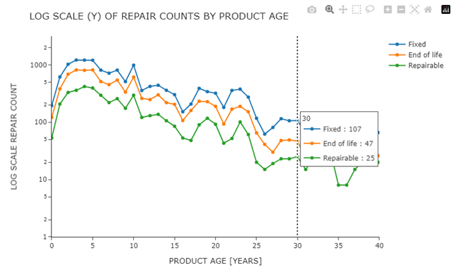
These scatter plots for week 43 show the number of repair cases by product age. Similar to the histograms shown in the week 43 announcement, the scatter plots provide a clearer visualization when the distributions have similar median values. All of these distributions peak between year 3 and year 5.

I dropped data where repair_status is unknown (only 1 row out of 75k+)

The x-axis ranges are set to 40 years max. All of the data are retained and can be viewed by hitting the plotly autoscale button.

The first scatter plot has a linear y-axis, the second plot has a logarithmic y-axis.

This week I learned how to set either axis scale to logarithmic. I tried replacing count values with their base-10 logarithms, and plotting them. This produces identical traces, however showing log values as axis labels and hover info (3.0 for 1000, etc) is much less intuitive. I learn something new on every figure friday project.

There is a local peak at year 10. Wondering what this means, maybe warranty or service contract expiration?

The log scale shows the 3 traces with consistent separation. This mean that the ratio between traces is maintained even as the volume of repair counts decreases with product age.

I used the pycountry library to map the 3-letter abbreviations of each country to the full country names. That said, these visualizations do not break out the data by country, but I leave this in the code for future use by me or anyone else.

Here are the screen shots and the code:

import polars as pl
import plotly.express as px
import pycountry

#------------------------------------------------------------------------------#
#  MAP COUNTRY ABBREVIATIONS TO FULL NAMES, USING PYCOUNTRY LIBRARY            #
#------------------------------------------------------------------------------#
df_countries = (
    pl.DataFrame(
        dict(
            zip(
                [c.name for c in pycountry.countries],
                [c.alpha_3 for c in pycountry.countries]
            )
        )
    )
    .transpose(include_header=True)
    .rename({'column': 'COUNTRY', 'column_0': 'CTRY_ABBR'})
)

#------------------------------------------------------------------------------#
#  READ DATA SET, TWEAK AND CLEAN FOR THIS EXERECISE                           #
#------------------------------------------------------------------------------#
df = (
    pl.read_csv('OpenRepair_Data_RepairCafeInt_202407.csv')
    .rename({'country': 'CTRY_ABBR'})
    .join(
        df_countries,
        on='CTRY_ABBR',
        how='left'
    )
    .with_columns(pl.col('product_age').cast(pl.UInt16))
    .with_columns(
        PRODUCT_AGE_COUNT = 
            pl.col('repair_status')
            .count()
            .over(['repair_status','product_age'])
            )
    .drop('problem')  # 66_071 unique problems out or 75252 entries, not useful
    .drop('group_identifier')  # too inconsistent, not useful    
    .drop('product_category_id')  # redundant, used named product category   
    .drop('partner_product_category')      # inconsistent data,      
    .drop('id')      # unique record id for this analysis not needed
    .drop('data_provider')  # all values are Repair Café International
    # only 1 entry for unknown, drop it
    .filter(~pl.col('repair_status').is_in(['Unknown']))              
)
# shift country name and abbr to left side of dataframe, drop first col
left_cols = ['COUNTRY', 'CTRY_ABBR']
reordered_cols = left_cols + [c for c in df.columns[1:] if c not in left_cols]
df = df[reordered_cols]

#------------------------------------------------------------------------------#
#  PREPARE DATAFRAME FOR SCATTER PLOTS                                         #
#------------------------------------------------------------------------------#
df_scatter = (
    df
    .select(pl.col('repair_status','product_age', 'PRODUCT_AGE_COUNT'))
    .unique(['repair_status', 'product_age'])
    .pivot(
         on='repair_status',
         values='PRODUCT_AGE_COUNT',
    )
    .sort('product_age', descending=False)
)

#------------------------------------------------------------------------------#
#  SCATTER PLOT REPAIR COUNT BY PRODUCT AGE, LINEAR SCALE                      #
#------------------------------------------------------------------------------#
plot_cols = ['Fixed',  'End of life', 'Repairable'] 
x_max = 40
fig = px.scatter(
    data_frame= df_scatter,
    x = 'product_age',
    y = plot_cols,
    template='simple_white',
    width=800,
    height=500,
)
fig.update_layout(
        title='Linear Scale (Y) of Repair Counts by product age'.upper(),
        xaxis_title='product age [years]'.upper(),
        yaxis_title='linear scale - Repair Count'.upper(),  
        yaxis_range = [0.0, 1400.0],
        xaxis_range=[0, x_max],
        legend_title=None,
        hovermode='x unified', 

)
fig.update_traces(
    mode='lines+markers',
    hovertemplate=' '.join(['%{y}'])
)
fig.show()

#------------------------------------------------------------------------------#
#  SCATTER PLOT REPAIR COUNT BY PRODUCT AGE, LOG SCALE                         #
#------------------------------------------------------------------------------#
fig = px.scatter(
    df_scatter,
    'product_age',
    plot_cols,
    template='simple_white',
    width=800,
    height=500,
    log_y=True,
)
fig.update_layout(
        title='Log Scale (Y) of Repair Counts by product age'.upper(),
        xaxis_title='product age [years]'.upper(),
        yaxis_title='log scale Repair Count'.upper(),  
        yaxis_range = [0.0, 3.5],
        xaxis_range=[0, x_max],
        legend_title=None,
        hovermode='x unified', 
)
fig.update_traces(
    mode='lines+markers',
    hovertemplate=' '.join(['%{y}'])
)
fig.show()

2 Likes

Hi, thank for this challenge .
Creating graphs using the Plotly library is becoming more and more enjoyable for me as I discover new things every day.
For week 43 my choose barpolar :upside_down_face:.

View code and chart on PyCafe

3 Likes

beautiful graph, @natatsypora Thanks for sharing. I don’t remember the last time I saw a barpolar this way. Nicely done.

2 Likes

After seeing this beautiful example, I am eager to try barpolar with my work data. This is so much nicer than a conventional bar chart. Great job on this @natatsypora

2 Likes

I had a simple approach and really wanted to get a Dash app running. Simple bars, line and pie charts slicing the data based of LLM recommendations on what it thought would be different interesting illustrations


I struggled with the vacuum errors as some of the problems were descriptive and I had to import and attempt a couple libraries to solve the keyword search in the problem, didnt help that some were even in different languages lol.
example:

Common Faults in Specific Products (e.g., Vacuum Cleaners)

import dash
from dash import dcc, html
import plotly.express as px
import plotly.graph_objects as go
from dash.dependencies import Input, Output
import pandas as pd
from collections import Counter
import re

df = pd.read_csv("https://raw.githubusercontent.com/plotly/Figure-Friday/refs/heads/main/2024/week-43/OpenRepair_Data_RepairCafeInt_202407.csv", low_memory=False)

# Define a basic set of common stopwords
stop_words = set([
    "i", "me", "my", "myself", "we", "our", "ours", "ourselves", "you", "your", "yours", "yourself", "yourselves",
    "he", "him", "his", "himself", "she", "her", "hers", "herself", "it", "its", "itself", "they", "them", "their",
    "theirs", "themselves", "what", "which", "who", "whom", "this", "that", "these", "those", "am", "is", "are", "was",
    "were", "be", "been", "being", "have", "has", "had", "having", "do", "does", "did", "doing", "a", "an", "the", "and",
    "but", "if", "or", "because", "as", "until", "while", "of", "at", "by", "for", "with", "about", "against", "between",
    "into", "through", "during", "before", "after", "above", "below", "to", "from", "up", "down", "in", "out", "on", "off",
    "over", "under", "again", "further", "then", "once", "here", "there", "when", "where", "why", "how", "all", "any",
    "both", "each", "few", "more", "most", "other", "some", "such", "no", "nor", "not", "only", "own", "same", "so", "than",
    "too", "very", "s", "t", "can", "will", "just", "don", "should", "now"
])

# Initialize the Dash app
app = dash.Dash(__name__)

# Layout
app.layout = html.Div([
    html.H1("Repair Event Data Analysis"),
    
    html.Div([
        html.H2("Top 5 Product Categories Seen at Events"),
        dcc.Graph(id='top-5-product-categories')
    ]),
    
    html.Div([
        html.H2("Barriers to Repair"),
        dcc.Graph(id='barriers-to-repair')
    ]),
    
    html.Div([
        html.H2("Average Age of Products at Repair Events"),
        dcc.Graph(id='average-age-products')
    ]),
    
    html.Div([
        html.H2("Repair Attempts Over Time"),
        dcc.Graph(id='repair-attempts-over-time')
    ]),
    
    html.Div([
        html.H2("Repair Success Rate Distribution"),
        dcc.Graph(id='repair-success-rate')
    ]),

    html.Div([
        html.H2("Common Faults in Specific Products (e.g., Vacuum Cleaners)"),
        dcc.Graph(id='common-faults-products')
    ])
])

@app.callback(
    Output('top-5-product-categories', 'figure'),
    Input('top-5-product-categories', 'id')
)
def update_top5_product_categories_chart(_):
    top_categories = df['product_category'].value_counts().nlargest(5)
    fig = px.pie(values=top_categories.values, names=top_categories.index,
                 title="Top 5 Product Categories Seen at Events")
    return fig

@app.callback(
    Output('barriers-to-repair', 'figure'),
    Input('barriers-to-repair', 'id')
)
def update_barriers_to_repair_chart(_):
    try:
        # Convert to DataFrame and ensure proper columns
        barriers = df['repair_barrier_if_end_of_life'].fillna("No Barrier").value_counts().reset_index()
        barriers.columns = ["Barrier", "Count"]
        
        # Create bar chart
        fig = px.bar(barriers, x="Barrier", y="Count",
                     title="Barriers to Repair", labels={"Barrier": "Barrier", "Count": "Count"})
    except Exception as e:
        # Create an empty figure with an error message if something goes wrong
        fig = go.Figure()
        fig.add_annotation(
            text=f"Error generating chart: {str(e)}",
            xref="paper", yref="paper",
            x=0.5, y=0.5, showarrow=False,
            font=dict(size=20)
        )
    
    return fig


@app.callback(
    Output('average-age-products', 'figure'),
    Input('average-age-products', 'id')
)
def update_average_age_products_chart(_):
    # Ensure 'product_age' is numeric
    df['product_age'] = pd.to_numeric(df['product_age'], errors='coerce')
    
    # Group by product category, calculate mean, reset index, and get top 10
    avg_age = df.groupby('product_category', as_index=False)['product_age'].mean().dropna().nlargest(10, 'product_age')
    
    # Check the structure of avg_age for debugging
    print(avg_age.head())  # This will output to the console for inspection

    # Explicitly cast 'product_category' to string and 'product_age' to float for Plotly
    avg_age['product_category'] = avg_age['product_category'].astype(str)
    avg_age['product_age'] = avg_age['product_age'].astype(float)
    
    # Create the bar chart
    fig = px.bar(avg_age, x='product_category', y='product_age',
                 title="Average Age of Products at Events", 
                 labels={"product_category": "Product Category", "product_age": "Average Age"})
    
    return fig


@app.callback(
    Output('repair-attempts-over-time', 'figure'),
    Input('repair-attempts-over-time', 'id')
)
def update_repair_attempts_over_time_chart(_):
    df['event_year'] = pd.to_datetime(df['event_date'], errors='coerce').dt.year
    repair_attempts = df['event_year'].value_counts().sort_index()
    fig = px.line(repair_attempts, x=repair_attempts.index, y=repair_attempts.values,
                  title="Repair Attempts Over Time", labels={"x": "Year", "y": "Number of Repair Attempts"})
    return fig

@app.callback(
    Output('repair-success-rate', 'figure'),
    Input('repair-success-rate', 'id')
)
def update_repair_success_rate_chart(_):
    success_rate = df['repair_status'].value_counts()
    fig = px.pie(success_rate, values=success_rate.values, names=success_rate.index,
                 hole=0.3, title="Repair Success Rate Distribution")
    return fig

@app.callback(
    Output('common-faults-products', 'figure'),
    Input('common-faults-products', 'id')
)
def update_common_faults_products_chart(_):
    vacuum_problems = df[df['product_category'] == 'Vacuum']['problem'].dropna()
    
    if vacuum_problems.empty:
        fig = go.Figure()
        fig.add_annotation(
            text="No data available for common faults in Vacuum Cleaners",
            xref="paper", yref="paper",
            x=0.5, y=0.5, showarrow=False,
            font=dict(size=20)
        )
    else:
        all_words = []
        for description in vacuum_problems:
            words = re.findall(r'\b\w+\b', description.lower())
            filtered_words = [word for word in words if word not in stop_words and len(word) > 1]
            all_words.extend(filtered_words)
        
        word_counts = Counter(all_words).most_common(10)
        keywords, counts = zip(*word_counts)
        fig = px.bar(x=keywords, y=counts, title="Common Keywords in Vacuum Cleaner Problems",
                     labels={"x": "Keyword", "y": "Count"})
    
    return fig

if __name__ == '__main__':
    app.run_server(debug=True)

2 Likes

output to my vacuum problem query, clearly by stop word portion of my script wasn’t working as intended or not thorough enough.

1 Like

Been experimenting with this further, wanted to see countries with most successful repair history using choropleth plot.

criteria was ratio of successful repairs = fixed against total entries per country.

Sweden, Ireland and Switzerland are doing a great job!

import pandas as pd
import plotly.express as px
import pycountry  # Library to map country codes to full names

# Load data
df = pd.read_csv("https://raw.githubusercontent.com/plotly/Figure-Friday/refs/heads/main/2024/week-43/OpenRepair_Data_RepairCafeInt_202407.csv", low_memory=False)

# Filter for valid entries in the 'country' and 'repair_status' columns
df = df.dropna(subset=['country', 'repair_status'])

# Calculate total repairs and fixed repairs by country
total_repairs = df.groupby('country').size()  # Total entries per country
fixed_repairs = df[df['repair_status'] == 'Fixed'].groupby('country').size()  # Only 'Fixed' entries per country

# Create a DataFrame with both total and fixed counts
repair_data = pd.DataFrame({
    'Total Repairs': total_repairs,
    'Fixed Repairs': fixed_repairs
}).fillna(0)  # Fill NaN with 0 for countries without 'Fixed' repairs

# Calculate the ratio of fixed repairs to total repairs
repair_data['Repair Success Ratio'] = repair_data['Fixed Repairs'] / repair_data['Total Repairs']

# Reset index to make 'country' a column for plotting
repair_data.reset_index(inplace=True)

# Map 3-letter country codes to full country names
def get_country_name(iso_code):
    try:
        return pycountry.countries.get(alpha_3=iso_code).name
    except AttributeError:
        return iso_code  # Return the code itself if the name is not found

# Apply the mapping function to add a 'country_name' column
repair_data['country_name'] = repair_data['country'].apply(get_country_name)

# Plot choropleth map using ISO-3 codes, with full country names in hover data
fig = px.choropleth(
    repair_data,
    locations="country",
    locationmode="ISO-3",  # Use ISO-3 country codes
    color="Repair Success Ratio",
    hover_name="country_name",  # Show full country name on hover
    hover_data={"country": True, "Total Repairs": True, "Fixed Repairs": True, "Repair Success Ratio": ':.2%'},
    color_continuous_scale="Blues",
    title="Repair Success Ratio by Country"
)

# Show plot
fig.show()

3 Likes

On my side, I displayed on top using Card Visual : Total repair attempts, % of Fixed During Repair Event, % of Repairable after the Event, % of End of Life products.

After that, I looked at the repair attemps logging over time using bar plot and finally using data_table from dash core component to display product category along with the number of End of Life Products, the number of those which are Fixed, repairable, the number of repair attemps , etc

Here is my code :

from dash import Dash, dash_table, html, dcc
import dash_bootstrap_components as dbc
from dash_bootstrap_templates import load_figure_template
import pandas as pd 

from dash import dash_table
import plotly.express as px


df = pd.read_csv("OpenRepair_Data_RepairCafeInt_202407.csv", 
                 parse_dates=["event_date"], 
                 low_memory=False, 

                )


category_repair_status =  (pd.concat([df["product_category"], pd.get_dummies(df["repair_status"], dtype="int")], axis= 1)
                           .groupby("product_category").sum()
                          )

category_repair_status = category_repair_status.assign(
    repair_attempts = category_repair_status.sum(axis=1),
    pct_of_total = (category_repair_status.sum(axis=1)/sum(category_repair_status.sum(axis=1)) * 100).round(2)
)

category_repair_status = category_repair_status.sort_values(by="pct_of_total", ascending=False)

category_repair_status = category_repair_status.reset_index()


app = Dash(__name__, external_stylesheets=[dbc.themes.BOOTSTRAP])

load_figure_template("BOOSTRAP")

app.layout = dbc.Container([
    dbc.Row([
        dbc.Col(dbc.Card([
            dbc.CardBody([
                html.H4("Total repair attempts", className="card-title"),
                html.H3(f"{df["id"].count()}")
            ])
        ])),
         dbc.Col(dbc.Card([
            dbc.CardBody([
                html.H4("Fixed During Repair Event", className="card-title"),
                html.H3(f"{(category_repair_status["Fixed"].sum()/df["id"].count() * 100).round(2)} %")
            ])
        ])),
        
        
         dbc.Col(dbc.Card([
            dbc.CardBody([
                html.H4("Repairable after the Event", className="card-title"),
                html.H3(f"{(category_repair_status["Repairable"].sum()/df["id"].count() * 100).round(2)} %")
            ])
        ])),
        
         dbc.Col(dbc.Card([
            dbc.CardBody([
                html.H4("End of Life products", className="card-title"),
                html.H3(f"{(category_repair_status["End of life"].sum()/df["id"].count() * 100).round(2)} %")
            ])
        ])),


    ]),
    
    
    dbc.Row([
        dbc.Col([
            dcc.Graph(figure=px.bar(df.groupby(df["event_date"].dt.year)["id"].count().rename("count").reset_index(), 
                x="event_date", 
                y="count",
                ).update_layout(title={
                "text": "Repair attempts logged over time",
                "x" : .5,
                "y" : 0.85,
                "font" : {"size" : 25}
            })
         )
        ])
    ]),
    
    dbc.Container(
        style= {"margin-left": "30px", "margin-right":"30px"},
        children=[
        
        dash_table.DataTable(
            data=category_repair_status.to_dict('records'),
            columns=[{"name": i, "id": i} for i in category_repair_status.columns],
            filter_action = "native",
            sort_action = "native",
            export_format = "csv",
            style_header={ 'border': '1px solid black', 'textAlign': 'left',  
                          'backgroundColor': 'blue',
                          'color': 'white',
                          "fontSize": "25px"
                         },
            style_cell={ 'border': '1px solid grey', "backgroundColor" : "white", 
                        "fontSize" : "20px",
                        'textAlign': 'left'
                       },
            style_data_conditional = [
                {
                    'if': {
                        'filter_query': '{pct_of_total} >= 3.79',
                        'column_id': 'pct_of_total'
                    },
                    'color': 'blue',
                    'font-weight' : "bold",
                    'backgroundColor': 'lightblue'

                },

                   {
                    'if': {
                        'filter_query': '{pct_of_total} <= 0.66',
                        'column_id': 'pct_of_total'
                    },
                    'color': 'red',
                    'font-weight' : "bold",
                    'backgroundColor': 'lightgrey'

                },

                {
                    'if' : {
                        'column_id'  : "product_category"
                    },
                    'font-weight': 'bold'
                }
            ]
        )
    ]) 
]
)


if __name__ == '__main__':
    app.run(debug=True, port=1020)
3 Likes

nice graphs, @ThomasD21M . it’s helpful to see the repair success rate. Why does the hover over Switzerland say 1 total repair? Does 1 mean 100% success in this case?

Hope you can join the Figure Friday session today.

1 Like

nice job, @Tiga . Your code wasn’t showing correctly; you just need to remember to put it all between 3 back ticks, or use the Preformatted text button. I already fixed it. Hope you can join the Figure Friday session today.

1 Like

Thank you for notifying me. I adjust it using Preformatted text, hope it’s showing correctly now.

1 Like

You’re absolutely right; including countries with only one or very few entries can skew the visual interpretation, as a single successful repair gives a misleading 100% success rate. To address this, I and should have could set a threshold for the minimum number of total repairs required to display a country’s repair success ratio.

1 Like

I like the export table! The feature to filter through data on Dash App and export that selection would be nice too.

1 Like

Your simple approach is impressive! :+1:
I also tried to create a chart of the most frequently used words :woman_facepalming: but describing the problem in several different languages makes it difficult to clean up data …
After using a collection of stopwords for multiple languages from Stopwords ISO I was able to create a chart, but I’m not sure it is informative enough :grinning:

2 Likes

Thank you for your review. I am very glad that you liked it. :blush:
For more than a month I have been watching your posts with pleasure, admiring the cleanliness and informativity of your code and visualiztions! :star_struck:

1 Like

lovely figures, @natatsypora . Do you mind sharing the code for them?

1 Like