Figure Friday 2024 - week 37

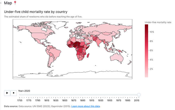
Child mortality rates (the estimated share of newborns who die before reaching the age of five) have gone down over the last two centuries, but in many places the rates are still unacceptably high.

This week’s Figure-Friday data set is on child mortality rates in countries around the globe, going back to the eighteen hundred.

Sample Figure:

Things to consider:

  • can you replicate the sample graph with Plotly?
  • can you improve the sample graph built?
  • would a different figure tell the data story better?
  • are you able to replicate or improve the app built by Our World in Data?

Participation Instructions:

  • Create - use the weekly data set to build your own Plotly visualization or Dash app. Or, enhance the sample figure provided in this post, using Plotly or Dash.
  • Submit - post your creation to LinkedIn or Twitter with the hashtags #FigureFriday and #plotly by midnight Thursday, your time zone. Please also submit your visualization as a new post in this thread.
  • Celebrate - join the Figure Friday sessions to showcase your creation and receive feedback from the community.

:point_right: If you prefer to collaborate with others on Discord, join the Plotly Discord channel .

Thank you to MakeoverMonday and OurWorldInData for the data.

4 Likes

Hey guys :wave:

I was a bit busy the last weeks, but happy to finally join you guys again!

The initial visualisation was already well made, the only thing I’ve changed was the color palette, because it didn’t seem to be colour blind proof, when I’ve uploaded it to the simulator. I’ve also removed the animation, and replaced it with a filter instead.

I’ve also replicated the app using Vizro in <160 lines of code. The table view is not identical but you get the idea :slight_smile:

figure-friday-week-37

:1234: Code: PyCafe - Vizro - Visualizing Under-Five Mortality Rates by Country
:computer: App: PyCafe - Vizro - Visualizing Under-Five Mortality Rates by Country

5 Likes

I have one Plotly question actually!

Does anyone know how I can have the y-axis zeroline on the same height as the x-axis line in the line chart? (similar to how it is done in the original chart) :thinking: I’ve tried a couple of post fig updates, but didn’t seem to find the right one.

1 Like

Nice app, @li.nguyen . I appreciate how you build apps and graphs that are accessible to everyone.

Is there a reason you chose to have the map animation go from present to past time as opposed to past to present? And any reason you chose to have it start at 1957?

1 Like

Li, try to add the range attribute to the figure: range_y=[0,70]

3 Likes

Uhh interesting, that is completely unintentional! I also didn’t configure anything extra, so that was the default behaviour as soon as I set animation_frame="Year" inside the px.choropleth. I’ll take a look later why it does that :thinking:

Your second suggestion worked like a charm! :star:

2 Likes

fig.update_yaxes(rangemode=‘nonnegative’)

3 Likes

I am really sorry that I have not been able to participate as much as I would like to, but unfortunately this semester I am a bit busy with my classes. Here is my attempt to replicate the sample graph.

Below is the code I used to generate the graph:

countries = ['Brazil', 'India', 'United States', 'France', 'United Kingdom', 'Sweden']
fig = px.line(
    data[data['Entity'].isin(countries)],
    x='Year',
    y='Under-five mortality rate',
    color='Entity',
    template='plotly_white'
)
fig.update_layout(
  title='Child mortality rate, 1751 to 2021',
  title_subtitle_text='The estimated share of newborns who die before reaching the age of five.',
  margin=dict(t=100, b=100, r=150),
  yaxis_ticksuffix='%', 
  xaxis_title='',
  yaxis_title='',
  font_family='Merriweather',
)
fig.update_yaxes(rangemode='nonnegative')
fig.update_xaxes(showgrid=False, showline=True, linewidth=1, linecolor='black', ticklen=5, ticks='outside')
fig.update_traces(line_width=1)
fig.add_annotation(
    x=0,
    y=-0.15,
    xref='paper',
    yref='paper',
    text='Data source: UN IGME (2023); Gapminder (2015)',
    showarrow=False,
    xanchor='left', 
    yanchor='auto', 
    xshift=0, 
    yshift=0,
    font_size=12
)
fig.show()

Observe that I added to update_layout, the following entry: font_family=“Merriweather”,

4 Likes

Fixed now! :bulb:

Turns out the animation takes on the underlying order of the dataframe by default, so one has to sort it by Year before. I’ve also filtered the data to only include every fifth year, as it the animation had too many ticks for my taste and looked a bit decluttered. This looks better now :slight_smile:

6 Likes

This week is challenging in the sense that the provided plot is already in good condition. Many others here have made improvements to it. My very small/incremental touch is to use a moving average (window_size=10) to smooth out the early years and keep the traces distinct. Always have to be careful about any steps like this that manipulate the data. To some the spikes may be the more interesting than the linear regions on each curve.

A comment about the data: this data set is truly eye-opening, but not unexpected. It brings to mind how lucky we are to live with the medical technology of this generation. I am surprised at how recent the data started in the United States.

Here is the code, and a screenshot below that.

import polars as pl
import plotly.express as px

df = (
    pl.read_csv('child-mortality.csv')
    .filter(
        pl.col('Entity')
        .is_in(['India', 'Brazil', 'United States', 'France', 'United Kingdom', 'Sweden'])
    )
    .select(pl.all().exclude('Code'))
    .pivot(
        index= 'Year',
        on='Entity'
    )
    .sort('Year')
    .with_columns(
        pl.all().exclude('Year').rolling_mean(window_size=10),
    )
)
fig = px.scatter(
    df,
    'Year',
    df.columns[1:]
)
my_title = 'Child Mortality Rate, 1751 to 2021<br>'
my_title += '<sup>The Estimated Share of newborns<sup>1</sub> who die before reaching the age of five</sup>'
fig.update_layout(
    title = my_title,
    height=400, width=800,
    xaxis_title='Data source: UN IGME (2023); Gapminder(2015)',
    yaxis_title='',
    xaxis_title_font=dict(size=14),
    margin={"r":50, "t":50, "l":50, "b":50},
    autosize=False,
    showlegend=True,
    template='plotly_white',
    legend=dict(
        title = ''
    )
)

fig.update_traces(
    mode='lines',
    marker=dict(line=dict(width=1)),
    )

fig.update_xaxes(showgrid=False)
fig.update_yaxes(showgrid=False)
fig.show()

3 Likes

Nice replica, @hebertodelrio . I’m glad you found some time to participate in Figure Friday :slight_smile:

And thank you for sharing your example. I like how you added the annotation at the bottom.

Hi @Mike_Purtell
I find it a little more readable when a moving average is implemented. Is there a particular reason you chose 10 as opposed to 5 or 3 or any other number? I wonder if there is a best practice in regard to choosing a moving average.

Hi @adam, I did not spend much time selecting the moving average window, 10 is just an arbitrary selection. For best practice I would say to pick the minimum moving average window that has enough noise cleanup while preserving the meat of the signal. Some applications would be intolerant of any moving average. I think this is a good use case for putting in a callback to change the moving average window and regenerate the graphs, I may try to do that. Thank you.

2 Likes

I made a modification to the quarto document that generated the graph so that it could include as the font a free font from the internet Merriweather, that it is closer to the font used in the sample plot than the default Plotly font. I also added to the update_layout method, the parameter: font_family=“Merryweather”.

Since quarto uses a Jupyter kernel to process the code cells, I added, as the first code cell in my document, the following code cell that loads the font:

from IPython.core.display import HTML
HTML("""
<style>
@import url('https://fonts.googleapis.com/css2?family=Merriweather:ital,wght@0,300;0,400;0,700;0,900;1,300;1,400;1,700;1,900&display=swap');
</style>
"""
)

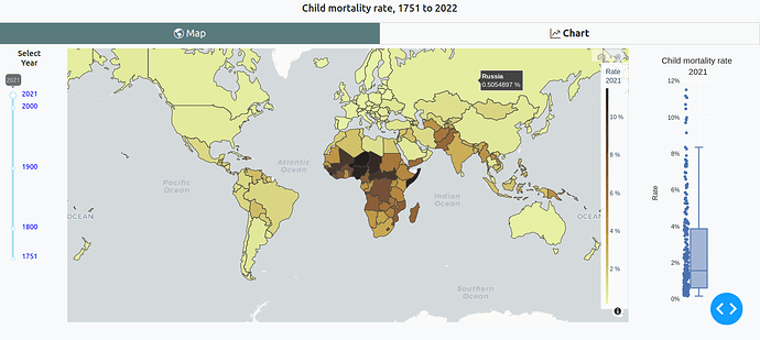
Hi, I find Figure-Friday interesting to learn and improve on data visualization, in this case @li.nguyen 's proposal for the use of maps, I can add a statistical visual resource for each year, and also in the line graph a country multi selector.


One consideration, using axes in a fixed range (0-100%) gives a better perspective to compare two entities, sometimes that could speculate figures for a country with a small drop in its figures.

Application code

3 Likes

Nice app, @U-Danny

What made you add the box plot next to the map, as opposed to a different type of visualization?

Hi, although on the map you can see the changes by color, in a boxplot you can see the presence of atypical values, the symmetry of the distribution, this can lead to a more in-depth analysis.

1 Like