Hey all! I’m super excited for the release of Plotly Studio. To get my hands dirty with it, I decided to take a look at my running data from Strava.
Pulling the data
I used the Strava API to pull down my data. You’ll need to set up a developer account to do this, but once that’s done, the data can be pulled with some Python. This video provides a detailed overview on how you can get started with the Strava API.
Plotly Studio Prompting
I wanted to start off by re-creating what I already see in Strava - weekly progress and maps of my routes. I also want to exclude data associated with other activities, like biking and hiking. So, I started off the generation with the following prompt:
Filter out all activities that are not Runs
Show me the following charts:
- Running distance over time
- Running routes map
Initial Charts
2 minutes later….here’s my app!
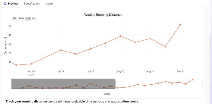
The first results looked pretty good - I like that it included options to filter my date range and adjust my aggregation directly inside the chart. It would have taken me ages to figure out the css for that otherwise.
Since the charts are Plotly charts, we still get to leverage the native chart interaction tools, such as the Pan option. It even connected it to some buttons for common time periods.
Making edits
The map chart looked good, although the default starting position surprised me - I guess it must have calculated the default based on centring coordinates between all runs. This is what you get as a result when you’ve got activities in Canada and Australia!
Luckily that was easy to fix by editing my prompt to be more clear about where I want my starting position. I wish that the dataset had more route data for each run than just the start/end positions (maybe I need Strava premium for that?), but I think Studio did a nice job with the data that it had.
Asking questions
These two charts were a good starting point, but I was curious to see what other insights there were in my data. I wonder - when during the week do I like to run the most?
Turns out it’s Tuesdays between 6 and 7 - makes sense, considering that’s when my run club is.
How about - on which runs did I set the most personal records?
So there we go - and nice to be able to digest the data as both a chart and a table. And once again, so glad I didn’t have to use css to embed those controls…
Sharing results
With one click, I can deploy my app to Plotly Cloud - check it out here! https://sams-strava-activities.plotly.app/


