Visualizing Electric Grid Data
Was exploring some electric grid data this morning from https://www.eia.gov/electricity/gridmonitor/dashboard/electric_overview/balancing_authority/PACE
This is a pretty hefty 100MB dataset.
Some pretty cool charts:
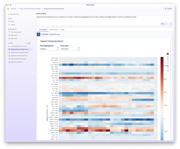
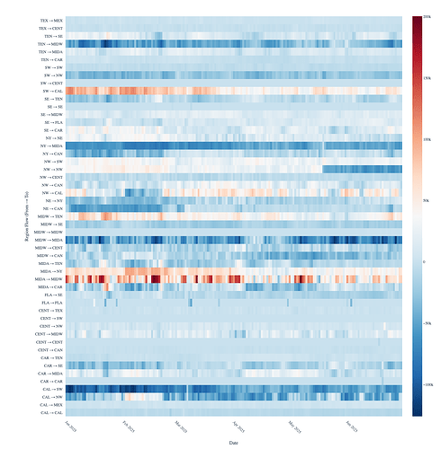
Interchange data by week - so showing how the energy flows between two interconnects on the grid over time.
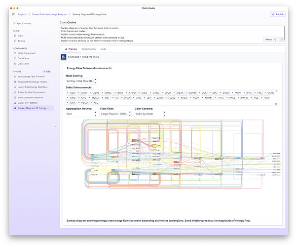
Sankey diagram showing flows between interconnects:
Sankey diagram of energy flow between interconnects.
Color bands and nodes.
Option to sort nodes energy flow amount.
Multi-select option to show just certain interconnects or ALL
Option to show all flows vs low flows vs medium flows vs large flows
Option to color by node or color by amount of flow (blue for positive, red for negative)


