Hi Everyone,
I thought I would share with the Dash community and maybe get some additional advice.
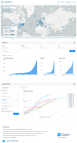
Pretty much a newbie to Dash, Plotly, Git & Co but I have just managed to put online the following initial version on my Dash app re Covid-19.
https://covid19-curves.herokuapp.com/
if anyone has some spare time, I would not mind some feedback on some of the code. See the following Git repo https://github.com/chk2817/covid-19-curves
all works pretty well but I find some on of the plot refresh slow on the second “timeline” section. There are 3+3 plots, nothing complicated but it is kind of slow. By design, I decided to update the 3+3 (over 2 tabs) all at once instead of using page refresh callbacks on each tab as i was not expecting any issue with either the data size to the plot complexity.
Anyhow, a big thank you to the Dash / Poltly folks for all the work they put in. Without their documentation, i would not be writing tonight from confined Switzerland. I took the liberty to add the Dash / Plotly Logo to advertise on your behalf, let me know if this is an issue.
Intend to finalize tomorrow few things before posting on LinkedIn.
Thanks
 Thanks for sharing! The data viz is very well designed, very clear & clean. This is one of the nicest Covid-19 dashboards I’ve seen out there. I really appreciate all of the region drill down and the development timeline comparison views, I’ve been looking for an app with this level of detail.