Update: version 4.9 has been released since this was posted.
Update: Version 4.0.0 final has been released. See the official announcement post at https://medium.com/@plotlygraphs/plotly-py-4-0-is-here-offline-only-express-first-displayable-anywhere-fc444e5659ee.
Introducing plotly.py 4.0.0rc1
I’m happy to announce the availability of the first release candidate of plotly.py version 4. This is a major release that includes many features and changes that we’re really excited about. For installation instructions, see the Getting Started page. Here are some of the highlights that will be discussed in more detail below:
- “offline” only (
chart-studiopackage split) - Plotly Express integration
- New figure update methods
- New renderers framework (or plotly.py everywhere)
- New default theme
- Consistent figure export API
- More flexible subplots
- Reduced package size (
plotly-geopackage split) graph_objstograph_objects- jupyterlab-plotly extension and JupyterLab 1.0 support
- How you can help
“offline” only (chart-studio package split)
Prior versions of plotly.py contained functionality for creating figures in both “online” and “offline” modes. In “online” mode, figures were uploaded to the Chart Studio cloud (or on-premise) service, whereas in “offline” mode figures were rendered locally. This duality has been a common source of confusion for several years, and so in version 4 we are making some important changes to help clear this up.
First, all functionality for interacting with Chart Studio has been moved from the top-level plotly module (e.g. plotly.plotly.plot) to a new top-level chart_studio module (e.g. chart_studio.plotly.plot).
Second, this chart_studio module is no longer included in the plotly distribution package. Instead, it is included in a new optional chart-studio distribution package. See the version 4 migration guide for guidance on porting “online” code to use the new chart-studio package.
Using our legacy terminology, both the plotly distribution package and the top-level plotly module are “offline” only. They contain no logic for interacting with external Chart Studio services. The only way to interact with Chart Studio services is to install the chart-studio distribution package and call functions from the top-level chart_studio module. Because this distinction is now much clearer, we are retiring the “online”/“offline” terminology.
Plotly Express integration
In March, we released a tech preview of Plotly Express: a wrapper for plotly.py that provides a simple syntax for creating complex charts. See the announcement at https://medium.com/@plotlygraphs/introducing-plotly-express-808df010143d for more background.
We have been very encouraged by the positive response that Plotly Express has received, and so for version 4 we are integrating Plotly Express into the main plotly.py distribution package. The top-level plotly_express module is now included as the plotly.express module. See the new documentation page for Plotly Express at Redirecting… for more information.
New figure update methods
One of our goals for the integration of Plotly Express was to make it easy for users to start with Plotly Express for data exploration, and then tweak and refine the resulting figures with all of the customization support built into plotly.py.
To this end, version 4 introduces a suite of new figure methods for updating figures after they have been constructed. These functions all return a reference to the calling figure, and are designed to support being chained together. We’ve also introduced “magic underscore notation” to make it easier to update nested figure properties. See the new Creating and Updating Figures page for full details.
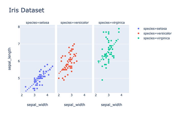
Here is an example that creates a faceted scatter plot with OLS regression lines using the Plotly Express scatter function and then:
- Updates the title font size using the new
update_layoutmethod with magic underscore notation (Without this notation, thetitle_font_size=24argument would be replaced bytitle=dict(font=dict(size=24))). - Updates the x-axes across all facets to disable the vertical grid lines using the new
update_xaxesmethod. - Updates the regression lines in each facet to have a dashed pattern using the new
update_tracemethod. Theselectorargument toupdate_tracesensures that the update applies only to the regression line traces, and not to the scatter marker traces as well.
import plotly.express as px
iris = px.data.iris()
(px.scatter(iris, x="sepal_width", y="sepal_length", color="species",
            facet_col="species", trendline="ols", title="Iris Dataset")
 .update_layout(title_font_size=24)
 .update_xaxes(showgrid=False)
 .update_traces(
     line=dict(dash="dot", width=4),
     selector=dict(type="scatter", mode="lines"))
)
New renderers framework (or plotly.py everywhere)
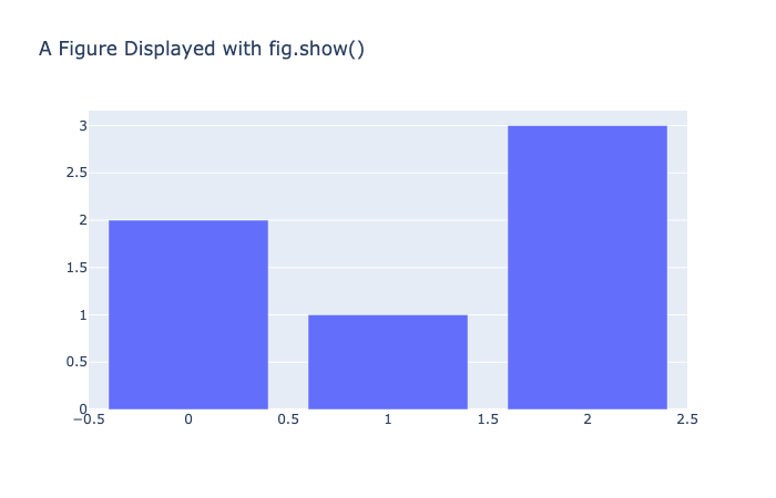
Version 4 introduces a new renderers framework for displaying plotly figures in a variety of contexts. The renderers framework is a generalization of the plotly.offline.init_notebook_mode and plotly.offline.iplot functions that were the preferred way to display figures in notebook contexts in prior versions. Rather than calling iplot(fig) to display a figure, now you can do the same with by calling the fig.show() figure method. And you don’t need to pre-initialize a notebook for rendering the way you needed to before using the init_notebook_mode function.
import plotly.graph_objects as go
fig = go.Figure(
    data=[go.Bar(y=[2, 1, 3])],
    layout_title_text="A Figure Displayed with fig.show()"
)
fig.show()
In most situations, you can even omit the call to .show() and allow the figure to display itself!
import plotly.graph_objects as go
fig = go.Figure(
    data=[go.Bar(y=[2, 1, 3])],
    layout_title_text="A Figure Displaying Itself"
)
fig
In many contexts, an appropriate renderer will be chosen automatically and you will not need to perform any additional configuration. These contexts include:
- Classic Jupyter Notebook
- JupyterLab (provided the
jupyterlab-plotlyJupyterLab extension is installed) - Visual Studio Code notebooks
- Nteract notebooks
- Colab
- Kaggle notebooks
- Azure notebooks
- Python interactive shell
Additional contexts are supported by choosing a compatible renderer including:
- IPython console
- QtConsole
- Spyder
- PyCharm
- Sphinx Gallery
See the new Displaying plotly figures documentation page for information on how to configure the default renderer, and for descriptions of all of the available renderers and why you might choose each one.
Note: The legacy
init_notebook_modeandiplotfunctions have been reimplemented on top of the renderers framework and are still supported for backward compatibility.
New default theme
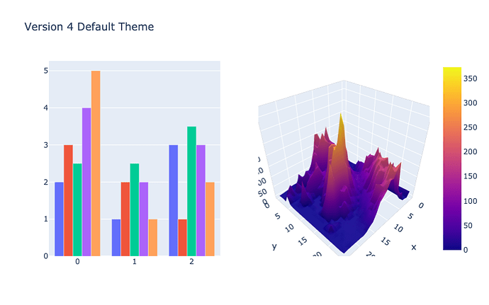
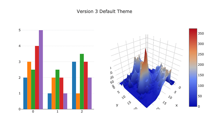
Plotly.py introduced theming support in version 3.4. Since that release, we have iterated on the design of the built-in 'plotly' theme, and we made this theme the default in the tech preview of Plotly Express. In version 4, we are making this theme the default for all figures created with Plotly.py. See the new Theming and templates documentation page for information on configuring the default theme.
import plotly.graph_objects as go
from plotly.subplots import make_subplots
import pandas as pd

# Make figure with subplots
fig = make_subplots(rows=1, cols=2, specs=[[{"type": "bar"},
                                            {"type": "surface"}]])

# Add bar traces to subplot (1, 1)
fig.add_trace(go.Bar(y=[2, 1, 3]), row=1, col=1)
fig.add_trace(go.Bar(y=[3, 2, 1]), row=1, col=1)
fig.add_trace(go.Bar(y=[2.5, 2.5, 3.5]), row=1, col=1)
fig.add_trace(go.Bar(y=[4, 2, 3]), row=1, col=1)
fig.add_trace(go.Bar(y=[5, 1, 2]), row=1, col=1)

# Add surface trace to subplot (1, 2)
# Read data from a csv
z_data = pd.read_csv("https://raw.githubusercontent.com/plotly/datasets/master/api_docs/mt_bruno_elevation.csv")
fig.add_surface(z=z_data)

# Hide legend
fig.update_layout(
    showlegend=False,
    title_text="Version 4 Default Theme",
    height=500,
    width=800,
)

fig.show()

# Disable theme
fig.layout.template = 'plotly_white'
fig.layout.title.text = 'Version 4 White Theme'
fig.show()

# Disable theme
fig.layout.template = 'plotly_dark'
fig.layout.title.text = 'Version 4 Dark Theme'
fig.show()

# Disable theme
fig.layout.template = 'none'
fig.layout.title.text = 'Version 3 Default Theme'
fig.show()
Consistent figure export API
In version 4, we have completed a long-running effort to clean up and simplify the various ways to export figures. A figure can now be written to a file as an image, as html, or as json using the .write_image, .write_html, and .write_json figure methods respectively. The corresponding .to_image, .to_html, and .to_json figure methods can also be used to convert a figure into an in-memory representation of an image, html, or json without writing to a file. Finally, all of these methods are also available as standalone functions in the plotly.io module. See the Static image export page for more information on static image export.
More flexible subplots
The make_subplots function is used to create figures with custom subplot layouts, and it has received a lot of attention for version 4. In addition to fixing many bugs, make_subplots now supports all subplot and trace types. See the subplots documentation page for more information.
Here is an example that creates and populates a 2 x 2 subplot grid containing 4 different subplot types.
from plotly.subplots import make_subplots
import plotly.graph_objects as go

fig = make_subplots(
    rows=2, cols=2,
    specs=[[{"type": "xy"}, {"type": "polar"}],
           [{"type": "domain"}, {"type": "scene"}]],
)

fig.add_trace(go.Bar(y=[2, 3, 1]),
              row=1, col=1)

fig.add_trace(go.Barpolar(theta=[0, 45, 90], r=[2, 3, 1]),
              row=1, col=2)

fig.add_trace(go.Pie(values=[2, 3, 1]),
              row=2, col=1)

fig.add_trace(go.Scatter3d(x=[2, 3, 1], y=[0, 0, 0], z=[0.5, 1, 2], mode="lines"),
              row=2, col=2)

fig.update_layout(height=700, showlegend=False)

fig.show()
The make_subplots function now supports creating figures with secondary y axes.
import plotly.graph_objects as go
from plotly.subplots import make_subplots

# Create figure with secondary y-axis
fig = make_subplots(specs=[[{"secondary_y": True}]])

# Add traces
fig.add_trace(
    go.Scatter(x=[1, 2, 3], y=[40, 50, 60], name="yaxis data"),
    secondary_y=False,
)

fig.add_trace(
    go.Scatter(x=[2, 3, 4], y=[4, 5, 6], name="yaxis2 data"),
    secondary_y=True,
)

# Add figure title
fig.update_layout(
    title_text="Double Y Axis Example"
)

# Set x-axis title
fig.update_xaxes(title_text="xaxis title")

# Set y-axes titles
fig.update_yaxes(title_text="<b>primary</b> yaxis title", secondary_y=False)
fig.update_yaxes(title_text="<b>secondary</b> yaxis title", secondary_y=True)

fig.show()
See the updated Multiple Axes documentation page for more examples of creating figures with multiple y-axes, and see the updated Subplots page for more subplot examples.
Note: The new preferred location to import
make_subplotsfrom isplotly.subplots. It is also available asplotly.tools.make_subplotsfor backward compatibility.
Reduced package size (plotly-geo package split)
In order to reduce the size of the core plotly distribution package, the bundled geographic shape files used by the create_choropleth figure factory have been moved to a new optional plotly-geo distribution package. This change reduces the size of the plotly source package from 27.4 MB down to 4.7 MB.
graph_objs to graph_objects
The graph_objs submodule is now available as the easier-to-pronounce graph_objects module. The graph_objs submodule is still supported for backward compatibility, but going forward we recommend using the following import statement to access the graph object classes.
import plotly.graph_objects as go
jupyterlab-plotly extension and JupyterLab 1.0 support
The @jupyterlab/plotly-extension extension for rendering plotly figures in JupyterLab has been replaced by a new jupyterlab-plotly extension that will now be maintained and updated as a part of the plotly.py project.
This extension improves the load time of notebooks that contain lots of plotly figures compared to the @jupyterlab/plotly-extension extension. This is done by displaying saved figures as static images initially. These static images are then replaced with live plotly.js figures when a user hovers over the plot.
The plotlywidget JupyterLab extension for rendering FigureWidget figures has been updated to support JupyterLab 1.0.
How you can help
If you would like to help us test the release candidate, please follow the installation instructions in the Getting Started page.
If you will be running legacy code, please reference the Version 4 migration guide.
If you think you’ve found a bug, please open an issue at GitHub · Where software is built.
If you notice an issue with the new documentation, please open an issue with our documentation project at GitHub · Where software is built.


 ) that led me to revert to the previous version. Now i’m having issues with all previous created visualizations and getting “Error displaying widget”. I looked at the java console and have all kinds of issues (below). Any ideas where i can start the rescue process?

