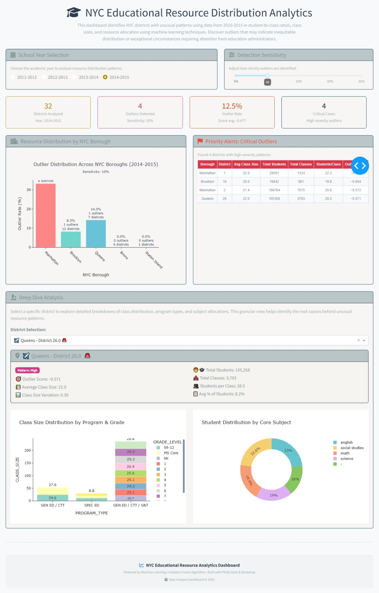
For this week 32 I built the NYC Educational Resource Distribution Analytics application as an interactive dashboard to help identify and visualize unusual patterns in how educational resources are distributed across New York City school districts. I use the Isolation Forest algorithm—to automatically detect districts with unusual patterns (outliers)
The objective is to help discover areas that might have an unequal distribution of resources or other unique circumstances. This lets investigate the data more deeply to understand what’s happening.
The code
import dash
from dash import dcc, html, Input, Output, callback, dash_table
import dash_bootstrap_components as dbc
import plotly.express as px
import plotly.graph_objects as go
import pandas as pd
import numpy as np
from sklearn.ensemble import IsolationForest
from sklearn.preprocessing import StandardScaler
Cargar los datos
try:
df = pd.read_csv(‘cleaned_class_size_data.csv’)
except FileNotFoundError:
print(“Error: ‘cleaned_class_size_data.csv’ no encontrado. Por favor, asegúrate de que el archivo esté en el directorio correcto.”)
df = pd.DataFrame() # Crear un DataFrame vacío para evitar errores
Mapeo de códigos de borough a nombres reales
BOROUGH_MAPPING = {
# Códigos de letras comunes
‘M’: “Manhattan”,
‘X’: “Bronx”,
‘K’: “Brooklyn”,
‘Q’: “Queens”,
‘R’: “Staten Island”
}
def map_borough_names(df):
“”"
Convierte códigos de borough a nombres reales de NYC
“”"
df = df.copy()
# Aplicar mapeo si la columna contiene códigos
if 'BOROUGH' in df.columns:
    # Convertir a string para manejo consistente
    df['BOROUGH'] = df['BOROUGH'].astype(str).str.strip().str.upper()

    # Mapear códigos a nombres
    df['BOROUGH'] = df['BOROUGH'].map(BOROUGH_MAPPING).fillna(df['BOROUGH'])

    # Si hay códigos no mapeados, mantener el valor original pero capitalizado
    df['BOROUGH'] = df['BOROUGH'].str.title()

return df
Aplicar mapeo de nombres de borough
if not df.empty:
df = map_borough_names(df)
Preparar los datos para análisis de anomalías
def prepare_anomaly_data(dataframe):
# Crear métricas agregadas por distrito (CSD), año y borough
district_metrics = dataframe.groupby([‘SCHOOL_YEAR’, ‘BOROUGH’, ‘CSD’]).agg({
‘CLASS_SIZE’: [‘mean’, ‘std’, ‘min’, ‘max’],
‘NUMBER_OF_CLASSES’: [‘sum’, ‘mean’],
‘NUMBER_OF_STUDENTS’: [‘sum’, ‘mean’],
‘PERCENT_OF_STUDENTS_IN_BOROUGH_/GRADE/PROGRAM/_SUBJECT’: [‘mean’, ‘std’]
}).round(2)
# Aplanar columnas
district_metrics.columns = ['_'.join(col).strip() for col in district_metrics.columns]
district_metrics = district_metrics.reset_index()

# Calcular métricas adicionales
district_metrics['students_per_class'] = (district_metrics['NUMBER_OF_STUDENTS_sum'] /
                                          district_metrics['NUMBER_OF_CLASSES_sum']).fillna(0)
district_metrics['class_size_variation'] = (district_metrics['CLASS_SIZE_std'] /
                                              district_metrics['CLASS_SIZE_mean']).fillna(0)

return district_metrics
Preparar datos base (sin anomalías aún)
district_data = prepare_anomaly_data(df)
Inicializar la app con tema Bootstrap
app = dash.Dash(name, external_stylesheets=[dbc.themes.SOLAR, dbc.icons.FONT_AWESOME])
app.title=‘NYC Education Distribution Analyzer’
Layout moderno
app.layout = dbc.Container([
# Header
dbc.Row([
dbc.Col([
html.H1([
html.I(className=“fas fa-graduation-cap”, style={‘marginRight’: ‘15px’}),
“NYC Educational Resource Distribution Analytics”
], className=“text-center mb-2”, style={‘color’: ‘#2c3e50’, ‘fontWeight’: ‘300’}),
html.P([
"This dashboard identifies NYC districts with unusual patterns using data from 2010-2015 in student-to-class ratios, ",
"class sizes, and resource allocation using machine learning techniques. ",
"Discover outliers that may indicate inequitable distribution or exceptional circumstances ",
“requiring attention from education administrators.”
], className=“text-center text-muted mb-4”, style={‘fontSize’: ‘16px’, ‘maxWidth’: ‘800px’, ‘margin’: ‘0 auto’})
])
]),
# Controles en Cards modernas
dbc.Row([
    dbc.Col([
        dbc.Card([
            dbc.CardHeader([
                html.H5([
                    html.I(className="fas fa-calendar-alt", style={'marginRight': '10px'}),
                    "School Year Selection"
                ], className="mb-0")
            ]),
            dbc.CardBody([
                html.P("Choose the academic year to analyze resource distribution patterns:",
                       className="text-muted mb-2", style={'fontSize': '14px'}),
                dbc.RadioItems(
                    id='year-radio',
                    options=[{'label': year, 'value': year} for year in sorted(df['SCHOOL_YEAR'].unique())] if not df.empty else [],
                    value=sorted(df['SCHOOL_YEAR'].unique())[-1] if not df.empty else None,
                    inline=True,
                    className="mb-0"
                )
            ])
        ], className="h-100")
    ], md=7),

    dbc.Col([
        dbc.Card([
            dbc.CardHeader([
                html.H5([
                    html.I(className="fas fa-sliders-h", style={'marginRight': '10px'}),
                    "Detection Sensitivity"
                ], className="mb-0")
            ]),
            dbc.CardBody([
                html.P("Adjust how strictly outliers are identified:",
                       className="text-muted mb-2", style={'fontSize': '14px'}),
                dcc.Slider(
                    id='contamination-slider',
                    min=5,
                    max=25,
                    step=1,
                    value=10,
                    marks={i: f'{i}%' for i in range(5, 26, 5)},
                    tooltip={"placement": "bottom", "always_visible": True}
                )
            ])
        ], className="h-100")
    ], md=5)
], className="mb-4"),

# Métricas generales en Cards
dbc.Row(id='metrics-cards', className="mb-4"),

# Gráfico de análisis por borough y tabla de anomalías críticas en la misma fila
dbc.Row([
    dbc.Col([
        dbc.Card([
            dbc.CardHeader([
                html.H5([
                    html.I(className="fas fa-city", style={'marginRight': '10px'}),
                    "Resource Distribution by NYC Borough"
                ], className="mb-0")
            ]),
            dbc.CardBody([
                dcc.Graph(id='borough-analysis', style={'height': '450px'})
            ])
        ], className="h-100")
    ], md=6),

    dbc.Col([
        dbc.Card([
            dbc.CardHeader([
                html.H5([
                    html.I(className="fas fa-flag", style={'marginRight': '10px'}),
                    "Priority Alerts: Critical Outliers"
                ], className="mb-0", style={'color': '#e74c3c'})
            ]),
            dbc.CardBody(id='critical-anomalies-card', style={'height': '450px', 'overflowY': 'auto'})
        ], className="h-100")
    ], md=6)
], className="mb-4"),

# Investigación drill-down
dbc.Row([
    dbc.Col([
        dbc.Card([
            dbc.CardHeader([
                html.H5([
                    html.I(className="fas fa-microscope", style={'marginRight': '10px'}),
                    "Deep Dive Analysis"
                ], className="mb-0")
            ]),
            dbc.CardBody([
                html.P([
                    "Select a specific district to explore detailed breakdowns of class distribution, ",
                    "program types, and subject allocations. This granular view helps identify the root ",
                    "causes behind unusual resource patterns."
                ], className="text-muted mb-3"),
                dbc.Row([
                    dbc.Col([
                        dbc.Label("District Selection:", className="fw-bold"),
                        dcc.Dropdown(
                            id='district-dropdown',
                            placeholder="Choose a district for detailed investigation...",
                            className="mb-3"
                        )
                    ])
                ]),
                html.Div(id='drilldown-analysis')
            ])
        ])
    ])
], className="mb-4"),

# Footer DEFINITIVAMENTE al final
html.Hr(className="mt-5"),
dbc.Row([
    dbc.Col([
        html.Footer([
            dbc.Row([
                dbc.Col([
                    html.P([
                        html.I(className="fas fa-chart-line", style={'marginRight': '8px', 'color': '#3498db'}),
                        "NYC Educational Resource Analytics Dashboard"
                    ], className="mb-1 text-center", style={'fontWeight': 'bold', 'color': '#2c3e50'}),
                    html.P([
                        "Powered by Machine Learning • Isolation Forest Algorithm • ",
                        "Built with Plotly Dash & Bootstrap"
                    ], className="mb-0 text-muted text-center", style={'fontSize': '12px'}),
                    html.P([
                        html.I(className="fas fa-calendar", style={'marginRight': '5px', 'color': '#95a5a6'}),
                        "Data Analysis Dashboard © 2025"
                    ], className="mb-0 text-muted text-center mt-2", style={'fontSize': '12px'})
                ], md=12)
            ])
        ], style={
            'backgroundColor': '#f1f3f4',
            'padding': '20px',
            'marginTop': '30px',
            'borderTop': '2px solid #e9ecef',
            'borderRadius': '8px'
        })
    ])
])
], fluid=True, style={‘backgroundColor’: ‘#f8f9fa’, ‘minHeight’: ‘100vh’, ‘padding’: ‘20px’})
Función para detectar anomalías (CORREGIDA)
def detect_anomalies(data, contamination=0.1):
# Seleccionar features para análisis
feature_cols = [
‘CLASS_SIZE_mean’, ‘CLASS_SIZE_std’, ‘NUMBER_OF_CLASSES_sum’,
‘NUMBER_OF_STUDENTS_sum’, ‘students_per_class’, ‘class_size_variation’,
‘PERCENT_OF_STUDENTS_IN_BOROUGH_/GRADE/PROGRAM/_SUBJECT_mean’
]
# Preparar datos para ML
X = data[feature_cols].fillna(0)

# Escalar datos
scaler = StandardScaler()
X_scaled = scaler.fit_transform(X)

# Aplicar Isolation Forest
iso_forest = IsolationForest(contamination=contamination, random_state=42, n_estimators=100)
anomaly_labels = iso_forest.fit_predict(X_scaled)
anomaly_scores = iso_forest.score_samples(X_scaled)

# Agregar resultados al dataframe
data_with_anomalies = data.copy()
data_with_anomalies['is_anomaly'] = anomaly_labels == -1
data_with_anomalies['anomaly_score'] = anomaly_scores

# CORRIGIDO: Calcular severidad basada en los scores ACTUALES, no fijos
# Usar percentiles de los scores actuales para determinar severidad
score_25th = np.percentile(anomaly_scores, 25)
score_10th = np.percentile(anomaly_scores, 10)

conditions = [
    anomaly_scores <= score_10th,  # 10% más bajos = High severity
    anomaly_scores <= score_25th,  # Entre 10-25% = Medium severity
    anomaly_scores > score_25th    # Resto = Normal
]
choices = ['High', 'Medium', 'Normal']

data_with_anomalies['anomaly_severity'] = np.select(conditions, choices, default='Normal')

return data_with_anomalies, feature_cols
@callback(
[Output(‘borough-analysis’, ‘figure’),
Output(‘metrics-cards’, ‘children’),
Output(‘critical-anomalies-card’, ‘children’),
Output(‘district-dropdown’, ‘options’)],
[Input(‘year-radio’, ‘value’),
Input(‘contamination-slider’, ‘value’)]
)
def update_anomaly_analysis(selected_year, contamination):
# Validar entrada de contaminación
if contamination is None or contamination < 5 or contamination > 25:
contamination = 10
contamination = contamination / 100  # Convertir porcentaje a decimal

# Filtrar datos por año
year_data = district_data[district_data['SCHOOL_YEAR'] == selected_year].copy()

if year_data.empty:
    empty_fig = go.Figure()
    empty_fig.add_annotation(text="No hay datos para el año seleccionado",
                             xref="paper", yref="paper", x=0.5, y=0.5, showarrow=False)
    empty_metrics = html.Div("Sin datos disponibles", className="text-center")
    return empty_fig, empty_metrics, "Sin datos", []

# Detectar anomalías con nueva configuración
year_anomalies, _ = detect_anomalies(year_data, contamination)

# 1. Análisis por borough CORREGIDO
borough_stats = year_anomalies.groupby('BOROUGH').agg({
    'is_anomaly': 'sum',  # Cuenta de outliers por borough
    'anomaly_score': 'mean',
    'CSD': 'count',  # Total de distritos por borough
    'CLASS_SIZE_mean': 'mean',
    'NUMBER_OF_STUDENTS_sum': 'sum'
}).reset_index()

# CORREGIDO: Calcular rate basado en outliers reales detectados
borough_stats['anomaly_rate'] = (borough_stats['is_anomaly'] / borough_stats['CSD'] * 100).round(1)

# Definir orden y colores específicos para los boroughs de NYC
borough_order = ['Manhattan', 'Brooklyn', 'Queens', 'Bronx', 'Staten Island']
borough_colors = {
    'Manhattan': '#FF6B6B',    # Rojo coral
    'Brooklyn': '#4ECDC4',     # Verde azulado
    'Queens': '#45B7D1',       # Azul claro
    'Bronx': '#96CEB4',        # Verde menta
    'Staten Island': '#FFEAA7' # Amarillo claro
}

# Ordenar datos según el orden deseado
borough_stats['sort_key'] = borough_stats['BOROUGH'].map({b: i for i, b in enumerate(borough_order)})
borough_stats = borough_stats.sort_values('sort_key').drop('sort_key', axis=1)

# Crear gráfico de barras MEJORADO con colores específicos
borough_fig = go.Figure()

# Asignar colores basados en el borough
colors = [borough_colors.get(borough, '#95A5A6') for borough in borough_stats['BOROUGH']]

borough_fig.add_trace(go.Bar(
    x=borough_stats['BOROUGH'],
    y=borough_stats['anomaly_rate'],
    marker=dict(
        color=colors,
        line=dict(color='white', width=1),
        opacity=0.8
    ),
    text=[f'{rate}%<br>{int(outliers)} outliers<br>{int(total)} districts'
          for rate, outliers, total in
          zip(borough_stats['anomaly_rate'], borough_stats['is_anomaly'], borough_stats['CSD'])],
    textposition='outside',
    textfont=dict(size=11, color='#2c3e50'),
    hovertemplate='<b>%{x}</b><br>' +
                  'Outlier Rate: %{y}%<br>' +
                  'Avg Anomaly Score: %{customdata[2]:.3f}<br>' +
                  'Outliers: %{customdata[0]}<br>' +
                  'Total Districts: %{customdata[1]}<br>' +
                  'Total Students: %{customdata[3]:,}<br>' +
                  '<extra></extra>',
    customdata=list(zip(borough_stats['is_anomaly'], borough_stats['CSD'],
                        borough_stats['anomaly_score'], borough_stats['NUMBER_OF_STUDENTS_sum']))
))

borough_fig.update_layout(
    title=dict(
        text=f"Outlier Distribution Across NYC Boroughs ({selected_year})<br><sub>Sensitivity: {int(contamination*100)}%</sub>",
        x=0.5,
        font=dict(size=16, color='#2c3e50')
    ),
    # xaxis_title="NYC Borough",
    yaxis_title="Outlier Rate (%)",
    height=450,
    template='simple_white',
    showlegend=False,
    plot_bgcolor='rgba(0,0,0,0)',
    paper_bgcolor='rgba(0,0,0,0)',
    xaxis=dict(
        tickangle=45,
        tickfont=dict(size=12)
    ),
    yaxis=dict(
        tickfont=dict(size=12),
        gridcolor='rgba(0,0,0,0.1)'
    )
)

# 2. Métricas en cards CORREGIDAS
total_districts = len(year_anomalies)
anomaly_count = year_anomalies['is_anomaly'].sum()
anomaly_rate = (anomaly_count / total_districts * 100).round(1) if total_districts > 0 else 0
avg_anomaly_score = year_anomalies['anomaly_score'].mean().round(3) if len(year_anomalies) > 0 else 0
# CORREGIDO: Critical cases ahora responde al slider
critical_count = len(year_anomalies[year_anomalies['anomaly_severity'] == 'High'])

metrics_cards = dbc.Row([
    dbc.Col([
        dbc.Card([
            dbc.CardBody([
                html.H3(f"{total_districts}", className="text-primary mb-0"),
                html.P("Districts Analyzed", className="text-muted mb-0", style={'fontSize': '14px'}),
                html.Small(f"Year: {selected_year}", className="text-muted")
            ])
        ], className="text-center border-primary")
    ], md=3),

    dbc.Col([
        dbc.Card([
            dbc.CardBody([
                html.H3(f"{anomaly_count}", className="text-danger mb-0"),
                html.P("Outliers Detected", className="text-muted mb-0", style={'fontSize': '14px'}),
                html.Small(f"Sensitivity: {int(contamination*100)}%", className="text-muted")
            ])
        ], className="text-center border-danger")
    ], md=3),

    dbc.Col([
        dbc.Card([
            dbc.CardBody([
                html.H3(f"{anomaly_rate}%", className="text-warning mb-0"),
                html.P("Outlier Rate", className="text-muted mb-0", style={'fontSize': '14px'}),
                html.Small(f"Score avg: {avg_anomaly_score}", className="text-muted")
            ])
        ], className="text-center border-warning")
    ], md=3),

    dbc.Col([
        dbc.Card([
            dbc.CardBody([
                html.H3(f"{critical_count}", className="text-dark mb-0"),
                html.P("Critical Cases", className="text-muted mb-0", style={'fontSize': '14px'}),
                html.Small("High severity outliers", className="text-muted")
            ])
        ], className="text-center border-dark")
    ], md=3)
])

# 3. Tabla de anomalías críticas CORREGIDA
critical_anomalies = year_anomalies[year_anomalies['anomaly_severity'] == 'High'].sort_values('anomaly_score')

if len(critical_anomalies) > 0:
    critical_table = html.Div([
        html.P(f"Found {len(critical_anomalies)} districts with high-severity patterns:",
               className="text-muted mb-2", style={'fontSize': '14px'}),
        dash_table.DataTable(
            data=critical_anomalies[['BOROUGH', 'CSD', 'CLASS_SIZE_mean', 'NUMBER_OF_STUDENTS_sum',
                                     'NUMBER_OF_CLASSES_sum', 'students_per_class', 'anomaly_score']].to_dict('records'),
            columns=[
                {'name': 'Borough', 'id': 'BOROUGH'},
                {'name': 'District', 'id': 'CSD'},
                {'name': 'Avg Class Size', 'id': 'CLASS_SIZE_mean', 'type': 'numeric', 'format': {'specifier': '.1f'}},
                {'name': 'Total Students', 'id': 'NUMBER_OF_STUDENTS_sum', 'type': 'numeric'},
                {'name': 'Total Classes', 'id': 'NUMBER_OF_CLASSES_sum', 'type': 'numeric'},
                {'name': 'Students/Class', 'id': 'students_per_class', 'type': 'numeric', 'format': {'specifier': '.1f'}},
                {'name': 'Outlier Score', 'id': 'anomaly_score', 'type': 'numeric', 'format': {'specifier': '.3f'}}
            ],
            style_cell={
                'textAlign': 'center',
                'fontSize': '12px',
                'fontFamily': 'Arial, sans-serif'
            },
            style_data_conditional=[
                {
                    'if': {'row_index': 'odd'},
                    'backgroundColor': '#f8f9fa'
                }
            ],
            style_header={
                'backgroundColor': '#dc3545',
                'color': 'white',
                'fontWeight': 'bold',
                'border': '1px solid #dee2e6'
            },
            style_table={'overflowX': 'auto', 'height': '350px', 'overflowY': 'auto'},
            page_size=8
        )
    ])
else:
    critical_table = dbc.Alert([
        html.I(className="fas fa-check-circle", style={'marginRight': '10px'}),
        f"No critical outliers found with current sensitivity ({int(contamination*100)}%). ",
        "Try increasing sensitivity to detect more subtle patterns."
    ], color="success", className="text-center")

# 4. Opciones para dropdown de drill-down con emojis para cada borough
borough_emojis = {
    'Manhattan': '🏙️',
    'Brooklyn': '🌉',
    'Queens': '✈️',
    'Bronx': '🏟️',
    'Staten Island': '🚢'
}

district_options = [
    {'label': f"{borough_emojis.get(row['BOROUGH'], '🏫')} {row['BOROUGH']} - District {row['CSD']} {'🚨' if row['is_anomaly'] else '✅'}",
     'value': f"{row['BOROUGH']}_{row['CSD']}"}
    for _, row in year_anomalies.iterrows()
]

return borough_fig, metrics_cards, critical_table, district_options
@callback(
Output(‘drilldown-analysis’, ‘children’),
[Input(‘district-dropdown’, ‘value’),
Input(‘year-radio’, ‘value’),
Input(‘contamination-slider’, ‘value’)]
)
def update_drilldown(selected_district, selected_year, contamination):
if not selected_district:
return dbc.Alert([
html.I(className=“fas fa-info-circle”, style={‘marginRight’: ‘10px’}),
“Please select a district above to begin detailed investigation.”
], color=“info”, className=“text-center”)
# Validar contaminación
if contamination is None:
contamination = 0.1
else:
contamination = contamination / 100
# Parsear selección
borough, csd = selected_district.split('_')
csd = float(csd)
# Filtrar datos específicos del distrito
district_detail = df[
(df['SCHOOL_YEAR'] == selected_year) &
(df['BOROUGH'] == borough) &
(df['CSD'] == csd)
].copy()
if district_detail.empty:
return dbc.Alert("No data available for the selected district.", color="warning", className="text-center")
# Obtener información de anomalía
year_data = district_data[district_data['SCHOOL_YEAR'] == selected_year].copy()
year_anomalies, _ = detect_anomalies(year_data, contamination)
district_anomaly = year_anomalies[
(year_anomalies['BOROUGH'] == borough) &
(year_anomalies['CSD'] == csd)
]
if district_anomaly.empty:
return dbc.Alert("No outlier information found for this district.", color="warning")
district_anomaly = district_anomaly.iloc[0]
# Análisis detallado por programa y grado
program_analysis = district_detail.groupby(['PROGRAM_TYPE', 'GRADE_LEVEL']).agg({
'CLASS_SIZE': 'mean',
'NUMBER_OF_STUDENTS': 'sum',
'NUMBER_OF_CLASSES': 'sum'
}).reset_index()
# Gráfico de distribución por programa
program_fig = px.bar(
program_analysis,
x='PROGRAM_TYPE',
y='CLASS_SIZE',
color='GRADE_LEVEL',
labels={'PROGRAM_TYPE':'Program Type', 'CLASS_SIZE':'Clase Size', 'GRADE_LEVEL':'Grade Level'},
title="Class Size Distribution by Program & Grade",
text='CLASS_SIZE',
color_discrete_sequence=px.colors.qualitative.Set3
)
program_fig.update_traces(texttemplate='%{text:.1f}', textposition='outside')
program_fig.update_layout(template='simple_white', height=400)
# Análisis por materia
subject_analysis = district_detail.groupby('CORE_SUBJECT').agg({
'CLASS_SIZE': 'mean',
'NUMBER_OF_STUDENTS': 'sum'
}).reset_index()
subject_fig = px.pie(
subject_analysis,
values='NUMBER_OF_STUDENTS',
names='CORE_SUBJECT',
hole=0.65,
title="Student Distribution by Core Subject",
color_discrete_sequence=px.colors.qualitative.Pastel
)
subject_fig.update_layout(template='simple_white', height=400)
# Determinar color de severity
severity_colors = {'High': 'danger', 'Medium': 'warning', 'Normal': 'success'}
severity_color = severity_colors.get(district_anomaly['anomaly_severity'], 'secondary')
# Emoji para el borough
borough_emojis = {
'Manhattan': '🏙️',
'Brooklyn': '🌉',
'Queens': '✈️',
'Bronx': '🏟️',
'Staten Island': '🚢'
}
# Card de información del distrito MEJORADA
district_info_card = dbc.Card([
dbc.CardHeader([
html.H5([
html.I(className="fas fa-map-marker-alt", style={'marginRight': '10px'}),
f"{borough_emojis.get(borough, '🏫')} {borough} - District {csd}",
html.Span("🚨" if district_anomaly['is_anomaly'] else "✅",
style={'marginLeft': '10px', 'fontSize': '20px'})
], className="mb-0")
]),
dbc.CardBody([
dbc.Row([
dbc.Col([
dbc.Badge(f"Pattern: {district_anomaly['anomaly_severity']}",
color=severity_color, className="mb-2"),
html.P(f"🎯 Outlier Score: {district_anomaly['anomaly_score']:.3f}",
className="mb-1"),
html.P(f"📚 Average Class Size: {district_anomaly['CLASS_SIZE_mean']:.1f}",
className="mb-1"),
html.P(f"📊 Class Size Variation: {district_anomaly['class_size_variation']:.2f}",
className="mb-0")
], md=6),
dbc.Col([
html.P(f"🧑🎓 Total Students: {int(district_anomaly['NUMBER_OF_STUDENTS_sum']):,}",
className="mb-1"),
html.P(f"🏫 Total Classes: {int(district_anomaly['NUMBER_OF_CLASSES_sum']):,}",
className="mb-1"),
html.P(f"👥 Students per Class: {district_anomaly['students_per_class']:.1f}",
className="mb-1"),
html.P(f"📋 Avg % of Students: {district_anomaly['PERCENT_OF_STUDENTS_IN_BOROUGH_/_GRADE_/_PROGRAM_/_SUBJECT_mean']:.1f}%",
className="mb-0")
], md=6)
])
])
], className="mb-4")
return html.Div([
district_info_card,
dbc.Row([
dbc.Col(dcc.Graph(figure=program_fig), md=6),
dbc.Col(dcc.Graph(figure=subject_fig), md=6)
])
])
server = app.server