join the Figure Friday session on October 10, at noon Eastern Time, to showcase your creation and receive feedback from the community.
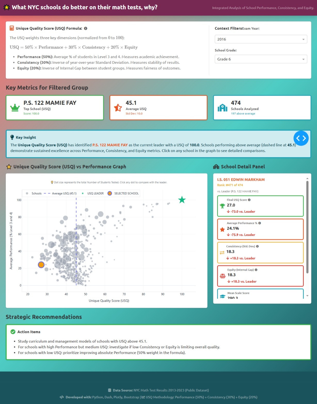
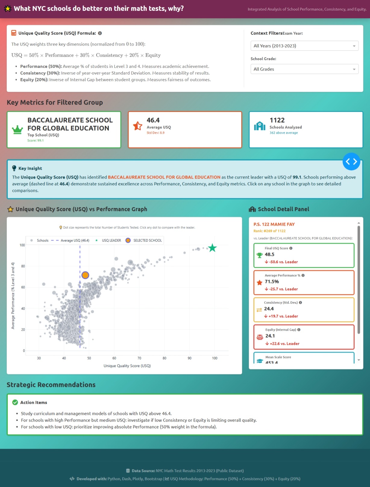
What NYC schools do better on their math tests, why?
Answer this question and a few others by using Plotly on the Math Test Results dataset.
Things to consider:
- what can you improve in the app or sample figure below (heatmap)?
- would you like to tell a different data story using a Dash app?
- how can you explore the data with Plotly Studio?
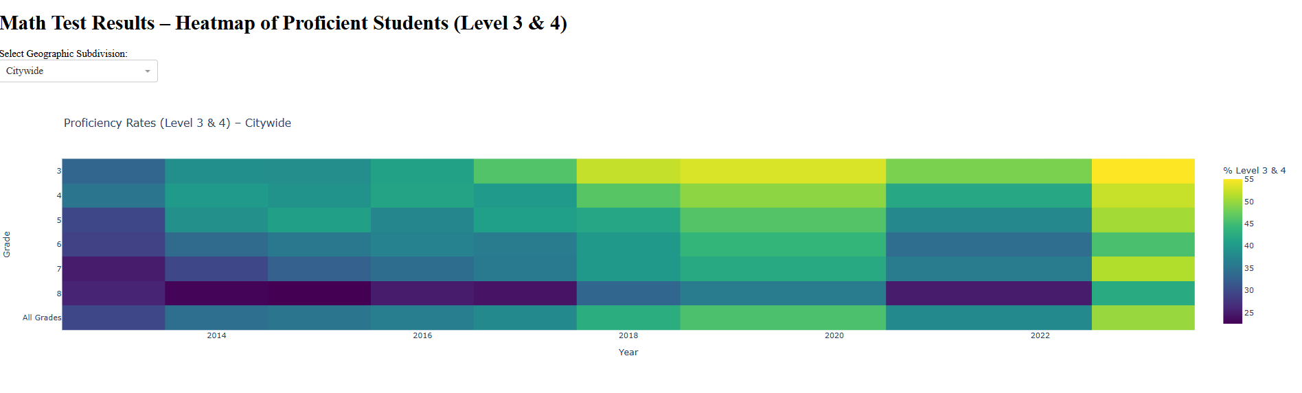
Sample figure:
Thank you @Ester for the heatmap and code.
Code for sample figure:
import dash
from dash import dcc, html, Input, Output
import plotly.express as px
import pandas as pd

# Load data
# Instructions to download CSV sheet: https://github.com/plotly/Figure-Friday/blob/main/2025/week-40/data.md
df = pd.read_csv("Math_Test.csv")

# Filter only "All Students"
df = df[df["Student Category"] == "All Students"].copy()

# Convert percentage to numeric
df["Pct Level 3 and 4"] = pd.to_numeric(df["Pct Level 3 and 4"], errors="coerce")

# Initialize app
app = dash.Dash(__name__)

app.layout = html.Div([
    html.H1("Math Test Results – Heatmap of Proficient Students (Level 3 & 4)"),

    html.Div([
        html.Label("Select Geographic Subdivision:"),
        dcc.Dropdown(
            id="geo-dropdown",
            options=[{"label": g, "value": g} for g in df["Geographic Subdivision"].unique()],
            value="Citywide",  # default
            clearable=False,
            style={"width": "250px"}
        ),
    ], style={"margin-bottom": "20px"}),

    dcc.Graph(id="heatmap")
])

@app.callback(
    Output("heatmap", "figure"),
    Input("geo-dropdown", "value")
)
def update_heatmap(selected_geo):
    # Filter by selected geography
    dff = df[df["Geographic Subdivision"] == selected_geo]

    # Pivot table for heatmap
    pivot = dff.pivot_table(
        index="Grade",
        columns="Year",
        values="Pct Level 3 and 4",
        aggfunc="mean"
    )

    fig = px.imshow(
        pivot,
        aspect="auto",
        color_continuous_scale="Viridis",
        labels={"color": "% Level 3 & 4"},
        title=f"Proficiency Rates (Level 3 & 4) – {selected_geo}"
    )

    return fig

if __name__ == "__main__":
    app.run(debug=True)
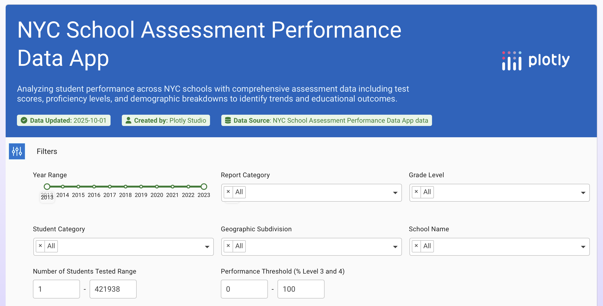
For community members that would like to build the data app with Plotly Studio, simply go to the downloads page to download Plotly Studio.
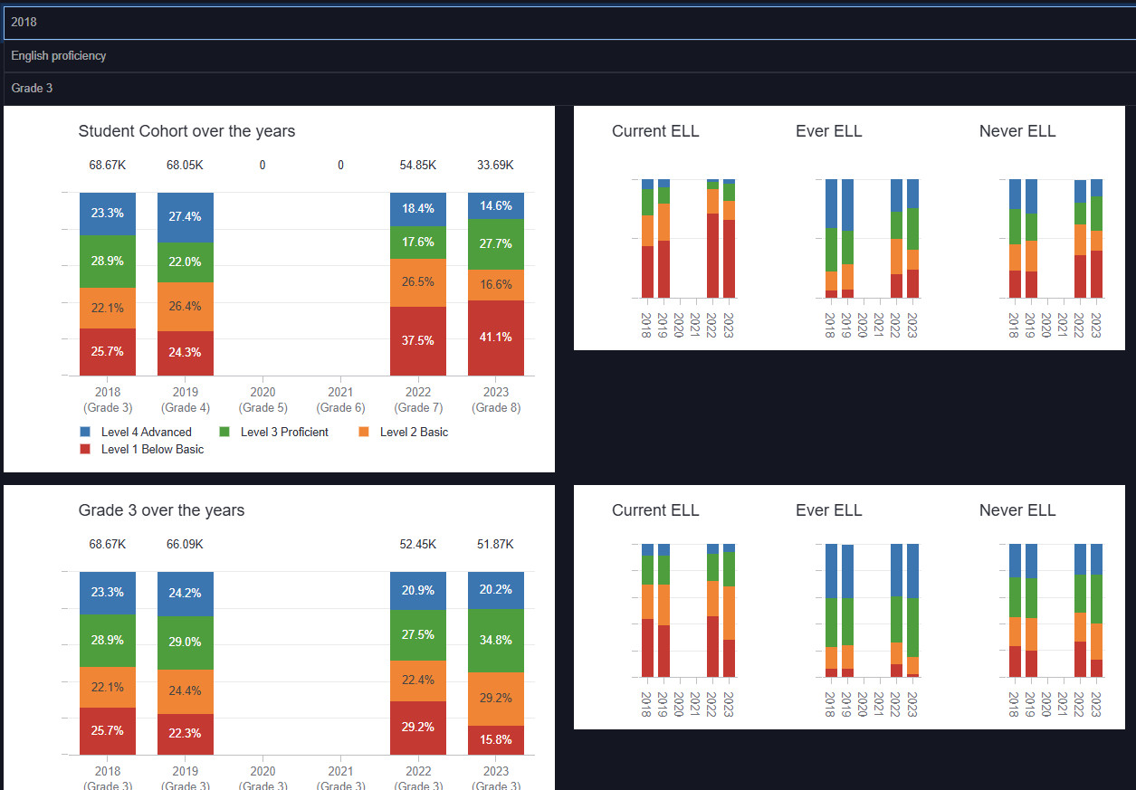
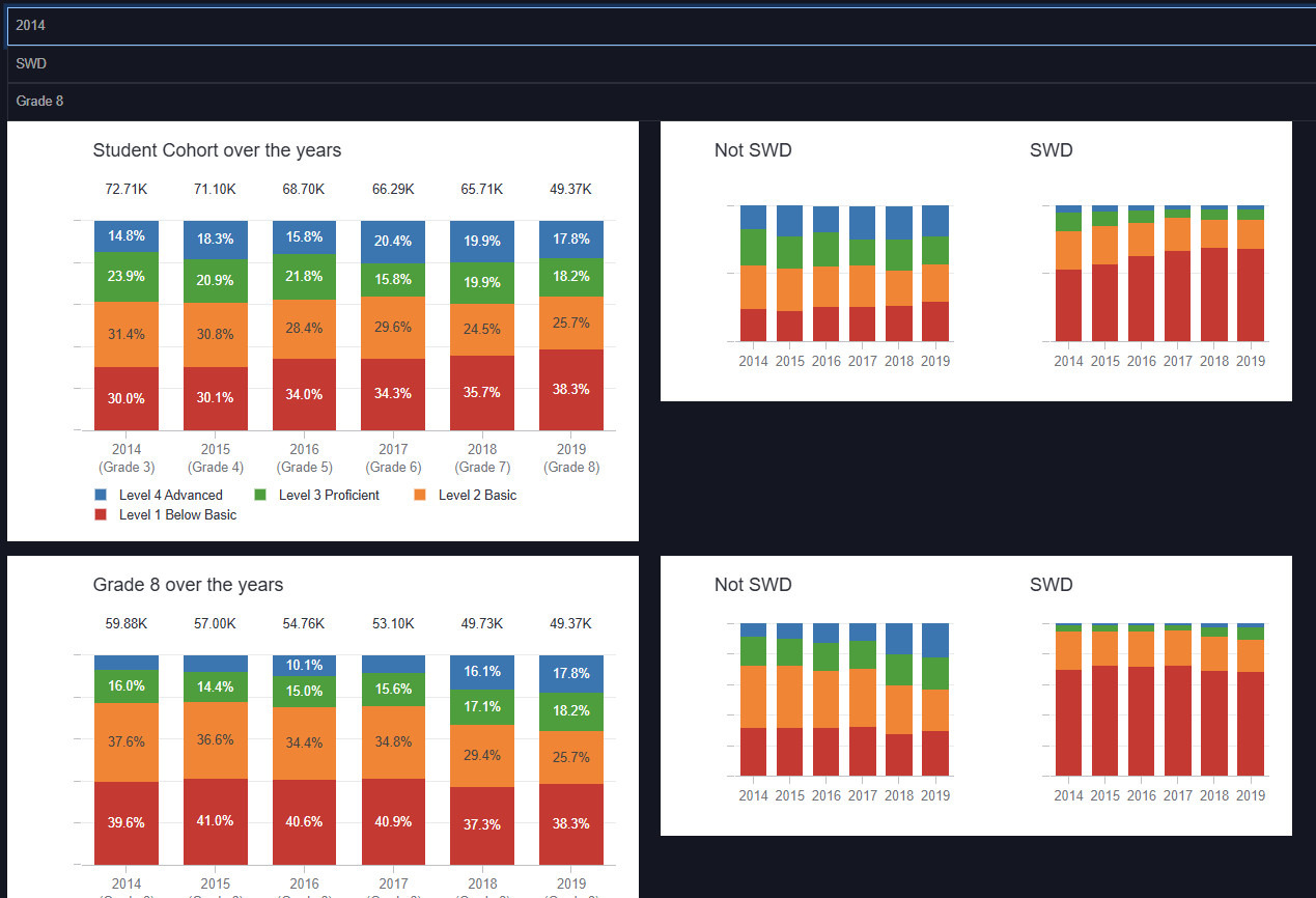
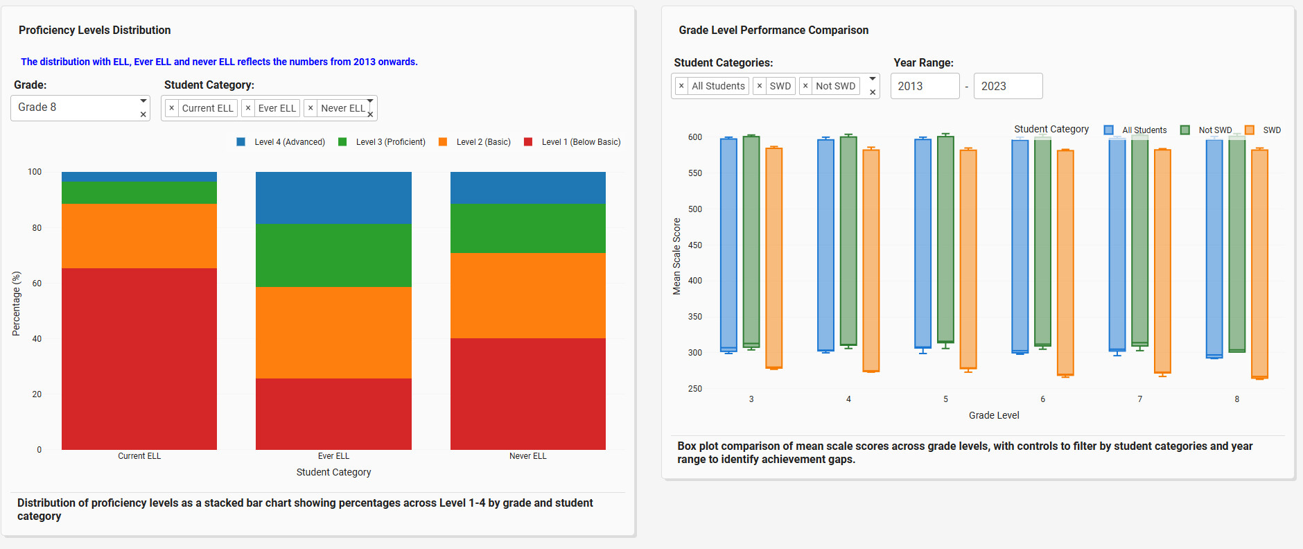
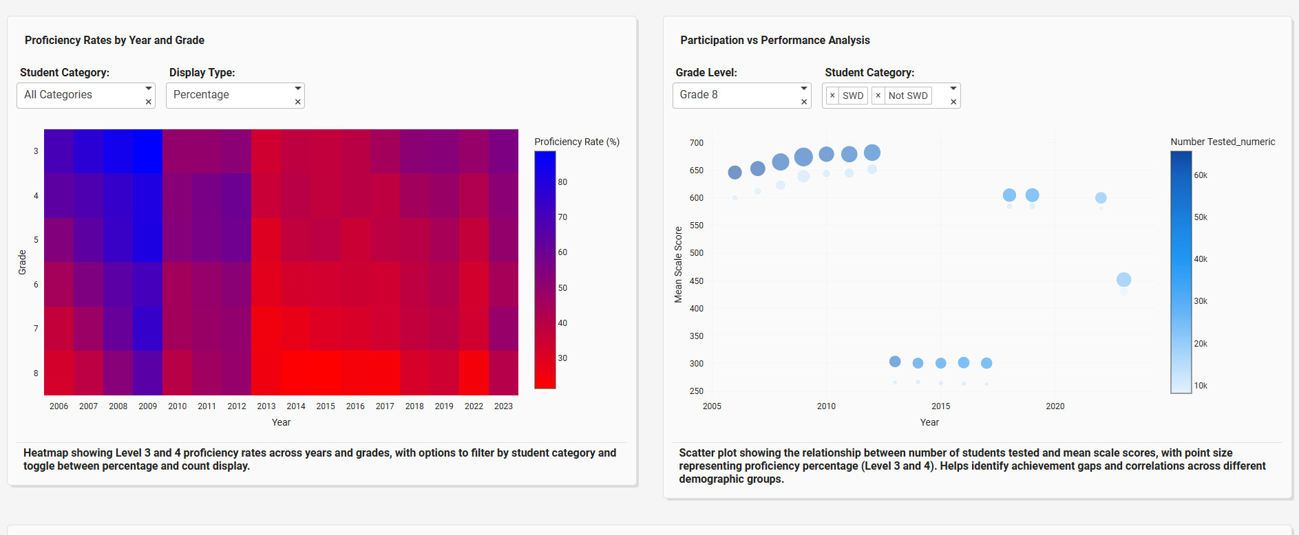
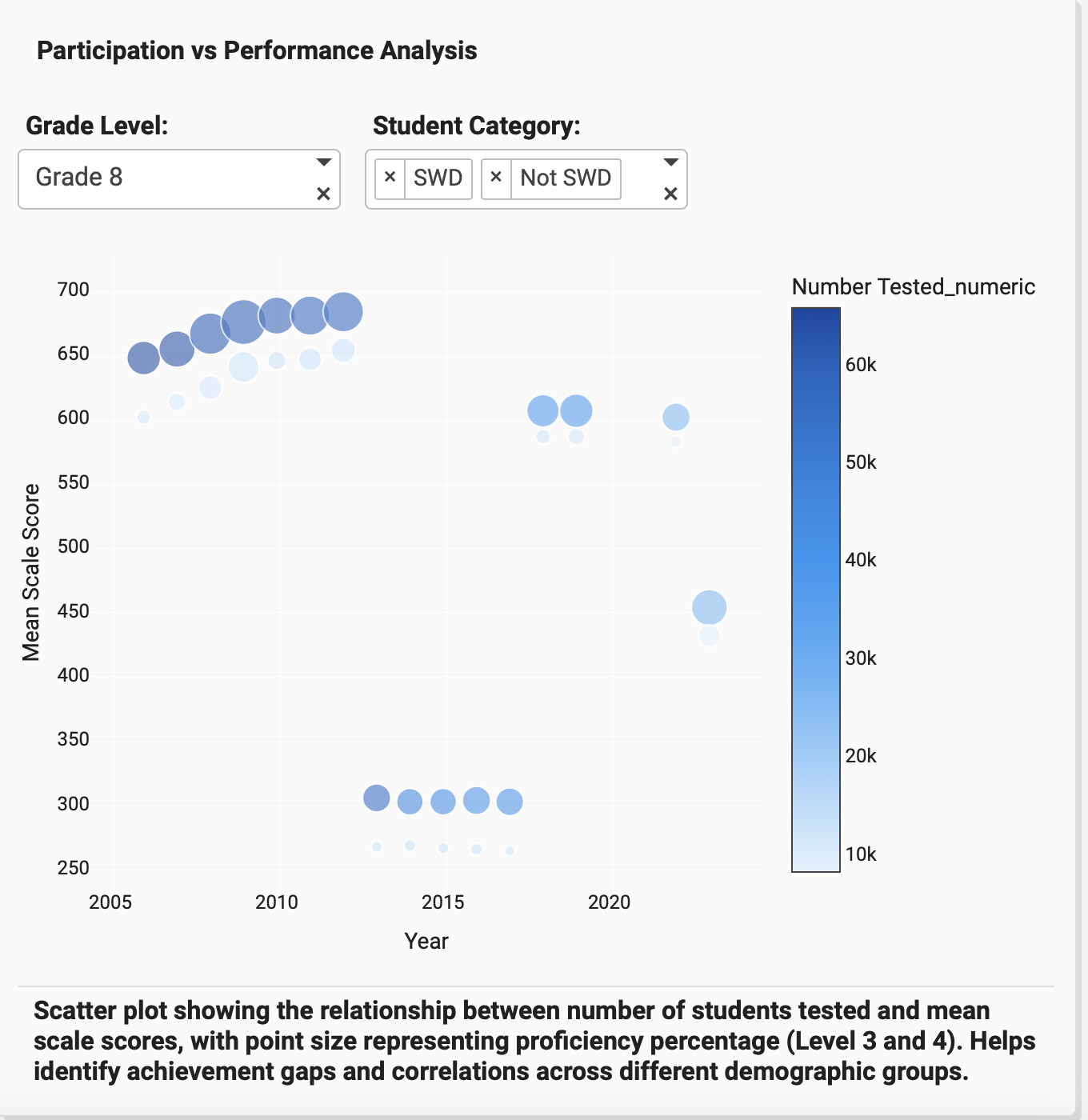
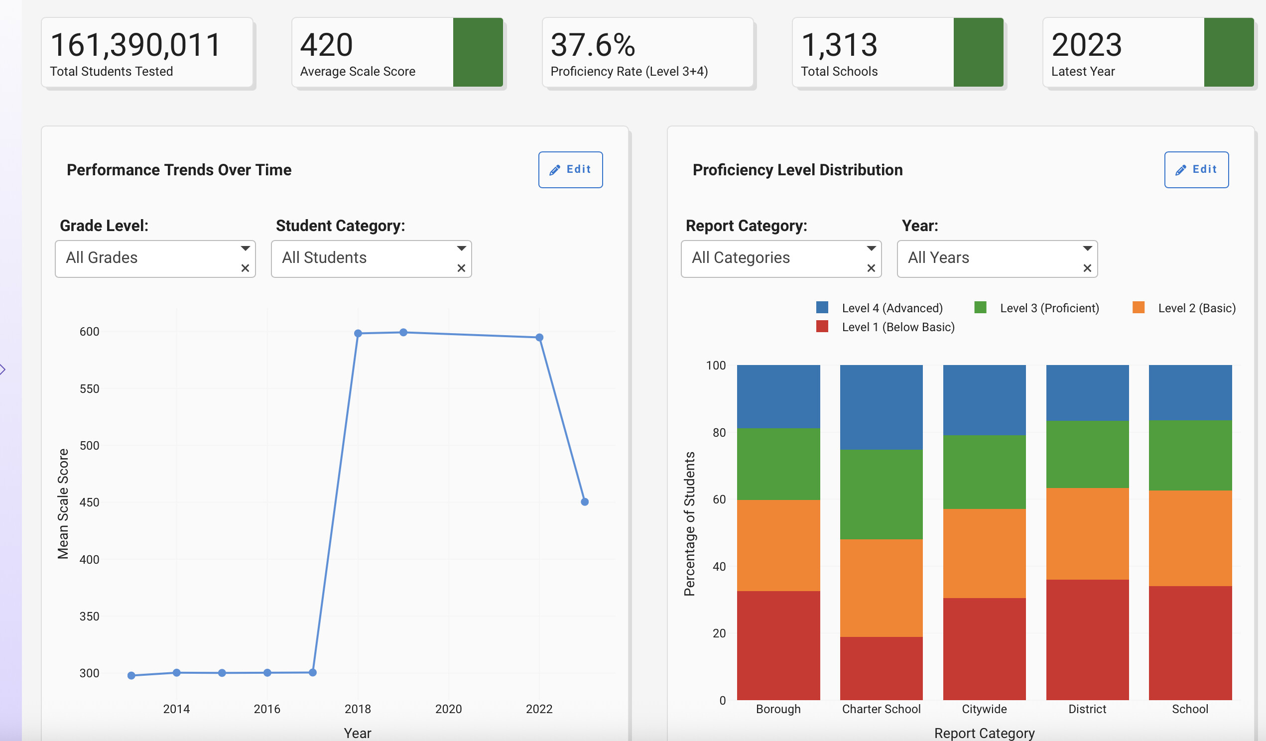
Below is a screenshot of the app that Plotly Studio created on top of this dataset:
Bar Chart prompt:
Proficiency level distribution as a stacked bar chart with controls to group by report category (School, District, Charter School, Borough, Citywide) and filter by year (2013-2023)
Participation Instructions:
- Create - use the weekly data set to build your own Plotly visualization or Dash app. Or, enhance the sample figure provided in this post, using Dash or Plotly Studio.
- Submit - post your creation to LinkedIn or X with the hashtags
#FigureFridayand#plotlyby midnight Thursday, your time zone. Please also submit your visualization as a new post in this thread. - Celebrate - join the Figure Friday sessions to showcase your creation and receive feedback from the community.
![]() If you prefer to collaborate with others on Discord, join the Plotly Discord channel.
If you prefer to collaborate with others on Discord, join the Plotly Discord channel.
Data Source:
Thank you to NYC Open Data portal for the data.