Dash Interactive Map with Time Slider

Hello everyone!

I have enjoyed Dash so far and I think that for python users is really nice to have such a library.
Unfortunately though, I found that there are several limitations when it comes to build a map: I haven’t found a way to build a choropleth map using my own shapefiles (that btw refers to the Netherlands).

I’ ve already visited these forum posts:
Choropleth map in dash,
Create your own choropleth map with custom shapefiles,
Map with custom choropleth areas
Python plotly: how to make a choropleth map with a slider (access grid data issue)
but have’t figured out how this can be realized. I am looking for a hands-on tutorial or at least a long step-by-step explanation! :slight_smile:

My final goal is to build an interactive map with a time slider where a specific percentage of each region in the choropleth map will be displayed and apparently this percentage changes every month…
Do you think that this is doable in Dash? I wouldn’t like using again Shiny for this!
Btw this is how my shapefile looks like:

Here is an example with GeoJSON and the scattermapbox chart type. You can’t use the .shp files directly, you will have to convert your shapefile to GeoJSON

Thanks for your reply. Is there any hyperlink in your post? I can’t find the example you talk about…

Whoops, sorry, here is the link: https://plot.ly/python/county-level-choropleth/

Thank you for your reply, I appreciate!
Unfortunately I can’t understand the example. This is my shape file (converted to geopandas) with the color column that I want to visualize:


The PC4 column is the the post district region I want to visualize. In matplotlib the map looks like this:

I have tried a lot to make the map, but still I can’t understand how to do it. This is my code. First I create a geojson file named shp_brabant_lim.json .

import plotly.plotly as py
from plotly.graph_objs import *

import plotly 
plotly.tools.set_credentials_file(username='USERNAME', api_key='API KEY')
mapbox_access_token = "TOKEN"

scl = [[0.0, 'rgb(242,240,247)'],[0.2, 'rgb(218,218,235)'],[0.4, 'rgb(188,189,220)'],\
            [0.6, 'rgb(158,154,200)'],[0.8, 'rgb(117,107,177)'],[1.0, 'rgb(84,39,143)']]

data = [ dict(
        type='choropleth',
        colorscale = scl,
        autocolorscale = False,
        locations = shp_brabant_lim['PC4'],
        z = shp_brabant_lim['Color'].astype(float),
        text = shp_brabant_lim['Color'],
        marker = dict(
            line = dict (
                color = 'rgb(255,255,255)',
                width = 2
            ) ),
        colorbar = dict(
            title = "Colorscale")
        ) ]


layout = graph_objs.Layout(
    height=600,
    autosize=True,
    hovermode='closest',
    mapbox=dict(
        layers=[
            dict(
                sourcetype = 'geojson',
                source = 'DIRECTORY/shp_brabant_lim.json',
                type = 'fill',
                color = 'rgba(163,22,19,0.8)'
            )
        ],
        accesstoken=mapbox_access_token,
        bearing=0,
        center=dict(
            lat=51.6978,
            lon=-5.3037
        ),
        pitch=0,
        zoom=5.2,
        style='light'
    ),
)

fig = dict(data=data, layout=layout)
py.iplot(fig, filename='Netherlands')

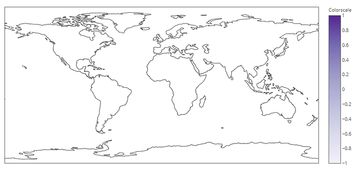
What I get is this:


I can’t see the reason why the map doesn’t zoom in these coordinates lat=51.6978,lon=-5.3037 and why netherlands is not colored… :frowning:

Can you figure out how to create a choropleth map using shapefile in Plotly?
I am struggling to create one. If you finally found how to do it, please show it to me. Thank you

No I haven’t found how to do this and I finally used another library. I hope that making choropleth maps using our own shapefiles will be easier in the future.