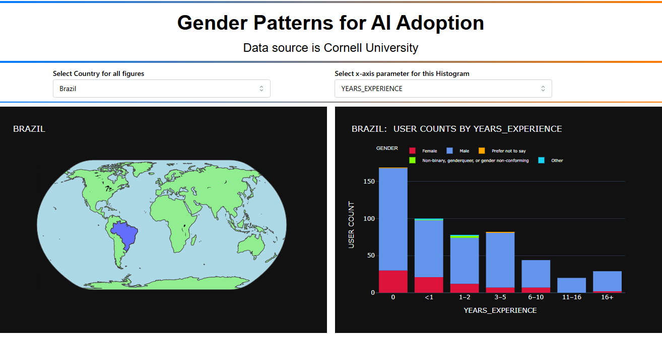
Hi Everyone, here’s my approach for this week. This time it’s an Analytics Dashboard since I didn’t use any charts. Instead, I used a card system with filters to explore associations/patterns among survey respondents. The analysis uses Chi-square tests and Cramer’s V to identify statistically significant relationships between student characteristics. Important to highlight that this is a small dataset of 9,538 respondents, which represents the students who answered ‘Yes’ they use AI.
The app translates complex statistical analysis into clear, actionable insights that anyone can understand and use.
By the way as usual is an on going project for instance the Export Report is there but is not fully working, the Refresh button it´s working
The code
import pandas as pd
import dash
from dash import dcc, html
from dash.dependencies import Input, Output, State
from scipy.stats import chi2_contingency
import numpy as np
import dash_bootstrap_components as dbc
from datetime import datetime
— Data Loading —
try:
df = pd.read_csv(‘ai_user_survey.csv’)
print(“ Success: ‘ai_user_survey.csv’ loaded successfully.”)
except FileNotFoundError:
print(“ Error: ‘ai_user_survey.csv’ not found. Please ensure the file is in the same directory.”)
df = pd.DataFrame()
— Data Preprocessing —
categorical_cols = [
‘Status’, ‘Country’, ‘Gender’, ‘Age_Range’, ‘Marital_Status’, ‘Children’,
‘Born_in_Current_Country’, ‘Employment_Status’, ‘Worked_in_Other_Field’,
‘Previous_Field’, ‘Paid_CS_Experience’, ‘CS_is_Primary_Income’,
‘Primary_Income_Source’, ‘Years_of_Coding_Experience’, ‘Annual_Salary_USD’,
‘Monthly_Online_Education_Spending’, ‘Willingness_to_Pay_for_Education’,
‘Willingness_to_Pay_Features’, ‘IDE_Learning_Experience’,
‘Dev_Environment_Setup_Experience’, ‘Learning_Pace’,
‘Studying_Device_Provider’, ‘AI_Assistants’, ‘AI_Features’, ‘Job_Roles’
]
categorical_cols_to_use = [col for col in categorical_cols if col in df.columns]
— Helper Functions —
def translate_metric_to_business(value, metric_type):
“”“Translate statistical metrics to business language”“”
if metric_type == “concentration”:
if value >= 80:
return f"{int(value//10)} out of 10", “Extremely High”
elif value >= 60:
return f"{int(value//10)} out of 10", “High”
elif value >= 40:
return f"{int(value//10)} out of 10", “Moderate”
else:
return f"{int(value//10)} out of 10", “Low”
elif metric_type == "lift":
    if value >= 3:
        return f"{value:.0f}x more likely", "Very Strong"
    elif value >= 2:
        return f"{value:.1f}x more likely", "Strong"
    elif value >= 1.5:
        return f"{value:.1f}x more likely", "Moderate"
    else:
        return f"{value:.1f}x more likely", "Weak"

elif metric_type == "cramers":
    if value >= 0.3:
        return "Very Strong Association", "🔥"
    elif value >= 0.2:
        return "Strong Association", "💪"
    else:
        return "Moderate Association", "👍"

return str(value), ""
def generate_insight(factor, category, concentration, lift, market_share):
“”“Generate Survey from statistical patterns”“”
insights =
# Primary insight
conc_text, _ = translate_metric_to_business(concentration, "concentration")
lift_text, _ = translate_metric_to_business(lift, "lift")

primary = f"💡 **Key Finding**: {conc_text} of '{category}' students fall into this selected group"
insights.append(primary)

# Market opportunity
if market_share >= 20:
    insights.append(f"🎯 **High Representation**: This segment represents {market_share:.0f}% of the study participants")
elif market_share >= 10:
    insights.append(f"📊 **Notable Representation**: This segment represents {market_share:.0f}% of the study participants")

# Business recommendation
factor_clean = factor.replace('_', ' ').title()
if lift >= 2.5:
    insights.append(f"🚀 **Strong Pattern**: Priority area for study {factor_clean} - {lift_text}  significantly higher than baseline")
elif lift >= 1.5:
    insights.append(f"📈 **Notable Pattern**: Significant finding {factor_clean} - {lift_text} higher than baseline")

return insights
— App Setup —
app = dash.Dash(name, external_stylesheets=[dbc.themes.FLATLY])
app.title = “CS Student Survey Explorer”
— Layout —
app.layout = dbc.Container(fluid=True, className=“px-4 py-3”, children=[
# Survey Context Header
dbc.Card([
dbc.CardBody([
dbc.Row([
dbc.Col([
html.H1(“CS Student Survey Explorer”, className=“display-6 fw-bold text-primary mb-1”),
html.P(“Understanding Computer Science Student Patterns & Preferences from a Survey Conducted by Cornell University”, className=“text-muted mb-2”),
html.Div([
dbc.Badge(“9,538 Students”, color=“info”, className=“me-2”),
dbc.Badge(“Global Survey”, color=“success”, className=“me-2”),
dbc.Badge(“27 Variables”, color=“warning”, className=“me-2”),
dbc.Badge(f"Updated {datetime.now().strftime(‘%Y-%m-%d’)}", color=“secondary”)
])
], width=8),
dbc.Col([
html.Div([
dbc.Button(“ Export Report”, id=“export-btn”, color=“primary”, size=“sm”, className=“me-2”),
dbc.Button(“ Refresh”, id=“refresh-btn”, color=“outline-secondary”, size=“sm”)
], className=“d-flex justify-content-end align-items-center”)
], width=4)
])
])
], className=“mb-4”),
# What This Analysis Shows
dbc.Card([
    dbc.CardHeader([
        html.H5("📖 What This Analysis Reveals", className="mb-0 fw-bold")
    ]),
    dbc.CardBody([
        html.P([
            "This dashboard identifies the strongest associations in student behavior and preferences. ",
            "Select any characteristic (e.g., 'AI usage', 'Salary range', 'Country') and discover which student profiles are most likely to exhibit that trait. ",
            html.Strong("Ideal for curriculum development, student recruitment, and program planning.")
        ], className="mb-2"),
        dbc.Alert([
            html.I(className="bi bi-lightbulb me-2"),
            "Pro Tip: Look for segments with high 'concentration' (many students in that group show the trait) and high 'association strength' (much more likely than average)."
        ], color="info", className="mb-0")
    ])
], className="mb-4"),

# Control Panel
dbc.Card([
    dbc.CardHeader([
        html.H5("🎯 Analysis Configuration", className="mb-0 fw-bold")
    ]),
    dbc.CardBody([
        dbc.Row([
            dbc.Col([
                html.Label("What student characteristic are you exploring?", className="fw-semibold"),
                dcc.Dropdown(
                    id='result-variable-dropdown',
                    options=[{'label': i.replace('_', ' ').title(), 'value': i} for i in categorical_cols_to_use],
                    placeholder="Select variable to analyze (e.g., AI_Assistants, Country, Annual_Salary_USD)..."
                ),
            ], md=6),
            dbc.Col([
                html.Label("Which specific value interests you?", className="fw-semibold"),
                dcc.Dropdown(
                    id='result-value-dropdown',
                    placeholder="Select specific value (e.g., 'Yes', 'Brazil', '$50,000-$99,999')..."
                ),
            ], md=6)
        ])
    ])
], className="mb-4"),

# KPIs Dashboard
html.Div(id='kpi-dashboard'),

# Key Factors Section
html.Div([
    dbc.Row([
        dbc.Col([
            html.H4("🔑 Strongest Associations Found", className="mb-0 text-primary")
        ], width=8),
        dbc.Col([
            html.Small("Showing strongest associations only (statistical significance required)",
                      className="text-muted text-end")
        ], width=4)
    ], className="mb-3")
]),

dcc.Loading(
    id="loading-1",
    type="default",
    children=html.Div(id='summary-cards')
),

# Export Modal
dbc.Modal([
    dbc.ModalHeader("📄 Executive Report Generated"),
    dbc.ModalBody([
        html.P("Your survey analysis has been processed. In a full implementation, this would generate:"),
        html.Ul([
            html.Li("Comprehensive survey analysis report with key correlations"),
            html.Li("Statistical methodology and significance testing details"),
            html.Li("Research findings and notable patterns identified"),
            html.Li("Exportable data tables and correlation matrices for further study")
        ])
    ]),
    dbc.ModalFooter(dbc.Button("Close", id="close-modal", color="secondary"))
], id="export-modal", centered=True)
])
— Callbacks —
@app.callback(
Output(‘result-value-dropdown’, ‘options’),
[Input(‘result-variable-dropdown’, ‘value’)]
)
def set_value_options(selected_variable):
if not selected_variable or df.empty:
return
if selected_variable in df.columns:
unique_values = df[selected_variable].dropna().unique()
return [{‘label’: i, ‘value’: i} for i in unique_values]
return
@app.callback(
Output(‘kpi-dashboard’, ‘children’),
[Input(‘result-variable-dropdown’, ‘value’),
Input(‘result-value-dropdown’, ‘value’)]
)
def update_kpis(selected_variable, selected_value):
if not selected_variable or not selected_value or df.empty:
return html.Div()
# Calculate basic KPIs
target_column_name = f'is_{selected_value}'
df.loc[:, target_column_name] = df[selected_variable].apply(lambda x: 1 if x == selected_value else 0)

total_sample = len(df)
target_count = df[target_column_name].sum()
baseline_rate = (target_count / total_sample * 100) if total_sample > 0 else 0

# Quick count of significant factors
significant_factors = 0
analysis_vars = [col for col in categorical_cols_to_use if col != selected_variable]

for factor_var in analysis_vars:  # Check first 15 for quick KPIs
    try:
        contingency_table = pd.crosstab(df[factor_var].dropna(), df[target_column_name].dropna())
        if not contingency_table.empty and contingency_table.shape[0] > 1:
            contingency_table_smoothed = contingency_table + 1
            chi2, p_value, dof, expected = chi2_contingency(contingency_table_smoothed)
            n = contingency_table_smoothed.sum().sum()
            phi2 = chi2 / n
            k, r = contingency_table_smoothed.shape
            cramers_v = np.sqrt(phi2 / min(k-1, r-1))
            if cramers_v > 0.15 and p_value < 0.05:
                significant_factors += 1
    except:
        continue

return dbc.Row([
    dbc.Col([
        dbc.Card([
            dbc.CardBody([
                html.H2(f"{target_count:,}", className="text-primary mb-1"),
                html.P("Respondents in Selected Group", className="text-muted mb-0"),
                html.Small(f"out of {total_sample:,} total respondents", className="text-secondary")
            ])
        ], className="text-center border-primary")
    ], md=3),
    dbc.Col([
        dbc.Card([
            dbc.CardBody([
                html.H2(f"{baseline_rate:.1f}%", className="text-info mb-1"),
                html.P("Survey Prevalence", className="text-muted mb-0"),
                html.Small("baseline rate in population", className="text-secondary")
            ])
        ], className="text-center border-info")
    ], md=3),
    dbc.Col([
        dbc.Card([
            dbc.CardBody([
                html.H2(f"{significant_factors}", className="text-success mb-1"),
                html.P("Associated Factors", className="text-muted mb-0"),
                html.Small("statistically significant correlations", className="text-secondary")
            ])
        ], className="text-center border-success")
    ], md=3),
    dbc.Col([
        dbc.Card([
            dbc.CardBody([
                html.H2("📊", className="text-warning mb-1"),
                html.P("Analysis Status", className="text-muted mb-0"),
                html.Small("ready for insights", className="text-secondary")
            ])
        ], className="text-center border-warning")
    ], md=3)
], className="mb-4")
@app.callback(
Output(‘summary-cards’, ‘children’),
[Input(‘result-variable-dropdown’, ‘value’),
Input(‘result-value-dropdown’, ‘value’)]
)
def update_summary_cards(selected_variable, selected_value):
if not selected_variable or not selected_value or df.empty:
return [
dbc.Alert([
html.H5(“ Get Started”, className=“alert-heading”),
html.P(“Select a variable and specific value above to discover the strongest associations factors in the CS student survey.”, className=“mb-0”)
], color=“light”, className=“text-center”)
]
target_column_name = f'is_{selected_value}'
df.loc[:, target_column_name] = df[selected_variable].apply(lambda x: 1 if x == selected_value else 0)

factor_scores = []
analysis_vars = [col for col in categorical_cols_to_use if col != selected_variable]

for factor_var in analysis_vars:
    try:
        contingency_table = pd.crosstab(df[factor_var].dropna(), df[target_column_name].dropna())
        contingency_table_smoothed = contingency_table + 1

        if not contingency_table_smoothed.empty and contingency_table_smoothed.shape[0] > 1 and contingency_table_smoothed.shape[1] > 1:
            chi2, p_value, dof, expected = chi2_contingency(contingency_table_smoothed)
            n = contingency_table_smoothed.sum().sum()
            phi2 = chi2 / n
            k, r = contingency_table_smoothed.shape
            cramers_v = np.sqrt(phi2 / min(k-1, r-1))

            # Only include strong associations
            if cramers_v > 0.15 and p_value < 0.05:
                factor_scores.append({'factor': factor_var, 'cramers_v': cramers_v, 'p_value': p_value})
    except ValueError:
        continue

if not factor_scores:
    return [
        dbc.Alert([
            html.H5("🔍 No Strong Patterns Found", className="alert-heading"),
            html.P([
                "No statistically significant factors were identified for this combination. ",
                "This could mean the trait is evenly distributed across all student profiles, or you may want to try a different variable/value combination."
            ], className="mb-0")
        ], color="info", className="text-center")
    ]

factor_df = pd.DataFrame(factor_scores).sort_values(by='cramers_v', ascending=False)

cards = []
for _, row in factor_df.head(5).iterrows():
    top_factor = row['factor']

    contingency_top_factor = pd.crosstab(df[top_factor].dropna(), df[selected_variable].dropna())
    contingency_top_factor_smoothed = contingency_top_factor + 1
    chi2, p_value, dof, expected = chi2_contingency(contingency_top_factor_smoothed)
    standardized_residuals = (contingency_top_factor - expected) / np.sqrt(expected)

    if selected_value in standardized_residuals.columns:
        top_pos_residual = standardized_residuals[selected_value].idxmax()

        # Business metrics
        total_students = len(df.index)
        category_total = df[df[top_factor] == top_pos_residual].shape[0]
        num_students_in_category = df[(df[top_factor] == top_pos_residual) & (df[selected_variable] == selected_value)].shape[0]

        percentage = (num_students_in_category / total_students) * 100 if total_students > 0 else 0
        concentration_rate = (num_students_in_category / category_total) * 100 if category_total > 0 else 0
        baseline_rate = (df[target_column_name].sum() / total_students) * 100 if total_students > 0 else 0
        lift = concentration_rate / baseline_rate if baseline_rate > 0 else 0
        market_share = (num_students_in_category / df[target_column_name].sum()) * 100 if df[target_column_name].sum() > 0 else 0

        # Business translations
        conc_readable, conc_strength = translate_metric_to_business(concentration_rate, "concentration")
        lift_readable, lift_strength = translate_metric_to_business(lift, "lift")
        assoc_readable, assoc_icon = translate_metric_to_business(row['cramers_v'], "cramers")

        # Generate insights
        insights = generate_insight(top_factor, top_pos_residual, concentration_rate, lift, market_share)

        # Determine card styling
        if row['cramers_v'] >= 0.3:
            border_color = "border-danger"
            header_color = "bg-danger text-white"
        elif row['cramers_v'] >= 0.2:
            border_color = "border-warning"
            header_color = "bg-warning text-dark"
        else:
            border_color = "border-info"
            header_color = "bg-info text-white"

        # Enhanced executive card
        card_content = [
            dbc.CardHeader([
                html.Div([
                    html.H5(f"{top_factor.replace('_', ' ').title()}", className="mb-0"),
                    html.Span(assoc_icon, style={"fontSize": "1.2rem"})
                ], className="d-flex justify-content-between align-items-center")
            ], className=header_color),

            dbc.CardBody([
                # Key segment
                html.Div([
                    html.H6("🎯 Strongest in:", className="text-muted mb-1"),
                    html.H5(f'"{top_pos_residual}"', className="text-primary mb-3")
                ]),

                # Business metrics
                dbc.Row([
                    dbc.Col([
                        html.H4(conc_readable, className="text-success mb-1"),
                        html.P("in this segment", className="small text-muted mb-0")
                    ], width=6, className="text-center"),
                    dbc.Col([
                        html.H4(lift_readable, className="text-info mb-1"),
                        html.P("vs average", className="small text-muted mb-0")
                    ], width=6, className="text-center")
                ], className="mb-3"),

                html.Hr(className="my-3"),

                # Business insights
                html.Div([
                    html.H6("💡 Survey Insights:", className="text-primary mb-2"),
                    html.Div([
                        html.P(insight, className="small mb-1") for insight in insights
                    ])
                ], className="mb-3"),

                # Technical details (collapsible)
                html.Details([
                    html.Summary("📊 Statistical Details", className="text-secondary small mb-2"),
                    html.Div([
                        html.Small(f"Group Representation: {market_share:.1f}% of selected group", className="text-secondary d-block"),
                        html.Small(f"Sample Size: {category_total:,} students in this group", className="text-secondary d-block"),
                        html.Small(f"Statistical Strength: {assoc_readable}", className="text-secondary d-block"),
                        html.Small(f"P-value: {row['p_value']:.4f} (highly significant)", className="text-secondary d-block")
                    ])
                ])
            ])
        ]

        cards.append(
            dbc.Col([
                dbc.Card(card_content, className=f"{border_color} shadow-sm h-100")
            ], lg=4, md=6, className="mb-3")
        )

return dbc.Row(cards)
@app.callback(
Output(“export-modal”, “is_open”),
[Input(“export-btn”, “n_clicks”), Input(“close-modal”, “n_clicks”)],
[State(“export-modal”, “is_open”)]
)
def toggle_modal(export_clicks, close_clicks, is_open):
if export_clicks or close_clicks:
return not is_open
return is_open
@app.callback(
[Output(‘result-variable-dropdown’, ‘value’),
Output(‘result-value-dropdown’, ‘value’)],
[Input(‘refresh-btn’, ‘n_clicks’)]
)
def refresh_dashboard(n_clicks):
if n_clicks:
return None, None # Reset both dropdowns
return dash.no_update, dash.no_update
server = app.server
The app I´m trying to set public, but I have not been allowed I will try and let you know