Check out how I used Plotly Studio to analyze GitHub issues in our public dash repository.
I used the GitHub CLI to export a CSV of repository issues with all the relevant details. In just a few clicks, I created interactive charts that reveal:
-
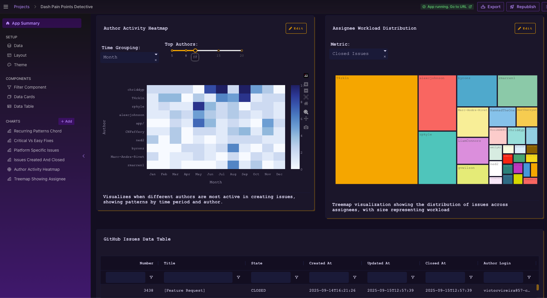
 Who has the most assigned issues
 -
 Contributor activity trends
 -
 Backlog growth and resolution patterns
What’s amazing is how easy it was to go from raw CSV data to meaningful insights — no complex setup, just install Plotly-Studio, upload CSV or Parquet data and explore.
You can do the same to visualize your team’s workload, productivity, overall project health, and more. View and share this app hosted on Plotly Cloud https://182ad432-14de-43b1-8b5d-ddfb83ea6aaf.plotly.app