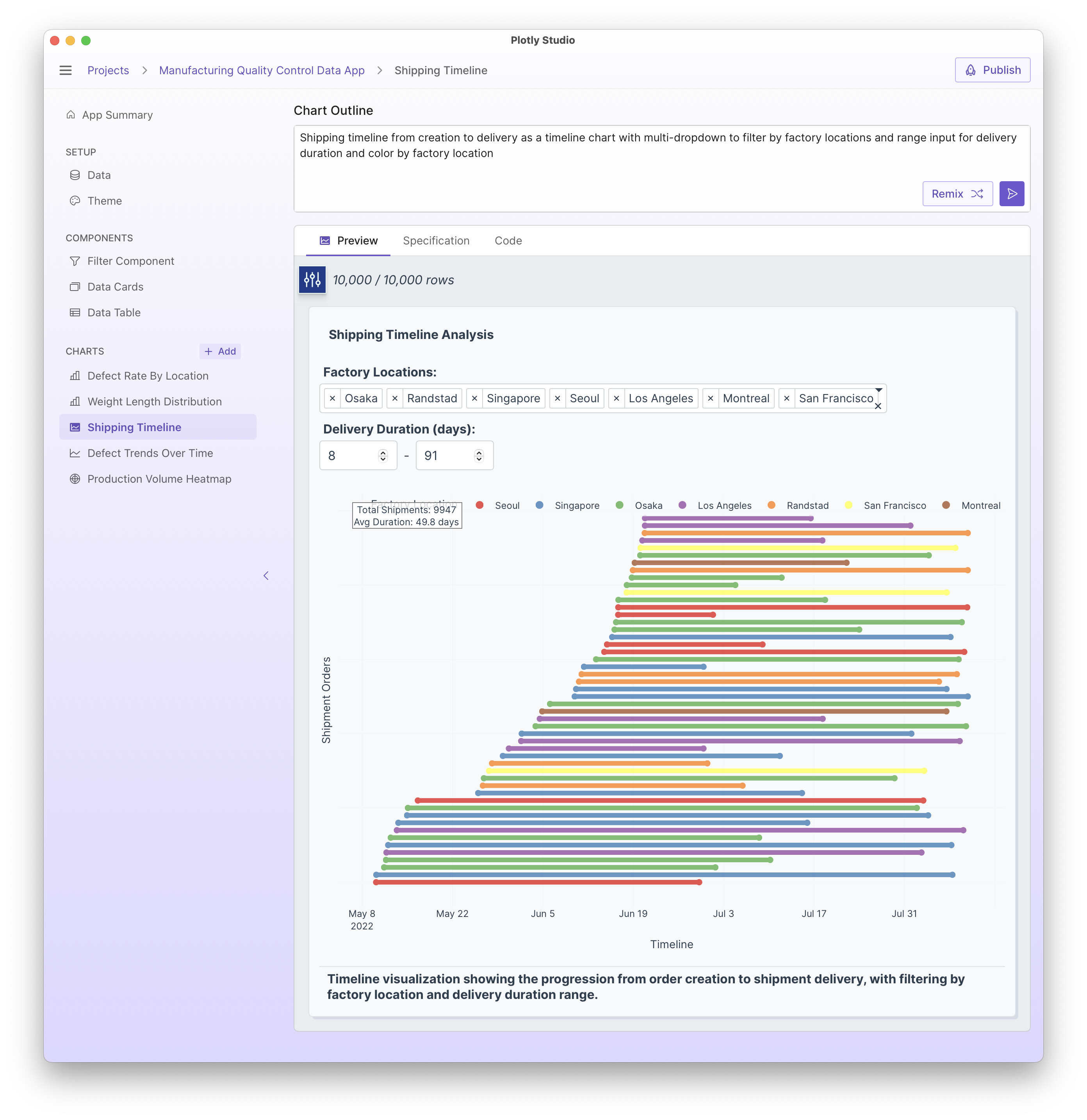
Here is a quick example of timeline charts in Plotly Studio. Timeline charts are a way to show duration - a separate line for each start date and end date.
This example uses the sample data available in Plotly Studio.
I really like these timeline plots, I have used them recently to look at notice periods for client visits to our facility, it was very effective in showing the variation in these notice periods so visually.
Another version of these charts I’ve been doing lately is to add an option to use relative dates vs absolute dates. So relative dates resets the start date across all events to be “day 1” rather than the real date. This allows you to compare durations across events.
The prompt I use is:
Provide an option to use relative dates instead of absolute dates. Relative dates reset the start date to be “day 1”.
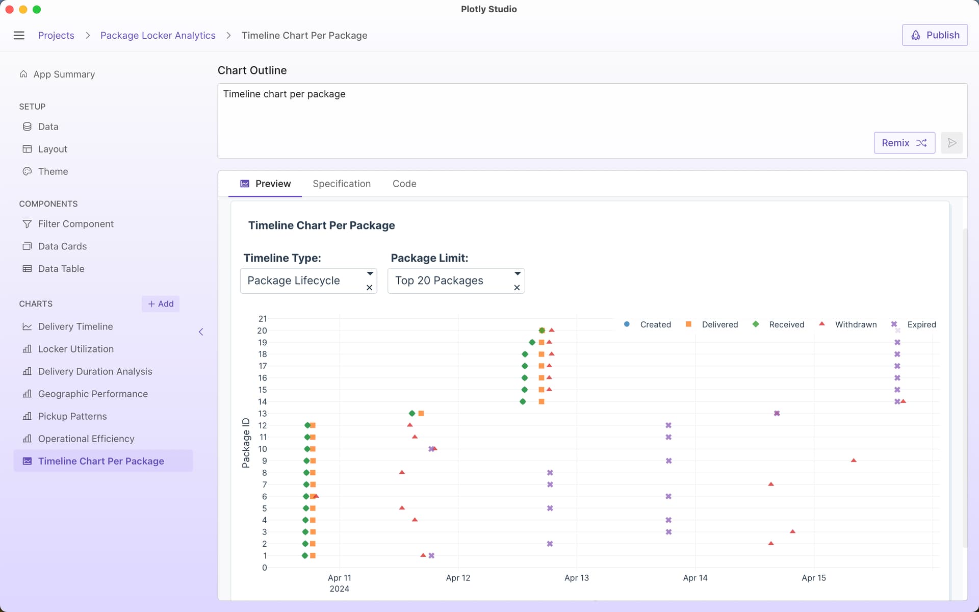
A really simple timeline prompt used in this week’s Figure Friday: Figure Friday 2025 - week 36 - #4 by chriddyp
Timeline chart per package
and with more details:
Timeline chart per package
Include option for absolute dates vs relative dates
Include options to sort by different durations (time delivered vs time received vs total time, etc)
Draw a line to connect each timeline
Different symbols for each event