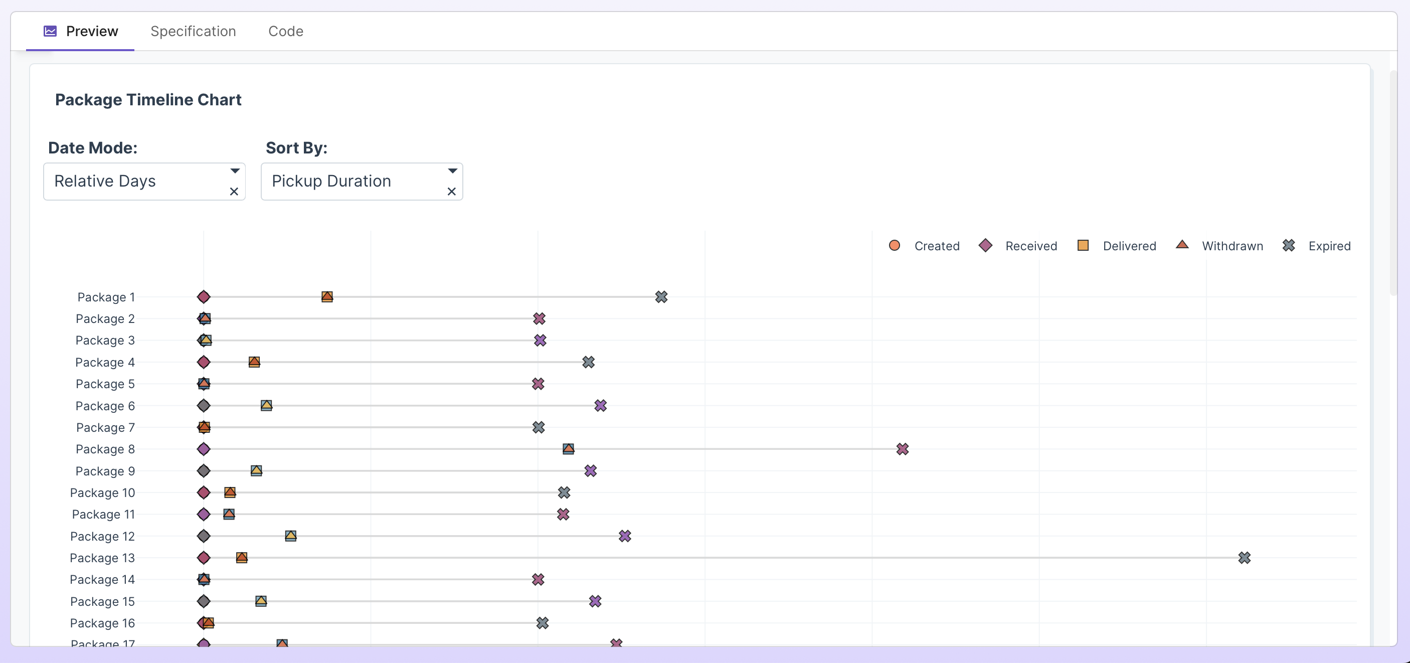
Timeline charts have come up a lot lately, and this dataset is great for them.
Here’s the simplest prompt to create one in Plotly Studio:
Timeline chart per package
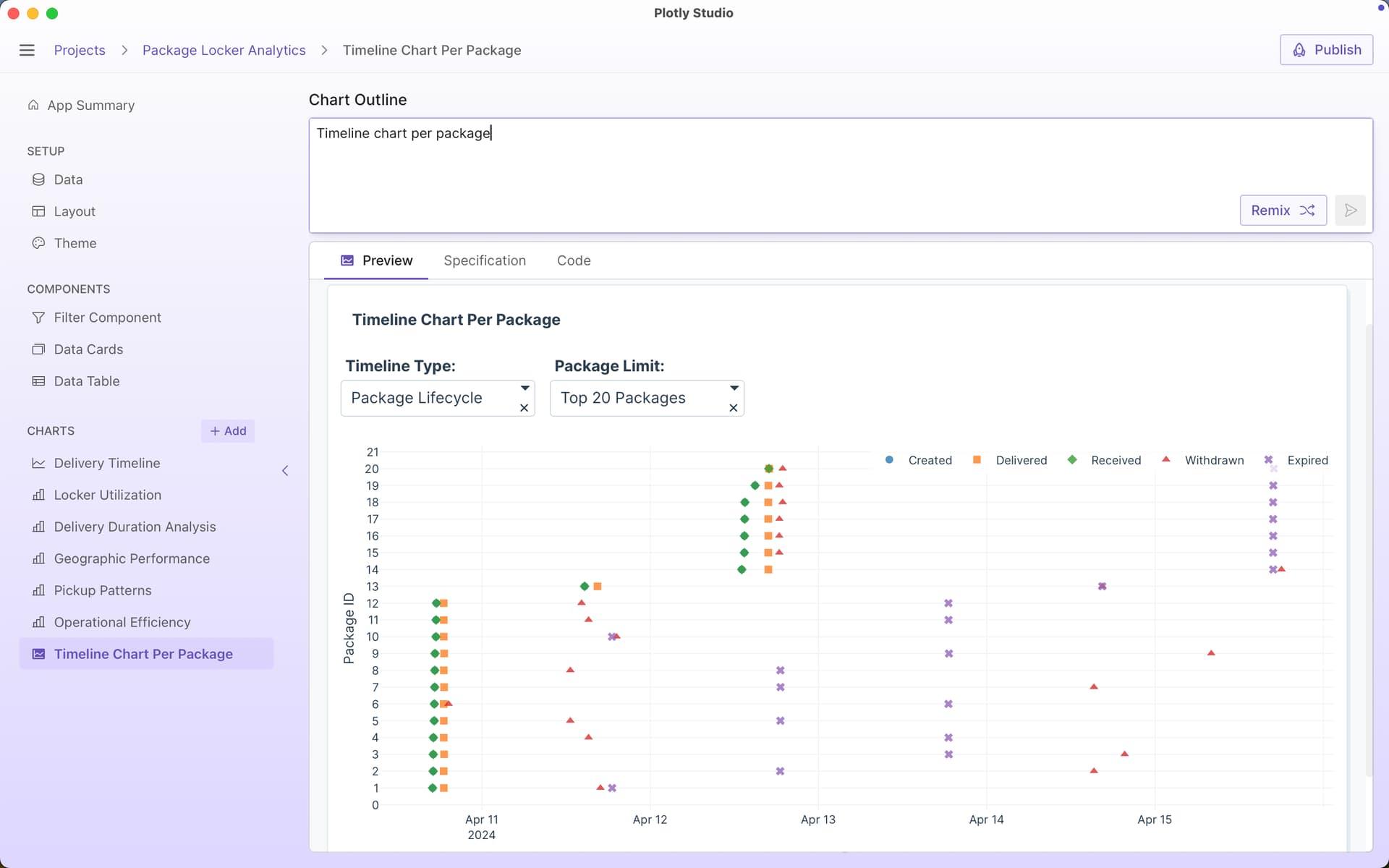
I then modified the prompt to include a couple of other suggestions:
Timeline chart per package
Include option for absolute dates vs relative dates
Include options to sort by different durations (time delivered vs time received vs total time, etc)
Draw a line to connect each timeline
Different symbols for each event

I really like the absolute vs relative days option for these timeline charts. Here’s absolute times:

whereas relative times resets everything to the same starting point: